Worst artwork for every Pokemon artist? Analysis of artists fails

Cool artwork get all the love, but I’d like to do a little analysis on the worst art from any TCG artist.
What are the worst in your opinion?

Inspired by @xileets collection, I’m starting with Arita sensei. As a wannabe artist myself, I respect mitsuhiro god level skills, but even gods sometimes fail.


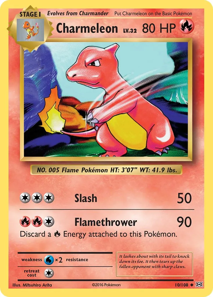
I can’t be too harsh on base set/jungle/fossil arita, but we must admit that his skills were still improving and “catching flies” charmeleon is at least weird looking lol. But iconic card, and beautiful painted background so is a 5/10 to me.

_


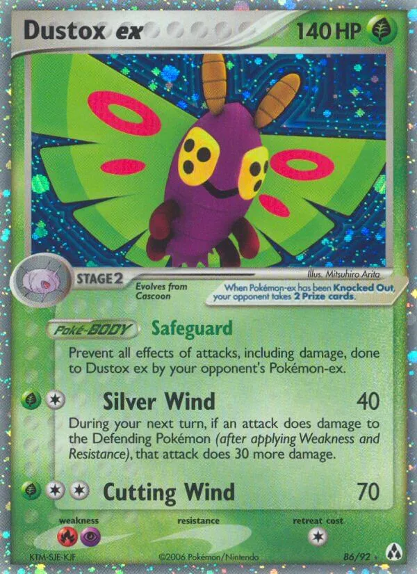
Ex era arita is excellent, but I notice problems when he illustrates ex cards. This is not an easy task, and a lot of these look bad imho. Ryo Ueda is the only (in my opinion) that has really understood the spirit of these, and set the gold standard. So “clip art” dustox gets a 5/10

_


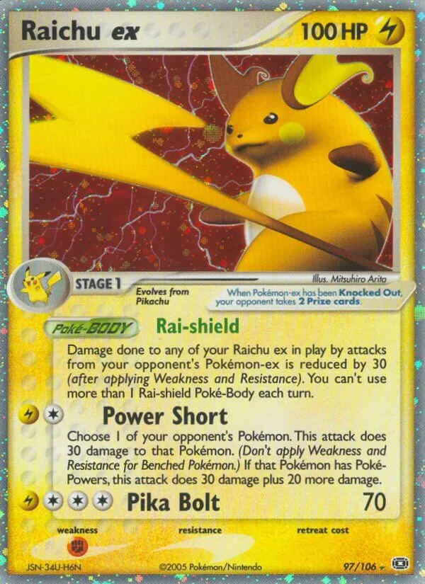
Microcephalic Raichu? 3/10. We’ll discuss later the struggle between Arita and Pika family lol

_


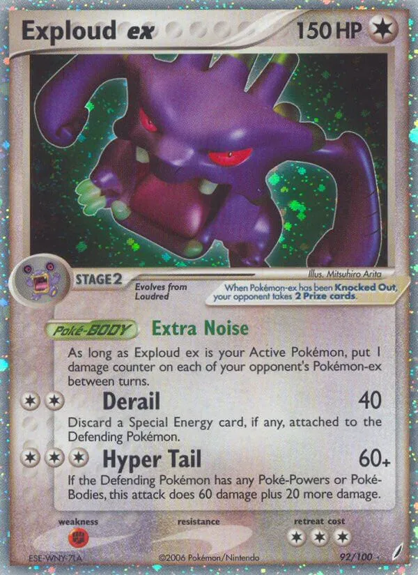
This looks Exploud to you? Really weird anatomy and perspective not helping. Materials look like some kind of playdoh. It also reminds me of those toys/surprises inside 90s snacks idk. 3/10

_


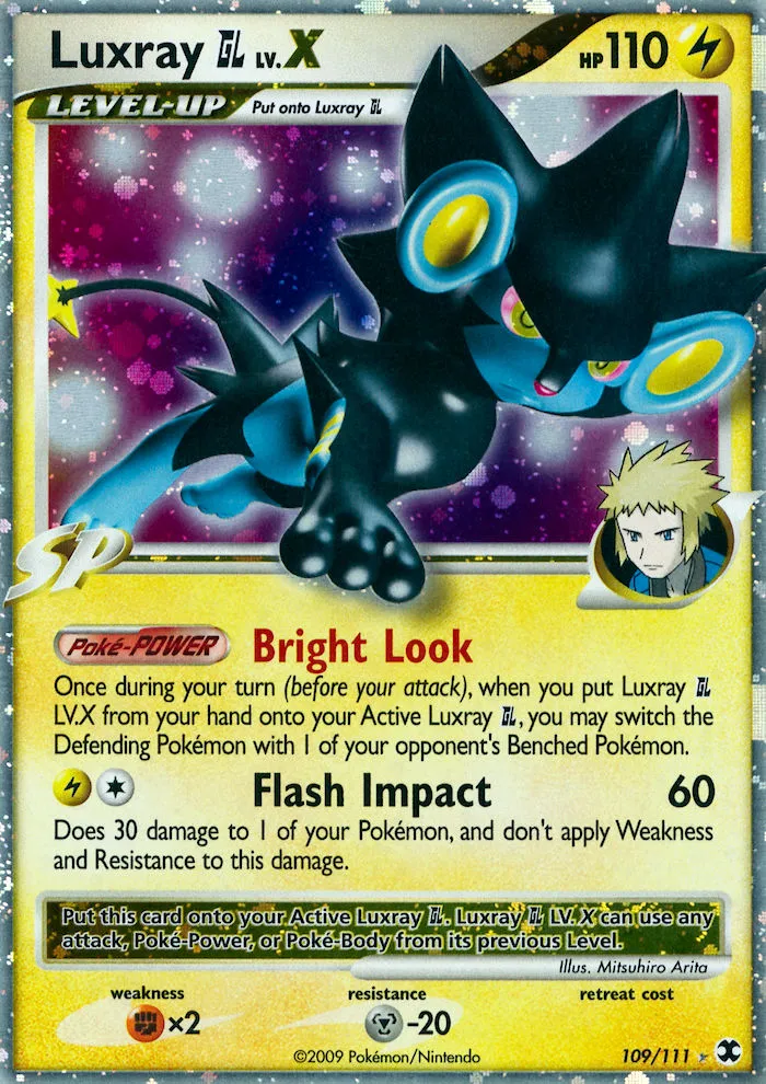
Same problems with “latex” luxray. 5/10

_


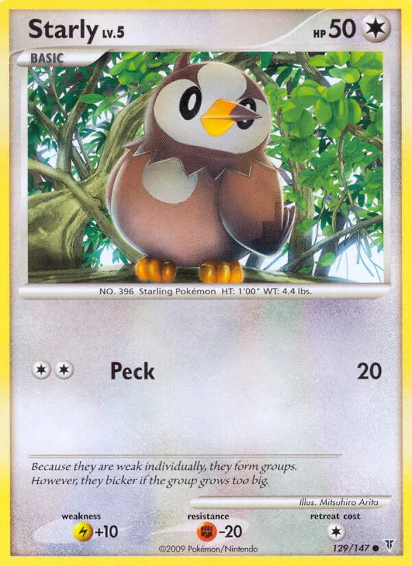
Good composition and ok anatomy. It has also a cool old style vibe (it reminds me a bit of bs rattata). So, where is the problem? That disturbing peck is bothering me so much. It breaks the eye silhouette, but the brown part is still following the pupil shape. It creates a sharp point of interest that disturbs the vision of the whole artwork. I… can’t… stop… looking that. 6/10 because It’s not a big mistake.

_


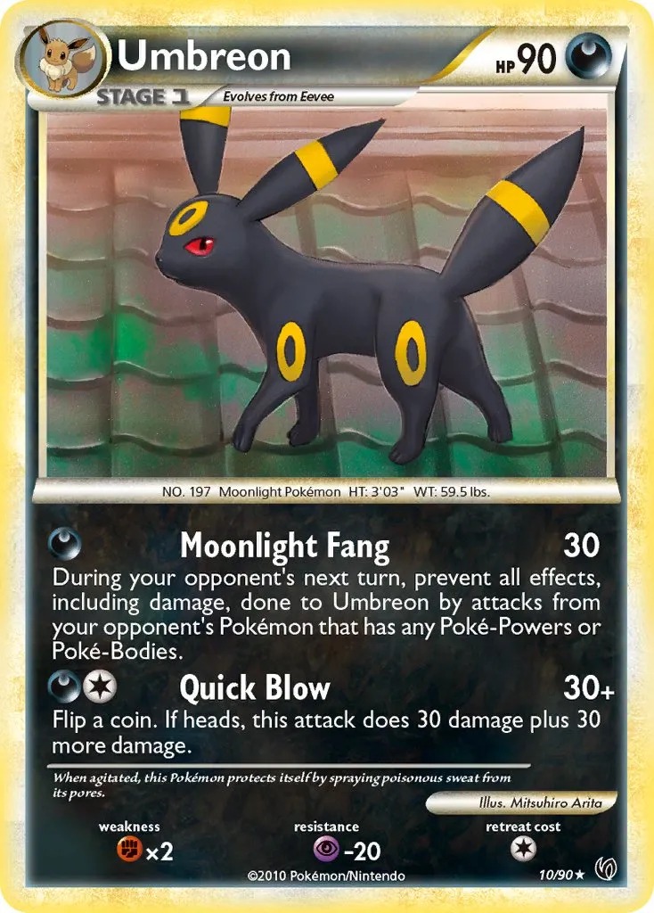
Another proof that hgss era is artistic low point of the tcg? Even arita looks bad. It really made me think that there is some kind of active art direction that didnt end too well. Lol, that “floating” umbreon doesn’t even have a shadow 4.5/10
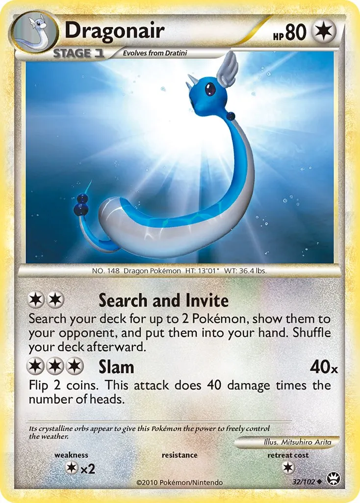
“Sperm cell” dragonair gets 4.5/10 too.

_


Well, I don’t have many words for this nightmare. Pikachu/raichu anatomy really seems difficult for arita sensei. The electric mouse really benefits of a more cartoonish and cute style that arita can’t provide. Also Pikachu’s lack of anatomical landmarks (pretty flat face, smooth chin) is maybe interfering with arita workflow. 1/10

__


An homage to Tomokazu Komiya? A stylistic choice? It’s not ugly but surely is a derp dragon. 5/10

_


Arita decided to go full corporate and gave us this magnificent soulless sheep.
“stock_wooloo_1.jpg” gets 5/10.

_


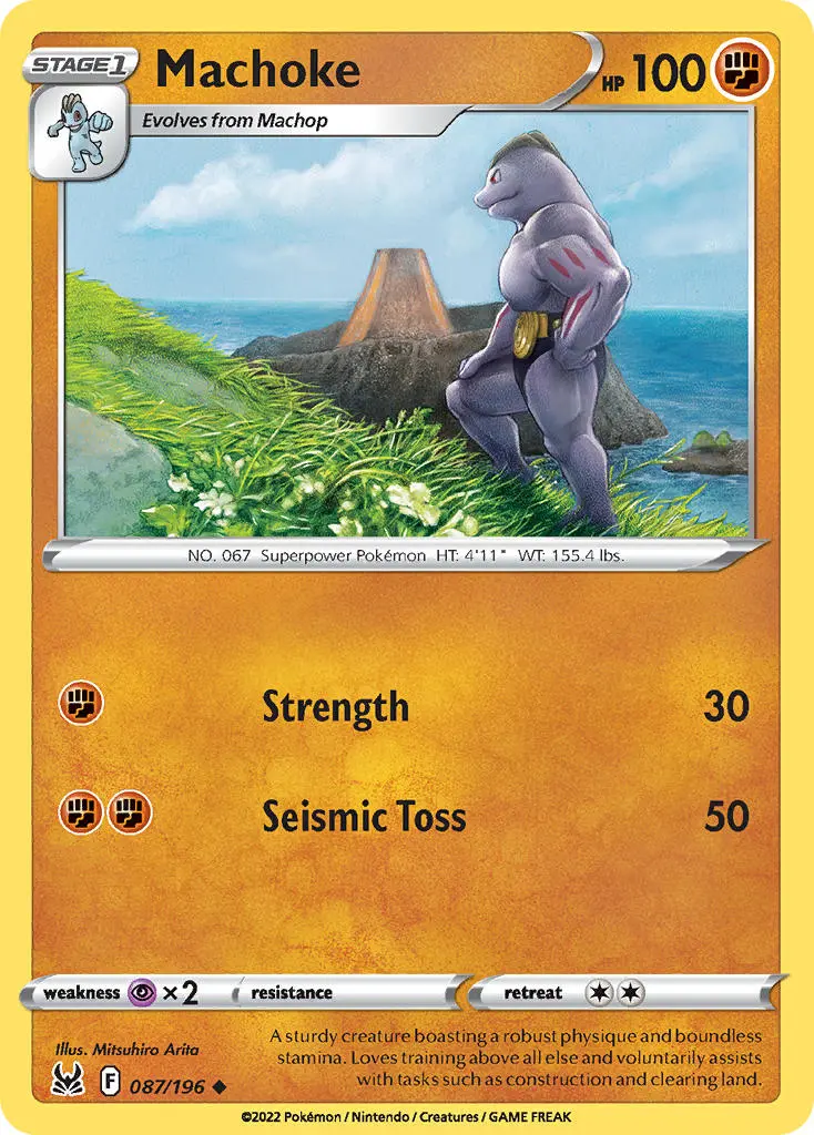
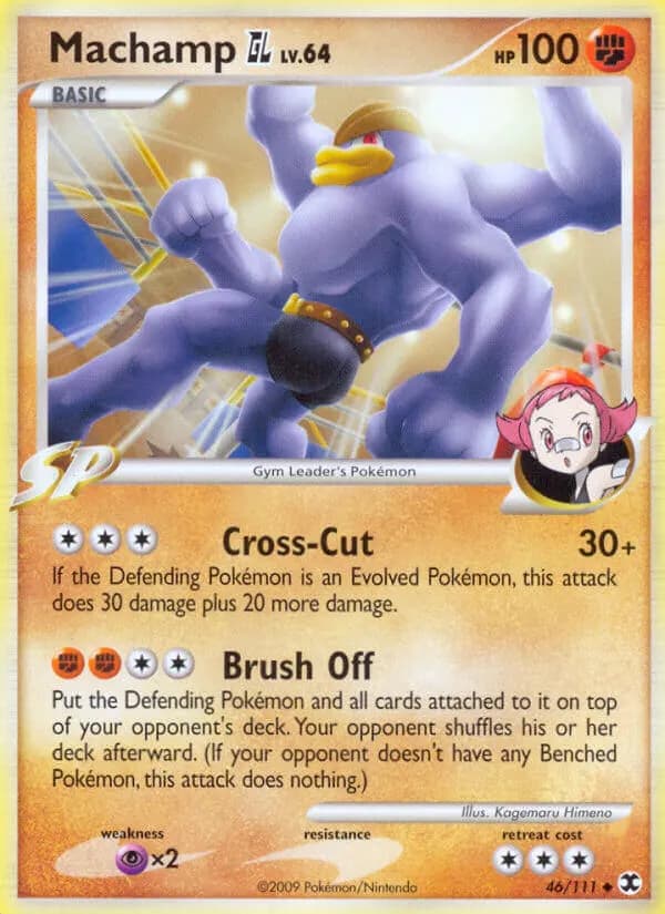
Honestly is just a terrible composition. Every object in the scene looks disconnected from the other, and the pose is so dumb. “Sexy machoke” gets 3.5/10

I will maybe try with other artists in the future. Feel free to add your example and post your worst artworks!

23 Likes
2 Likes

[Reserving Kouki Saitou. Gonna have a field day with this one] :face_with_monocle:

Edit: I think this topic is fine so long as the discourse remains constructive and is limited to the technical aspects of their art. It’s very common (and healthy) in circles related to visual media to critique even the most sacred cows. Imo it leads to greater understanding and appreciation of art and allows people to see the pros and cons of their favorites.

3 Likes

I don’t think that my topic is simply an unpopular opinion and I’m sorry if it looks like something to just provoke people.
It tooks me ~40 min to put this together and my goal was to quickly explain why some artwork doesn’t work (in my opinion), hoping to give another perspective. Art is no science for sure, but there are rules like composition, anatomy, color theory that can be freely discussed, and this is common practice in art communities.

5 Likes

Shigenori Negishi

Save us all

18 Likes

Saying that Arita has a difficult time drawing Pikachu’s anatomy when he has illustrated the character countless times over 25 years seems a bit extreme to me. But they are your opinions and I can respect that.

3 Likes

Fukuda

Deviantart vibes

21 Likes

2013-14 Kimura sleeping on the job:

Made by the same person that made Fossil Dragonite:

12 Likes

I love Nishida’s artwork, but some of her Gym Pokemon were poorly integrated into the background.


10 Likes

Almost forgot the obligatory mention, precious vintage holo slot wasted:

8 Likes

That Machamp made me laugh. It almost seems like its butt is the focal point of the image. And his sexy buttock really impressed Maylene lol.

image

8 Likes

This blows the rest of them out of the water. The elbows… :skull:

2 Likes

It’s like she made a concrete effort to make an impossible body type blend. Neckless strongman, synthol chested bodybuilder with pro fighter limbs.

2 Likes

Related thread: The Best & Worst of an Artist.

To quote myself:

@decoypalmette you forgot these two by Arita. :wink:


Greetz,
Quuador

9 Likes

LOL I came here to post that exact Pikachu and Raichu.

1 Like

I’m not too familiar with Arita or that era but was there a time when he was dabbling with 3D CG art?

It’s probable. I recall reading an interview where he said that he originally started using cgi to have better references and understanding of shadows and anatomy.

Radiant blastoise by fukuda is prolly one of the most tilting moments for me when comparing it to his gold star glory days.

He really fu-kued up.

1754368

9 Likes

idk how to participate in this, so i’m just here to say this is a strange topic

3 Likes

You can post a pokemon art that you don’t like. Then you try to explain why and what problems you found, in a constructive, funny (if you want) but polite way.

1 Like