I think you have to look at the perspective of conceptual meaning behind the work, and why this was chosen.
Firstly, from memory I think the above set has a number of artworks which were made from a childrens drawing/art competition. Submitted by children, and the winners were chosen.
I know that if this was made by a professional artist, hired out by wotc, the technical resolution of the work is quite sad.
But it was a kids drawing competition, I think its badass for children’s work. The background is what makes it amazing, the whole power-plant and the hanging electabuzz is so awesome. I could see in this set why they chose it, because its background was more detailed in a dionysiac sense, than many of the submissions.
There is some hilarity behind how bad it looks as a fully licensed print, which makes it a fun card. It’s like… so bad that its good?
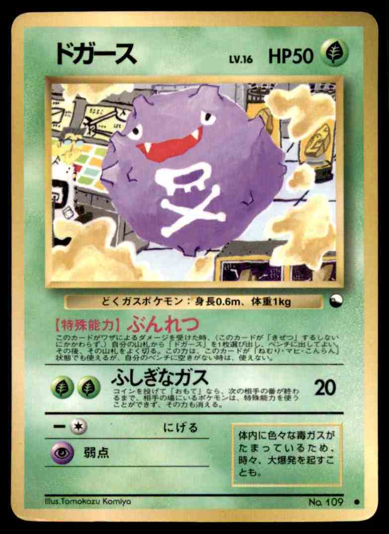
Wellllll the voltorb was done by Komiya who has done quite a few cards lol. For me his work is hit or miss, but it should be noted that this is his style of artwork: crude and playful. I can definitely appreciate his art in the sense that his style is unique to the pokemon tcg. They look absurd and that’s why I like them
See here: bulbapedia.bulbagarden.net/wiki/Tomokazu_Komiya
As for my least favorite: I dislike cards in which the illustration looks too smooth and cartoony if that makes any sense. For example I enjoy the roughness and texture of older sugimori art but don’t like his newer art as much (ie. Post-frlg)
Come on other Scott! This Voltorb is one of my favorites. Then again I am partial to the older hand drawn artwork. I remember seeing that Voltorb back in the 90’s at a card shop and couldn’t forget it. Since at that point all I knew was the base set Voltorb, I thought it was cool that one could look that way.
Anyway, tangent aside, artwork that is forgettable to me are most of the common cards from the original EX series.
Yes, Tomokazu Komiya is a professional artist, not one of the kids who won the art contests to make Vending cards (those were Mr. Mime, Snorlax, Poliwrath and maybe one more). Different strokes and all that but I find Komiya’s early artwork to be HIDEOUS, all of it. Since the BW-era, he’s modified his style a bit so that it’s still recognizably Tomokazu Komiya but it doesn’t make me want to spew vomit. So there’s that, at least.
Any of the 3D crap rolling around, the only 3D art I actually like is the Ditto from the original Fossil set because it was like a breath of fresh air at the time, nowadays it’s like they’re spamming it for no particular reason.