This was an easy one for me. What is your choice?
This abomination looks like it was a Madame Tussaud’s Wax Museum reject.

This was an easy one for me. What is your choice?
This abomination looks like it was a Madame Tussaud’s Wax Museum reject.
@pkmnflyingmaster, lol. That is awful,
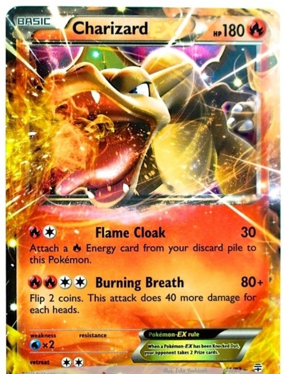
I know lots of people like it and it’s very popular, but I always felt this artwork, shall we say, missed the mark. Platypus/Charizard combo? I embraced it all the same ![]()
I struggle to even look at the whole EX era that has japanese names on the artwork, these cards are just ugly

Break cards should be mentioned also as second ugliest in history of Pokemon TCG…
Every CG artwork other than the detective Pikachu ones.
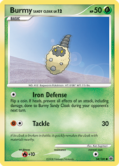
You failed to look deeper into this one as this is featured in the desert to feature Burmy changed to its Sandy Cloak. A coat of leaves, sand and gravel, or pink building insulation can be used to cover Burmy’s body. It will not hesitate to collect nearby materials to construct a new cloak if the old one breaks or falls off. The artwork is simple yet complex once we start looking at the circles around Burmy. This artifact can result from the backscatter or retroreflection of the light from airborne solid particles, such as dust or pollen. Rather fitting for a Sandy Cloak Burmy, is it not?
I always hated the Masaki Golem, it looks like a 6 year old drew it.

Hate this card and Pokémon with a passion it’s ridiculous
Agreed with this one lol, so ugly and that’s not a Pokemon, it’s a building w/ eyes…
Speaking of Golem, a more recent example is this one from the same evolution line:

I don’t know why but I despise this artwork so much. I hated pulling this guy and I’m someone who normally enjoys common, uncommon and rare artwork a lot. Something about the face and shape is just terrible.
Like just look at this Alolan Golem instead and compare the difference in quality:

no

Most stock Sugimori art is what it is, this is that repeated more then the usual. All of Rumble also wasn’t good, 5ban too. @garyis2000, at least that version is the better one from a set of three. ![]()
Anything jynx or smoochum. I think those are the two most stupid and awful looking pokemon that exist, it’s impossible for them to not ruin whatever piece of cardboard they are printed on. I havent seen many of the pokemon beyond gen 3 so perhaps they have been surpassed but I have always loathed both of them.
I hate this type of shit while some love it, I can’t even do it fam. It makes me a tad bit sick.

Wow that’s uglier than the expedition zard 
the winner without doubt for me ![]()
Wow, I respect your opinion but I didn’t know about this and really love it. Thanks for showing it to me for the opposite reason haha
There was the fat Snorlax and Pikachu recently too I loved
Any “break” card. I’m sorry but I just really really hate the look of these. Also my OCD goes nuts at the fact they are not oriented the same way as normal cards.
