Worst artwork for every Pokemon artist? Analysis of artists fails

This topic is great! Sure, I have a few:

The colors are wonderful and it’s well drawn but I just can’t get over that pose and keep thinking ‘why this angle…’ It distracts from an otherwise great card.

I love Yuka Morii’s older artworks but I feel her newer ones have not been the same. The older ones had a kind of whimsical fancy to them. I feel the new era ones stand out too sharply from their background and look more like toys. Maybe its the lighting.

Face has always made me uncomfortable, lol.

image
I realize Galarian Corsola is meant to be a depressing Pokemon but this just makes me sad :sweat_smile:.

6 Likes

Omg I KNOW. Kimura was trying something different for a while and it was not working haha. So odd. Thankful she changed her ways and returned to her old style

1 Like

that’s crazy :sweat_smile: i love those 4 cards

2 Likes

Is this even a Komiya piece? Can’t tell! None of his usual flare and vibe, its just a normal Pokemon card. This one specifically stands out as disappointingly normal for such a unique artist.

5 Likes

Perhaps the worst Harada. Tbf, it’s hard to make this pokemon look good

9 Likes

So here’s an interesting one. I feel it’s less an issue of Aya Kusube’s art being lacking and more an instance of absolutely asinine cropping.

Someone at WOTC really just said “oh baby, let’s ZOOM IN on Golden’s crotch!”

13 Likes

In Fukudas defense, it is only the face that is nightmare fuel. The rest is perfectly fine.

By this stage in Kusajimas career, the average is dropping with almost every new card but the cards aren’t necessarily ugly per se, just lackluster especially when compared to the glory days. But this is downright ugly, no question about it.

5 Likes

Really good example of bad cropping. I will try posting a card that would have benefited from more cropping instead. My choice is Tomokazu Komiya, since he was used as example in the ai topic.


I opted for this cropping.

Komiya these days got really colorful and texture heavy, and I’ll show you this little progression (trying to not cherry pick anything)


This can be risky, because it generates noise, and eyes can’t easily understand where to look and what is important in the scene. Probably ok for a piece of art in a gallery, but less ideal in a Pokemon card (where the subject must be clear).

So, he maybe realized this a bit later, working on the drowzee artwork, and maybe tried to do the little spotlight thing that helped Drowzee to be detached from the background. A good cropping probably would have been helpful.

3 Likes

Greatly disagree with the Drowzee card point!

7 Likes

First off, let me say that I love this topic and had a great time going through all the posts so far, even though I don’t agree with every single one.

I just skimmed through my artist binders and this is what I came up with:

Kusajima:


Contrary to @c0ll3ct0r 's opinion, I personally don’t think Kusajima’s XY and early SM era stuff is that bad, with some artworks even being very good. They still have his specific “vibe” imo.
The one I posted, however, is a complete mystery to me. How could he possibly - willingly - put this out into the world while he was still in his absolute prime? I can only imagine that he missed the deadline for this artwork and TPC took some old random Sugimori stock art out of the drawer as substitute - because this is definitely post-OG era Sugimori style boring (as f*ck)!

Kusube:

I chose this one because it is, chronologically speaking, the first of her artworks that I wouldn’t immediately recognize as one of her works. It lacks the sinister shading and the heavy pencil strokes I (and surely many others) adore so much about her earlier cards. Sadly, that became more common with time, but in her latest illustrations she seems to find back to her roots which I personally couldn’t be more thrilled about :).

Baba:


Way, way too pink. That’s it. These eggs look like they’re recovering from a sunburn or suffering from hypertension or whatever.

Komiya:

I seriously couldn’t find a single artwork in the whole binder that I would confidently label “bad”. Even during ca. 2008 - 2014, where imho many OG artists had a dry spell, his output was still decent. Love him or hate him, TPC and the Pokemon fanbase can be glad af they have this dude. Setting the boundries of what a Pokemon can look like and what’s allowed to put on a card since 1998.

Cheers.

6 Likes

I was just thinking how this drowzee may be the best card art of modern alt art era not least because of the entity it creates :sweat_smile:

3 Likes

I agree with a lot of your perceptions here. I also and other Arita lovers also, really dislike the CG stuff. a few are good, but most of his strictly CG (as he uses computer touch-up on most every work) is lack-luster.

I always thought that machoke was “pensive machoke”, but…
I have to disagree strongly with the charmeleon: I see no objective problems or compositional problems here, BUT anatomy is SUPER important to me as well, so here is a far more mutated 'meleon. Where is the second leg?! What is the tail attached to? Where are it’s shoulders, and if the far arm is twisting toward the camera, how is the chest toward the ground, and the near arm smaller, and… :face_with_head_bandage: My head hurts. :face_with_spiral_eyes:

4 Likes

This thread inspired me to look through Kusajima’s artworks again, as I also was a firm believer that Kusajima produced nothing of value after ex-era.

What I found was a mixed bag. For example this Flygon I could’ve sworn was cookie-cutter Kouki Saitou stock art:

Upon closer inspection I noticed the distinct hallmarks of Kusajima, and yeah, not necessarily "bad" art, but definitely subpar for him during this era.

I then looked at some more recent art, and wow, there are some actual bangers in BW! Some great Arita-like-realism among them. But then his XY art is just so forgetful, it leaves absolutely no impression, my brain straight up doesn’t want to process what I’m seeing, as if I’m looking at static noise:


1 Like

Since Arita san has been reasonably thrown under the bus, I’ll throw Komiya san myself, but in a different way than @decoypalmette. :smirk:

What. Is. This?!


skelington strange

:woozy_face:
I have no clue what is going on in this picture. Is this thoughts in his head? Is that Arabic? Kinda looks like Arabic. Why? The right side of the ribbon is cleaner and clearer than the left. Is that food on a table? Lucy in the Sky with carpet beneath him?! There are great ways to illustrate an acid trip, with non-descript forms and shapes, that still looking like some distorted form of a perceptible reality (see below). THIS, contrary to popular belief is not it.

Good examples + the drowzee above :smile:


2 Likes

Good thread! I’m also an artist, trained in classical animation and working professionally for over a decade, so I get where you’re coming from. Arita’s 3D work was some of the worst I’ve seen, I always thought he was forced against his will to do them.

I made a post awhile back in the Unpopular Opinions thread that seemed to ruffle some feathers, but I’ll paraphrase it here for relevancy:

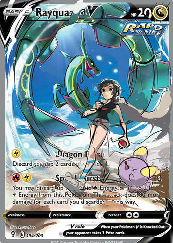
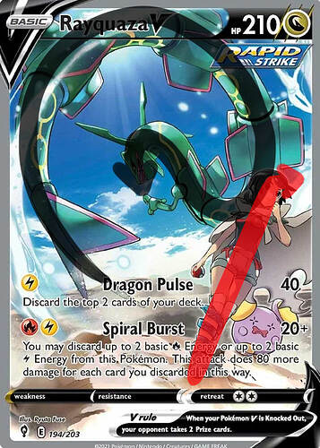
I’ll pick on Ryuta Fuse because they did the main card I had a complaint about.


“This one is annoying because it’s such a cool card idea. But the composition I just can’t stand, it doesn’t flow like it should.”


“Obviously very rough idea I sketched out but I would have vastly preferred this composition, with Rayquaza spiraling into the center, looking back at the girl, while she walks and faces into the composition and her head is cradled by Rayquaza’s silhouette.”


“You can see here in the original there’s an awkward S shape on Ray, and the girl’s line of action is very straight and angled off the composition (doesn’t keep the viewer inside). I think the artist was going for a dynamic angle but it looks like she would fall since the horizon isn’t angled. There’s also a terrible tangent where they both meet. But most people don’t consciously notice such things. When you learn how to draw you start seeing it everywhere lol.”

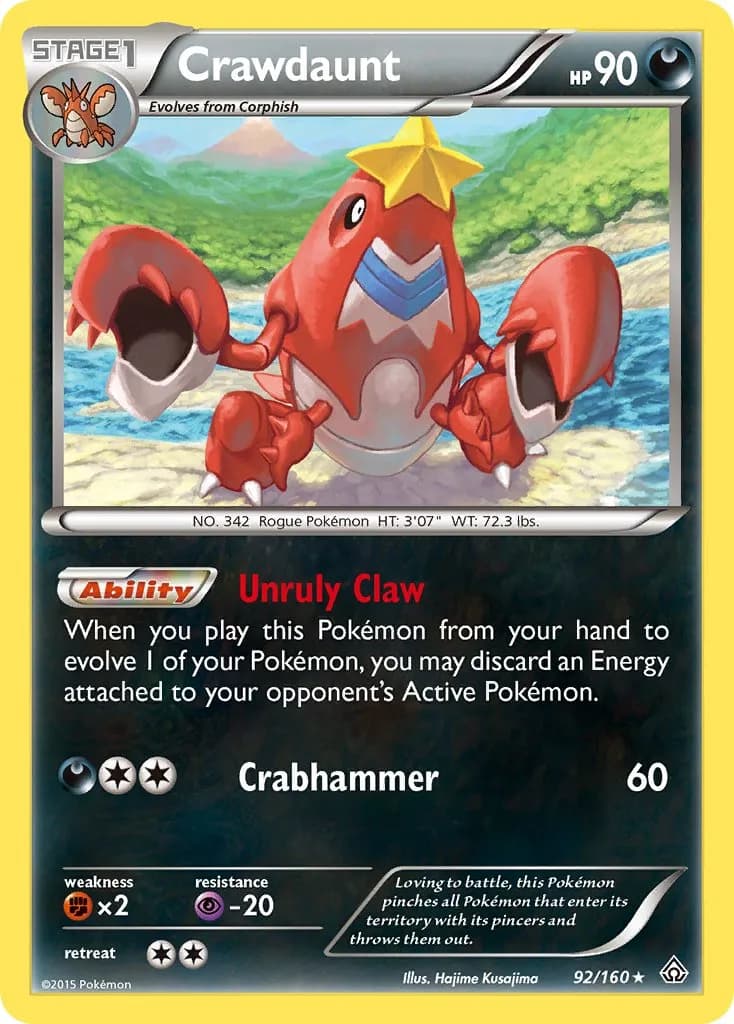
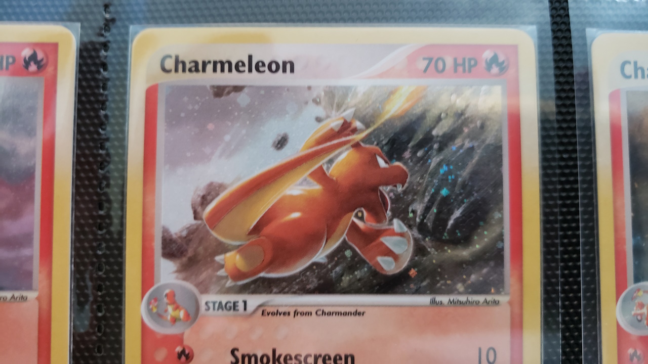
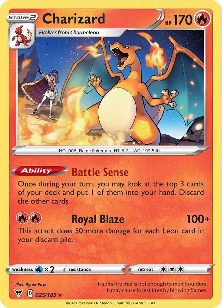
Another one that always bothered me was this Charizard solely for the wonky jaws:

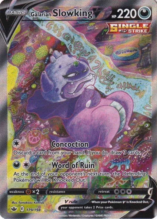
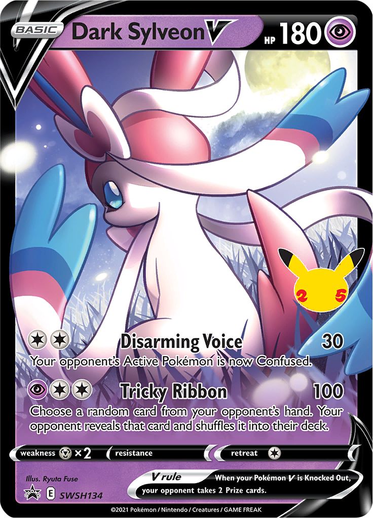
And lastly, I didn’t realize Ryuta did another one of my most hated modern artworks, the Dark Sylveon V:


Everything about this illustration bothers me. The drawing itself is anatomically poor, the volumetric rendering and shadow placement makes no sense. The style of painting looks like someone who just learned how to use dodge and burn in Photoshop. The strange lighting scenario. The moon is clearly out in the background, but Sylveon is full-bright with no cast shadows on the environment. It’s like an atomic blast went off, maybe Sylveon set it off herself idk. The grass tool. I just hate this image lmao.

All that said, Ryuta isn’t a bad illustrator. If we look at a few of their other works, they look fine, especially the trainers. It’s possible they are just better at drawing humans than pokemon.

20 Likes

Awesome analysis people! This is what I was aiming for. I love the discussion and all the different opinions.


For example, taking @expedition analysis, this is one of my favorite cards: really love how dynamic it is, and how air movement is conveyed to the viewer. But I appreciate seeing kusajima flygon roasted, to have a different point of view.
Also I see a ton of cards which I hadn’t thought of.

It’s also really cool seeing people (especially those that never tried this exercise) going back to binders/scan sites and doing a little retrospective on their favorite artists.

3 Likes

Agreed, agreed, agreed, except… I love the exeggcute. It’s about to evolve!

4 Likes

I do have to say I hate any card that shows the back of a Pokemon rather than the front. Artists learned thousands of years ago than depicting things and people from behind is boring but we still get a glimpse of Pokemon ass more often than we should.

1 Like

Part of Galarian Slowking’s lore is that they chant spell incantations so I think that’s what the script is in reference to.

2 Likes


My least fav artwork from Hironobu Yoshida.

  • Wings proportion looks tiny in comparison to body.
  • Shiny charizard’s colour scheme here is overly dull
  • Backfacing
  • Background cliff looks almost like scribbles
  • The yellow/green hue of the sky don’t look good.
12 Likes