Ill chime in, this one isn’t terrible but that back arm always confuses me ![]() I still like this card but how?
I still like this card but how?
5 Likes

It’s really hard for me to dislike this card because I’m a Charizard collector… But the art really is lackluster compared to what it could be for a Shining secret rare.
7 Likes
Any comments on the Lugia V AA by kawayoo?

One of my favourite artists but something just doesn’t seem right, but I’m not an artist so can’t put it into words/drawings like you did.
Great post btw.
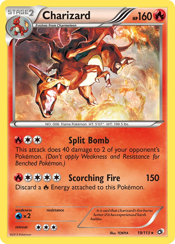
Another artist I really like is TOKIYA but this Charizard always made me think the proportions were whack.
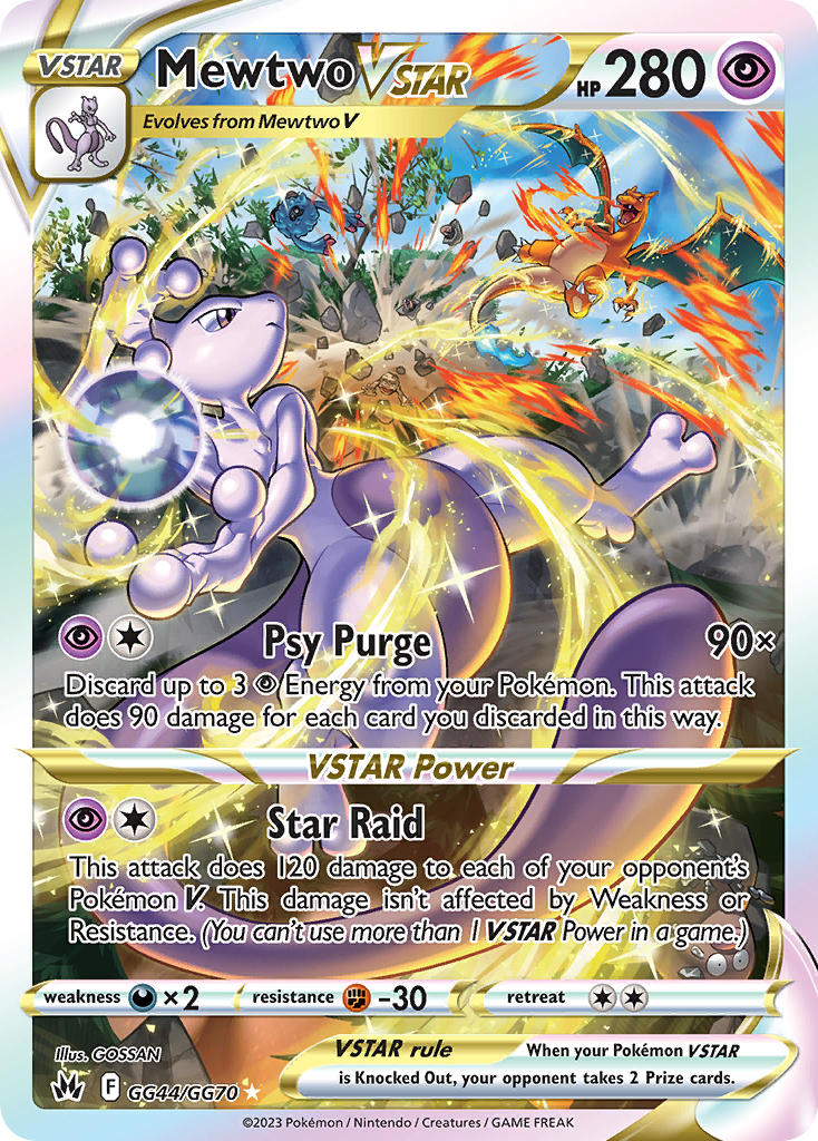
And another fan favourite but one of my least favourite arts out of VSTAR Universe is this Mewtwo.
His face just looks super off. The lighting is weird. Just doesn’t really work for me.
4 Likes
Glad you liked my post!
So that Lugia card, I think when I hear people say they don’t like this art it’s because of the pose, though? Personally I think it’s awesome. It feels like Lugia jumped out of the sea.
My main grievances are with the lighting and the way the waves are painted. I also never liked that dumpy ass kawayoo gave him LOL. There’s also a lot of gray in this illustration and I think it’s kind of a shame because there’s some nice color in the water. Nothing really looks wet, either. I’m sure these are all artist preferences but if I were to be nitpicky that’s what I’d change.
I made a quick edit, hope it kind of illustrates what I mean. I’m not messing with the waves because that’s too much work, I’m also not the best at painting water.
As for the charizard card, I think the proportions on this make sense overall, it’s just an exaggerated perspective. The bottom foot though, I don’t think should be visible like that. It could be but… based on everything else it really shouldn’t be. The neck may look weird to some people because it’s mostly hidden by Charizard’s head being turned to the side, but technically it’s “correct”.
The Mewtwo card bothers me too. I’m a huge Mewtwo fan but I don’t even want this card LOL. It’s just way, way too busy and the art style I think does it no favors here.
I would have to change this way too much to suit what I selfishly think it should look like, but I did another edit just to try.

I changed the magic pee to blue since that color makes more sense for Mewtwo and I added more light around the energy ball. What looks odd on the original artwork is the fact that the light from the ball on Mewtwo’s face / arms looks exactly like the sunlight on the rest of his body. I am assuming this is meant to be from the ball, but it might not be. This confusion could be fixed by just changing the color of the light or making it more intense.
Like I said, the style doesn’t do this scene favors with all the tiny details. Illustrations with black outlines are going to look visually noisy, especially with things in the background. Generally, outlines are thicker the closer the object is to the “camera”, and thinner in the distance. I emphasized the closer lines, removed the outlines from the background elements, blurred stuff and added more light to soften everything.
It’s not perfect but I think it’s at least an improvement. Again, it’s just an incredibly visually busy card.
Hope that suffices!
9 Likes

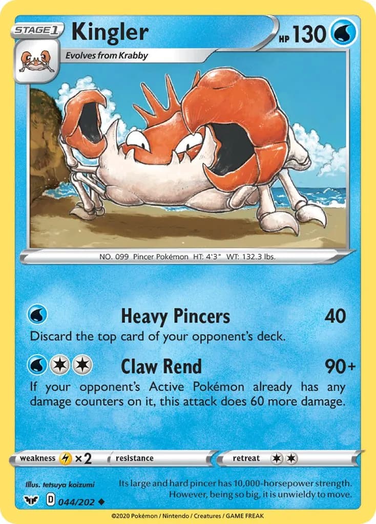
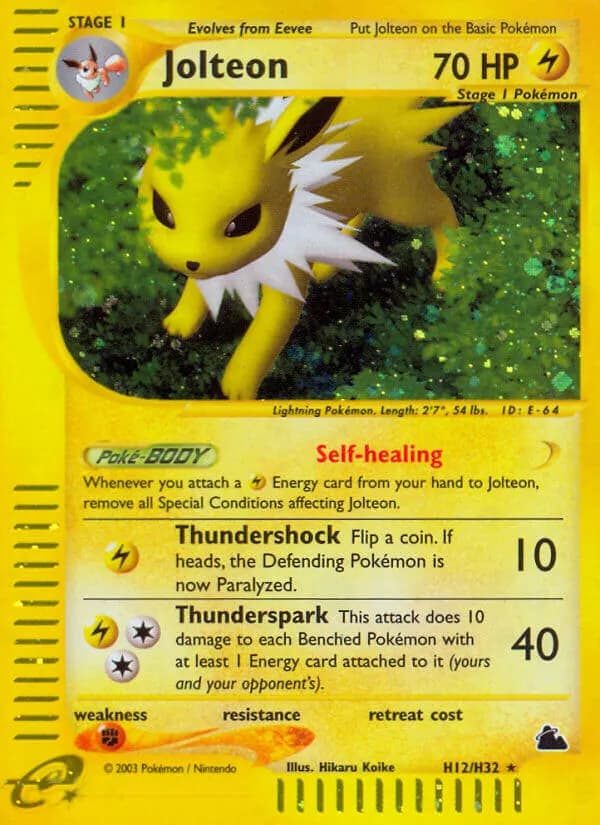
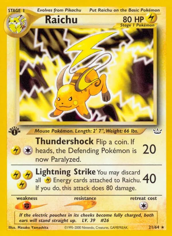
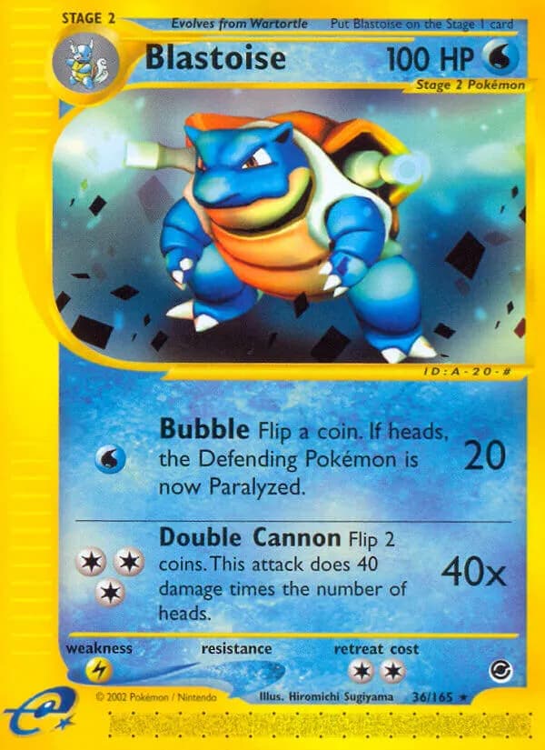
A few more. Deformed Kingler from someone who normally twist things in a pleasant way, stuffed toy Jolteon in otherwise pleasant greenery. No idea what went wrong with the Raichu, it is 8 characters below the second worst Yamashita. The Houndoom sticks out from other ADV Nishida’s and not in a good way. Could never deal with the peashooters on the fairly decent Blastoise (if we discount that then I like this more than the Feraligatr,) and the Diglett is just as displeasing to the eye as it was 22 years ago.


6 Likes
Agree with everything except Kizuki Diglett, that I really like.
I love the first Kizuki, and I still liked her through Ex era. Unfortunately she started losing her charm around BW era, and now she looks super generic. Very sad.
I find diglett coherent with her original “flat” style (and machineries/futuristic things in background). But I get this is really subjective and I understand why someone doesn’t like weirdo diglett.

Neo-ex era. She started using this big border/crayon style, that I really like,


HGSS: Her style became a bit less unique, but there are a lot of good illustrations.


Now: well… not always trash, but honestly underwhelming. far from her glory days
8 Likes
lol. I really like this art because of the lighting, but I never noticed the tail before.
yeah. His neck is super long, and what is his back arm attached to… very stylized.
1 Like
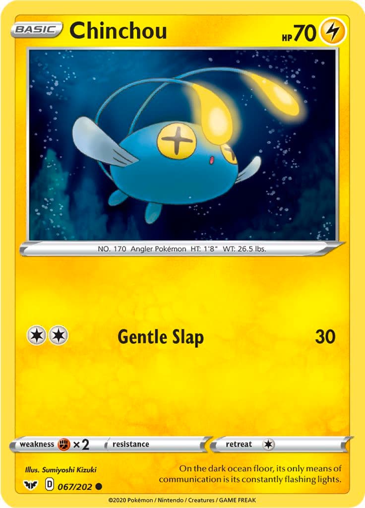
I also like Kizuki’s earlier arts–both the outline-less style and the thick outlines. I hadn’t exactly followed the more modern arts they were doing, but I recently saw this Chinchou card and was surprised it was Kizuki, given that it lacks the charm of Kizuki’s earlier works. And now that I see your post outlining their artistic progression, it is a bit sad to see the loss of the more conspicuous style of the earlier cards.
2 Likes
I agree with @decoypalmette. I’ve always loved that diglett art.
1 Like
Thanks for your input and the examples!
I actually like your Mewtwo a lot better haha.
I guess for me the Lugia’s head is what throws me off, is it possible for it to arch its neck like that?
Granted, some things that are possible in nature look weird too but if I rotated it 90*, the image and pose would make more sense to me (obviously not within the context of the sea and boat though lol).
Maybe it’s the proximity to the waves and the boat that is throwing me off.
Anyway, thanks again!
2 Likes
Thank you! I’m not quite sure what you mean about the neck, but maybe this will help? I rotated the scene about 90 degrees and also drew a top-down of I think the approximate location? To me it looks like Lugia is leaping / flying over the boat and looking upside-down at the guy.

30 Likes
It blows my mind that you can just sketch something like that. You are very talented!
10 Likes
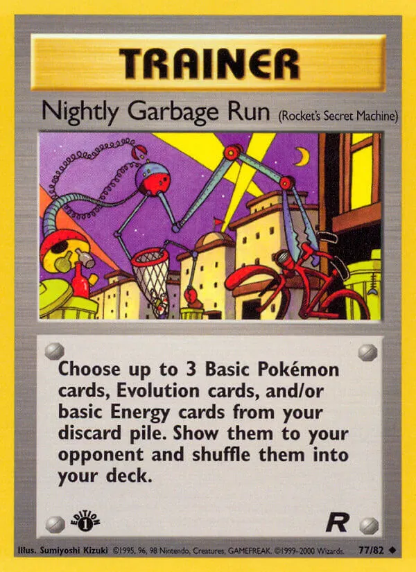
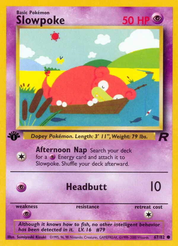
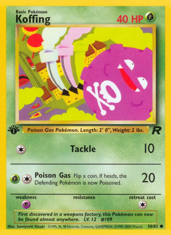
Love early Kizuki! I think her cards really made Rocket feel unique and stand out from base, jungle and fossil.
7 Likes
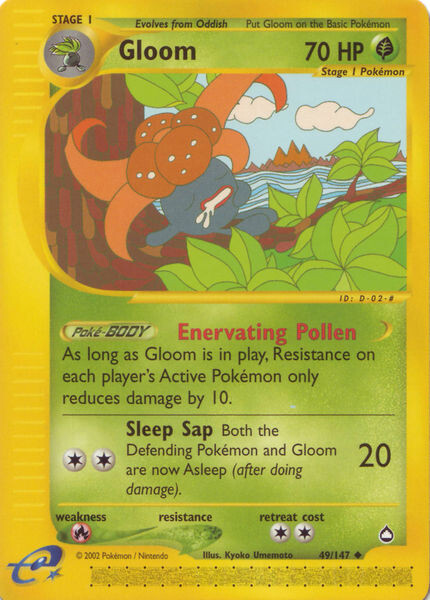
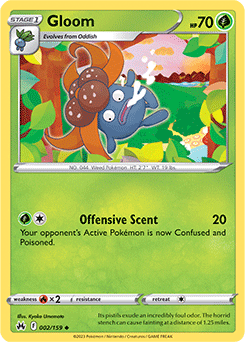
I know Kyoko Umemoto’s newer Gloom art is supposed to be a parody of the first, but I feel the white borders around Gloom in the newer one makes it look like a cheap sticker lol; strict downgrade from the original for me.
3 Likes
It’s coming out of his leg lol so weird
Yeah I am a big Kizuki fan but I’ve noticed her more recent stuff has lost her original charm/style/simple nature. Not sure what the reason is for it but I do miss her team Rocket-ex era stuff. Like someone else mentioned, her illustrations in Team Rocket were iconic and made it stand out from the rest. Her cards made the set resonate with me so much more
4 Likes
Your drawing certainly helps!
I meant as though it was flying vertically upward and looking down.
Even with your drawing, I like your angle better than the current artwork. Perhaps it might just be a personal preference thing then. (Like, why would Lugia look back when the waves are barely below its face but anyway…haha)
1 Like
There are a few artists who seemed to have changed their style drastically that it’s no longer recognisable and you wonder why they are even chosen anymore when it’s indistinguishable.
4 Likes
Regarding Kizuki tbh I wonder if the style change was under instruction of The Pokemon Company. I hear they’re quite restrictive and it’s possible they wanted a less unique style more in line with their other art.
7 Likes