The Best & Worst of an Artist

In his defense, I’m sure when he got the requisition he was like “$&@!!%#*” “ what am I going to do with this”

1 Like

At least the 2007 card has Dialga and Palkia, that older one is just disappointing for an actual trophy card…

Masakazu Fukuda is one of my top favorite artists but there’s something weird I’ve noticed - his style changed completely during the HGSS era. During that era, the art he made had really strong black outlines and overall the vibe is completely different. It feels like some of his HGSS arts were made by a completely different artist.

Here’s an example:

Your usual Fukuda style vs. HGSS style:

If you look at the colors, shading, everything, these are very different styles. After HGSS he changed back to his usual style. I’m not saying his HGSS era illustrations are bad or anything like that but there’s a clear difference and I prefer his usual style. I just find it interesting and wonder what happened there.

8 Likes

The transceiver is not that bad compared to this abomination

17 Likes

Forgot about this monstrosity

Dang, I would not have expected that to be Mitsuhiro Arita, haha. I’m currently watching a YouTube series of someone who collects all Mitsuhiro Arita cards, so I’m already curious what he’ll say about this one when he’s at that point. :grin:

But great idea @dizzylochs . I’ll go with Naoyo Kimura, since he made my favorite artwork of all:

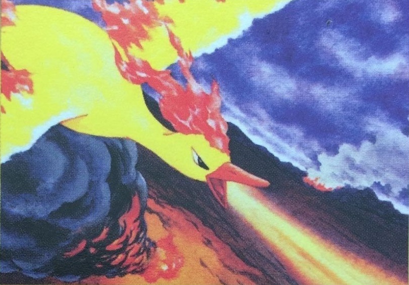
He’s also well-known for the Tropical Island set (halve of the Southern Islands set) and for example the Neo Revelation legendary dogs:

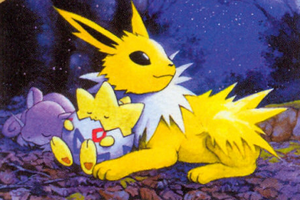
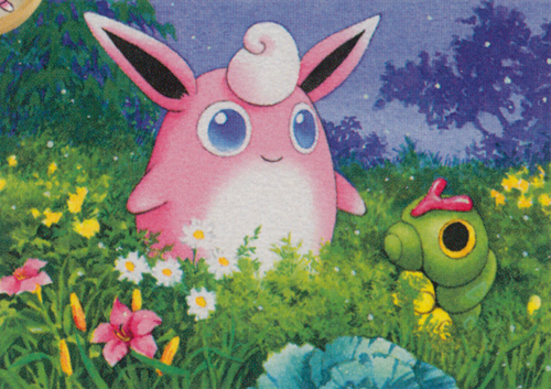
Or the Light Jolteon and Wigglytuff of Neo Destiny:

I love his color contrast on his cards, and also how all the Pokémon are never in a stale pose. He really captures the Pokémon in their natural habits, while at the same time having both the Pokémon and background as a single artwork look absolutely amazing.

As for his worst artwork, I’d probably have to give it to this one:

It’s not really bad, but there isn’t much going on. Just the Pokémon in the water. Of course that’s its natural habitat, but it’s just a bit lackluster compared to most of his artworks.

Oh, and looking at all his artwork made me realize he made a lot of artworks that stood out to me in sets. If I didn’t already had so many collection goals, I would have picked up collecting all his artworks, lol. Damn you, Loch. :laughing: (Unlike a lot of other people I never really look at all cards made by a single artist and am also pretty bad at picking up the illustrator from an artwork alone (except for obvious ones like Yuka Morii or Asako Ita). I definitely should look at lists of a single illustrator I like more often I realize. :blush: )

Greetz,
Quuador

7 Likes

@chrisbalestra @pokekuma13 You guys are crazy, the first Champions League is is a beaut

1 Like

I don’t think it’s that bad tbh but maybe I’m just biased. A lot of ex era cards have a similar 3D style that looks a bit dated. And I think the flames on his neck look very cool

2 Likes

Maybe a cop-out, but this is Yusuke Shimada’s best AND worst Pokemon card artwork:

Because it’s his only one…

9 Likes

Daisuke Ito. Not any best art made by him, only worst.

5 Likes

I give it love for being a proper trophy and holo but as far as art goes, not his best.

2 Likes

Favorites from Naoyo Kimura:

Worst:

2 Likes

Yeah, it’s a fantastic collectible but the art leaves a lot to be desired personally especially when compared to some of Ueda’s other cards aha

Edit: Actually I’ve just realised the first one is by Akabane…

I was doubting between this Rhydon and the Alomomola as his worst artwork when I made my post. :grin: Neither of them are really bad per se, there just simply isn’t anything noteworthy about them either. Compared to his usual artworks these two are just so lackluster.

Greetz,
Quuador

1 Like


Worst Sugimori? Maybe worst card ever??

9 Likes

Harada: The Good.

The Not Good.

4 Likes

Both look great imo

5 Likes

Agreed. I think the lack of contrast and boring color tones leave you like, “Come on, Naoyo. Don’t do us like this.” :laughing:

1 Like

An artist that I recently discovered and that I’m currently putting together a binder collection of is Sekio. I really like the use of soft colors and often outdoor/nature-set art with a lot of detail. It’s tough to pick a favorite but I would go with:


This Zubat is probably the worst since its the only card of theirs with thick white outlines which makes the Pokémon not blend in with the background. Also the background itself is kinda bland in comparison with most other cards.

4 Likes

I like the thread idea. Decided to take on the challenge of selecting Sugimori. Here’s what I came up with.

Best:

Worst:

1 Like