Go to bulbapedia and share your favourite card of the Pokemon, and (in your opinion) the worst card of that Pokemon.
Add comments/explanation if you wish.
Even if you don’t like any of the cards it has, you have to pick a favourite.
Try not to generate until you get a pokemon you want(if the Pokemon only has 1 card you can reroll). The fun of this game is that you might see cards you never knew about and get to share with others.
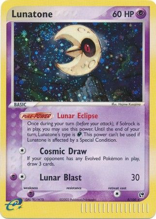
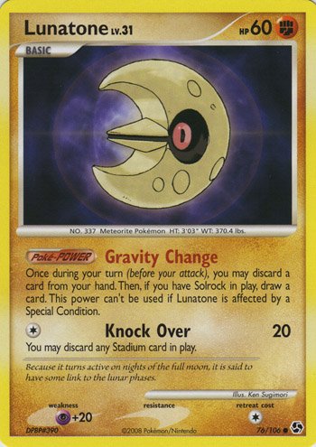
Pokemon: Lunatone
Comments: Almost all of the Lunatone cards are quite boring and static with no real dynamic cards outside of the EX Sandstorm print. Worst of a bad bunch, sadly.
Comments:
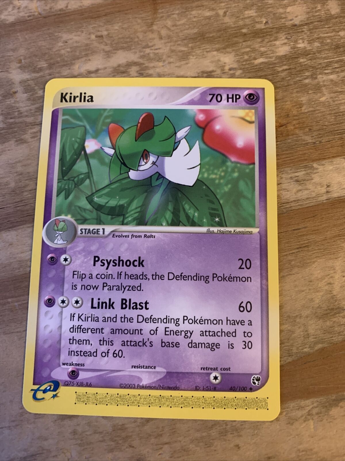
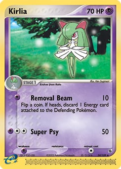
Every Kirlia card but one has phenomenal artwork (Himeno, Kusajima, sowsow, Sakuma, Mizue, Arita, Nishida, etc), but my love for Kusajima’s rich colour contrast knows no bounds.
Spare a cross for this blasphemous Sugimori stock image.
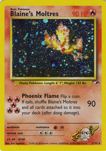
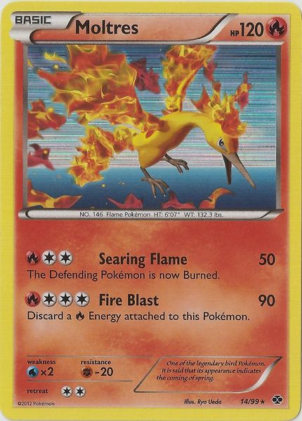
Comment: One of the legendary three, not my most favourite of the original 3 but definitely a Pokemon that lends to gorgeous art when done right, favourite showing simple but wonderful art of a Moltres flying in the night sky with the holo acting as a starry sky and worst, some soulless generic 3D-art (absolute trash).
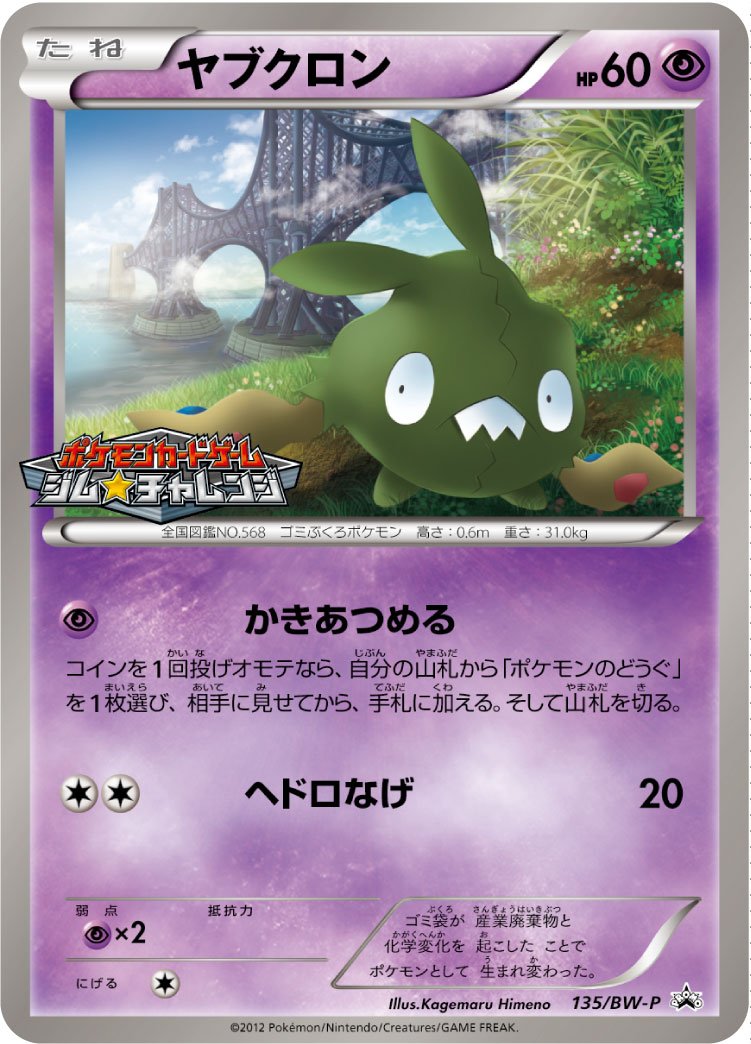
Did I just become a Trubbish collector? Trubbish has a lot of nice cards, this was a close call with Komiya and Morii also having very nice Trubbish cards! Feels like blasphemy to choose a Himeno card as my worst card, but it does feel quite flat to me.
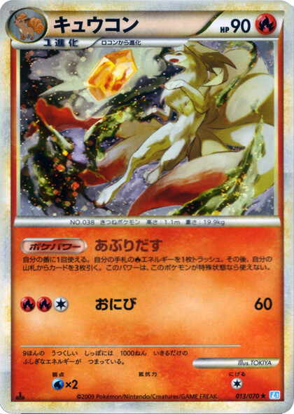
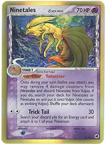
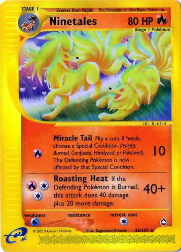
comments: not many, but overall very good quality artworks, I´m actually intrigued to buy the missing ones now Even the “worst” in my opinion is a cool card, I just don´t like that ninetails looks like a weird lion in this one.
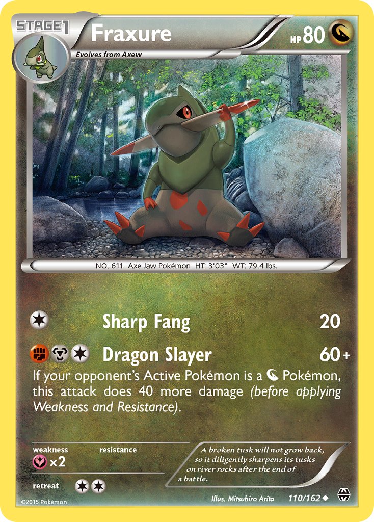
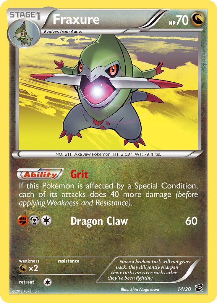
Pokémon: Fraxure
Comments: Although Fraxure only has six artworks, all of them are pretty decent, and at the same time none really stands out that much above the rest. Overall all of them are just good.
For favorite I go with BREAKthrough 110/162. Just a solid Mitsuhiro Arita artwork, as we’re used from him. I always like how Arita displays both the Pokémon and background, and has great sense of details in his artworks.
As for worse, probably the Dragon Vault 14/20. Not a bad artwork per se, and I do like how it’s flying high in the air and about to shoot an attack based on its pose. But from the six available artworks it’s just the most bland of the bunch.
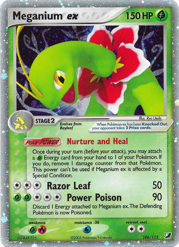
Pokémon: Meganium Comments: Far from being my favourite choice, poor Meganium doesn’t have many cards to its name…and even fewer that you’d call “good”. My favourite of the bunch at least has some personality to the artwork, with Meganium in a pretty dynamic pose, showing its best “I’ve just told the best dad joke” face. The background of the Indigo Plateau is also an interesting one that really ties the starter Pokémon and storyline of the games into the art.
Just look at my least favourite though. That low-detail, early 2000’s CGI render, with its dull pose and lacklustre background. It probably says something when your worst card is an EX-Era ultra rare!
Vaguely remember this Pokemon - was leaving the hobby just when he arrived.
Pretty uninspiring set of cards to be honest; seems to have a similar pose in a lot of them. Very unmemorable and can’t say this Pokemon has gained a fan…
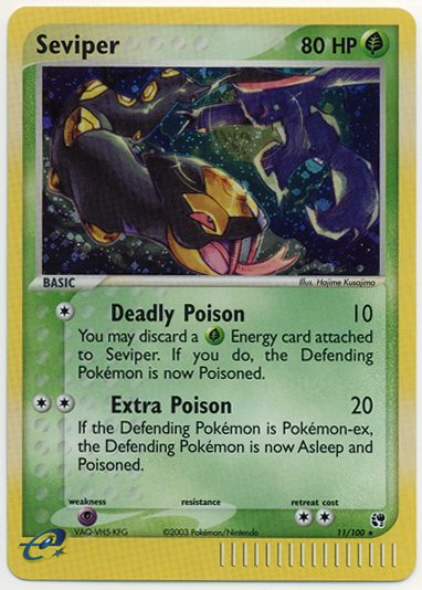
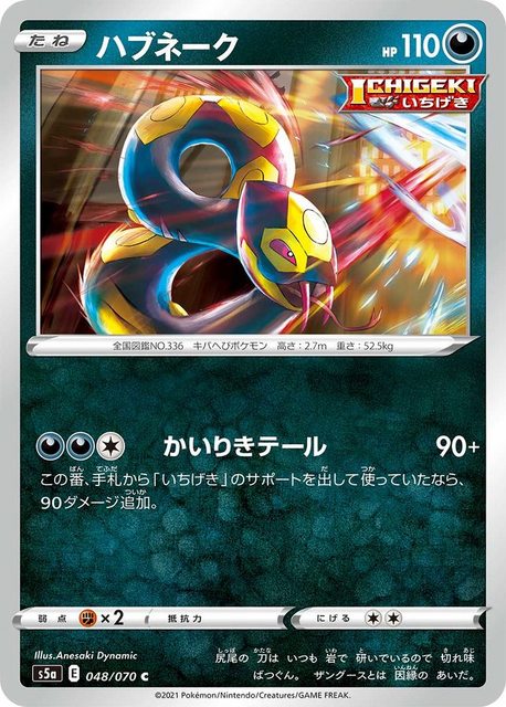
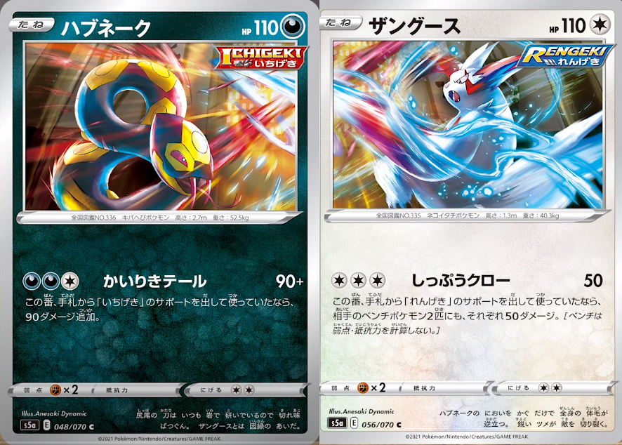
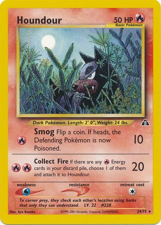
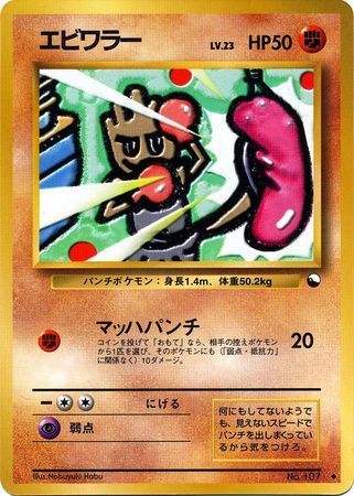
Best card: Ex Sandstorm - it’s a holo so that’s cool I guess. Bit too dark to be a really nice card, but bonus points for being extra-poisonous!
Worst card: Matchless Fighters - What’s even happening here? Feels like an artwork trying to be cool for the sake of it with no story or substance. Also loses more points for that hideous Ichigeki logo!
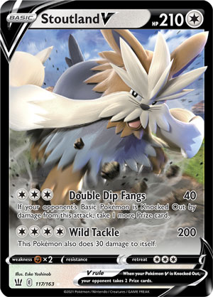
Pokémon: Stoutland
Comments: Unsurprisingly, like a lot of Unova mons, Stoutland doesn’t have many cards, with only 8 to its name. The few cards it does have don’t really stand out, with the exception of 1.
Favorite
Least favorite: awful cgi
Favorite: definitely the original. I have a couple of these (in holo) and they’re gorgeous but I actually really like the non-holo. The art has a really nice hand-drawn quality to it and it really captures the mood of the scene. The holo obscures a lot of the background; I didn’t realize quite how detailed the card actually was.
Least favorite: I actually like Kizuki’s style usually, just not on this card. It looks like a mediocre DeviantArt photoshop job to me.
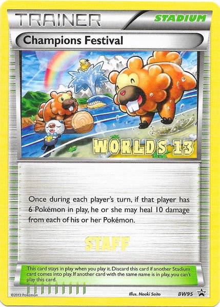
As we all know, this glimpse into the future explains how after Bidoof have taken over, the world will be a better, more peaceful and more accepting place, hence the rainbow - note the happy Psyduck as well. Surely a paradox in a worlds card - not in their world, no.
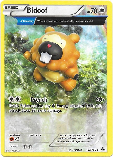
For named card, my choice has to be the Bidoof from Primal Clash:
This Bidoof, flexing its water control in complete zen with its surroundings, shows just how in touch their species is with the elements and how dangerous it would be to contest their incoming claim of it. “It nests alongside water” for a reason - be prepared.
The worst card of this mangificent creature would have to be the 2007 Diamond and Pearl appearance:
This card surely has the most boring art of any Bidoof card, uninspired background and simple design alike, but note the subtle warnings it delivers: “…it is more agile and active than it appears”, clearly referencing their silent plot. With its first appearance in the TCG, Bidoof have already staked their claim for world leadership and all the Pokemon Company can do is subliminally prepare us for the inevitable.
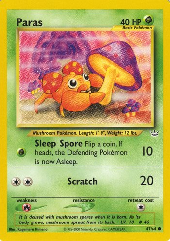
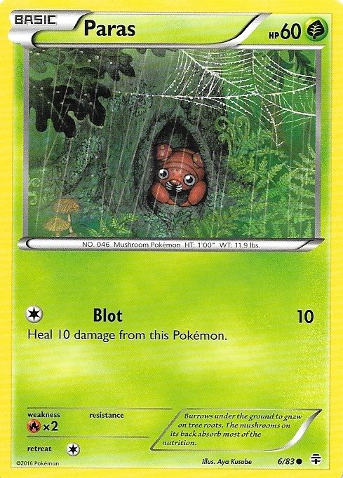
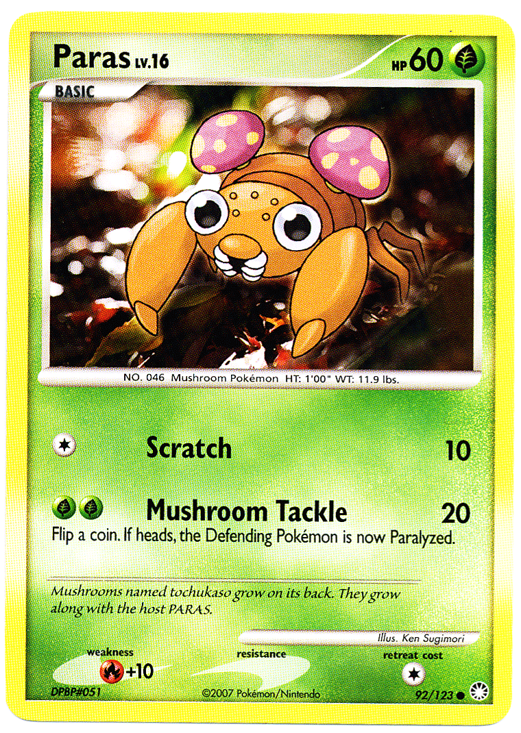
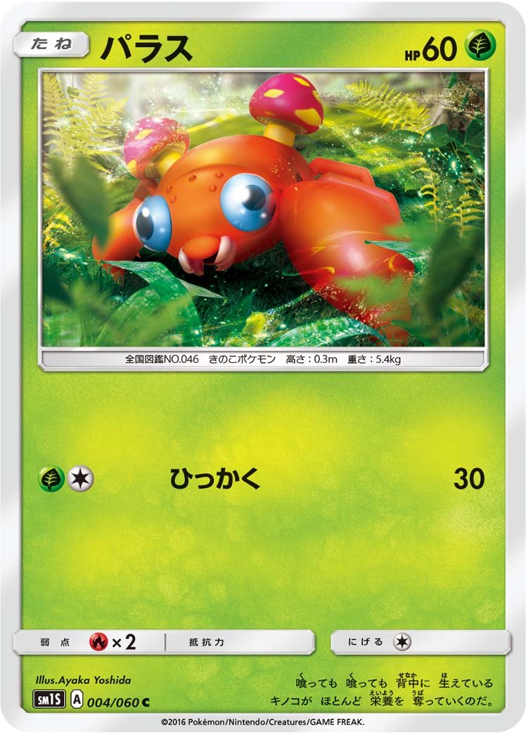
I love this thread idea! So many great and exceptionally terrible artworks alread. And yeeeeeyyy to me, because I got Paras! One of my favorite underrated Gen 1 Pokemon. Has quite a few artworks to choose from, too.