Yay me, I got:
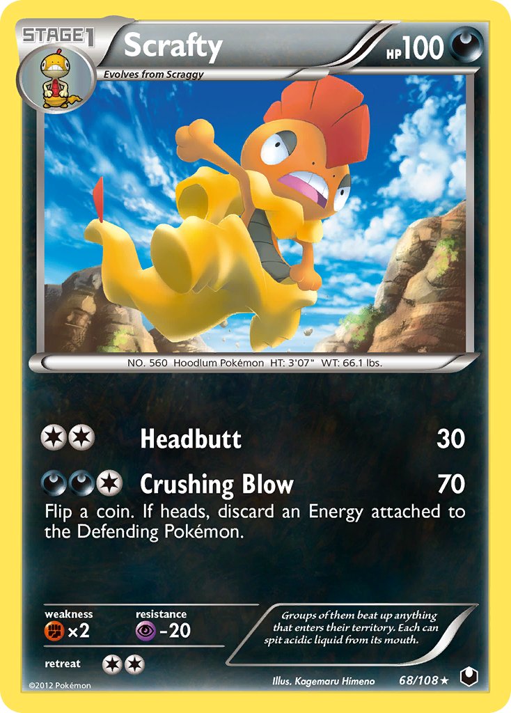
Scrafty
I don’t know this pokemon and his cards suck lol
Best:
Worst:
Cufant. Can’t complain but holy hell did I not know how Sowsow got drafted into that shiny department.
Was almost gonna say some people were lucky with choices close to me, @zorloth with Houndour, @ferny with Trubbish and @shadowless with Ninetales but actually I’ve realised this is an awesome out of comfort zone oppertunity to make people talk about Pokémon and generations outside of their go to as those three aforementioned are some of my best. Even seeing Paras get the analysis of @muk is worth it alone.
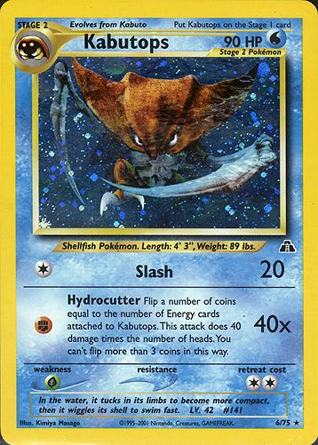
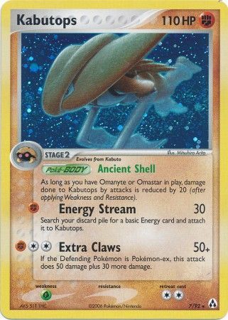
I got Kabutops!
Kabutops has a great selection of cards and was one of my favorites of the original 151 - what middle schooler didn’t love scythes?
I honestly think best card is tied for both Neo features of Kabutops:
Choosing a worst one was hard, as some of the 3D ones looked meh but my ultimate pick was EX Legend Maker Kabutops - the art makes it look so short and bulky as if someone is wearing a Kabutops suit and a bulbous helmet/mask:
Fun game!
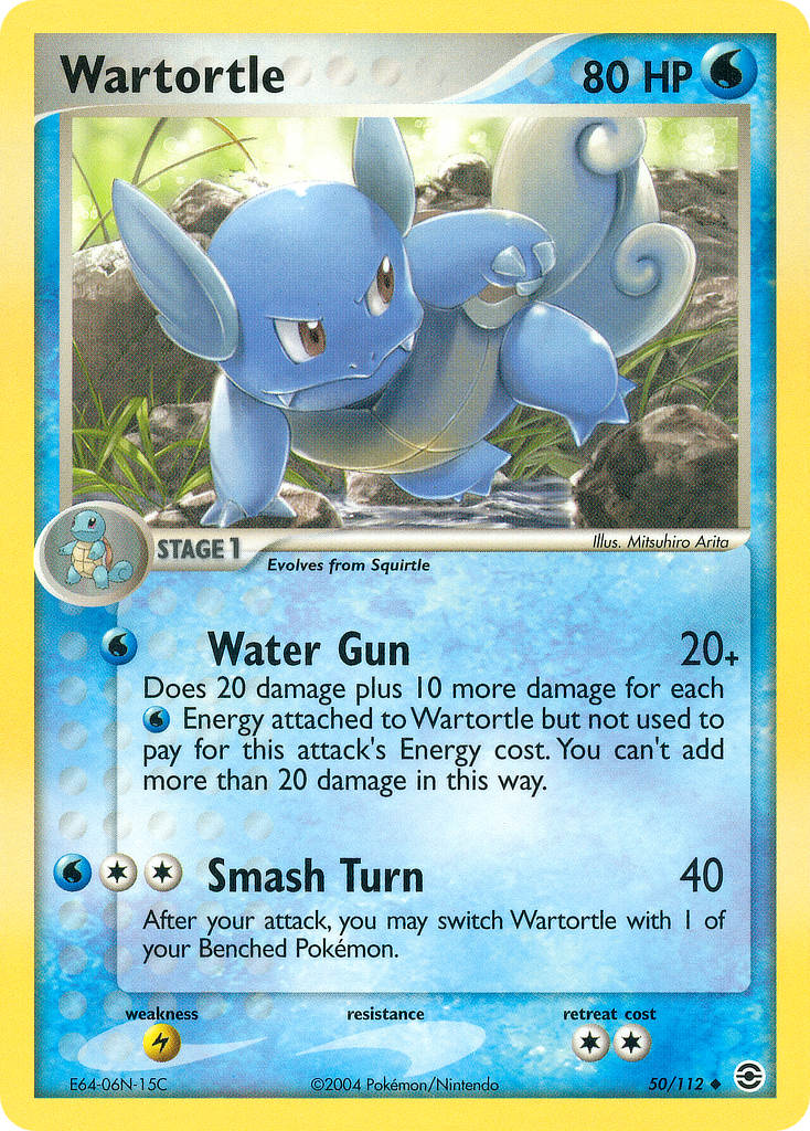
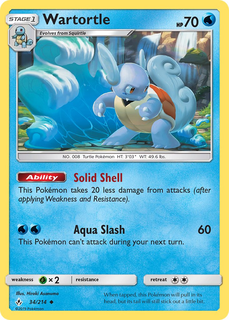
Pokémon: Wartortle
Most of the Wartortle artworks actually look very good with dynamic poses, nice backgrounds and a variety of art styles. It was difficult to choose a favorite but in the end I went with the one from FireRed LeafGreen by Arita. Really cool pose with a great background. This Wartortle is on a mission and I like the look of determination in its eyes. Runner ups include the grumpy looking Dark Wartortle and the one from Southern Islands.
When it comes to the worst artwork, my gut feeling was to go for one of the two stock Sugimori ones but then I saw the latest addition of Wartortle cards and had to go for that. Weird pose and the Surf or whatever attack its using looks lame. The overall artwork just seems off to me.
Best:
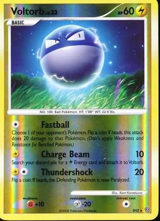
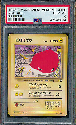
Voltorb
Best: stormfromt SH3. Love this one, the lighting around his body is great
Worst: vending. Wtf is this, gotta be the ugliest non 5ban card ever.
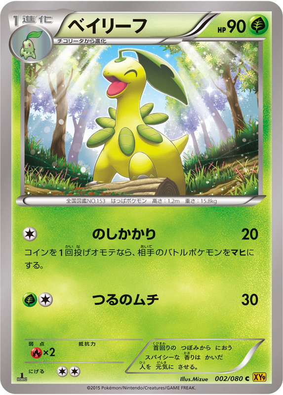
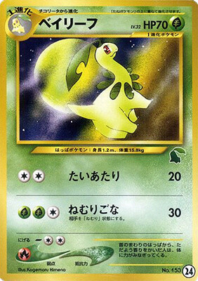
First I got Impidimp, which has two cards. Then Bidoof, which was done just above, so I regenerated and got Bayleef. Now Bayleef was incredibly hard because even the worst one is not a bad artwork at all, so this was a challenge. Obviously Neo Intro is a masterpiece, so I had to go with it.
Best:
Worst. But even then it is not even bad.
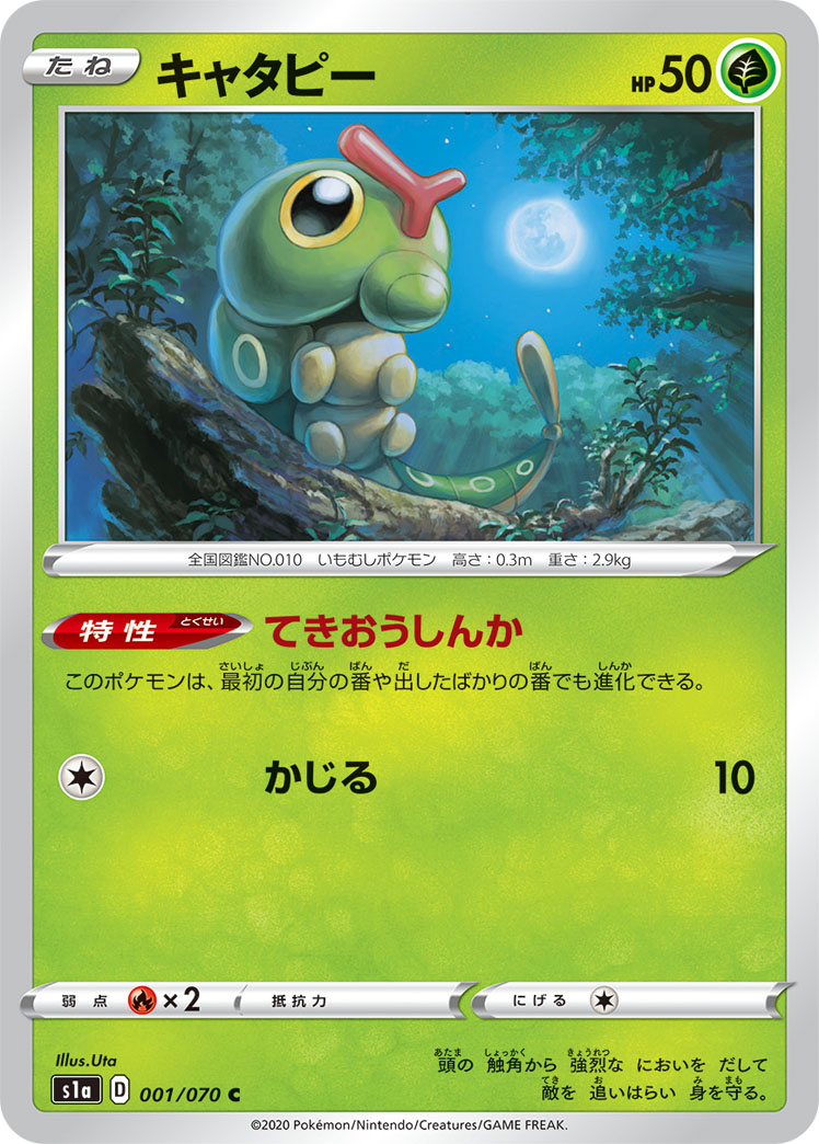
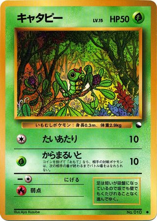
Pokemon: Caterpie
Comments: …I feel like artists are assigned Caterpie as a way to force them to retire/quit. 90% of Caterpie arts are clearly career ending and perhaps reflect the faith that Pokemon has in the artist as a person, a professional, and a citizen of the world.
Best: (basically, these two made fantastic backgrounds, and then slapped a Caterpie on there because they had to.
Worst: Let’s throw a green filter on this because that’ll cover up how stupid the card is
This is fun!
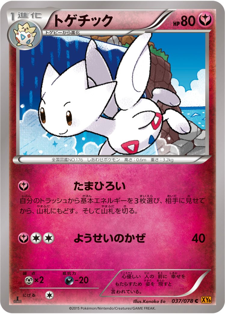
Best Art: Light Togetic seems to really represent the “angelicness” of the pokemon
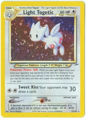
Worst Art: Too cartoony
This is a fun game! Was absolutely hoping for a more exciting Pokemon but wanted to stick to the rules of only rolling once.
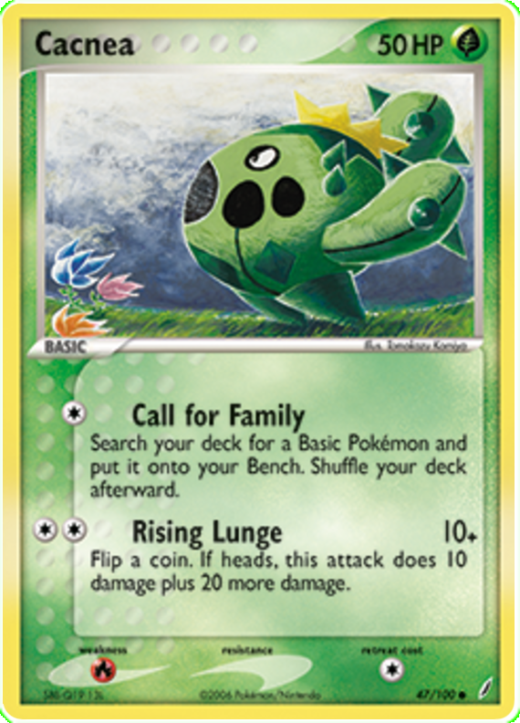
Pokemon: Cacnea
Favourite: Cacnea from Crystal Guardians. Majority of the Cacnea cards captured the front-profile of the Pokemon, this one stood out from the pack.
Komiya lovers in this thread right now setting up some people’s graves:
I jest, I jest. ![]()
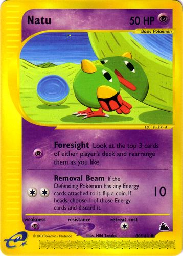
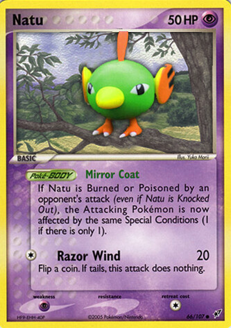
I got Natu!
Favorite: Skyridge
I like the reflection here, definitely a common I’ve overlooked:
Least Favorite: EX Deoxys
I love Yuka Morii, but sometimes the backgrounds look out-of-place and distract from the clay craftsmanship. The intended effect may have been for the focus to be on the clay and not the background but I find it ugly on some of her cards and would prefer a matching background.
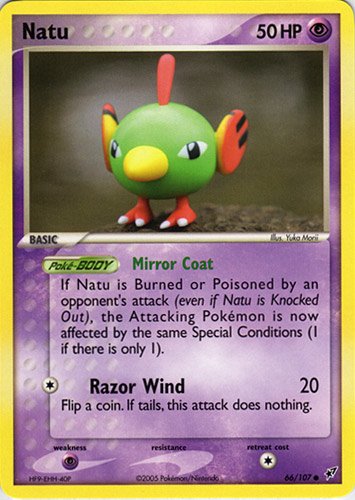
For example, here is with the Rebel Clash style background:
Got Ursaring… There were a few I was choosing between for my favorite, until seeing the skyridge one. By far the #1 Ursaring card.
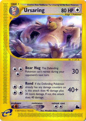
5Ban made it a bit easier to decide for my least favorite.
As a side note… This is a great idea for a thread, looking forward to see everyone else’s picks ![]()
This random Pokemon generator sure likes to spit out Gen 1/2 Pokemon ![]()
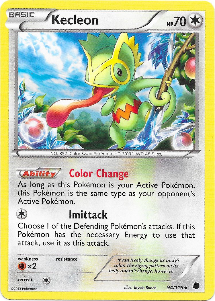
Kecleon… there arent many cards and a most look the same. Fun thread idea though.
Best: Plasma freeze Kecleon. It has an awesome background, the pokemon pose is its generic “hold onto a tree with tongue out” but at least the colors look pretty and makes you notice right away that half the tree is freezing.
Worst: Theatrical promo Kecleon. Weird yellow filter, no background details, boring pose.
Ok I got this ““Pokemon”” I think is from gen 3 (could be wrong)
This is my fav art cos you can notice it’s handpainted and it gives me a jungle or team’s rocket style vibe
And this one is the worst I saw, I don’t like the framing and what it’s even doing, maybe breeding with the one that is on the back, idk
Alright I confess lol, I got Natu second. My first was Frosmoth, which has only one card with unique attacks, though it does have multiple art prints and rarities for the card. I love the gold card so it would’ve just been picking a “least favorite” and rather boring so I rerolled.
Illumise from a whopping total of 8 cards
Favorite: EX Emerald, its fine honestly the bar wasn’t to high as most of the cards of this mon are pretty bad.

Least Favorite: EX Delta Species, it’s the eyes man they creep me out, I feel legitimately unsettled looking at this card.
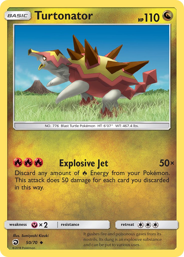
I got Turtonator! I don’t think about Turtonator a lot, so it’s fun to take a look at his cards.
Favorite: SM Promo 27. I’ve always been a big fan of TOKIYA’s work. I love the colors in this illustration and the angular shapes that define Turtonator’s form. The background is energetic and loose, which contrasts well the triangular Turtonator. I kinda want to buy this card now lmao.
Least Favorite: Dragon Majesty Poor Turtonator looks lost and distressed! I don’t want to see a confused and sad Turtonator, I want to see a badass fire breathing turtle dragon! Also I’m calling this artist out for using the default Photoshop grass brush, smh.