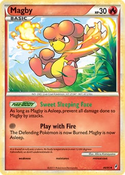
My favorite is the Call of Legends Magby. I like the colors, I like the pose and how the fire breath is used here.
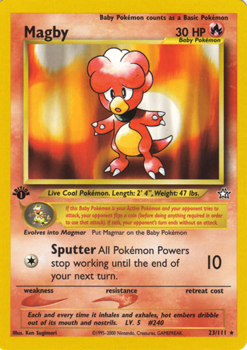
My least favorite is Neo Genesis Magby. The art itself is good don’t get me wrong but this whole card just screams “boring”. Just your regular Sugimori stock art with an effortless background.
Maybe you should switch the order in your post, since every other post is favorite before least favorite, so if someone is just skimming through without reading too much, yours might be confusing.
A solid variety of quality art for this pup, but I honestly couldn’t see myself picking any other artwork over his OG appearance in EXRS for my favorite. I was still overall very impressed with how many great arts of Manectric’s that I’ve been blind to for so long!
Fun game! I’m not thrilled with my roll as it didn’t let me delve into anything unknown or interesting… Necrozma - (yay)
Pretty ridiculous looking Pokemon in my opinion. And it doesn’t get any less ridiculous looking with all of its alternate forms.
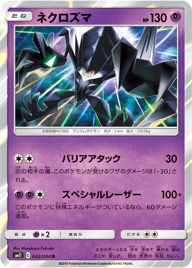
I suppose my “favorite” artwork is the Miracle Twin holo Necrozma which seems to be its first appearance card; so it was all downhill from there. For worst card I had a little difficulty deciding which rarity variant of Ultra Necrozma GX looks the worst objectively, but I settled on probably the worst looking gold card that Pokemon will ever print. Incredibly bland looking two tone secret rare.
Although mine sucks I am really enjoying the thread!
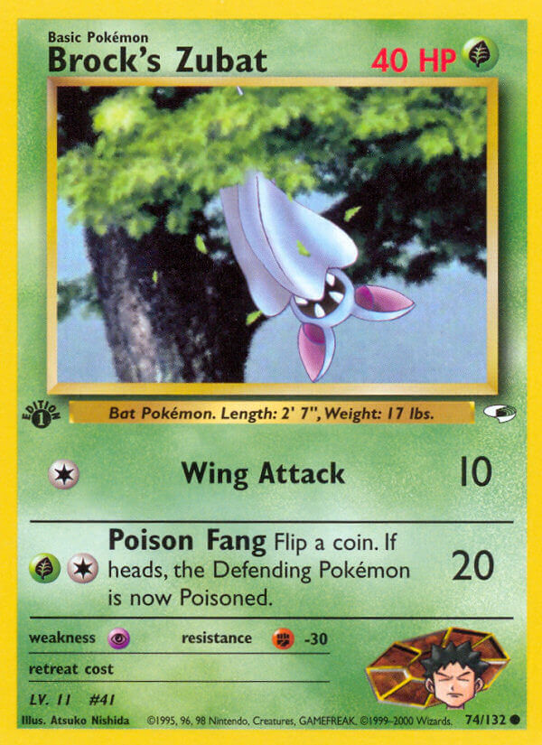
The reason I dislike Brock’s Zubat so much is because the interesting posture (which is unique for a Pokémon whose anatomy does not allow many expressive poses) is totally wasted on the background of the card. It appears to be a stock graphic of a tree and that’s very frustrating because Zubat don’t live in trees. Zubat, famously, live in caves. Additionally, obscuring its lower half in leaves begs the question one naturally has: how does Zubat fasten itself to surfaces with its unusual legs? Because the card was not prepared to answer that question, it doesn’t even try.
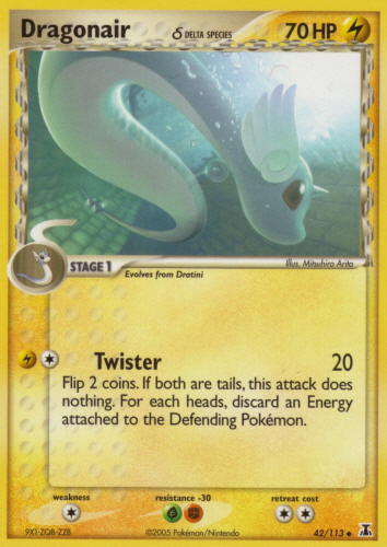
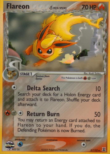
Worst: Delta Species, I chose this over the other delta species version because this one looks like a dratini, the proportions are wack. Also delta cards never sit right with me (even when they try to match the color and type, which they dont do here either)
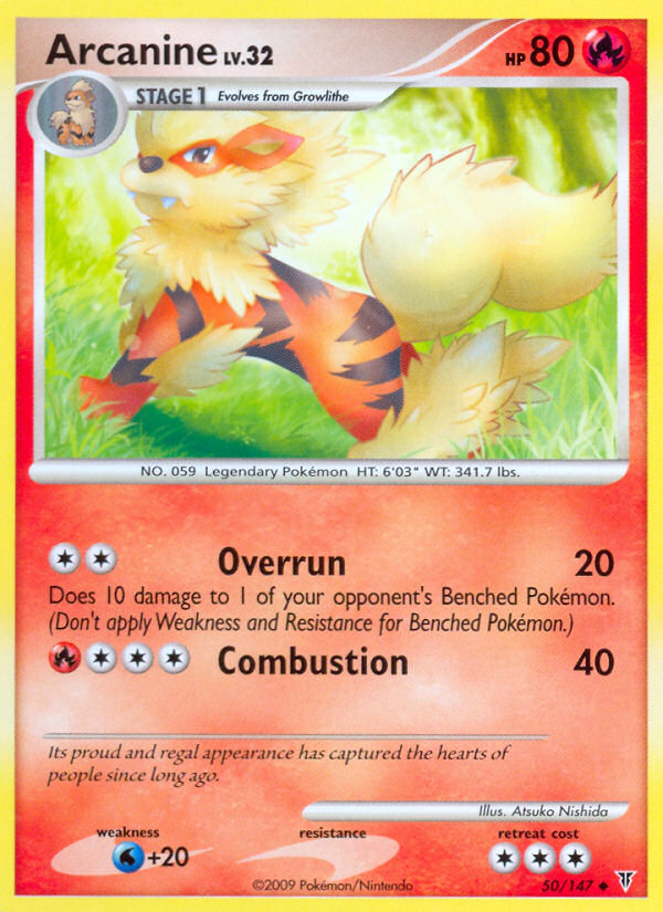
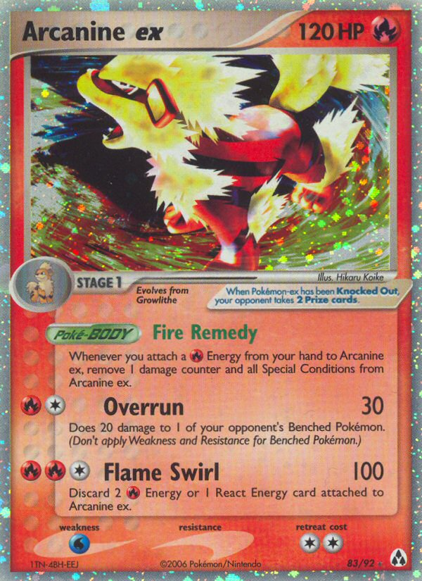
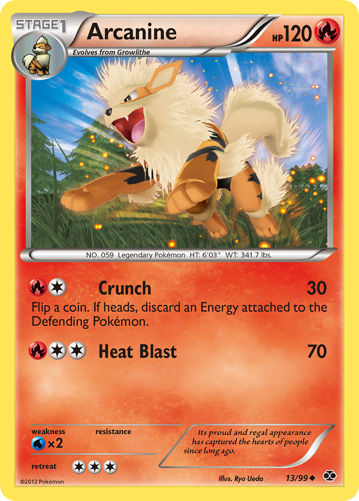
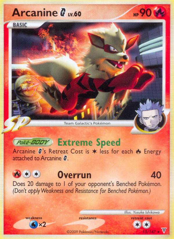
There’s a lot of competition here since there are quite a few Arcanine cards by now, so I decided to pick two cards for each category and also ignore Arcanine BREAK and the stock Sugimori arts, as they’re uninteresting and an obvious choice.
I think most everyone loves Nishida’s work, so no explanation needed for the first one. As for the ex, I find that Hikaru Koike is very hit-or-miss (more often a miss), but he did a great job with this one. It’s a welcome contrast to the usual poorly-aged messes of renders for sure.
Ryo Ueda is also very inconsistent, and unfortunately it’s for the worse this time. Not only does the Arcanine itself look stiff and weirdly spiky, but the background is painfully basic and muted. I like the latter’s setting and colors more, but the model is even more unnatural, especially with those eyes. Looks like he realized he left the stove on at home and froze like that. It’s not even that difficult of a fix either. I drew over the eye in Paint in thirty seconds and I already like it better.
For those who want to have another go, then feel free. It’s nice to see the interest in the thread so if you want to keep participating just maybe keep it to 1 go per 1-2 pages.
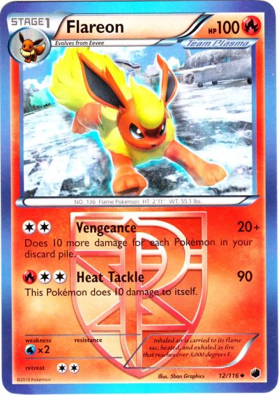
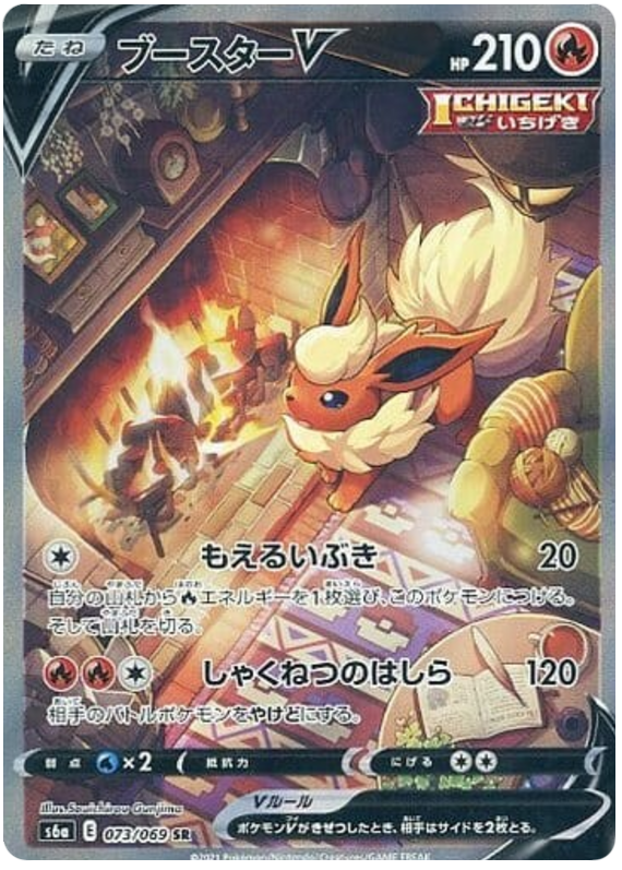
Holy Hell there is a lot of really good Flareon art. Flareon was always my favorite of the three initial eeveelutions as a kid so jungle flareon has a special place in my heart but it just can’t top some of the other options on pure artwork.
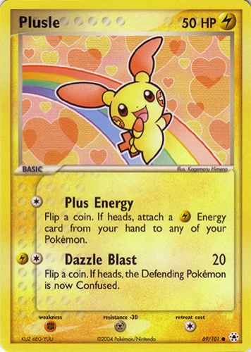
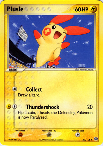
I got Plusle so thought I knew which one I was going to for but was surprised how many solid cards Plusle has has.
Best one (EX Hidden Legends)
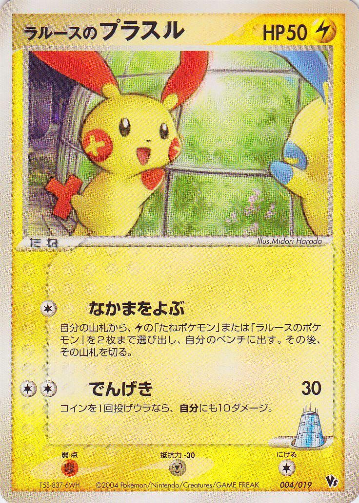
Always loved this card and its companion Minun in the set. These cards in reverse holo look really good in a binder together. I may of come into this baised so I have also included the best art I hadn’t seen before.
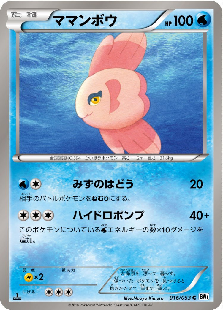
**Best I had not seen before (EX Emerald)
**
With a rarely used angle and a interesting background Kimura has really done a good job with this card. EX Emerald is often only remembered for the inclusion of Battle Frontier and Medicham ex. As well as no Gold Stars. It is no surprise that cards like this one slip under the radar.
WorstIt is too easy to pick the stock Sugimori for the worst of any species so I went for this Harada. I am just not sure why its cheek is so large. Some lore that I am aware of or just a tumour?
Pokémon: Noctowl
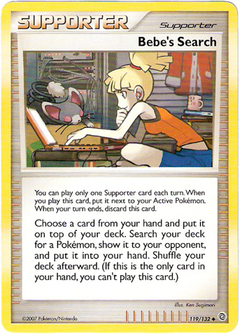
Comments: My favorite goes to Neo Genesis 42/111. A Ken Sugimori background done well. I’ve always liked this card ever since I first saw it. The dark forest at night with two other yellow-eyed Noctowl in the background. Ken Sugimori is an amazing illustrator (just look at the second non-TCG Bandai Carddass set for example), but I usually dislike the generic backgrounds on his TCG cards. Imo Ken Sugimori’s strength within the TCG lies in his (Supporter) Trainer cards. Some examples: Pokémon Fan Club; Town Volunteers; Bebe’s Search; Traveling Salesman; Pokémon Nurse; Juggler; etc. Although he does have some pretty solid Pokémon TCG artworks when the background was chosen correctly, and this Noctowl is one of them.
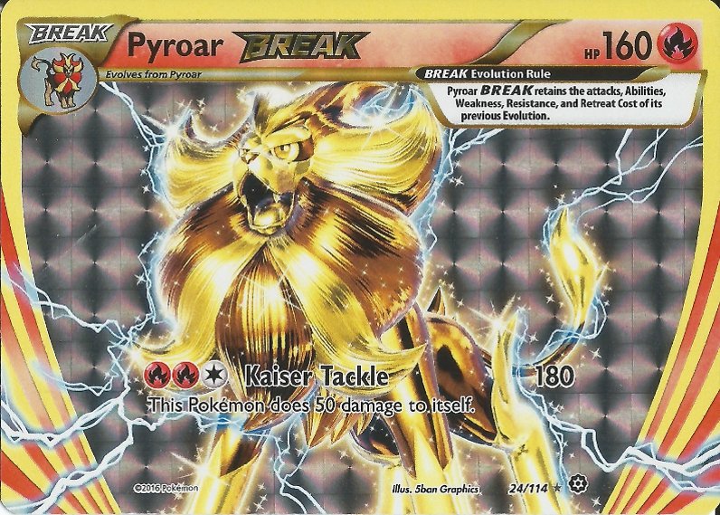
As for worse Noctowl, it’s no surprise it’s the BREAK. Never been much of a fan of BREAK cards (them being just gold, silver, and black without other colors AND made by 5ban Graphics in addition to it doesn’t help much…) The pose of Noctowl isn’t too bad I guess. Excluding the BREAK, my personal worst Noctowl would go to EX Unseen Forces 43/115. It looks like those fat pigeons I see in my garden sometimes… And apart from the shadows used, it’s pretty boring. I’m actually surprised it’s a Mitsuhiro Arita artwork.
Alomomola. Pointless Pokemon, why doesn’t Luvdisc evolve it this?
Favourite
Really nice colours and the background is really well done too, not sure what it is doing in the sky, but let’s just assume its jumped out of the water for a second…


 **
**


