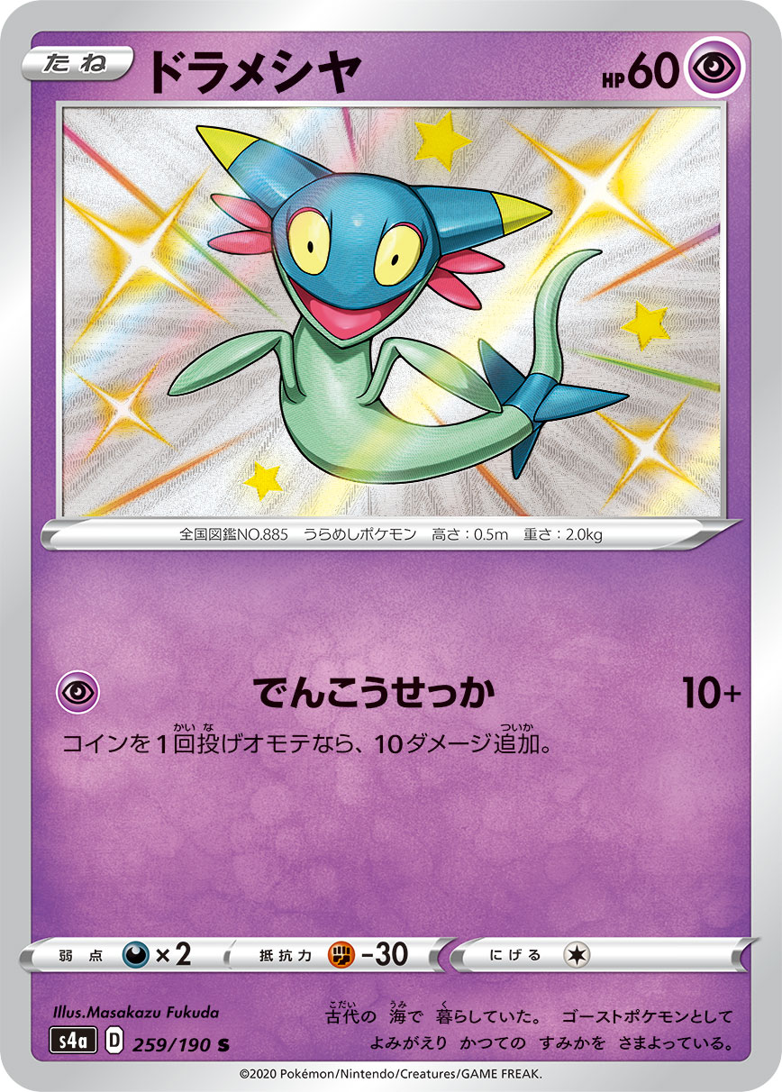
Yay for Dreepy!
Of the 2 cards to choose from, Mazakazu Fukuda’s “toon” artwork reminds me of the Yu-Gi-Oh toon series.
AT.
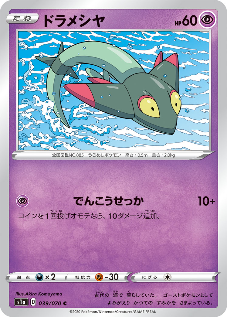
Yay for Dreepy!
Of the 2 cards to choose from, Mazakazu Fukuda’s “toon” artwork reminds me of the Yu-Gi-Oh toon series.
AT.
This is fun!
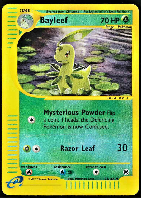
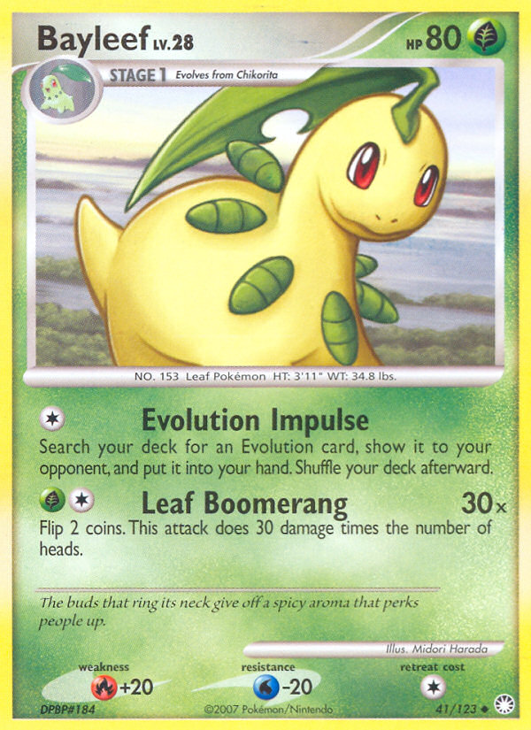
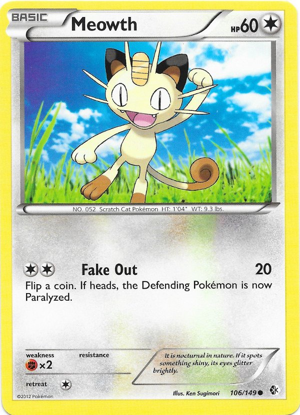
I got bayleef. Not really a pokemon I ever think about but it did have some good artwork
The winner:
I just love the artwork on this card
The loser:
Do I need to say more? WTF happend when they did this card
Hate that is just proving some people have no taste at all and that makes me question how people can have such invalid opinions haha.
Favorite: feels creepy and has an especially sinister vibe with the childish smiles and dolls in the background. Perfect fit for the pokemon
Least favorite: I’m cheating on this one and putting the same card 3 times… painfully generic and it doesn’t help that banette got shafted in the shiny department
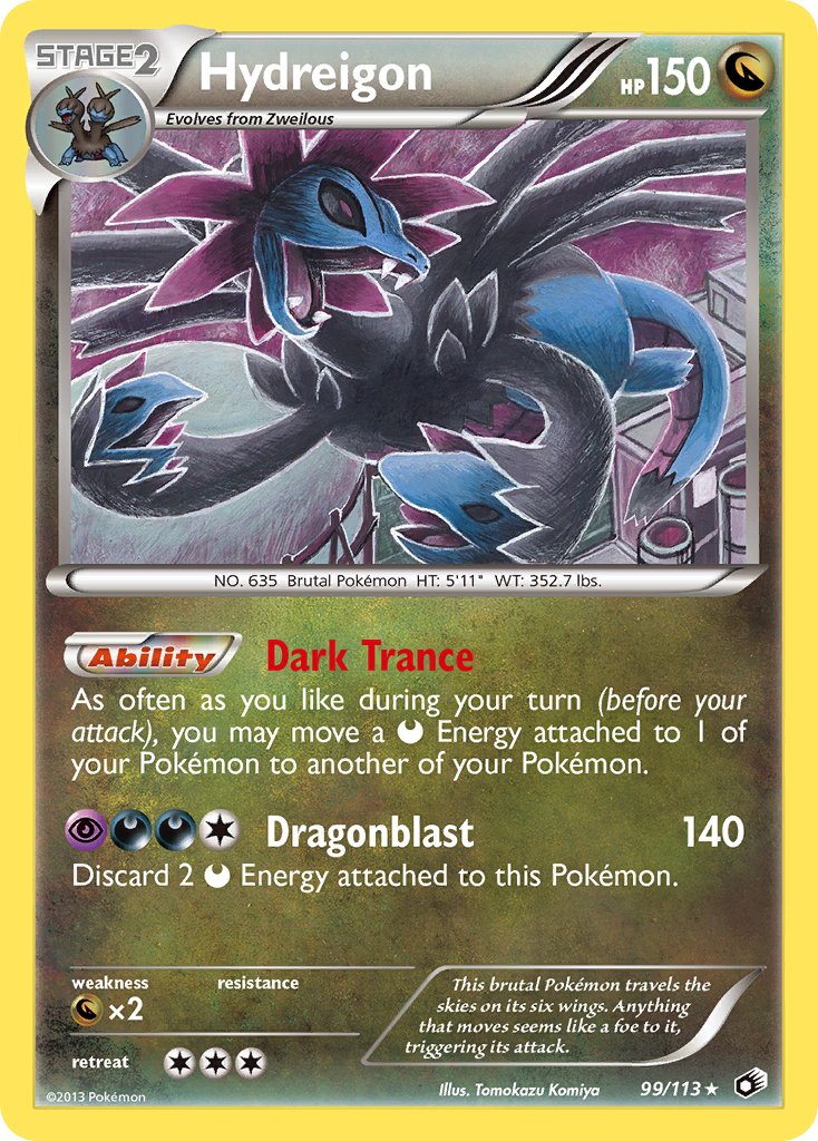
Pokemon: Hydreigon
I am a sucker for a good Komiya, and most of the BW/XY era Hydreigons are awkward 3d renders. The holo version from Legendary Treasures is a card that I think looks pretty amazing with the horizontal foil pattern.
I don’t much like this EX version. The material on the heads looks like foam and definitely not dragon scales or anything like that.
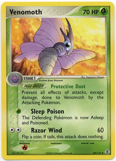
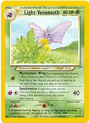
I got Venomoth! I always appreciated the bug Pokemon growing up, so glad to get this one. For my favorite, I thought about pandering to the Komiya crowd with Janine’s Venomoth, but nah. Not my favorite, but did include it at the bottom. My favorite has to be Light Venomoth from Neo Destiny. So many artworks for Venomoth portray it as a giant Mothra type create, but this one gets the scale down, with some nice artwork. Worst has to be FRLG. I really don’t like the cortorted pose, and while I think it’s just flying towards the sun, it almost looks like a flame? Which would be a pretty dark rendition of Venomoth taking one last look back at us before it’s fiery demise.
Favorite:
Least Favorite:
Artwork to appease the Komiya masses:
I had to go again, it’s too much fun!
Got Palossand though…which sucks.
Stupid Pokemon designs=stupid cards…
Best: I think it is smart to take a silly Pokemon, and make a cartoony/silly card.
Worst: The dumbest thing to do is take a stupid Pokemon and TRY to make them look tough and awesome. Doesn’t work. Exhibit A:
Definitely want to hop in on this again.
I got Muk this time around. Not a favorite of mine but definitely a couple cool artworks.
Favorite:
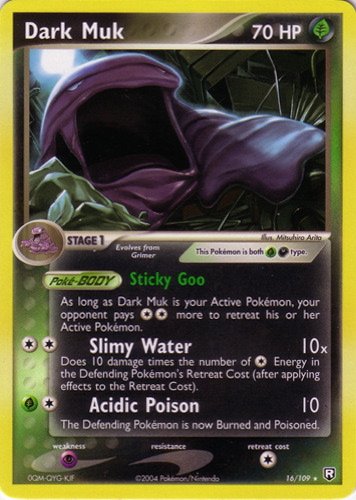
Dread it, run from it, Dark Muk arrives all the same. This one is nightmare fuel (in a good way).
Worst:

I’m straight-up not having a good time.
I try to avoid looking at the “not a favourite of mine” part and admire the 2 great muk cards you posted!
Girafarig seems to lack beautiful cards :’(
Lol you got the same crap as I but evolved, next level crap
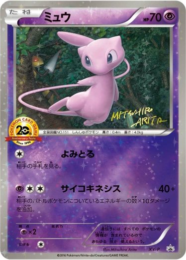
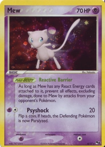
So I went for a re-roll and got a more rewarding Pokemon the second time around - Mew!
A lot of solid artworks but I ended up deciding my favorite Mew is the 20th Anniversary Festa Mew done by Arita. Very nice artwork on a fantastic background.
For worst card, 5ban surprisingly dodged the bullet on this one. I ended up choosing this POP series 4 Mew. It seems like they used a blur effect to try to make it look like Mew was streaking through some kind of generic void, but the pose isn’t very dynamic so it comes across looking pretty awkward to me.
Hmmm, don’t you like this card at all??? I think Kusube’s organic style with thick strokes and heavy shading works exceptionally well in this artwork, particularily in the reverse holo version. But to each their own of course. I can see why one wouldn’t enjoy Girafirig’s character design in general.
I’ve actually never seen this card until now! That is a nice card indeed - especially knowing there’s a holo of it!
First time I’ve seen this pokemon, I don’t think I’d be sad if it was the last time too ![]()
Best:
Worst
bruh
Nice thread idea btw! ![]()
How I envision the concept for Stunfisk went:
Person 1: We need a new Pokemon.
Person 2: How about a flat potato.
Person 1: That’s not exciting enough.
Person 2: What if we put an exclamation point on it?
Person 1: Still not quite there…
Person 2: Give it chicken wings and a beak and call it good.
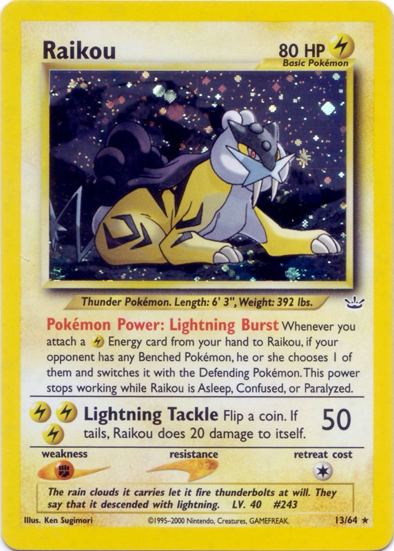
All right, I got a cool one! Most Raikou cards are pretty great IMO, so this was tough.
Best:
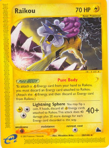
Runner-up:
Worst:
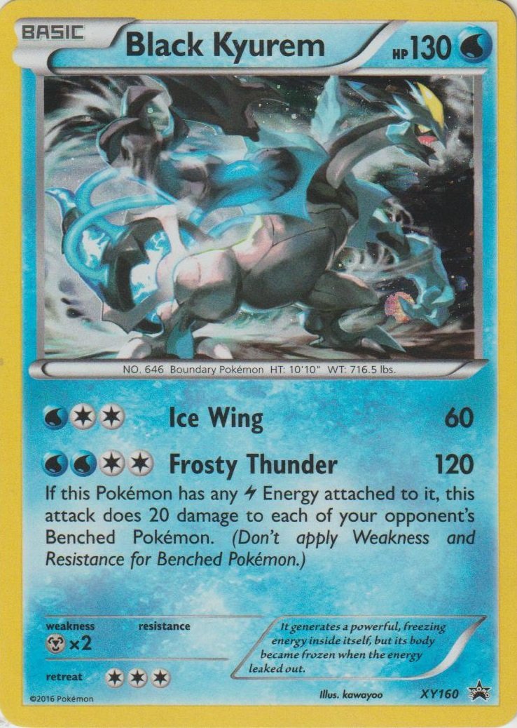
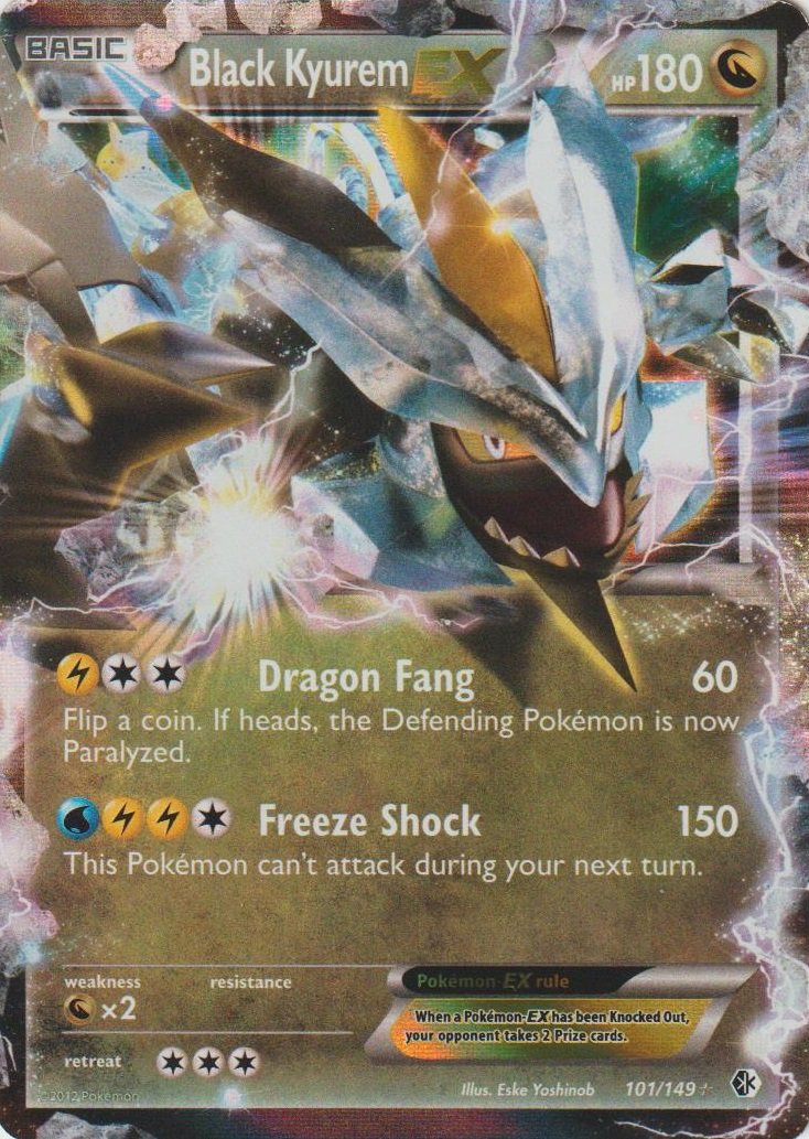
I got Black Kyurem. Most of his cards are from 12-13 during the BW2 era with only a few exceptions, so here goes:
Best: Something about how wispy and frosty this is makes it pretty cool to me.
Worst: This one is a two for one.
I am comfortable with calling Eske Yoshinob the worst TCG artist out there. Every card I’ve seen is like what the biggest 5ban haters always complain about but turned up to 11. It just looks like a grotesque upscaled Nintendo 64 game. Cards have no business looking like this in the 21st century in my opinion.