Random Pokemon - Favourite and worst Card.

Since I wasn’t thrilled with the Pokemon I got in my first attempt, I thought I’d take advantage of a second try.

Pokemon: Oshawott
Fave: Black and White Promo - Mitsuhiro Arita. You can feel the emotion of the Pokemon in this illustration

Least Fave: _____________'s Oshawott, another Promo card from B&W Promos. 5ban missed on this, amongst most things

6 Likes

which pokemon’s rookie card is also their best art? Its a very hard question to me. I think T17 is probably the best typhlosion from an art perspective (and Im not really a huge typhlosion fan). Its hard because all gen 1 and 2 pokemon have eseries arts (except unown) which are usually leagues above the rest ie: lugia, ttar, blastoise, celebi, feraligatr, charizard (not the holo), ho oh (arguable) kingdra, etc

Agreed Sugimori trainers are great. Mr. Fuji and Pokemon Breeder Fields are two of my favorites.

4 Likes

Donohan, one of my favorites from Gold & Silver!

Favorite Donphan card was an easy decision, really like the only Dark Donphan. I should pick one of these up for my binder. :blush:

There was no standout for worst Donphan card. I considered Donphan Prime from HGSS, but ultimately decided on the Pop 3 card.

And for a favorite honorable mention, Donphan’s Aquapolis card is also excellent!

9 Likes

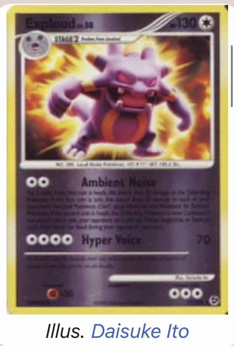
Second try; this time I got Exploud.
I actually really liked this dude when he came out in the gameboy games!

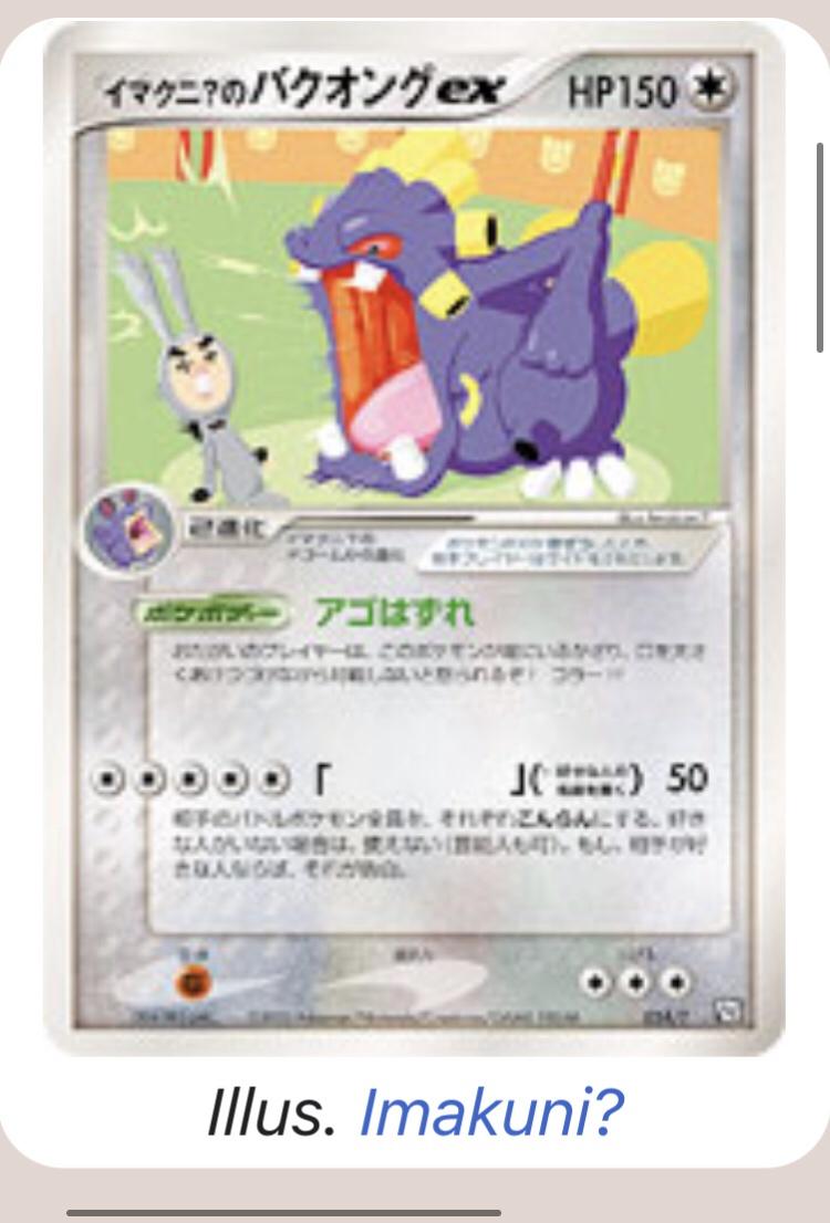
Straight away I knew what my favourite would be! imakuni Exploud ex from the Trainer promos.

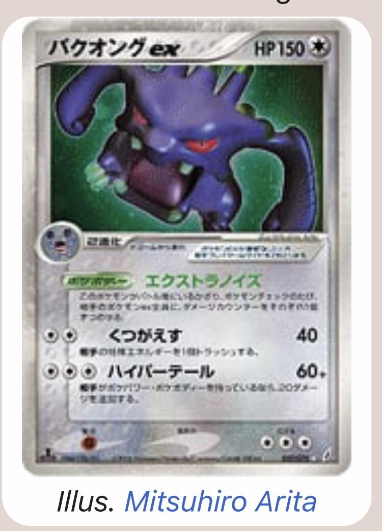
I then searched through and I must say a lot are god awful. I had to settle on two being the worst and to my horror one is by Arita himself!
For worst I went with Ex Crystal Guardians and Great Encounters

Best:

Worst two:


1 Like

Let’s do this again.

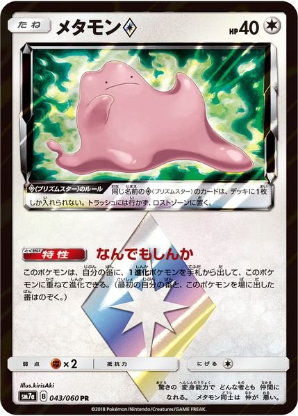
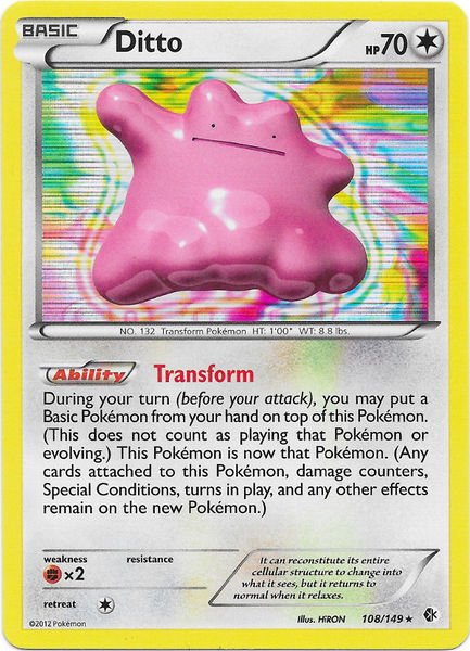
I got Ditto. Most Ditto cards don’t have much going on with them unfortunately, but:

My favorite is the “come at me bro” Ditto. Also a special mention to all the Delta Species Dittos in different forms but I’m not choosing any of them for now as I want him to be in his actual Ditto form for this :blush:

And least favorite is the Boundaries Crossed Ditto. There are quite a few boring ones and ones I don’t care about but this one is really hideous for me for some reason.

8 Likes

Absolutely love the come at me bro ditto!

I just did a search and was actually shocked at how little ditto cards there are - thought would have been more!

I really like the XY promo ditto where he’s/she’s still in ditto colours but morphing into pikachu!

1 Like

Zarude

Best:
Obviously the Garigari-kun promo which could only be obtained by eating copious amounts of popsicle sticks until you found a winning stick. The ice cream brand’s logo stamp elevates the card’s original artwork to a newfound level.

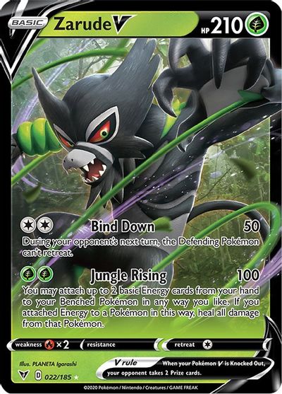
**Worst:**Has to be Zarude V from Sword And Shield. English card text, soulless 3D style, overly busy composition and zero stamps.

16 Likes

So I rolled Murkrow

Best
This card just looks and feels menacing and it gives me the vibes that Murkrow should put up.

Worst
Most of the Murkrow cards are just so boring, Murkrow + stock background… Yeah Imo this is the worst of the worst.

6 Likes

Had to give this another go, to much fun! This time around I got Furret.

Best**

**This would have made for a lovely holo.

Worst**

**
Honorable Mentions****

7 Likes

Another great example of a Ken Sugimori background done well. :blush:

Greetz,
Quuador

4 Likes

Agreed. Even though it is the same artwork scaled down and flipped; it works well. I always say we would be even more spoiled as collectors if Sugimori illustrated new art for cards rather than Creatures pasting on stock art and giving the card a generic background.

2 Likes

Cacturne

Best: I love the colors on this card. It’s also refreshing to see Cacturne in a dynamic pose instead of just standing around like some sort of cactus.

Runner up: I don’t care much for the CGI art on this card, but I love the holo background and the overall color scheme.

Worst: In most cases, I actually like the simplicity of Sugimori stock art cards, but this is just bland and flat.

9 Likes

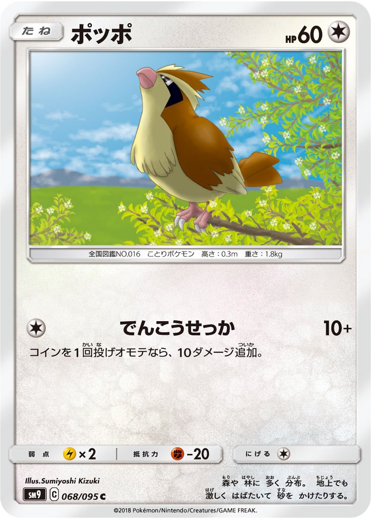
Best: Look at him, he’s looking up at the sun and he’s having a good day. He looks nice. Very different than other Kizuki artworks, so it’s interesting to see how their style has diverged.

Worst: I don’t like the head-on profile for Pidgey as much, and I’m underwhelmed by the scene.

3 Likes

I’ll do another roll.

Pokemon: Frosmoth

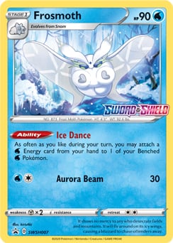
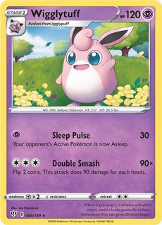
Comments: One of the stand out current generation Pokemon. Great design and I am a sucker for Bug Pokemon in general. Very easily could have been a Pokemon in any generation and fit in. It only has 4 different card designs so far(all the same card, play wise). None of the cards are particularly bad but I had to choose 1.

Best:

Worst:

8 Likes

I got Drowzee, the Hypnosis Pokemon.

The BEST is a recent card, should hopefully be coming out in the US within the next few sets:

The WORST is this abomination, I imagine they just gave an intern a thumb drive with a bunch of stock Sugimori PNGs and told them to go wild:

10 Likes

The Best:

TPC should get refunded for commissioning these monstrosities:

7 Likes

There’s something about the colors on this that make it look actually so cool. I haven’t seen this one before somehow… or at least not that I remember

Definitely my favorite of the WOTC era for Wigglytuff. So much detail and so many beautiful colors.

3 Likes

The don himself, Honchkrow!!

Favorite! Supreme Victors by Arita


(pls don’t hate me for snubbing the Komiya Krow from Unified Minds)

Worst! Unbroken Bonds - just not good!

4 Likes