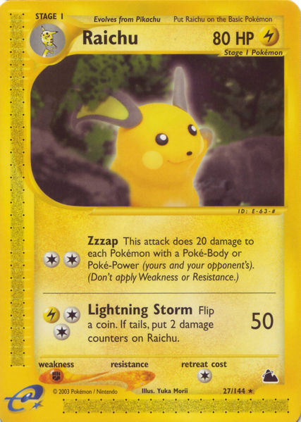
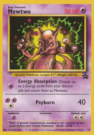
Himeno is one of the best, but this piece didn’t land for me. The proportions of the ears and the front legs are weird, and the light pink on the uninspiring yellow/mustard gradient is kinda bleh. The SM Espeon-GX Promo is my second least favorite copy of Espeon.
What about this gengar works? Last I checked gengar doesn’t have that kind of weird fur like texture. Yeah I know, blah blah kinebuchi was great for what he had to work with but that doesn’t change the fact that this is mostly cgi bs with no background, and I frankly would’ve preferred a sugimori copy paste.
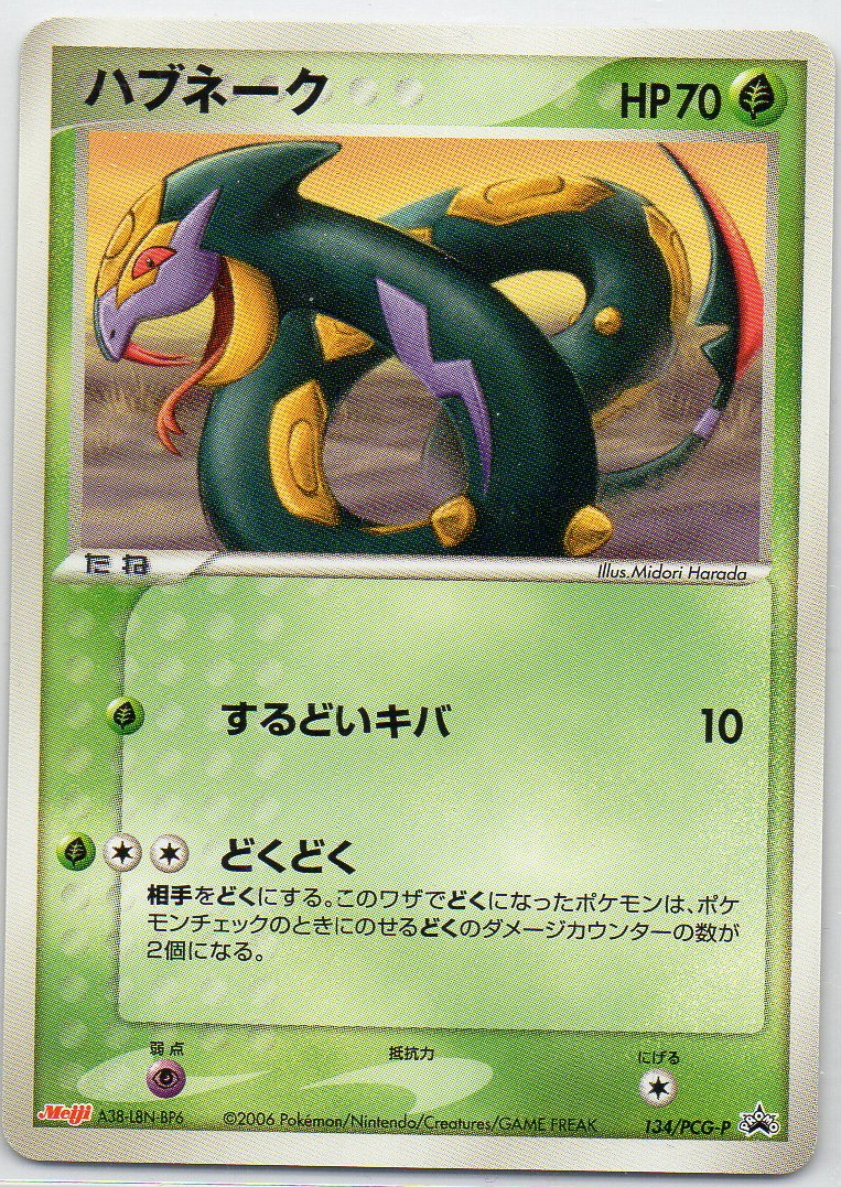
Not a bad artwork per se (Seviper doesn’t have any bad artworks ), but I never really liked the pose of Seviper in this artwork, and there also isn’t much going on with the background:
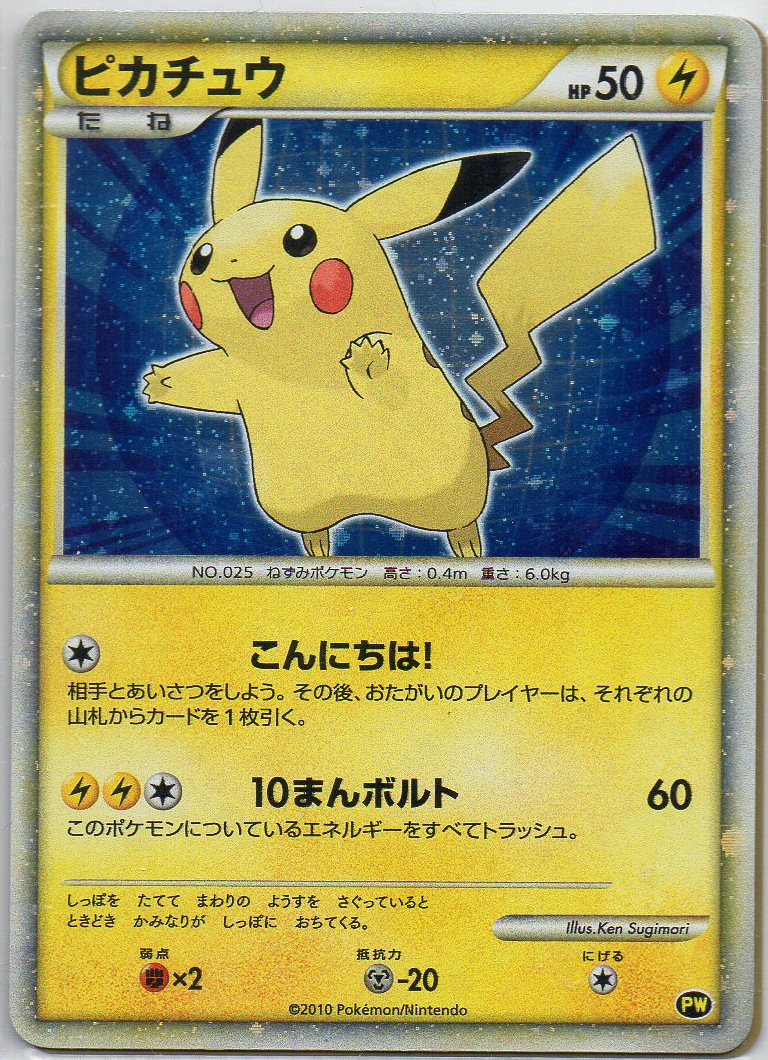
And although it’s not in my top 25 favorite Pokémon, as a Pikachu collector I had to choose my least favorite artwork for it as well of course, which is the Japanese blue background Pikachu World Collection 2010 card. The other eight Pikachu cards in the Pikachu World Collection 2010 are more dynamic in both pose and background, and also all have the language’s flag incorporated in the artwork. Because of that, the Ken Sugimori Pikachu with blue background is just lazy and not really part of that same set imo. (The green background version I don’t mind that much, since green is my favorite color.)
@digitaldash Geeze, that has to be one of the unsettlingly bad cards I’ve seen. Thank you for that.
I think we can all agree that Keiji Kinebuchi nailed body proportions with his early CG work, but his implementation of fur was questionable (looking at you Base Diglett).
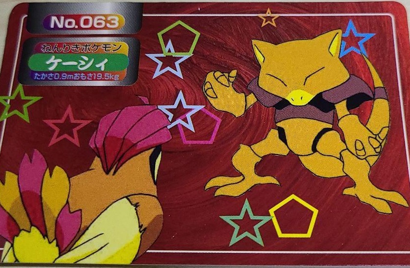
Abra is my favorite pokemon. I couldn’t think of a tcg card of abra that I don’t like but then I saw this and realized this set could probably apply to a lot of people’s favorite gen 1 pokemon in terms of worst looking cards. I’m actually one of the weirdos who enjoys the original topsun, but this set they did later on after they changed their name (and looks like their staff along with it) is just objectively terrible. It’s like an 8 year old drew abra and then cut him out poorly with scissors leaving some of the white outline of the paper and glued him onto this card design that has stars and pentagons on it randomly strewn about. The card designer apparently then decides oh if I make all these shapes different colors that will make the card so much more dynamic and interesting. I might buy one just to have the satisfaction of burning it with fire.


