I think it’s a relic from a time Pokémon wasn’t a Billion $ company interested in minimizing risks and maximizing profits.
1 Like
Inspired by AzulRyu’s post, here is my least favorite Rayquaza card.
How can you make such a well designed Pokemon look so bad…

9 Likes
Yeah, it’s because drawn front facing characters almost always look weird.
Case in point:

Google ‘Front Facing Simpsons’ to see more examples.
3 Likes
A lot of the gen 3 rayquaza arts were… questionable

1 Like
I know its a rumble card, but come on guys.

7 Likes
I actually like that ex card but yeah it may be a bit of an awkward pose
1 Like
I dont hate it but the 1 bottom tooth just makes it look really stupid
3 Likes
That’s not a tooth mate. It’s the reflection of the light on its gums.
3 Likes
Grandpaquaza forgot his dentures again.
3 Likes
oh! i found a different hi res picture its actually p cool!
Bumping with this because I found it in a drawer.

2 Likes
A lot of Gen 1 WOTC cards have terrible artwork, but this one deserves to never see the light of day

4 Likes

4 Likes
Seriously though, what is happening in the picture? The background looks amazing but the arcanine seems to be doing some kind of weird air dog yoga
2 Likes
Dude I always thought this was the single wost WOTC promo ever. So out of line.
1 Like
And the runner up for worst WOTC promo, you ask?
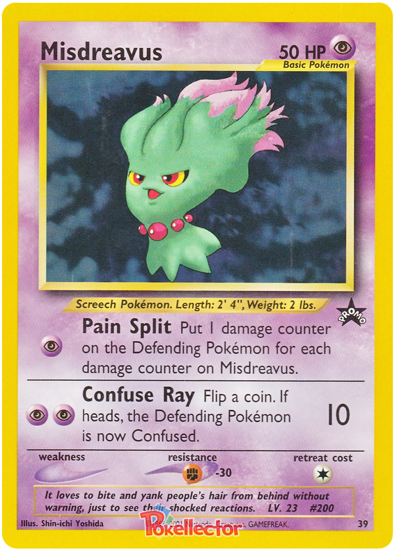
Why, Yoshida? WHY???
13 Likes
A few cards that make me laugh
This artwork just hits you different

Just me or does this look like a chicken with its head cut off?

This is just horrible

vr
odds
3 Likes
Thought it was the coolest mewtwo card when I was a kid and I still love it.
5 Likes
I disliked this card as a kid and I still do tbh
1 Like
Lend him your energy!
4 Likes