He’s doing a solar beam
Who hurt you?
9 Likes
Light Arcanine is one of the prettier cards in Neo Destiny…
3 Likes
Lol I agree 100% with this pokemon being ridiculous, but I love the shiny full art from Hidden Fates.
1 Like
Never liked this card.
1 Like
God dammit what’s wrong with you people? I LOVE half of the artworks in here.
5 Likes
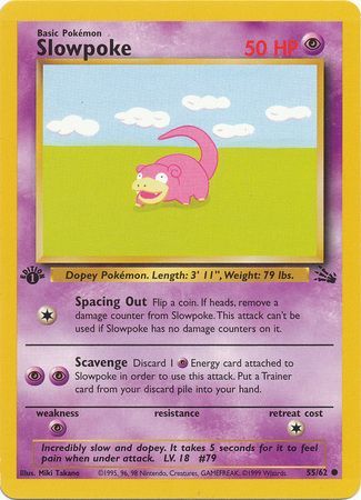
Here’s the thing @dilbert, I like the card, I just don’t like that it is the debut of Slowpoke. It pains me that it isn’t a phenomenal work. Otherwise, fine minimalistic card.
Now these… THESE are thouroughly ugly artworks, stuff that makes me sick just looking at it.


HOWEVER I still can at the very least respect the artist’s efforts to make them unique and distinct - something I can’t say for 99,8% of the 5ban rainbow rares.

Those are actually the worst offenders BY FAR. They are so indistinguishable, so utterly void of ANY artistic aspiration, so mind-numbingly boring that you wouldn’t even want to call them the “worst” artworks, because they aren’t even capable of triggering ANY emotional reaction AT ALL. FUCK THEM.
Thank you for listening.
6 Likes
I had to look these two up when I first saw them since I thought I stumbled upon a custom card, but lo and behold they’re real. I do appreciate the newer generation as it makes me more nostalgic for the first 150.

4 Likes
Ahh… @muk , you indeed have fine taste. I too do not like those Neo cards. And, well… you just talked like I talk in regards to the rainbow rares. Bless you sir!
To be fair I only wanna be critical of stuff from my era. I don’t do modern so it would be biased as hell. But again, I agree.
1 Like
No what those Dark Neo cards are so cool. The graphic approach and shading is awesome! I’m shook by so many answers in this thread, I no longer trust any of you.
The real answer is Full Art Dragon type GX Pokemon. They all have a gross mustard colored background. Why did the GX full arts have BG colors determined by type??? I hate it to much. Such a downgrade from BW and XY.


5 Likes
any xy era - present 5ban/CG Works cards. They make every Pokemon look like a plastic toy. It’s lazy and most of the artworks are the pokemon “posing”. Shame that these are the “hits” of most modern packs.
2 Likes
Although there are plenty…this Tangela always comes to mind.
Although I like the idea of mixing Tangela in with yarn…this is not what I envision. lol Effort level; none.

2 Likes
The sausage slap’n Hitmonchan
1 Like
And he isn’t even punching!
4 Likes
Special form, it is kickmonchan!
1 Like
Aw man, I really hope that limb is his leg…
5 Likes
Ah man, I’m loving this thread, but for all the wrong reasons! The imperfect, crude, and unique and loosely-illustrated cards are so memorable!
If it’s hand drawn, I’ll take it over generated 3d/CG any day, unless there’s a creative reason it’s distinctly CG. Base set Porygon is a notable and awesome exception. In that case, there was intent behind the CG style, and it really stood out from the rest.
That promo mewtwo takes me back instantly, and the Exchange promo reminds me of the colors and illustration styles being used when I was a kid. New Star Wars coming out and Darth Maul’s face is all over the literal mall. Cheesy ads on Pepsi cups from fast food restaurants. Maybe I’m cynical, but things were just more… fun? Seeming? Rough, wild, and not so worried about precision, optimization, and perfection.
These days there are so many cards illustrated with a razor blade that are completely forgettable. I’ll Wabi-sabi all the way home, thank you, and I’ll take that fat Eevee with me.
Edit:

In general, nothing in this style really clicks for me, especially as you turn up the geometry slider.
3 Likes