Never noticed that. That’s actually awesome
4 Likes
It’s weird but it seems like the only good Venusaur artwork comes from Arita or Sugimori!
WHAT
1 Like
no and no.
This card has Sabrina on it and that is the best win one can get.
1 Like
woah.
This is one of the the best for being solely unique and initially I used to feel the same way but now love the chairoscuro, Stadium CG big cosmo boarder ex’s and respect them for being a unique place in time.
I’m probably not the one to talk about logic, but holy sheet. And this is not disagreeing with your stance on the card but the justification seems, sorta, backwards?
oh yeaahhhhhhhhh

Benimaru Itoh’s choice of depiction was way ahead of it’s time, it may have even foreshadowed the route Aya Kususbe went. It harkens back to the lumbering humanoid therapod monster the RB sprite glorified it as and has got a strong manga vibe going for it. Plus anyting invluding the Millenenium Eye balls is never a bad choice.
![]()
I needed that laugh. That’s really funny. Cheers. Good luck next time, take care.
3 Likes
The less buying competition my friend the better.
Uh, interesting thread! I like pretty much every Snorlax card (There is a reason I recently chose to collect them all), but there are 3 I’m not a fan of (And one I straight up HATE). Here goes:
- Diamond & Pearl 37/130 Snorlax
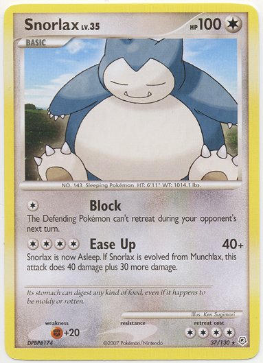
Now, I don’t DISLIKE this one, but I find it so lazy! there is nothing unique or interesting going on in the background or on the Pokemon and that fact is made even clearer by the decision to cut a part of the Pokemon. Like, seriously! What did you want to show off so much to cut, JUST A TINY PART of the Snorlax. IMO, Cut it more or don’t cut it at all
-
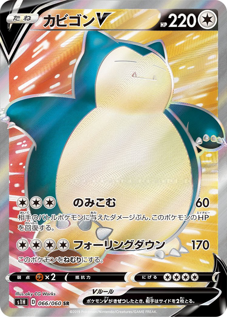
Sword & Shield 197/202 Snorlax V
Of course there had to be a Full Art in there. Here, I don’t dislike the CG itself as much as I find the background and pose of the Pokemon illogical. Like, the arms position and the background clearly are supposed to show that Snorlax is running, but then the foot position is one which I would imagine if it was walking slowly and intimidatingly. Also, WHY MAKE SNORLAX RUN?! That’s like, the opposite of its thing??? Anyway, yeah, I don’t like it… Oh welp, Snorlax VMAX Rainbow Rare looks cool imo so.
-
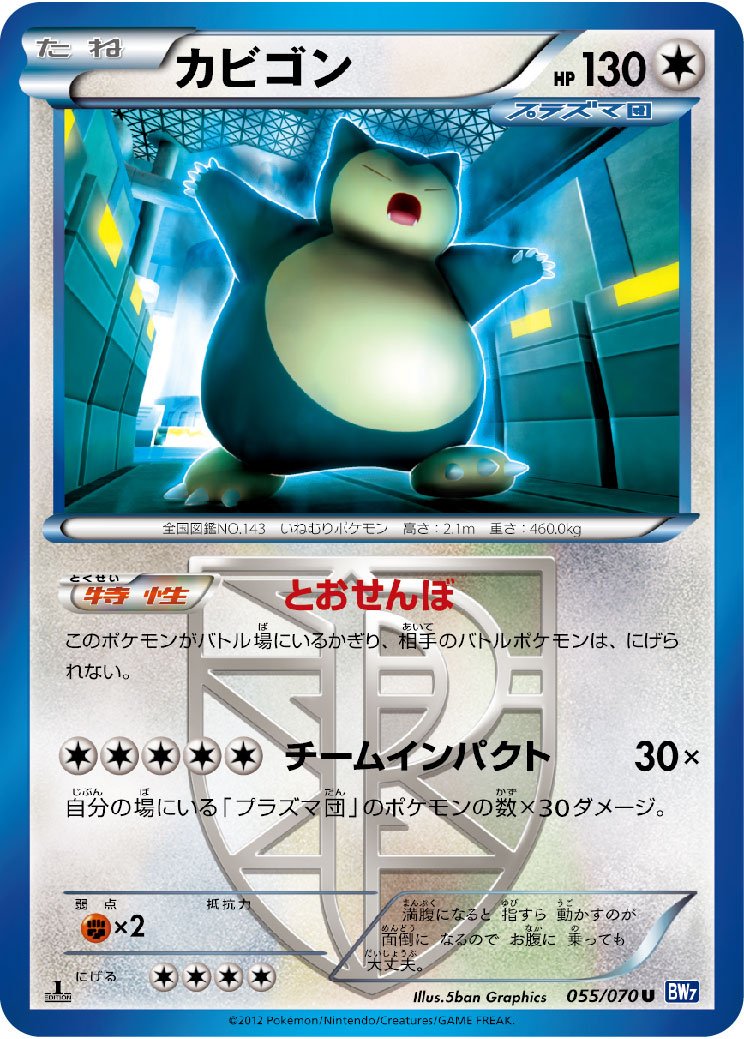
Plasma Storm 101/135 Snorlax
What DO I like about this card? ABSOLUTELY NOTHING! IT’S TERRIBLE! I hate how pixelated the shaded area on Snorlax is. I hate how the 2 feet and the right arm don’t look connected to the body. I hate the Yellow in the card. I hate how unstraight the pillar in the top left is. Most importantly, I hate THIS got a Promo release in Japan. If my life depended on saying something positive about it, all I could say is the Pokedex definition of the card is kind of funny.
Alright, that last one really pissed me off (barely exaggerating my hate for it), so let’s finish on a positive note with what is imo not only the best Snorlax artwork, but the best artwork in the Pokemon TCG History PERIOD:
2 Likes
(Making this post made me edit my signature. Thanks for the motivation.)
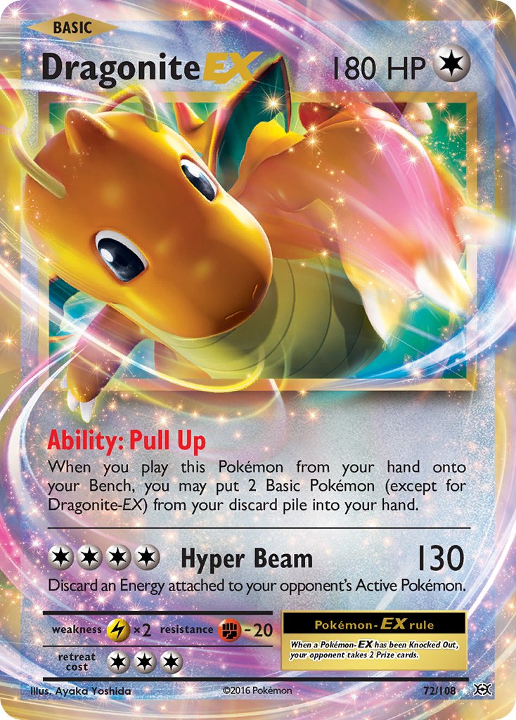
When I think of Dragonite, I think of him being one of the secret ‘final boss’ Pokemon of Red/Blue (most kids playing the game for the first time didn’t know about him and then get their butt kicked if they don’t have an ice move). Or Mailman Dragonite, or Lighthouse Dragonite, or ‘Great Bowls of Fire’ Dragonite (that episode is INSANE), or the Pokemon ‘Generations’ animation, or ‘Breeder Fields’ Dragonite.
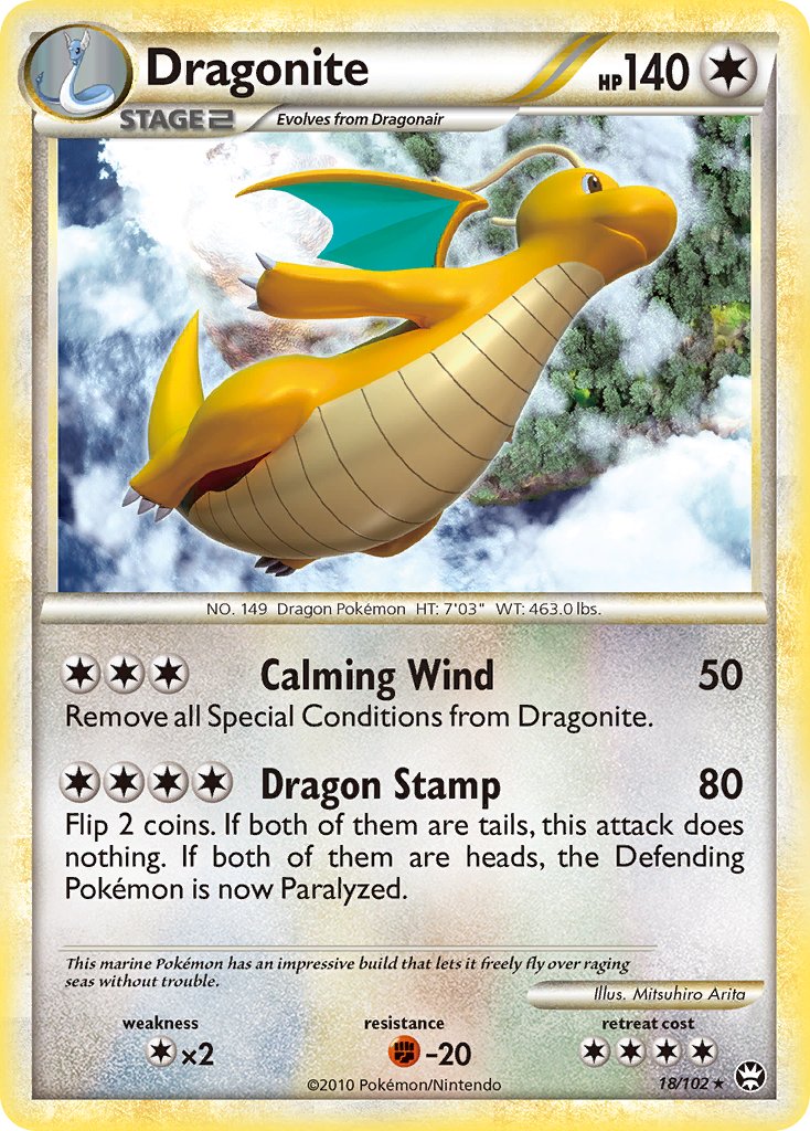
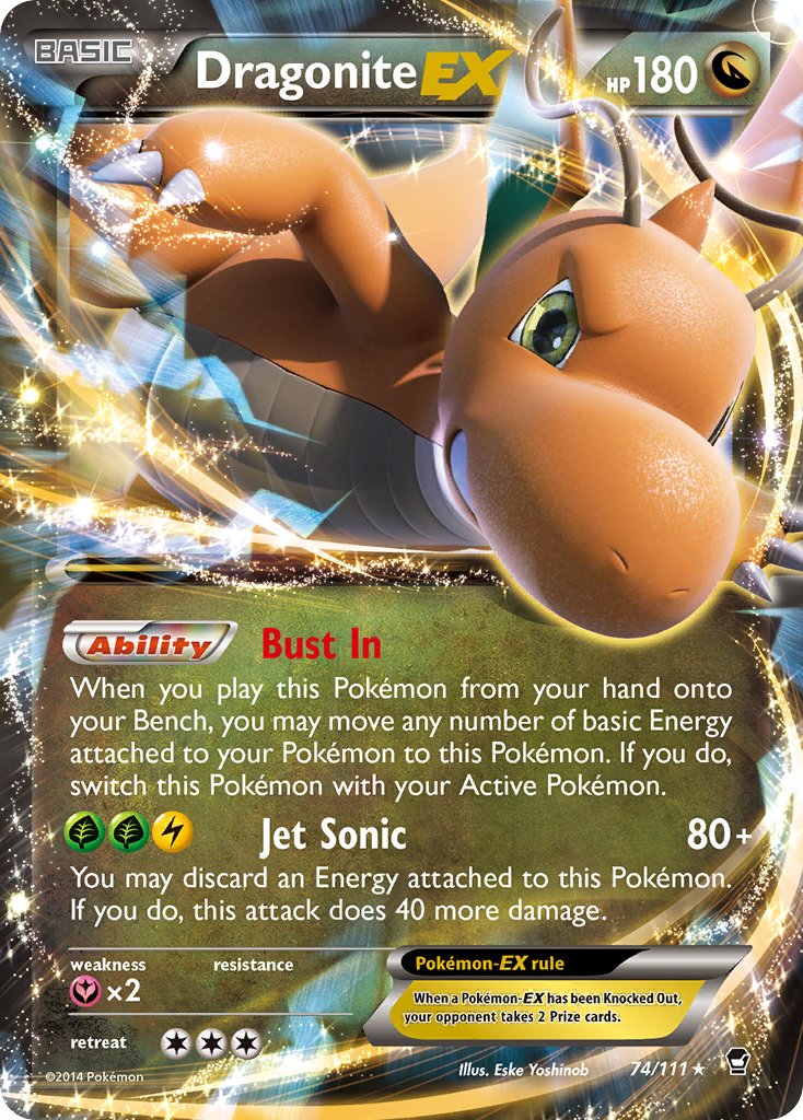
So…you have to put him in the right situation or art-style, otherwise he does indeed look like a ‘derpy Barnie dragon’ like a lot of people like to meme about. Making a good CG render of him is difficult. Here are some of the ones that could be deleted from existence and I wouldn’t shed a single tear. Sadly even one of them is done by the GOAT, Arita. But he has so many bangers that I can forgive him.
6 Likes
Woah, I thought those were just random photoshop filter type effects. Maybe I like it a bit more now lol
1 Like
whales are bendy, except wailmer who must remain perfectly rotund at all times
3 Likes
Eske Yoshinob has an extremely weird 3D style overall, but I actually like this Dragonite. I think it was inspired by the Pokemon Red & Blue sprite which is still my favorite after all those years. Really menacing. The end result may not be nearly as great as Shizurow’s 3D art, but I commend him for trying something different.

The fact that Dragonite is derpy Barney, yet still easily holds its own against its (generally ferocious and intimidating) dragon counterparts throughout the generations makes him even better IMO.
1 Like
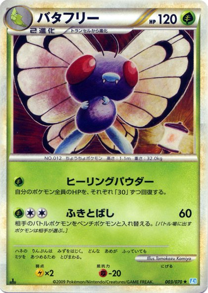
Not my #1 favorite pokemon, but Butterfree has a really really solid roster of artworks… except for this one
I’m sorry Komiya this is a big miss
2 Likes
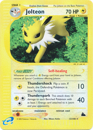
Jolteon has so many cards with amazing artwork but this one from Skyridge is just so bad. The yellow and green just dont match together and its just overall awful to look at lol
6 Likes