Honestly, i agree. The stadium games are pretty mid too imo
2 Likes
One thing everybody seems to unanimously agree on is that Darkness Ablaze is a terrible set. I dont understand why this is. I think its a cool set! I really like Butterfree, Houndoom is a really cool Pokemon, you got Salamence, Scizor, I think Centiskorch is cool too, and the Crobat FA has a really nice colour scheme going on, with a very interesting circular texture.
Maybe people are bothered by the Zard hype, but not even counting Zard, i personally think theres some really great cards in the set! The Vikavolt FA has some nice bright colours too which i enjoy. The Scizor FA background is literally split Gold and Silver, possibly referencing its original gen.

Sure, it doesnt reach the ultra-juiced hype that the later SwSh sets do, but its far from a bad set and gets way too much hate imo
8 Likes
Didn’t know that DA was thought of as bad! I personally love the set.
3 Likes
Idt its unpopular but conditional rarity is the most fun rarity to chase
3 Likes
Pokemon needs to stop putting energy cards in packs, like, relax.
Every ETB already comes with a ton of them, literally who, if ANYONE, is getting any value from an energy card in packs?
6 Likes
I 2nd this! Booster packs should be for BOOSTING your deck by adding a few cards from the pack.
There are theme decks and ETBs as a great start to a deck that already has energy cards in it.
Or do something like only having 1 or 2 sets a year get energy cards in their packs.
Looking back at WOTC, base set packs had energy cards, and the theme decks also had plenty. Jungle and Fossil did not have energy cards. So could do SV base set has energies, but no other sets in the SV era.
2 Likes
Agreed! In the early days, I got it, but NOW? In Magic, when you need basic lands, most shops sell them for pennies, and at limited events, you can go to the desk and borrow the lands you need for that event. (And MtG lands are WAY cooler than basic energies…)
2 Likes
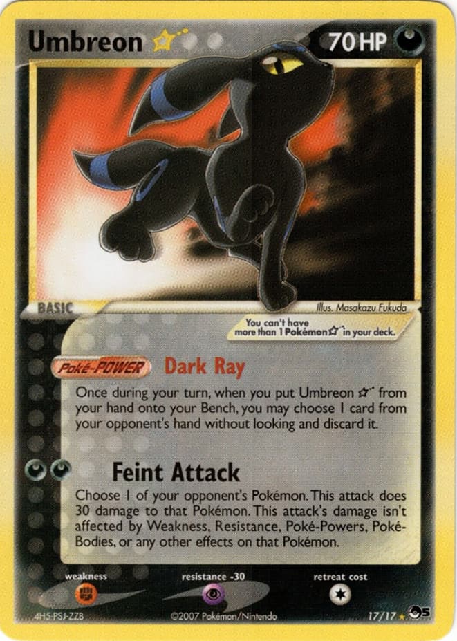
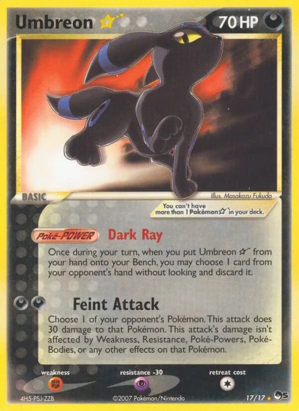
Goldstar Umbreon looks awful.
Rarity and cost aside. The color scheme is terrible. Why would you design a black card, only to realize you can’t read the black font and you now need to overlay a white background on top of a black background? Why not just make it white. Or Black, with different font coloring. Don’t get me started on the yellow border (At least the S8a 25th JP one has consistency between the background and border). Lastly the shape of Umbreon is weird and not proportional. The look on it’s face is weird, and it looks like it’s walking on a flood light. Thank you for coming to my Ted Talk.
15 Likes
On that subject, this (and the Japanese WCP and Play versions) is the only good or even palatable Gold Star Eeveelution.
3 Likes
Unpopular opinion maybe but I think collecting “waifu” Pokémon cards is strange especially when referring to underage characters on the cards. But that’s none of my business ![]()
![]()
17 Likes
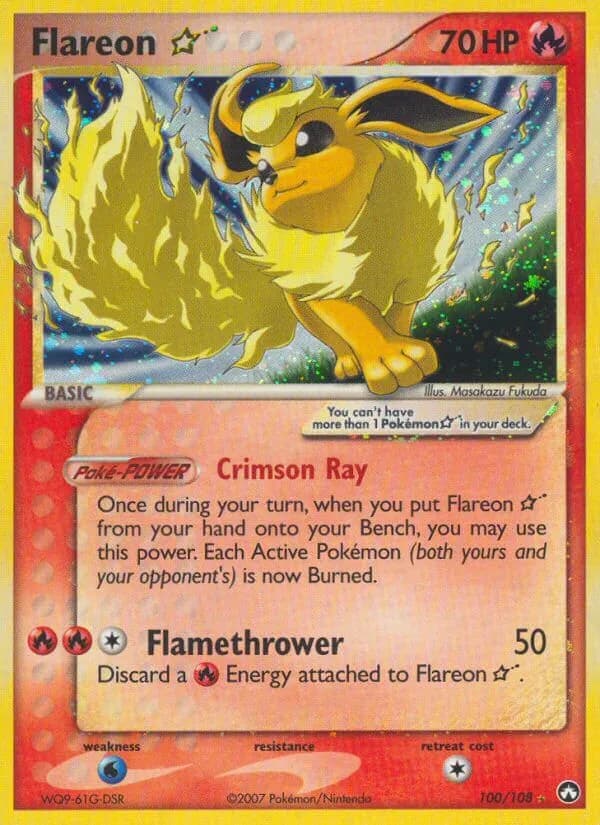

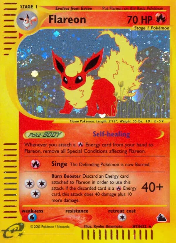
Flareon Gold Star deserves to walk among them!
2 Likes
I’d put the gold star above skyridge and below the others
1 Like
It’s the only one I gave 1/10

1 Like
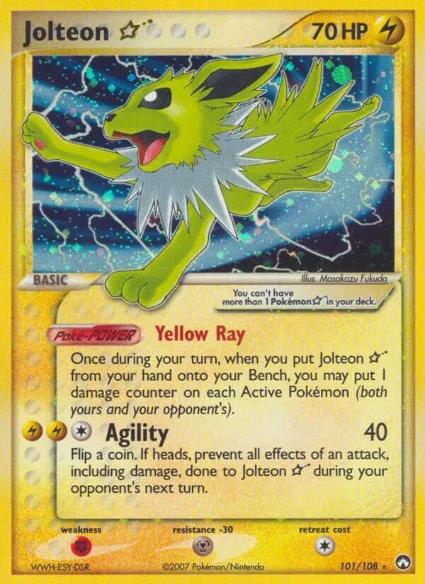
Jolteon Gold Star is much worse than Flareon Gold Star…
2 Likes
It’s…also pretty underwhelming, I gave that a 3/10.
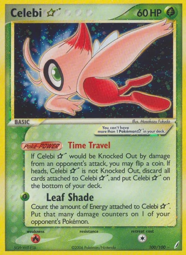
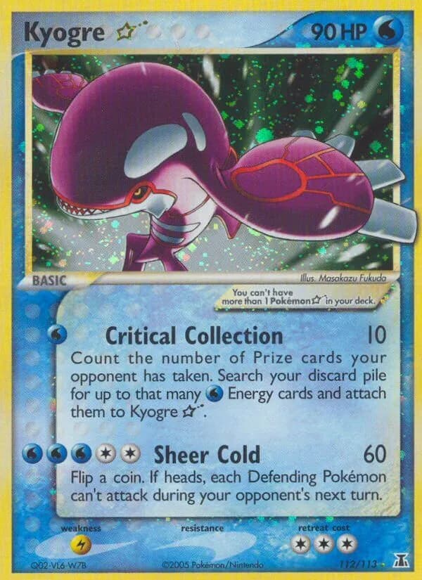
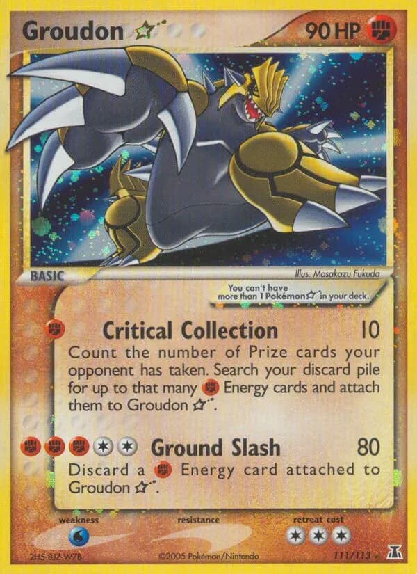
I can agree with 4 out of 5 of those. I’m not sure I’d describe the Celebi and Groudon as bad per se, more just painfully uninteresting, but that is semantics. ![]()
I have developed a taste for the Kyogre though! There’s just something intriguing about it.
2 Likes
I think the goofy proportions through me off. Some gold stars work with the odd proportions but others just look so bad.
2 Likes