I think mine would be…
Sugimori 4-2 Yoshida
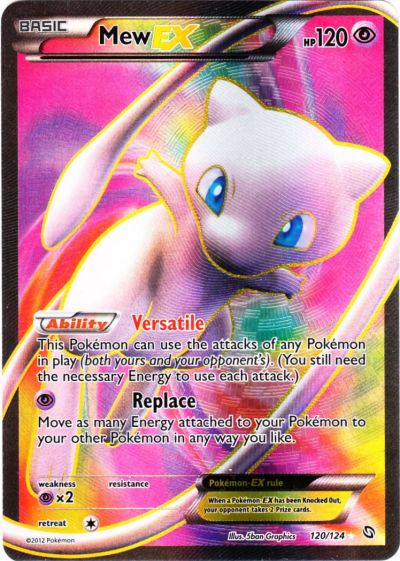
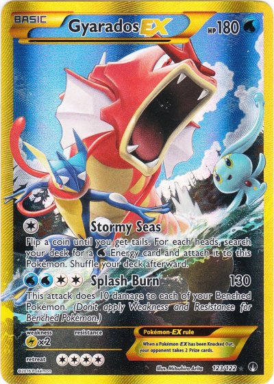
Magikarp, Gyarados, Noctowl, Tyranitar
vs.
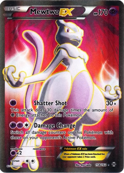
Kabutops, Mewtwo
I think mine would be…
Sugimori 4-2 Yoshida
Magikarp, Gyarados, Noctowl, Tyranitar
vs.
Kabutops, Mewtwo
Pretty strong agreement overall I’d say. ![]()
Don’t forget about ButtBreon too
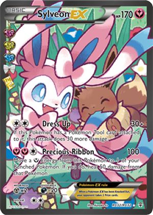
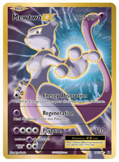
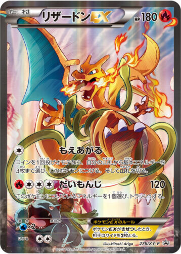
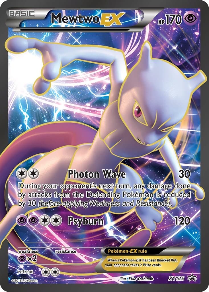
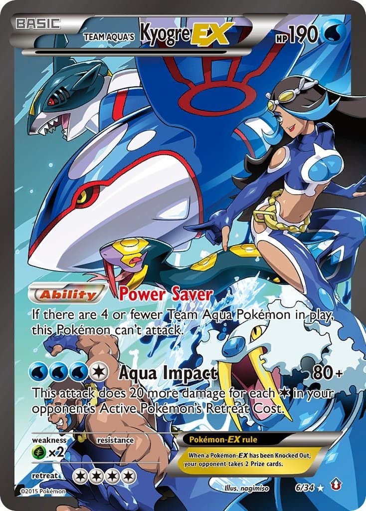
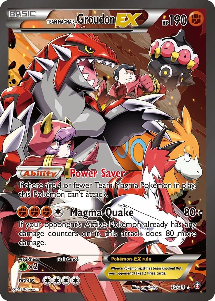
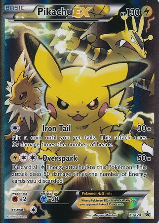
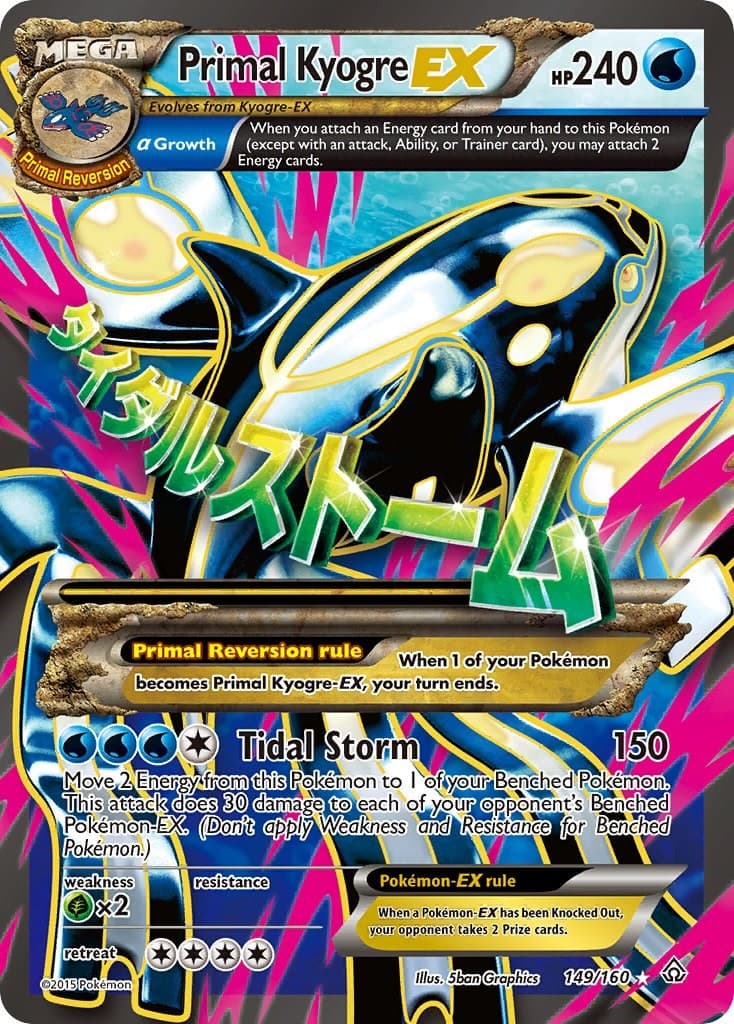
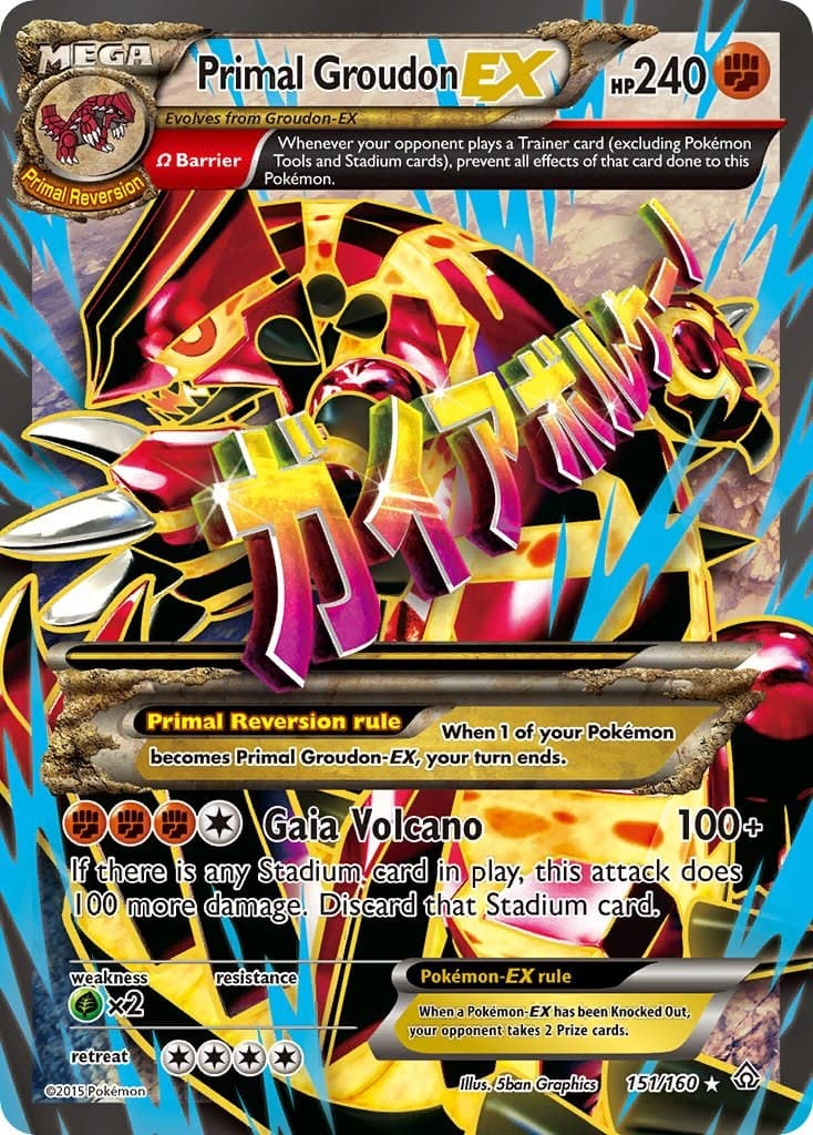
Ha ha! @A.P.Speeze I wouldn’t agree with all those EX, but I do love the XY Charizard Art Promo! The full art Kyogre Groudon Mewtwo. are nice. That Pika and Alakazam are also favs from that era.
hehehe this was my plan all along, I knew I was forgetting some. thank you. I lost on auction on that Charizard in Japanese ![]()
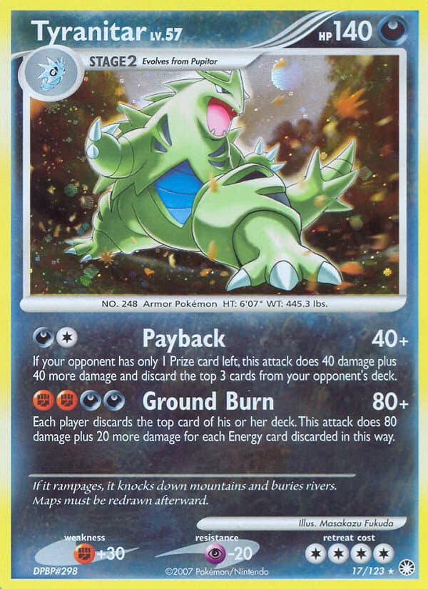
I wonder what would have happened if Yuka morii did the gold stars? I think Fukuda is a fine artist for them, I do however think that not all of Fukudas gold star artworks made it to gold star printings, take Tyranitar from mysterious treasures, you can’t tell me that isn’t a gold star artwork.
I’m not sure how widespread Morii’s art is received, but It would be interesting to see. I agree with that! I think the Play promo Dialga and Palkia card by him look like they could have been gold stars too. Guess they didn’t want to continue gold stars in DPPt ![]()
It would have been really neat if Pokemon would of had a different artist do each of the gold stars! By doing it that way, we could have gotten a wide array of unique style differences. Just imagine if we had Keiko Fukuyama with her cute Pokemon, Yuka Morii’s clay Pokemon, Komiya’s goofy and trippy style, Kusube with her early dark style, and Kusajima’s ability to add a dark theme to the Pokémon. There are so many wonderful artists with different styles they could have chose from!
I’ve thought about this a lot. There are plenty of gold star-esque cards that Fukuda illustrated. Here are some of my favorites.
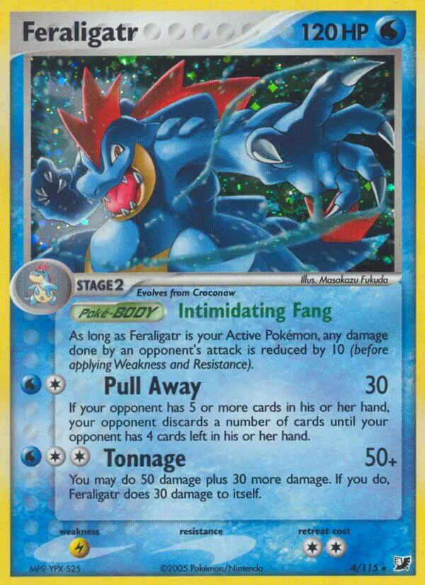
That Feraligatr is definitely Gold Star material, I know someone made a mockup of how it would’ve looked like.
One thing I’m almost surprised they never tried during ex is make those dots across the top and the left side holographic, that would’ve taken the gold stars to the next level.
The holo bleed gold stars have around the text box still reminds me of crystals. And im a big fan of the eseries border but without the actual ereader there isnt much point
Gold stars are some if the more subtle chase cards which i really appreciate
Agreed on the E-reader borders, they made sense when they had a practical purpose. They were glorious for as long as they lasted though.
I said “all” in my post above which was a bit too generic, didn’t bother to edit it. There are some instances where I like going beyond the regular holo format but it’s mostly just holo placement, like ex cards, SL and things like the Arceus cards. Not a fan of titles, symbols or extended art. But the Gold star layout is decent, no doubt.
I agree, the star icon though isnt super big and obnoxious. It also has relevance to the game which the random letters of ex, gx, lv. X do not. And isnt as drawn out as spelling out “shining”. plus the icon actually looks like the stars that pop off of shiny pokemon
I think the star does a good job of reflecting the subtle nature of shinys in-game. Same poke as always, just a different color that enters battle with a little twirl and beep to tell you that it’s not entirely ordinary.
Ultimately I think the illustrations mostly speak for themselves, and whatever needs to be presented on the card beyond that should be kept as minimal as possible. That said, I think they did a marvelous job with Magma v Aqua, and those are anything but subtle. But I think it has something with the utility of it. It’s not cartoonish or vague, it’s simply a matter of “these belong to Team Magma and Team Aqua, and they do Team Magma and Team Aqua things.”
I’m glad Fukuda doesn’t do many illustrations anymore. One of my least favourite artists.

Agreed, except for Shining Kabutops. I think the concept for that art is the only one that makes sense.