Very hit or miss. Their mass modern Vs are largely uninspired and blend together. Some of their early full arts, promos and cards like Victory Cup are bangers, and they do release nice new cards.
5 Likes
In regard to the modern trophies that 5ban has done; I will concede that even a blind squirrel will find a nut every once in awhile and those trophies look good. When an artist or group of artists are gifted such a large swath of commissions, it is hard to speak in terms of absolutes and say that “all 5ban sucks”. That said, I don’t think it’s unfair to say that they strike out most of the time and come across as lazy. Often, their card art is simply reused and repackaged with different color palettes. In short, I fucking HATE 5ban and think that if any other artist was given as many chances/opportunities at illustrating cards as 5ban does, they’d do a hell of a better job of delivering some absolute bangers than what 5ban has managed to bring to the table.
4 Likes
They did a great job with the BW shiny secret rares, the only thing they managed to get completely right. They also did a decent job with some of the regular BW cards, early BW full arts and some of the trophies.
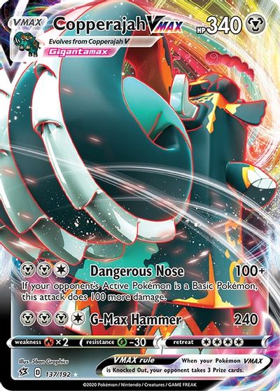
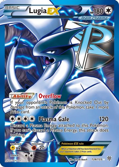
Modern EX cards? Mostly shit. Plasma cards? Shit. GX? Complete and utter shit. V and Vmax? Big lol.
The fact that this slice of moldy wonderbread is even considered a Pokemon, and the card an official release, is an embarrassment:
5Ban are probably the only artist in Pokemon where I both like and dislike a lot of their work.
One thing I would like to point out is that 5Ban is not a singular artist but rather a group of 3D artists from Creatures. Hence why you don’t see 5Ban anywhere but Pokemon and also why they have no website or portfolio like most freelance artist have.
Also explains why they get to do so many full art cards. lol
1 Like
I’m sorry what


1 Like
Ok, the Giratina is fucking sick, I won’t deny that. But I don’t like the rest of those. A few though, the Eelektross is great.
The pictures I used don’t do em justice, the texture is amazing
2 Likes
Ya I think the Plasma full arts look really nice for the most part but ONLY in person where the texture can do its thing.
2 Likes
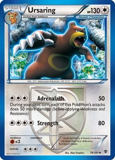
I will always love the Plasma set cards, even the non-holos. Plasma Storm, Freeze and Blast lean heavily into in-game events and locations which is something not many sets do (actually, most of the BW sets do this). Since 5ban Graphics designed all of the Plasma cards, it creates a feeling of uniformity across the set. This could’ve easily been accomplished by multiple artists building off the same ideas together (see the e-Reader sets), but another thing 5ban brings to the table here, at least for the non-holos, is their awkward animation - it makes most of the Plasma Pokemon look strange and foreign, which suits the “invading enemy” vibe nicely. So while objectively Plasma Ursaring or Masquerain look ugly, they fit well in context of the Plasma Blast set.
3 Likes
The 5ban graphics cards are mostly misses to me. I’m not a huge fan of the 3D stuff they put out, it’s almost always very uninspiring art.
I agree. They set the bar so low that everyone was hyped about any secret rare that wasn’t done by 5ban.
4 Likes
5ban has some amazing artworks (great examples earlier in the thread, like Mew and Ho-oh) but maybe even more horrible ones. I agree that the Eeveelutions you mentioned (main point of your thread) are yuge missed opportunities—although they’re about average and definitely not among 5ban’s worst, like Gyarados from Hidden Fates.
Makes me wonder whether it’s a team of people on which talent for designing Pokémon artwork is not evenly distributed ![]()
As a general matter, some of 5ban’s best is good only to the extent it emulates Ryo Ueda!
The Plasma Blast/Storm era had great cards. I do like the SWSH full arts, they’re simple: just a color background and a Pokémon. Not the most popular opinion, but I like them. They are over done though.
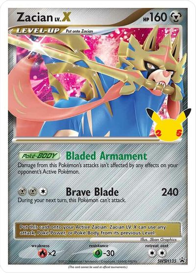
I don’t care much for a lot of their stuff, though I gotta say that the Zacian Lv X promo looks pretty clean.
While this is very lazy and I honestly feel 5ban V’s leave much to be desired, these aren’t any less lazy than “slap Sugomori artwork on a gradient” that some early WotC era cards were.
But at least then Sugomori’s work was good enough to support that.
1 Like
While I completely agree with your overall point, keep in mind that Sugimori was Pokemon back then, and at that time, we had no other Pokemon card artwork to compare it to (or really much Pokemon artwork in general outside of the few strategy guides that were around). If a set full of Sugimori stock art were released today, it would probably receive some pretty significant backlash.
Any card that 5ban graphics can do, nearly any other artist can do better.
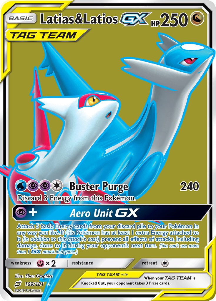
Take for example, Latias&Latios GX from Team Up.
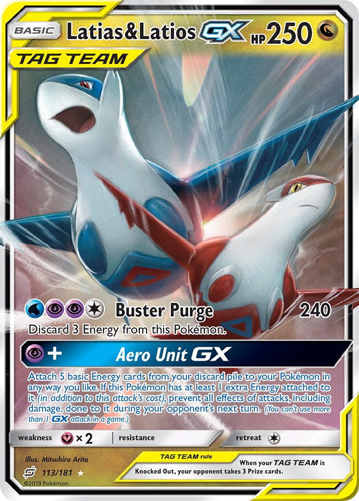
Personally, this is one of my least favorite Mitsuhiro Arita cards (maybe due to the odd proportions/mouth on the Latios), but there’s still a lot of dynamism in the art, the angrier expressions are a nice contrast to the soft and romantic art of Sanosuke Sakuma, whose art feels inspired, like it wasn’t just this phoned in “draw two pokemon” type drawing
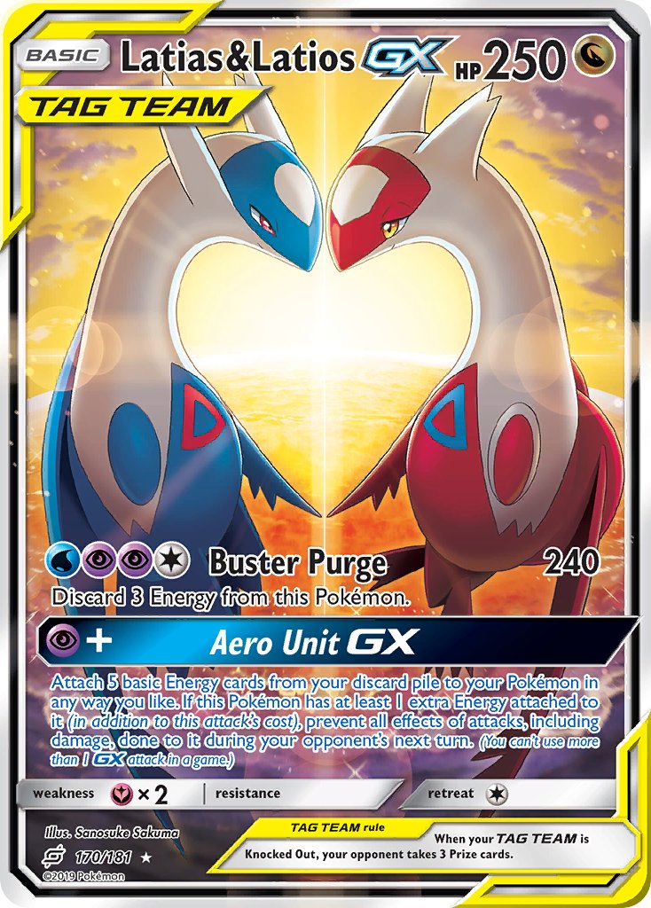
Compare either one to this:
It’s not even like 5ban doesn’t have some decent-looking cards – a monkey flinging shit at the wall is eventually going to produce a Pollock – but their cards have very little identity outside of being 3D. The Sun&Moon era and its single-color backgrounds is especially assaulting to the eyes and is a weird limit to instate on creativity. There’s a reason why the Tag Team era art was such a step up – it ended 5ban’s dominance over higher tiers of rarity.
5 Likes