Damn, this is such a good topic because I don’t like the majority of my favorite Pokemon’s art but I’ve never thought about which one is my least favorite.
This is the first one that came to mind (especially considering the price). I have to assume there is far worse if I think about it longer though
This Typhlosion ex. I think objectively the two Typhlosion Prime from HGSS are worse, but when you have this ex alongside the regular holo Typhlosion from the same set (which is incredible and my favourite Typhlosion ever), it’s so much more disappointing by comparison
I don’t love the Sandstorm Typhlosion that much either, so it feels like they just missed an opportunity to make a really cool Typhlosion ex during this era
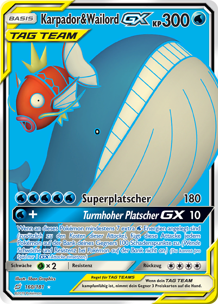
But aside from that Wailord’s debut card is a big disappointment, apart from being stock art, they couldn’t even give it a proper background that fits it.
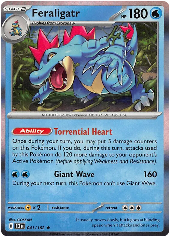
The Temporal forces Feraligatr just doesn’t do it for me, the cartoony style feels off to me and there’s just not much interesting going on in terms of his pose or overall art.
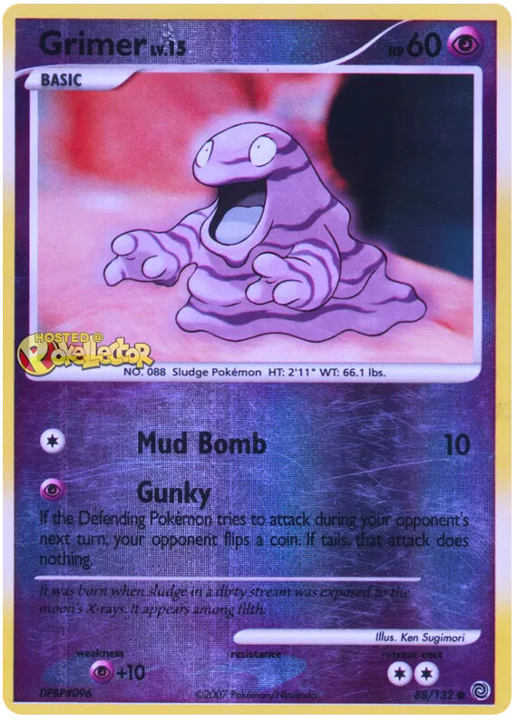
For grimer, this one from secret wonders feels very generic. The background is very weirdly out of focus and the pose is super-generic. It was close between this one and the aloan ones which I also dislike, but at least the Aloan grimers have a tiny bit of effort put into them.
This card reminds me of a little diorama turtle habitat with sand and rocks in the background. I am biased because I had a turtle I always called Squirtle as a kid. I like it a lot, but I would definitely prefer a different angle and maybe pose.
I guess Seviper doesn’t really have bad artworks. So I go with the shiny one, since I like backgrounds of artworks and this one is basically lacking one.