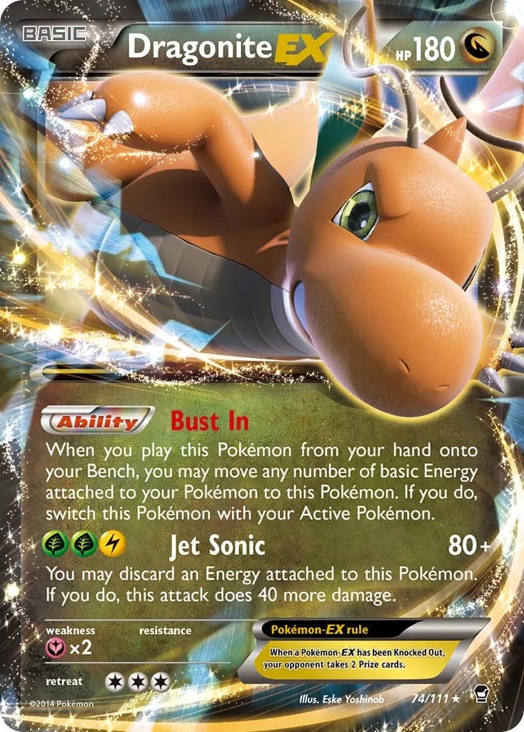
The worst Yoshinob, quite a feat. The longer you stare at it the worse it gets.
4 Likes
You know your favorite artist is amazing when the only card you can say something about is the card when pokemon looks too “normal”. ![]()
![]()
It’s garbodor and I wish Aya Kusube used her skills to draw it in a weird or unsettling way like back then when she used to draw pokemon having existential crises.
(but if you squint your eyes i guess you can pretend that Garbodor is flipping you off so once again it’s a cool Kusube card!)

3 Likes
I’d definitely place it as 3rd worst. But I actually like his head and pose in this one despite the weird cgi look.
This card in Korean is a banger
I think the forcing the pokeball to be perfectly front facing is also making the art feel weird. Especially for the Arven one, where the other items are just in complete chaos from falling at different angles from the table. Having the pokeball face you in the most perfect way just looks unnatural, like it doesn’t belong in that scene.
The Penny one also looks weird to me. I think I understand the posing and what the different depths/layers should be, but I think the foreshortening or whatever signals we should be using to gauge depth are just off. Like, the change in depth that the art wants to portray doesn’t justify or align with the size change in the hand. Again, the core of the issue is probably the forced size and angle of the pokeball.
1 Like
Oh jesus that puckering mouth
Interesting. I always liked this one because of all the foreground action. It creates a really good scene. BUT You’re right! Bahaha! That is one gurthy-dos! I’ll never not see it. Still like it a lot though.
Because Garbodor often has one pipe or cable sticking out of it’s R hand, it always looks to me like it’s giving us the finger. ![]()
2 Likes
Sure sure, just poking around a bit ![]() Can see your argument, but honestly, for me personally, the best card komiya has ever produced. a real pokemon acid trip!
Can see your argument, but honestly, for me personally, the best card komiya has ever produced. a real pokemon acid trip!
1 Like
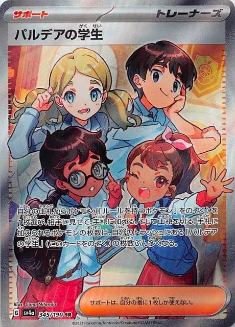
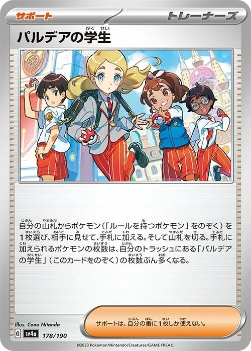
Anyone have any idea what the posture is of the kid in the top right?
The rest are pretty clear but I haven’t a clue how that kid fits into the picture. Is he leaning on a table? Where are his pants? Where is his body?
Compare that to the girl on the left who is just standing up.
I’m not an artist, but it just looks wrong and I wonder how it gets through multiple revisions.
The normal artwork also has the kid contorted like this:
2 Likes
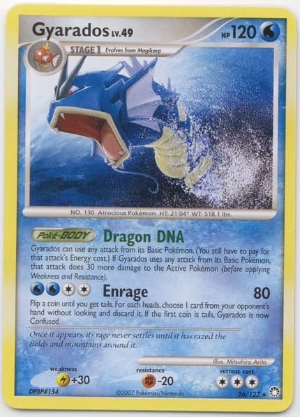
Im sorry but call of legends is the worst gyarados art! Not a huge fan of platinum or the eng only xy promos despite them having the shiny on them.
3 Likes

2 Likes
I think you’re right, he seems was originally planned to lean on a table. My theory is that the artist changed their mind but didn’t want to discard an already established pose (since it requires time, work, and often you simply like how it turned out)
There’s indeed a bit of cutting corners obviously, but it’s ok enough to showcase characters imho thanks to an abstract background and a bit of fantasy in placing them. I’m not always a huge fan of this kind of cards though.
Once an illustration breaks immersion, or rather, once I realize it, then it’s hard to like it because I can’t unsee it.
And given that we’ve now seen two interviews with Pokemon illustrators and how many notes TPC gives them on everything, it makes it even less forgivable when crap art comes out.
AKIRA EGAWA
Atsushi Furusawa
Approved art…
3 Likes
Something is definitely wrong with this Squirtle but it’s not that it doesn’t look like the head is attached. It’s that there is no black border around his head, so it looks more like a skull.
Personally, I was loving the Lugia V 186/195 artwork until I noticed the ass. It looks very wrong because it looks like it has 3 segments (left high, tail, and right thigh) when it should be connected smoothly. The light/shadow effect on the tail isn’t intuitive to me either. It’s ruined the art for me quite a lot. I don’t want to own my card anymore lol
2 Likes
In case anyone says we are artist-bashing, we are not. Abit of constructive criticism will go a long way!
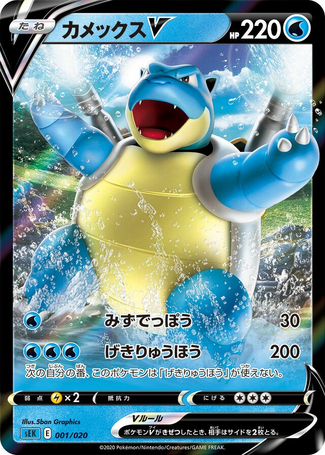
I dislike those 3D computer graphics of modern FA cards by 5ban Graphics. So much so that I developed a dislike for FA cards generally and favour AAs.
2 Likes
The ass is prob the main thing that bothers me. Also, I don’t know WHY I didn’t post the cards side-by-side for comparison, looking at my edit I forgot what the original looked like until I googled it again. Here’s my edits with the originals next to them so it’s easier to see what I changed:


I should find a couple more cards that I wish looked different it’s pretty fun to do these paintovers.
8 Likes
It’s not who has done something first, it’s who has done it best
(ie) A night to remember is a good Titanic film. Titanic 1997 is a great Titanic film.
2 Likes
Hope fans who collect 1st edition cards are reading this