Being neckless is extremely useful for Jiu Jitsu (to defend chokes) so if anything this is a bonus.
Oh wow I never read that. Then yeah, I have no idea how they thought that was okay. Very strange, they seem strict about the model and even the colors (even if the colors should look differently due to lighting…).

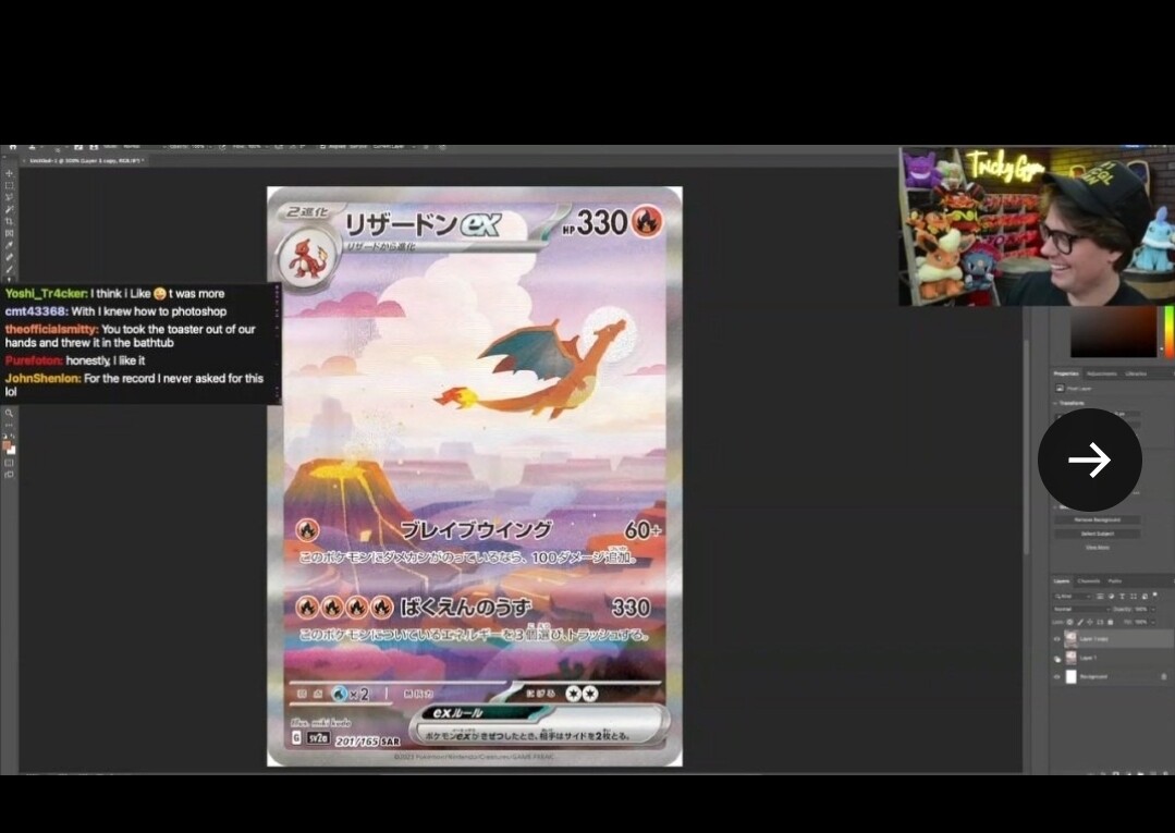
Am i really the only one who likes the zard a lot even though i normally don’t find zard cards very interesting anymore O_o
1 Like
I don’t mind the card I think the scene is calming and aesthetically pleasing. Didn’t even notice the neck.
1 Like
I need to bump this thread because of these:
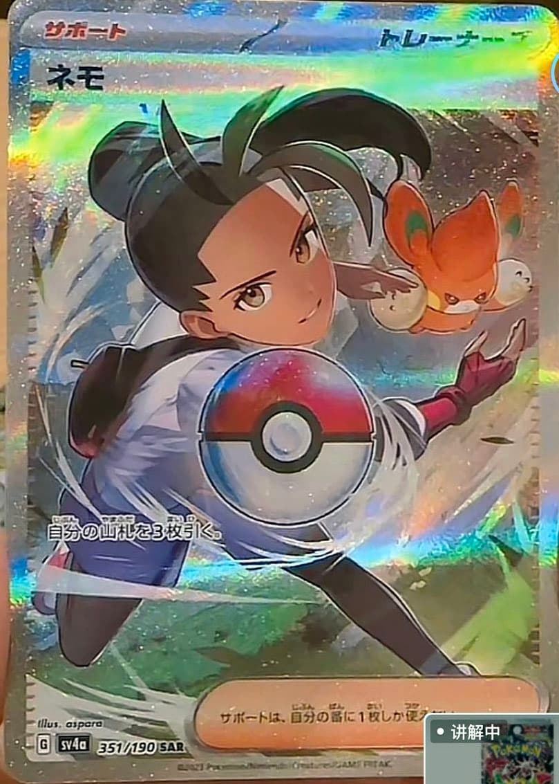

The Nemona is probably the best but even then, the focal point being the Pokeball is dumb and off-putting.
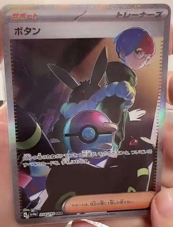
The Arven makes no sense. The motion is down and rightward due to the table cloth moving in that direction, yet there’s a sandwhich flying up and in the opposite direction. The Mabosstiff is meant to be the cause but actually is doing nothing at all to contribute. The size of the ball and the Mabosstiff’s head also do not jive. Really, all that can be seen is forced art direction from an incompetent art director or worse, a random executive.
Then you have the Penny. How exactly is she able to hold the ball? Where is her arm? What kind of finger grasp is that? What angle are we actually looking at? Why does it not make sense with how the Umbreon is part of the art as well?
How were these approved? Awful.
6 Likes
As someone who isn’t normally a big fan of full art trainers, I actually like the Arven a lot. Perhaps I’m not as analytical with the physics of the art, but I think the perspective is unique and eye catching. I also like the Nemona compared to the boring FA that we sometimes get. The Penny is definitely a little weird, but I’ll reserve judgement until we see the full quality scan.
The Penny is her right arm, the top right finger is the pinky. It makes sense once you see it.
2 Likes
She’s basically holding the pokeball the same way I hold a baseball before a pitch.
4 Likes
Fellow baseball player!
2 Likes
Yep, but isn’t it still too big? It’s at least twice the size of Umbreon’s head which it’s next to.
1st layer: Pokéball
2nd layer: Umbreon as it walks out of frame and Penny looking back
Her arm extends outward through both layers
The pokeball is the front of the frame and the Umbreon is a couple of feet into the frame. Eeveelutions aren’t the biggest in size, Umbreon is only 1 meter. With the frame depth differences, this makes sense
how can you choose the best art komiya has ever produced as an example for the worst??? ![]()
1 Like
haha. ![]() I can see why people like it, but In my opinion, it has very little cohesion. It’s wonderful colors and well… IDK what all that stuff is supposed to be. That’s my problem. That’s why I gave the other examples there. voltorb has no shapes, just shading in the background. Jynx has lots of shapes, but you can still see that there is a foreground and a background, and a subject. For me, I want to be able to understand the scene, and here I got nothin. My Opinion and feeling on it.
I can see why people like it, but In my opinion, it has very little cohesion. It’s wonderful colors and well… IDK what all that stuff is supposed to be. That’s my problem. That’s why I gave the other examples there. voltorb has no shapes, just shading in the background. Jynx has lots of shapes, but you can still see that there is a foreground and a background, and a subject. For me, I want to be able to understand the scene, and here I got nothin. My Opinion and feeling on it.
1 Like
The ball seems to be too small for the vanishing point as well. I feel like this was an exercise “See if I can illustrate a scene around a pokeball centered in the scene.” While I like the texture and shading, and action, these do feel just off… It’s a details thing. When you’re really perceptive of the details you start to feel an uncanny awkwardness.
I think the sandwih is one part that’s OK, because it appears it was knocked upo and out of her hands. haha. Yeah, reading your comments and noticing these are different artists… definitely what I said first “Let’s make scenes around a static pokeball! It’ll be cool!”
Stretch Armstrong-Penny
Best for last. I think Nemona could have been saved easily by making her further away. Like the ball had travelled farther, OR make the ball bigger, but it appears they all “had to be” the same size… ![]()
that voltorb artwork is hilarious, might have to pick that one up
My favorite Luxray card getting slandered ![]()

