I love the e-reader holos from R&S - Dragon (and the two secret rares from TMTA) irrespective of their value. Some of the best artwork in the TCG.
After that I’ll agree regular holos feel less special (with the exception of the delta species - tho reverses are preferred). Even then, much of the ex era artwork is still gorgeous to look at.
Oh I do too. Literally my favorite things in the whole hobby. Early ex isn’t as bad a discrepancy as later sets even but it definitely marks the start of holos erosion. I’d argue shinings and crystals were more in line with just being holos, they didn’t look too different. But ex made it super super clear what the “cool” cards are. After that we got all kinds of stuff to the point we are at right now with tyranitar with a big ass lightbulb on his head
I totally agree, and I know Exs were the nail on the coffin.
But for me it’s something different from the value or desirability: I just miss rare cards meant to be holo, and that original sparkle really complementing the art. After HG/SS they became so muted, it’s totally a different ratio between the holo and the background.
I think it could be possible to resurrect a chase regular holo if it met certain criteria. Good art, popular character, COSMO, and then implementing a little extra flair. The way the holo can be seen around the cards text and outside of the art frame on cards like crystals and gold stars goes a LONG way. Pair all of this with a good colour scheme, quality printing, and some good ol’ fashioned manufactured rarity and you’ve got stonk/hype city.
i love the sun moon holo pattern in Japanese, it just clicks well due to the way the holo reaches the border but sadly feels super lackluster in English.
I do collect technically worthless holos that are not the top chase cards. Sometimes I buy 1 or 2 packs to try my luck and I keep the holos if I like the artwork.
Edit: Some of the worthless holos from my collection (not worth but got ):
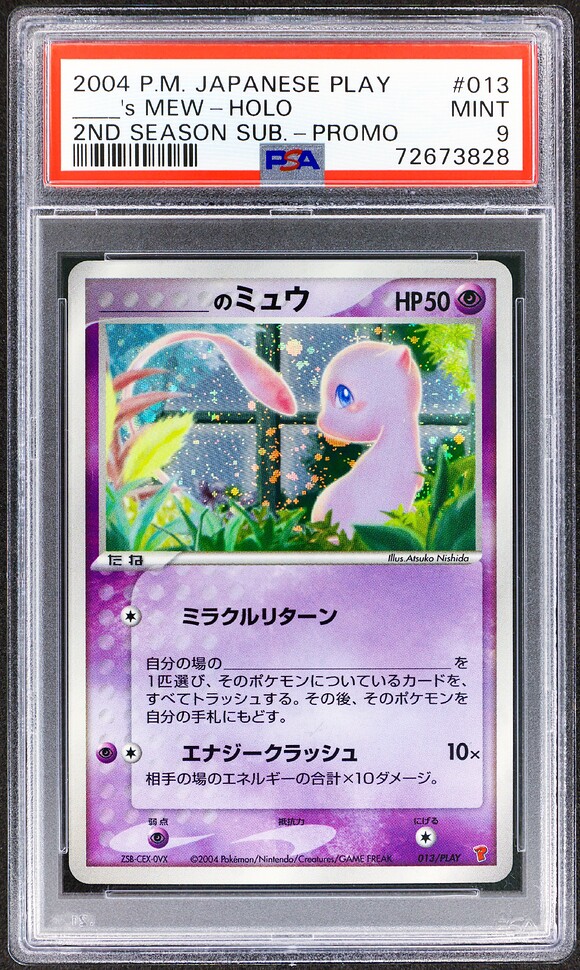
-I don’t like the general composition of the art in this case, too static and flat for me. I would say also unbalanced , but it’s just a feeling.
-The window (?) behind seems here just to fill the background and out to place in my opinion.
-not the best Nishida work (imho, totally subjective), can’t feel her typical “glowing” effect.
-the mew has a weird anatomy/perspective, the tail seems disconnected and the head almost human-like, round and bald I would say lol. I would have appreciated some limbs showing up and giving reference points.
Me on autopilot about to like this post thinking it was in appreciation of this card before realizing I’m in the unpopular opinions thread and actually reading the post:
Agreed that this is indeed an unpopular opinion, but glad we got to hear your thoughts on the card!
If you can pay for the card or the set separately, meaning that they are on sale, they should not be considered as Promo cards.
The most popular ones guilty of this (as examples): The Vending series set, McDonalds e-minimum pack, PokePark files, The World Pikachu Collection etc. I believe these can be considered as special sets but not as Promo cards.