My understanding is that the border is basically one thick, solid yellow layer, not multiple. It’s called a “spot color” (in contrast with a “process color” that is made up of CMYK dots that you see on the rest of the card). The other spot color used is black, which makes the text solid among other things.
Should note that I’m talking about wotc cards specifically here.
The overall gloss of the card is actually a thin layer they spray on right at the end to give the cards a mild matte look. I believe i remember reading somewhere that it also helps prevent sheets from sticking together but don’t quote me on that
Indeed i assume info on old cards doesn’t necessarily apply to newer cards because of modern printing machines or techniques. I am slowly learning about the rosette pattern so i kind of understand it all. Just need some time to digest. Hahaha
Also for the gloss i was thinking about the variations in this thread and that it maby could have something to do with the borders.
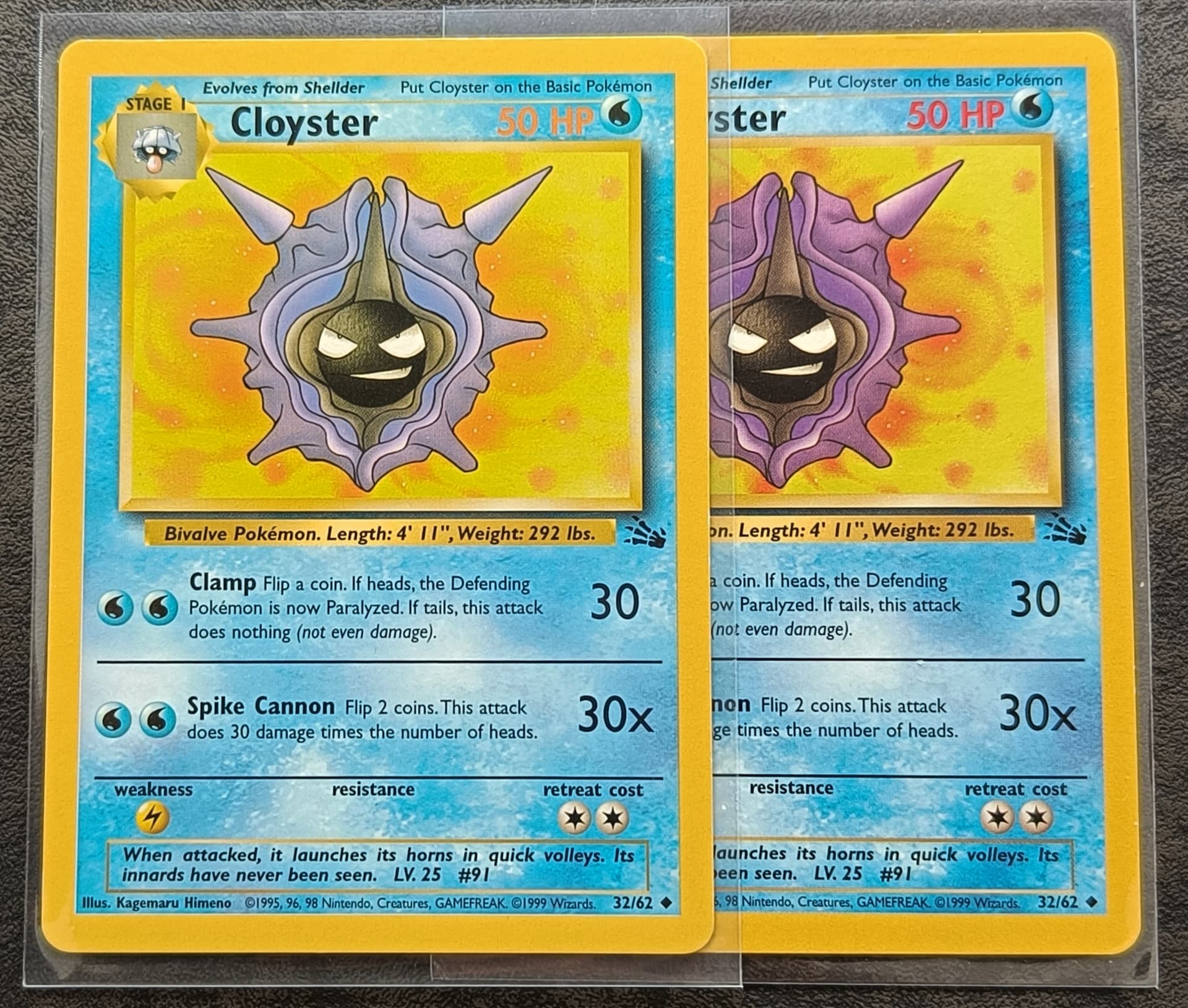
Here another of my error cards. (Low magenta ink cloyster) (repost from my collection thread ^^)
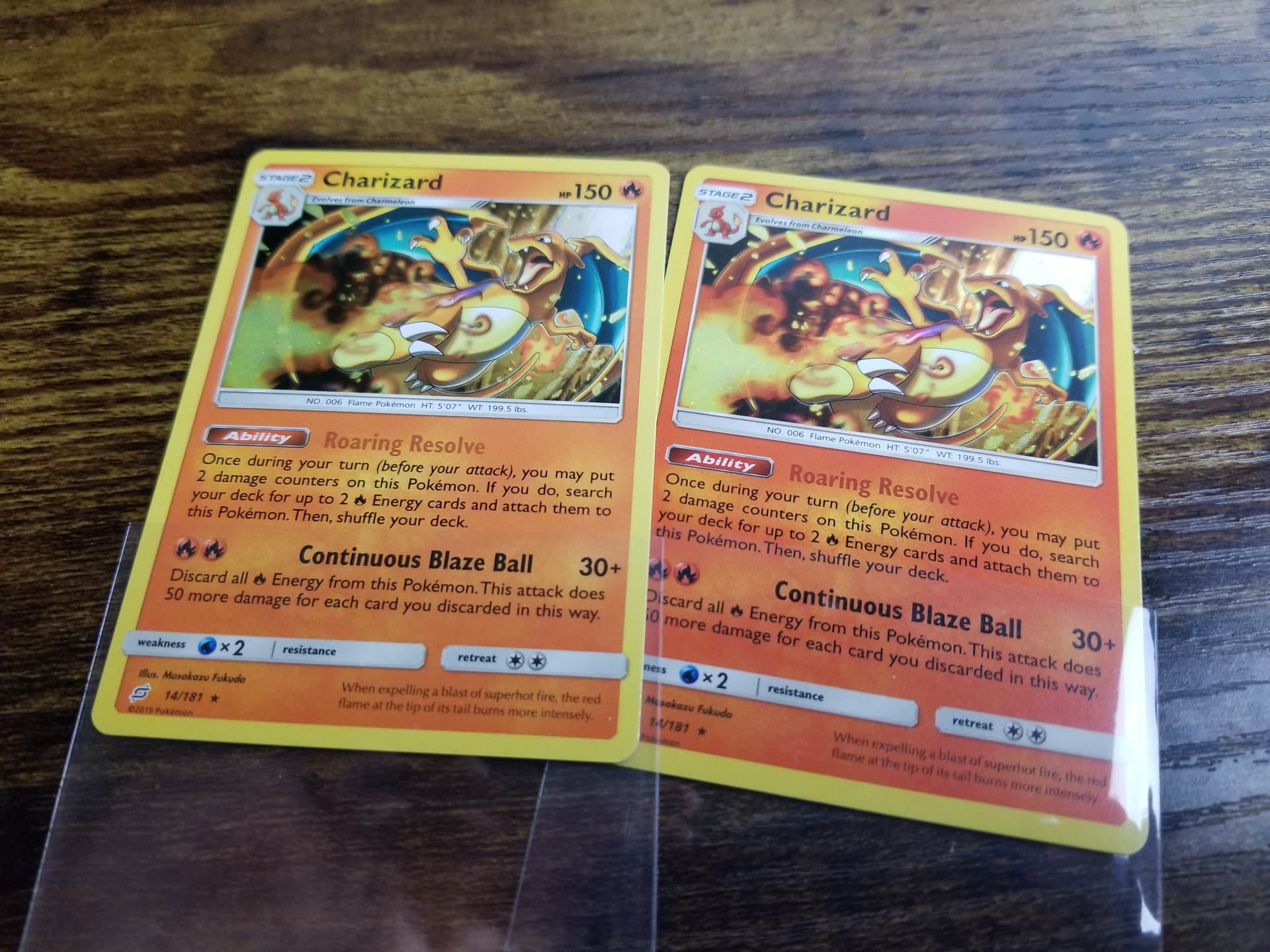
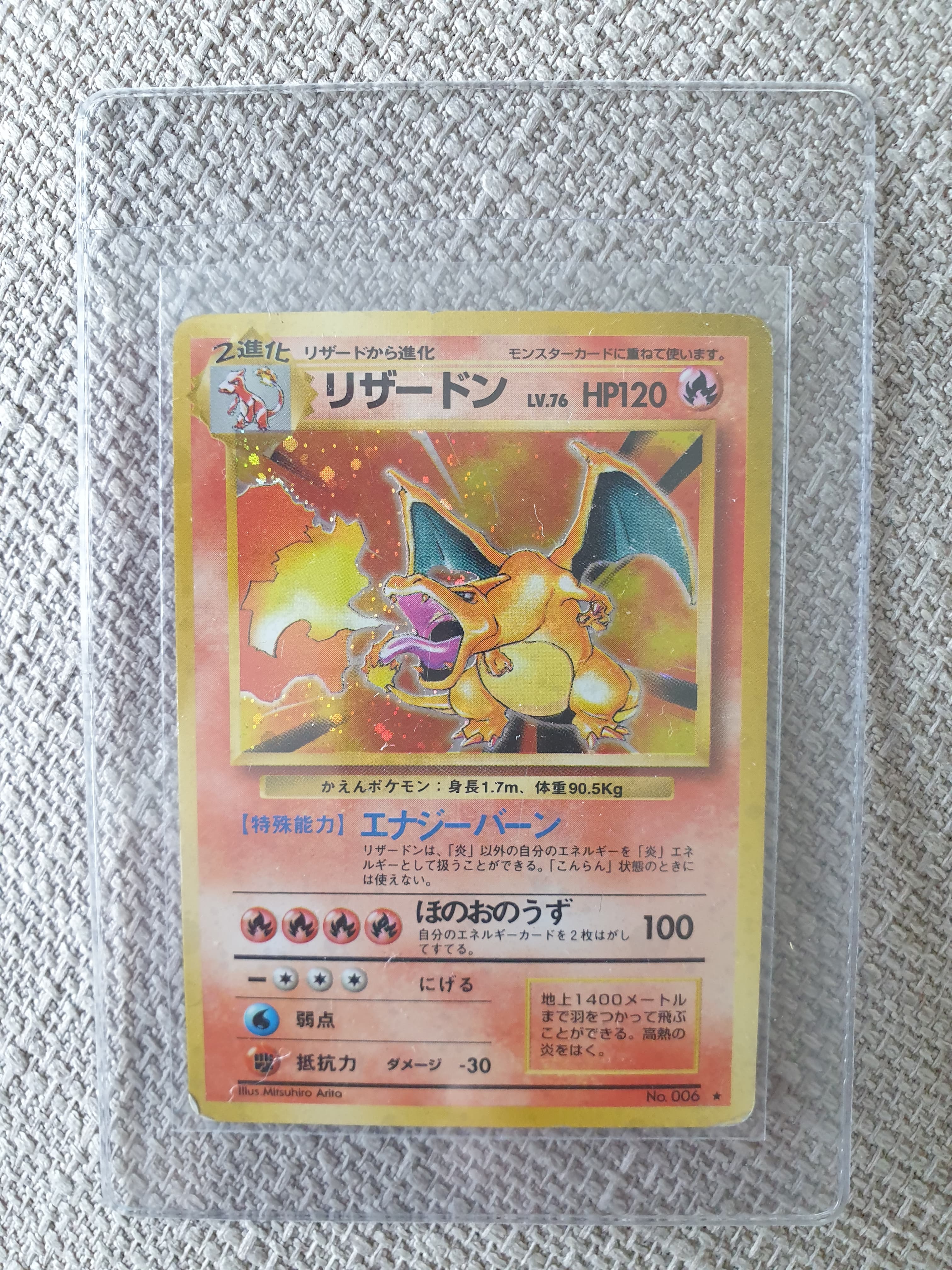
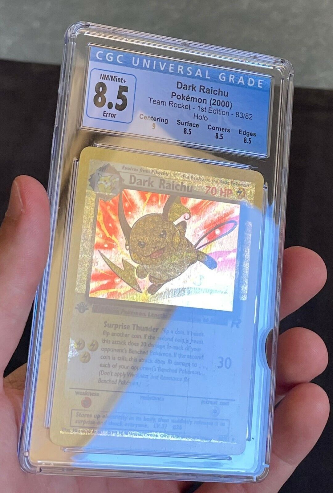
Would this left charizard be considered a ink layer missing type thing like that cloyster? Ive seen a lot of these but idk what makes them official errors. Yes it is real and it just looks very orange while the rest look red. Its almost missing shadows on some text too. Not aure what it is here. I have a large sample size of the red ones and just 1 orange.
Left one indeed looks more orange so it could be something similiar but i’m hesitant to give you an answer because my knowledge after the wotc era is very small and i don’t want to give bad info.
So, this are a few error cards I have. First of all, my first pulled crimped card from a pack, and I really like the artwork so for me this was definitely a hit
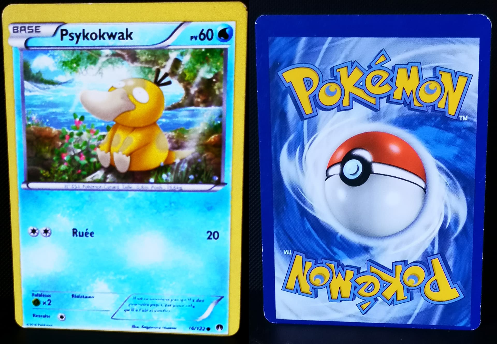
This is just a simple miscut or extreme outcentering, but is a (french) Psyduck so it’s a nice piece of my collection, even if it’s not in good shape (specially on the back)
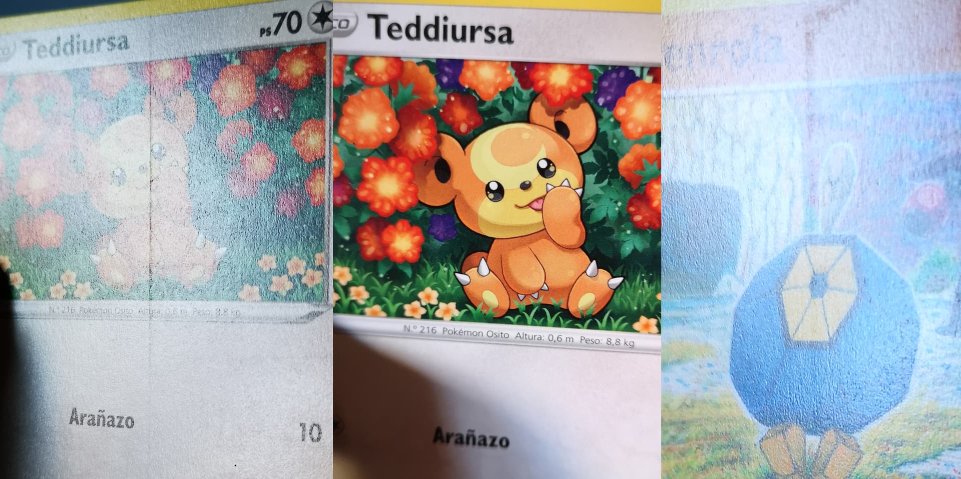
Also, I dont know if this is a known error (definitely I dont think it’s common since It only happened to me in one booster pack, from all the boxes I opened): printlines in not holo cards? I have like 5-6 like this, and they all were from the same pack. Apparently look fine, but when I check them with direct light…
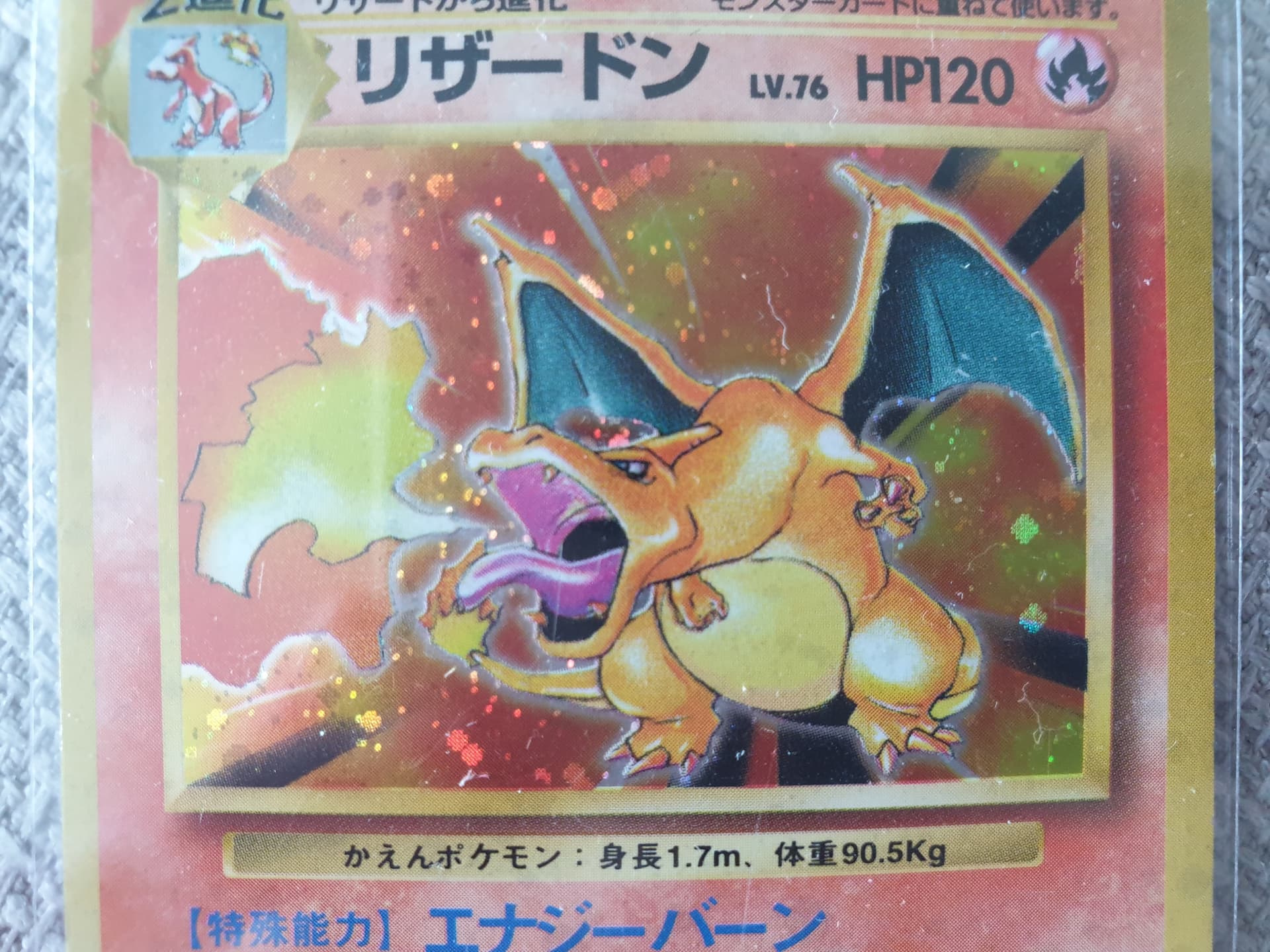
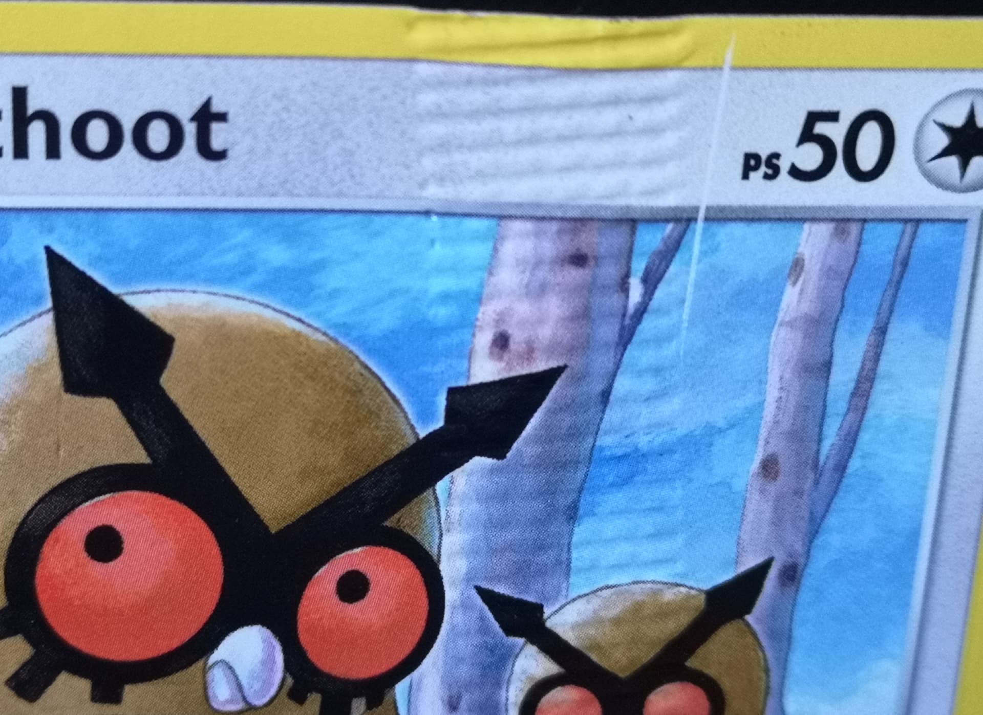
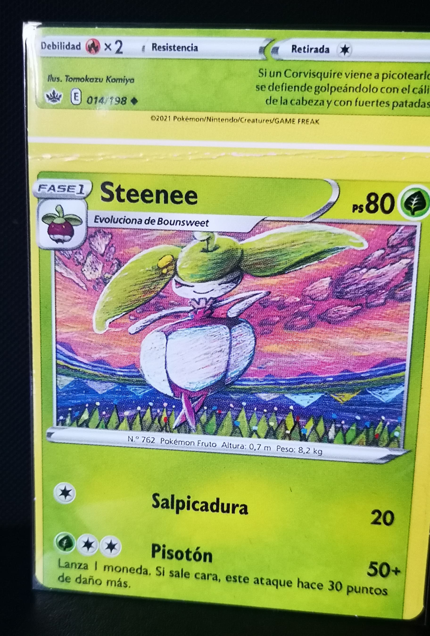
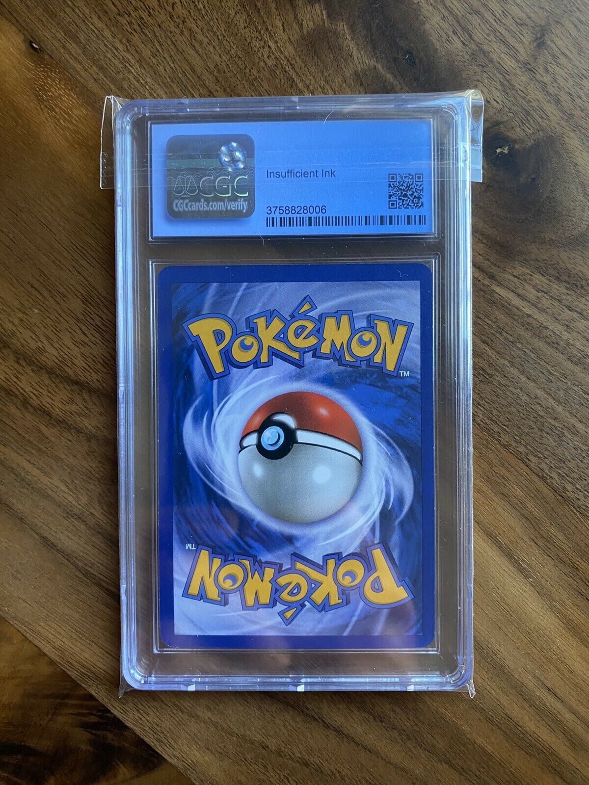
Is this an insufficent ink error? I could have sworn i saw one graded by cgc somewhere but i cant remember where. I remember they labeled it an error of sort but i dont remember what
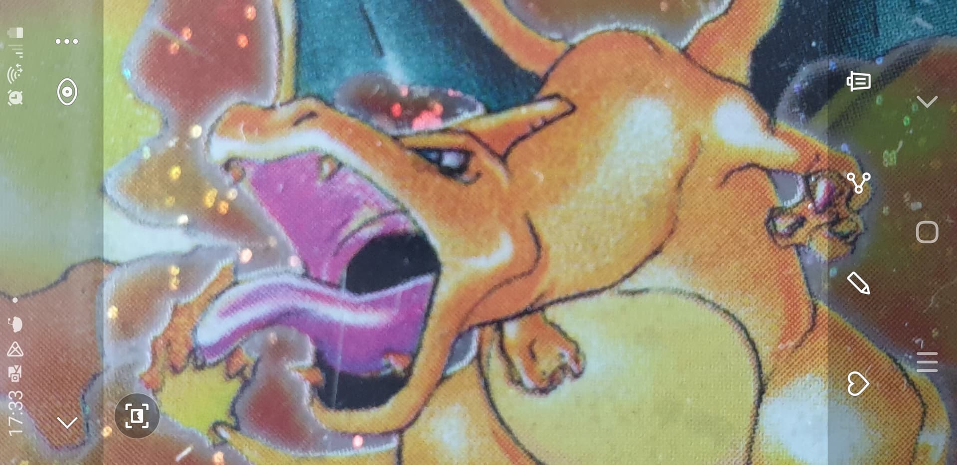
Noticed I had a Go Venusaur holo with a streak of additional ink on the back (behind top Pokémon logo). The shading on the letters is also darker near the streak.