
6 Likes
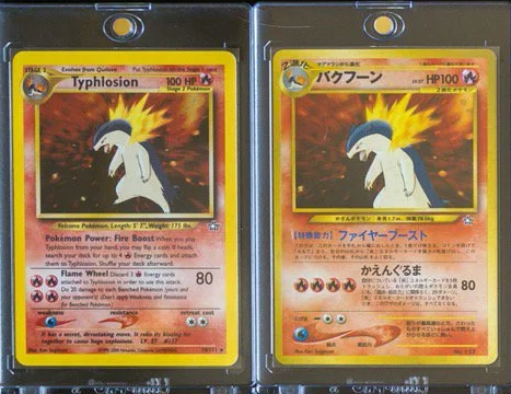
TIL that the Japanese T18 Neo Genesis Typhlosion artwork was zoomed in, in comparison to its English and international release:
Greetz,
Quuador
12 Likes
@quuador
Feraligatr 5/111 is also smaller in japanese version, in other hand Meganium 10/111 has less space around it in english version ( almost looks like it is standing over artwork window ).
Seriously by the time we reach 50th anniversary year the Feraligatr has been reprinted and zoomed in so many times there’s only mouth/tongue left in final product.
2 Likes
Yes the difference is easy, USA ones are thick paper, the EU ones are thing and they look thin. I dont’know how to post pictures.
1 Like
Only found out a month ago that greninja’s scarf is actually its tongue, completely blew my mind.
5 Likes
This may be common knowledge but it seems to surprise a lot of people when I share it with them. Not quite a “TIL” but interesting trivia nonetheless.
Dark Exeggutor from Neo Destiny prominently misspells the Pokémon’s name as “Exeggcutor”:
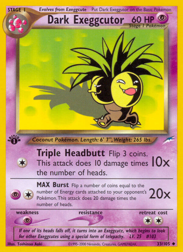
WotC had famously spotty quality control and they were really rushing to meet release schedules around this time. This card leaves a strong impression on me as the most emblematic of needing to just get it out the door. WotC made lots of little mistakes over their years, but getting a Pokémon’s name wrong like this is the most egregious to me. Although perhaps that’s rather anglocentric of me since other languages fell victim to this sort of thing too.
11 Likes
The English side only recently started adding 0’s to their set number to fill in empty spaces if the card isn’t in the three digit range (like 005/147) in Sword & Shield, which the Japanese already have been doing since the VS set in 2001.
3 Likes
Most likely well-known but new for me, but today I learned that Dark Pokémon have darker artwork, evolution, and Pokédex boxes than default. And Light Pokémon have lighter artwork, evolution, and Pokédex boxes than default.
To quote from the Bulbapedia pages:
Here three Neo Destiny Fire Pokémon: a Dark, regular, and Light Pokémon, so we can see the difference in the box-borders:


Greetz,
Quuador
9 Likes
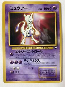
I was flicking through my binder like one does. I then noticed this:
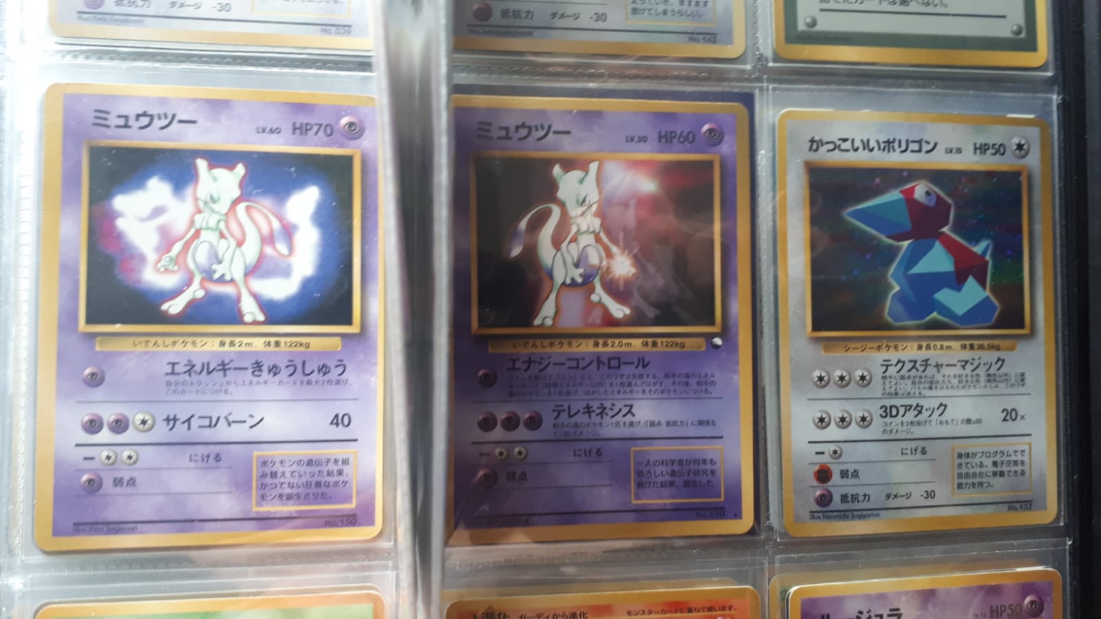
The Mewtwo from the CD and the Mewtwo from the Pocket Monsters fan book are the same art but just a mirror image. I guess I knew they were very similar but I only actively noticed they were the same when I was looking through the binder.
Here are some better pictures:

9 Likes

For real? That make me appreciate that art even more if so. Where are the deets on this?
2 Likes
Time to revive this thread with two things I learned today.
- It’s reasonably well-known that Ekans and Arbok are Snake and Kobra backwards (and Muk backwards of course…), but today I learned that Rotom is Motor backwards.

- Girafarig is a palindrome, just like the Pokémon itself kinda is.
Greetz,
Quuador
6 Likes
I’ll add another e-Reader fact to the ones already mentioned in the first post!
On Holo e-Reader cards, the e-Reader dot codes were replaced with bars of Holo stripes matching the background for that Pokémon’s type. However, on Aquapolis Holo cards only, the bottom stripe of the vertical dot code replacement bar lacks the Holo effect entirely. For whatever reason, it appears that this one stripe was printed over the Holo layer alongside the non-Holo body and frame of the card - for every Holo card in the set. The fact that Aquapolis was the middle set of the e-Series expansions and neither of the other sets contained this error makes it even more of an oddity.
2 Likes
TIL that the POP1 Rayquaza holo has two different variations: ©2004 and ©2006 (where 2006 seems to be the more common one to find).
Here a non-holo, holo ©2004, and holo ©2006 side-by-side:


Greetz,
Quuador
8 Likes
I can be wrong, but those holo cards released way later than the original POP series boosters. So than 2004 one looks as a “mistake” to me.
2 Likes
Just looked on Bulbapedia, there is a claim the 2006 is rarer…
I really don’t know.
1 Like
The term “Gold Star” is fan made. ![]() is rarely written in words and often shown as ☆. However, in the tcg manuals it is written out as “Star” as in “Latios Star”.
is rarely written in words and often shown as ☆. However, in the tcg manuals it is written out as “Star” as in “Latios Star”.
From Clash of the Blue Sky (EX Deoxys) manual:

Translated:

7 Likes

TIL the reason that Arcanine is the Legendary Pokemon despite having no lore tied to other legendaries in the pokemon universe.

The flavor text above reads:
A legendary Pokémon from Chinese legends. It is said that many captured it for it's beauty.
This piece of flavor text and it’s designation as the legendary pokemon is likely what contributed to this scene in the anime conflating Arcanine with the legendary bird trio

7 Likes
