Lol it reminds me of the cosmic eclipse trainer cards that are apparently “Grails” these days
3 Likes
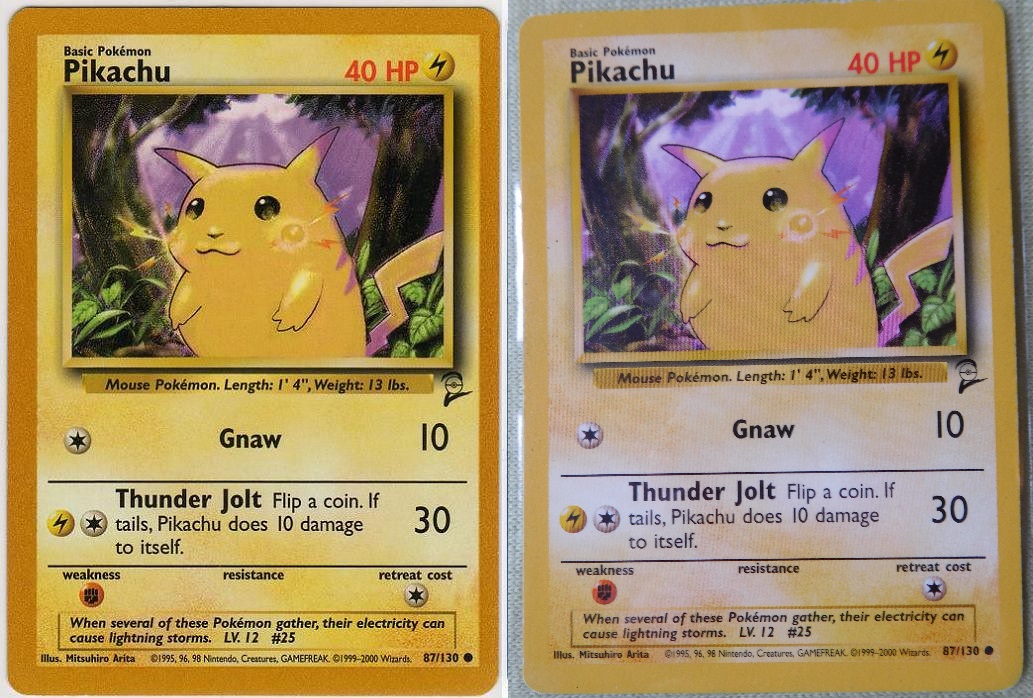
Also get that copyright date out of the border! Dafaq
1 Like


5 Likes

To be fair Ive always thought any border looks great, but is dependant upon the clashing color scheme of the artwork itself, and even then most cards pull them all off really well.
1 Like
Although I do really like these:
Red Flare borders:

Blue BW era borders:

Red Trainer Deck A/B back borders:

I think that if every card’s border would be red or blue instead of yellow, I wouldn’t like it as much.
So I go with the black V border. Black borders overall look pretty good on almost any card. And like the frame of a painting or photo, it emphasizes the inner card/artwork:

With the HGGS era borders as a close second:

I also like some of the misprinted variants. But mostly because they are misprints. ![]() If all borders would look like these, I’d likely hate them instead.
If all borders would look like these, I’d likely hate them instead. ![]()
Golden borders:


Dark blue back borders:

Holo border:

Greetz,
Quuador
9 Likes
Cosmos blue borders. Being limited to a handful of cards illustrated by 5ban in korean doesn’t exactly make them a widespread success but these do look fucking sick.


11 Likes

BW gold borders are my favorite because of the way the texture catches the light. They look amazing in person and in a slab. It often will catch my eye from across the room and I’ll walk over to my display to marvel at the border design

8 Likes
I thought this card was fake at first lol.
I have to echo those that said the HGSS borders. IMHO, they were unrivaled as thematic aesthetics that enhanced the art rather than detracting from it.
That being said, I do believe the SV era shift to silver borders has been for the better compared to SWSH at the very least.
3 Likes