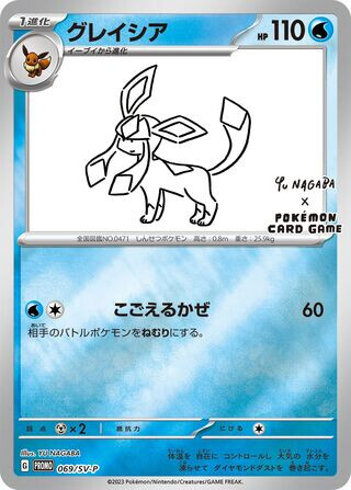
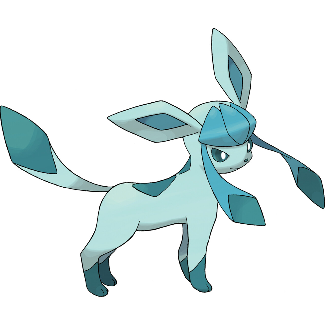
I thought the Yu Nagaba Pikachu was a neat card, but the same artstyle does not lend itself well to the Eevee line in my opinion. Additionally, the art on the Glaceon looks like a trace of the official Sugimori art.
5 Likes
Got few nice cards to add in my wants list from this thread ![]()
1 Like
Wow what a difference in artwork! Can’t go wrong with Kawayoo
3 Likes
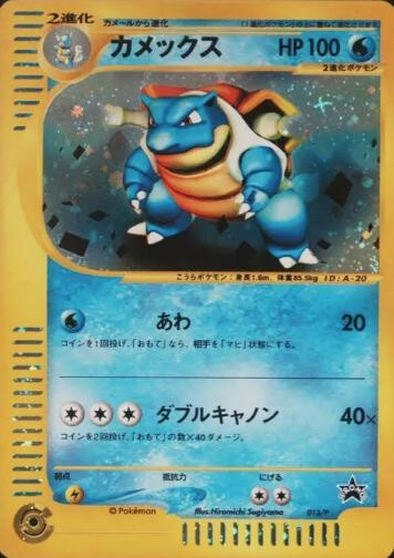
Black and white had some amazing full arts but possibly the worst looking basic ex style cards ever.

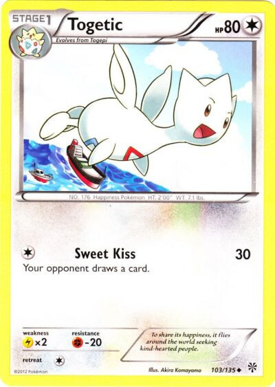
Togetic has really strong artwork. This is the only one that doesn’t do much for me. It doesnt have that cute factor all other togetic cards have. More Chin please!
2 Likes
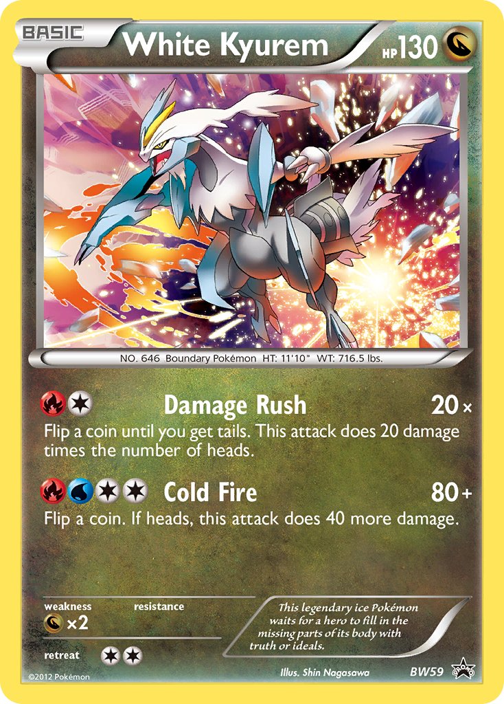
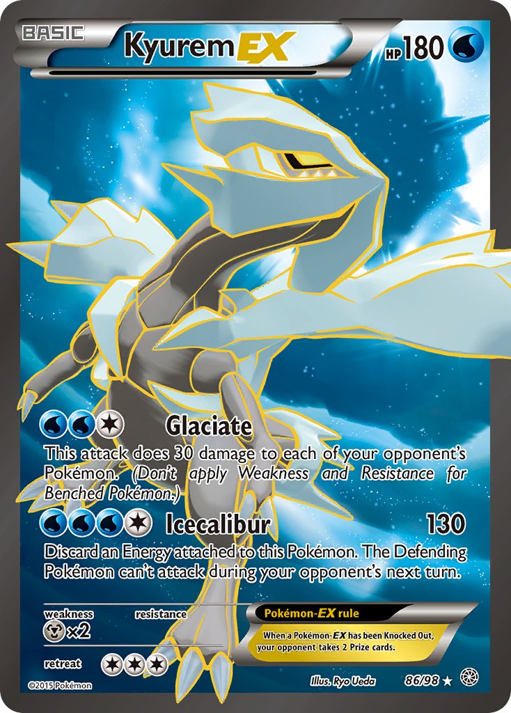
Sorry to be frank but I hate anything Shin Nagasawa does with Kyurem, or any Pokemon really. Super super bad proportions, underwhelming poses and awfully amateur airbrush shading. I have no clue how he was given the go-ahead to make the Boundaries Crossed booster art, let alone these promos.


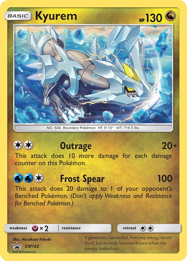
Honorable mentions go to the Masakazu Fukuda Kyurem with the tiny wings and incorrect shape of its face, but I’ll definitely admit it’s by no means an easy mon to draw.
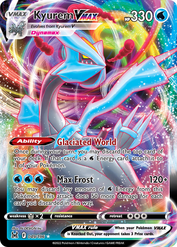
…and also the Lost Origin Kyurem Vmax. Just has a very saggy belly, upturned tail, elongated/emphasized neck, and ice that almost looks melty and smooth. Very bizarre card.
2 Likes
Very warm welcome to the forums @pobennington. Nice of you to post and give an interesting perspective. Do you have a favourite Kyurem artwork in card or other media or know of any other artists who do a better job of portraying the Pokemon?
Again, thanks for sharing your thoughts.
Cheers!
1 Like
Thanks for the warm welcome! I would have to say kawayoo always does a great job with Kyurem. The recent Surging Sparks ex is so slept on imo

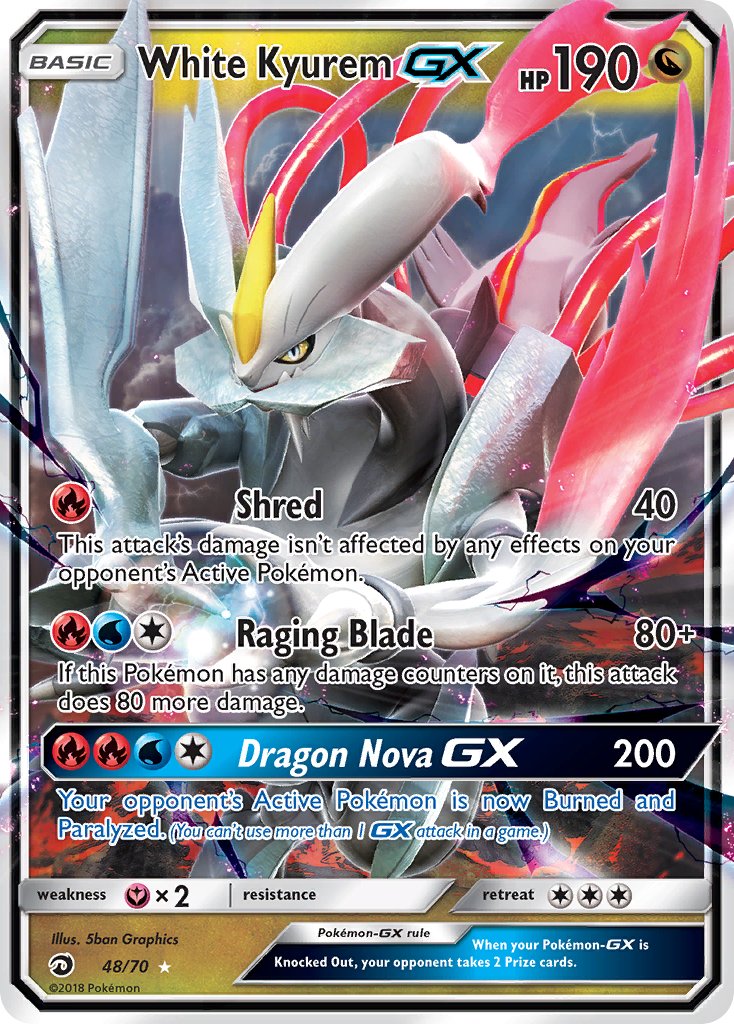
Also nice modeling work with Dragon Majesty White Kyurem GX and the Ancient Origins FA EX. That is how you depict Kyurem standing upright.
Apologies for the excessive images but I would like to end with the Pokemon B2W2 preorder bonus clear file art. The juxtaposed legendaries, palette and expressive lineart is amazing.

4 Likes
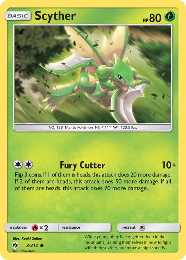
Scyther has loads of bad art. This one might be the worst of them all.

Wtf are those proportions. And as I always point out now, they told AKIRA EGAWA her Milotic was fat and yet all these abominations get through.
Runner ups:
3 Likes

It might actually be considered a cardinal sin to dislike that Kizuki art tbh
8 Likes
Obviously they’ve produced some amazing artwork (Tropical Wind and Abra come to mind).
I still don’t like this card.
1 Like
Espeon and Umbreon are tied for my favorites:
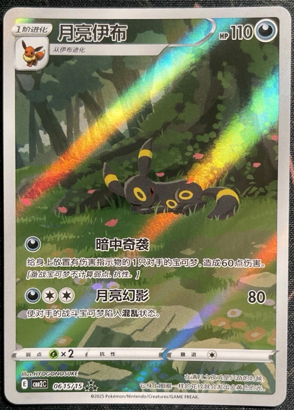
Despise HYOGONOSUKE’s art and style, nothing against the artist but seeing any of their cards just dampens my mood. The only exception being their Paldean Wooper AR which is quite well done
Just a hard nope from me. Espeon is just off here and reminds me of the character Rat from Courage the Cowardly Dog

4 Likes
That umbreon art is my favorite artwork and I don’t even particularly like the eeveelutions ![]()
1 Like
That’s okay ^.^
Everyone has different tastes, HYOGONOSUKE just isn’t for me
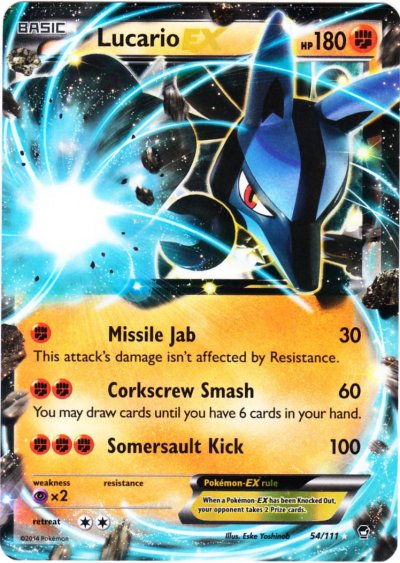
TPCI really loves giving Lucario one static pose of them punching through the card art ![]() Take your pick they are all the same!
Take your pick they are all the same!


5 Likes