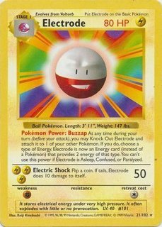
Do not insult Keiji Kinebuchi like that! He was incredible at using spheres and other 3D rounded shapes to create computer generated art as opposed to the usual sharp angled surfaces of the time period. Keep in mind we are talking about software from 1996 or earlier.
16 Likes
I respect what the man did for the game and I appreciate the time period but you can’t say that it didn’t age poorly with a straight face lol

Aging poorly generally refers to the design sense of an overall time period. Not the technological limitations. No one talks about an iPhone 1 “aging poorly”.
Here is a computer generated design from 1996 that exemplifies the style of the era with jagged angles forced into a weird permutation of an overall complex shape. This style aged poorly. Sorry Tomb Raider fans.

In contrast, Kinebuchi’s decision to make the best of round simple shapes rather than cram shapes together until they form something vaguely recognizable aged very well.
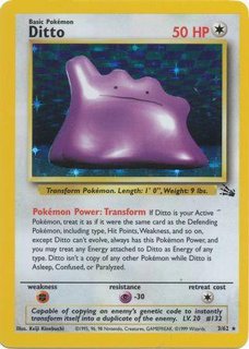
The proof is in the pudding. These designs are aesthetically the same. There are some hair tufts added but the texture-less sphere has stayed constant. If the original design had been bad it would’ve been scrapped for a fuzzy style stuffed animal since the technology today is more than capable of generating furr. Pokemon choosing to stick with many of Kinebuchi’s designs (Energy symbols being the most obvious; they are identical) a full quarter-century later is a testament to how well his work has aged.


9 Likes
I appreciate the dissertation but
-
my main focus was poking fun at Diglett specifically because that card is downright hideous and
-
maybe aged poorly isn’t the right term but you can very very very clearly tell when a card art (not the simple energy insignia, the entire art) is from base set. That Clefairy doll is the definition of mid-late 90s. Following the iPhone comparison (which I like), the original model was great for the time and for innovation but in terms of 2021 it can only be looked at as groundwork as there are better models (get it like 3D models) available now, and
-
the post was titled “stupid meme” so
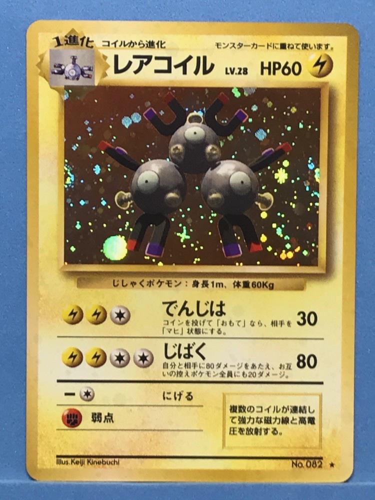
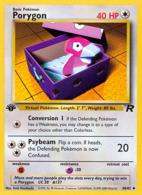
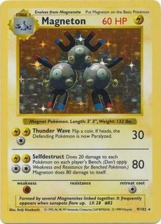
Sorry but I will die on this hill because Kinebuchi’s work is so often shat on and he does not deserve it. Magneton most of all. Maybe it didn’t fit in with the hand drawn holos but this card could come out today and people would think it looked cool.
Honestly just seeing SPHERES on digital art from this period is refreshing.
11 Likes
Magneton is my favorite base holo. There, I said it.
7 Likes
THIS THREAD IS SUPPOSED TO BE FUNNY
8 Likes

7 Likes
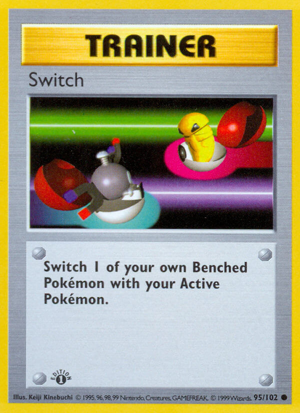
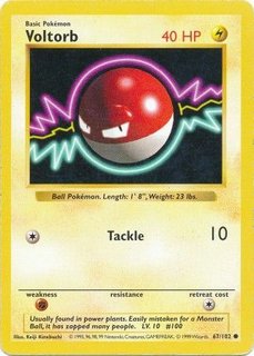
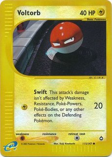
Yh bt that Switch tho.
To put it simply 5bans best work (FA Secret landscapes) are pure, golden Kinebuchi worship and I love them for it.
1 Like
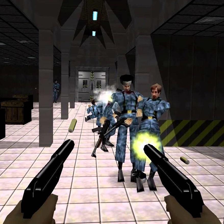
That N64 James Bond snippet had me laughing. That game was awesome and makes me miss the split screen era of gaming. I remember that stupid train level where you have to use your watch-laser to cut a rectangular hole in the floor
3 Likes
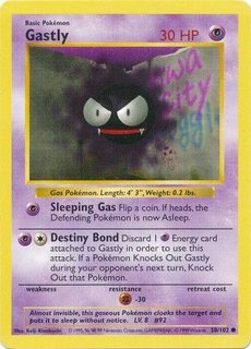
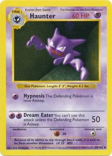
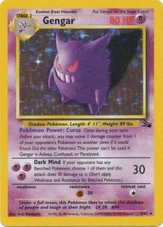
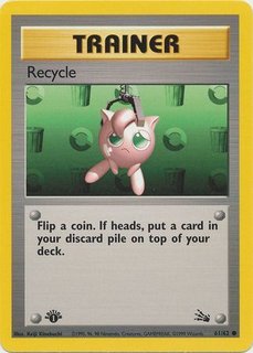
I like Kinebuchi! Many of his cards are incredibly iconic to the Pokemon TCG! Here are some of my favorite Kinebuchi cards:
(I just noticed that the Pokeball button is on the botton half of the Pokeball like how it is on the back of English cards! : O)
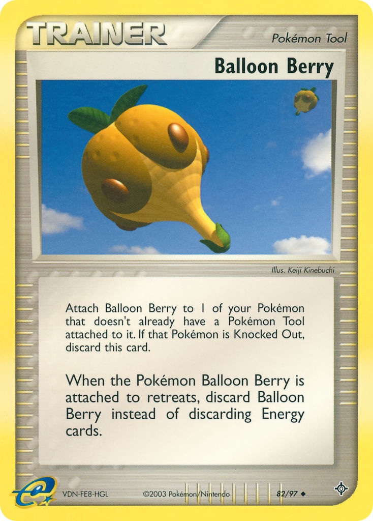
(Specifically this print of Balloon Berry, I always thought it looked like a hot air balloon!)
9 Likes
ohh nooo…
Oh boy my first spinoff thread because I took part in derailing another one.
Now that this is a more serious place and not the meme thread, I’ll say how I actually feel:
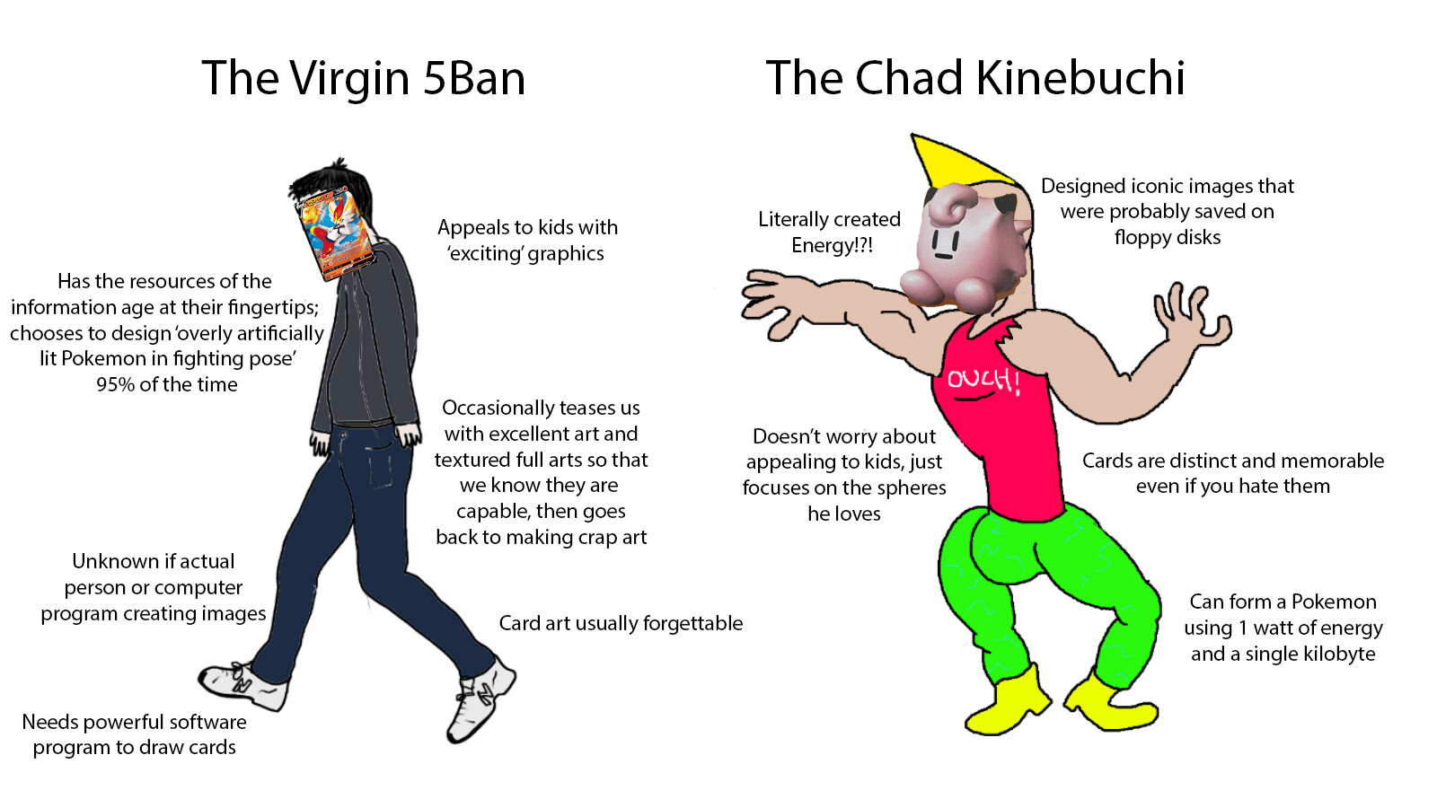
Kinebuchi is undoubtedly one of the most influential artists for the TCG. He is half of Base Set, the creator of the timelessly iconic energy symbols, and the godfather of 3D, computer-generated art in the TCG. That being said, I don’t think his card arts are anything today but time capsules. From the backgrounds to the main subjects themselves, they just look dated. I look at the original Star Wars films (before the retouches) the same way. The effects don’t look good compared to the effects in the recent Star Wars films. Whenever we watch the originals, my dad always laughs about how they used to think the effects were so great, but now they just look cheap. It’s fine; it’s just a product of the time.
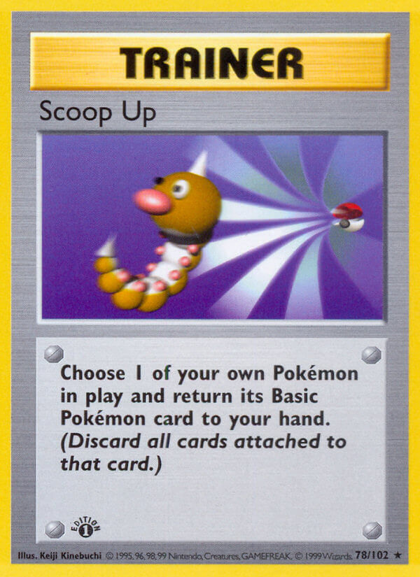
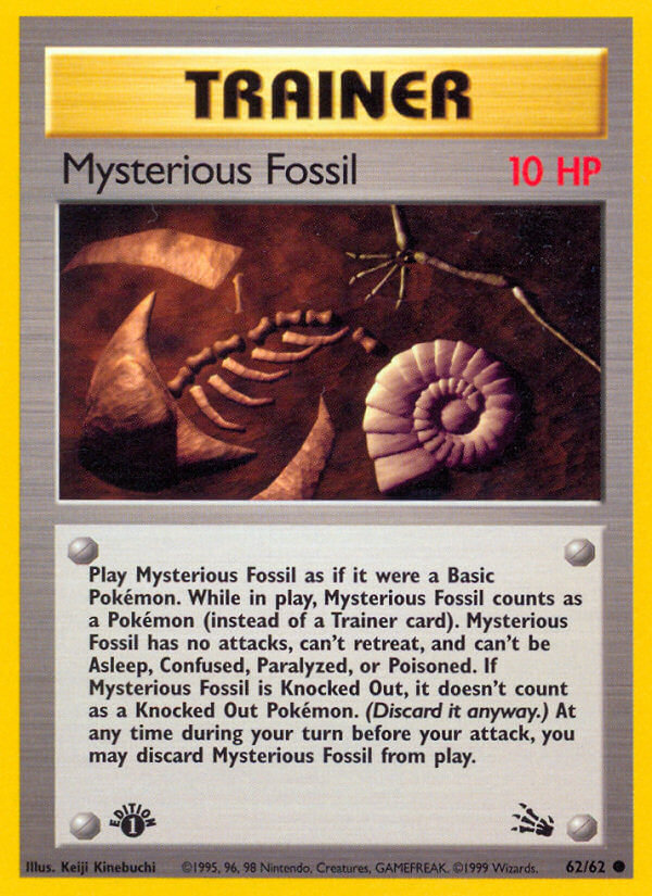
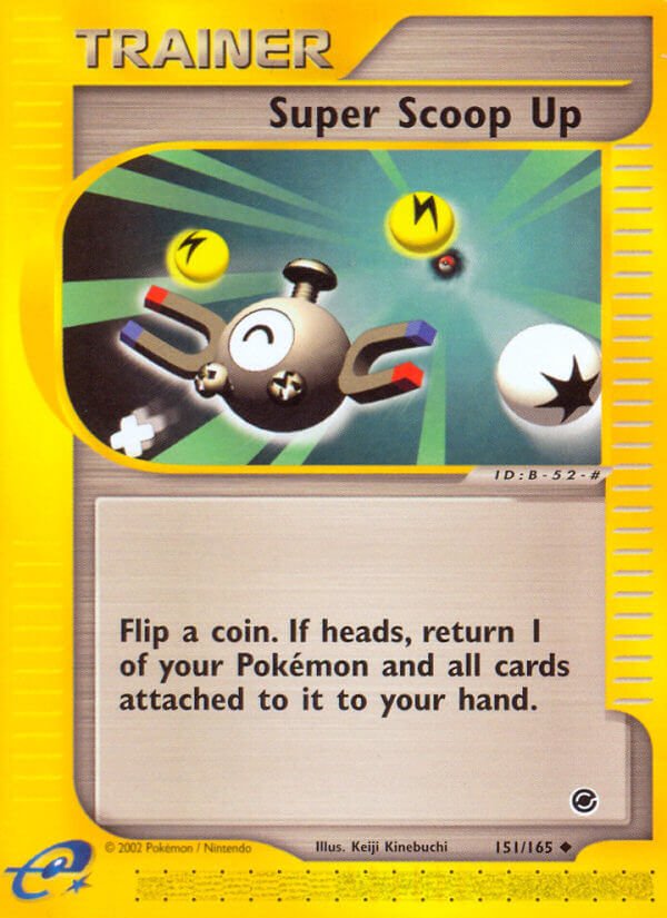
Magneton isn’t particularly offensive, but cards like Switch, Gust of Wind, Scoop Up, Diglett, hell even Coro Jigglypuff and Pikachu just come off as extremely derpy to me. Maybe it’s because I don’t have nostalgia, but I’m not sure. I certainly appreciate Arita and Sugimori illustrations, maybe because I feel they aren’t as dated. But I have a lot of controversial opinions about card art. I like a lot of the Mega EX cards and I think McDonald’s P-Promo Mew and E1/Lottery Charizard both look very strange (don’t ban me PFM). You can appreciate the art for what it is regardless of anything I’ve said, but I do think there is an element of objectivity here because the capabilities of CGI are so much greater today than 25 years ago. I think 5ban is the natural evolution of Kinebuchi’s style, just updated for the new generation. Again, maybe I’m biased because I remember pulling Zekrom full art from Black and White Base when I was a kid. But I’ll only see Kinebuchi as a sort of godfather figure and not as cards I would collect and enjoy, specifically the '96 stuff because I’m sure he has cards after that that are better but the Digletts and missing-pupil Weedle are the ones that stick with you and haunt you lol.
6 Likes
No shot I turned serious and you make a meme
Now that we have a dedicated thread to the great Kinebuchi apropos of the meme thread mixup, I can fully and with reckless abandon express my dearest love and appreciation for the man’s genius.
He singlehandedly brought a profound diversity of artwork to the world of Pokemon, through the TCG. It was incredibly important, out of the gate, for us to get the aesthetic he brought in addition to the hand drawn, for the essential need for us to have a dynamic series of art work.
His talents are godlike, and no one in any medium then or since has produced such indelible and explosive style, personality, and jazz through the use of CG. Visionary.
Let us now follow with a gallery of his fine, fine achievements.
I cannot include the base trainers because we all already know those are the greatest cards ever made and it would be positively redundant to list those considering that everyone already has a mantel or shrine with copies of them all in their domicile. And then there’s all his stadium cards–don’t get me started on those.
18 Likes
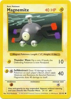
Base Magnemite is the most nostalgic card to me
2 Likes
I like most of his art but I hate the gengar, looks terrible with the weird texture
1 Like