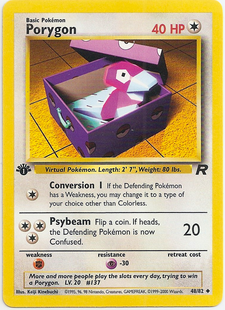
I love Kinebuchi. Gastly, Haunter and Porygon are three of my favorite Base Set non-holo artworks, and I agree with @brendantheclayboy that Magneton may very well be my favorite Base Set holo (it’s either Magneton, Gyarados or Venusaur for me).
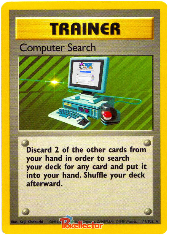
Let’s be honest: the art in Base Set is pretty bland overall. The good majority of it is just run-of-the-mill Sugimori art on a clipart background. So to me, Kinebuchi’s style is incredibly refreshing and brought some much-needed balance to the Base Set.
@mjs61290 , maybe I just am overthinking it and you know, if that’s the case, I apologize. I would doubt you don’t already know and you are just generally naming your top 3 base.
Imho it’s possible to both laugh about his goofy designs AND respect the icons he created, despite the technical limitations of the time. They are a landmark in the history of digital graphic design for sure, but many of them are also funny (and intentionally so, I guess).
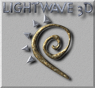
WOW, I remember playing with Lightwave on my dad’s work computer while he finished up drafting stuff. NOW THAT takes me back. Like Kenebuchi’s awesome 90s CGI. It certainly is an excellent example of the tech at the time and that enshrines it’s value, beyond it’s utility or value today.
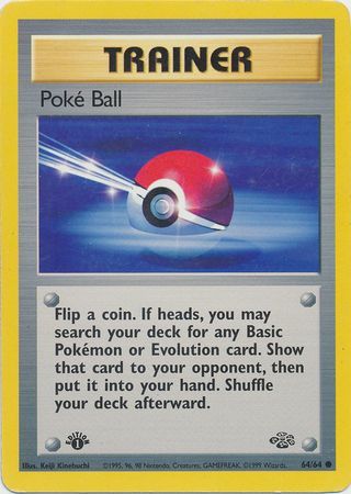
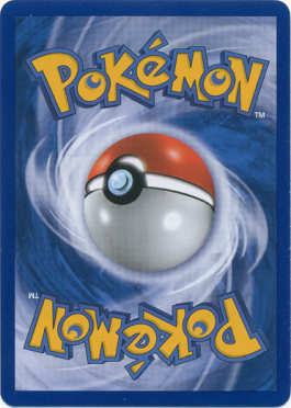
So on discord, we put together something that is in retrospect, is probably obvious. The back of Pokemon cards was probably also the work of Kinebuchi, probably even using the same (or similar) model as the Jungle pokeball.
It would be glorious if we could contact the artists who worked during his time and figure it out once and for all. Like maybe Himeno or something. If they even know anything.
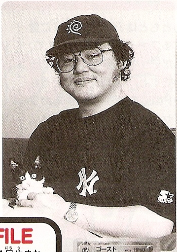
I also would love to find certainty that your auto is real beyond all doubt pfm. I’m hoping it is. Would be friggin’ awesome.
I have always loved Kinebuchi’s work. He’s a genius for being able to create these somewhat simplistic card arts that are still extremely eye-catching and appealing. When I was a kid I loved the cards he designed because they felt futuristic and had a “cyber age” aesthetic. Some of my favorite non-holos of all time are the Voltorb and the Electrode. The rainbow background of the Electrode rocks-it would have been cool to have seen a holo version of it as well.
It would have been amazing to have met him or gotten his signature.
Did this thread literally get cut off from the meme thread or something? XD
Kinebuchi’s design just gives me so much 90’s nostalgia vibes, not only for his Pokemon stuff but it reminds me of some of the old 3D kids shows I used to watch as a little one - Reboot, Beast Wars, etc.
Another thing Arita mentions in the livestream is that they were friends before they worked on Pokemon, and Kinebuchi essentially introduced him/got him on board. Who knows, but maybe if it wasn’t for Kinebuchi, Arita might not be involved in Pokemon at all!
The Pikachu that was released simultaneously was by Keiji Kinebuchi as well. Both were the very first Pokémon TCG cards, released on October 15th, 1996 as inserts in the CoroCoro magazine, five days before the Japanese No Rarity Base Set released in October 20th.
The Pikachu was an error though, since it mentioned Ken Sugimori as illustrator by accident.
The reprints of this Ivy Pikachu promo in Japanese had Keiji Kinebuchi as illustrator as expected: one released in the Easily Understand How to Play Pokémon Cards magazine; one in the 1998 CoroCoro lottery magazine; and a more recent 281/XY-P promo (I’m unfortunately still missing the glossy reprint from the 1998 lottery magazine in my own Pikachu collection). Funny enough, the Portuguese Pikachu World Collection 2000 version from Australia had the incorrect Ken Sugimori illustrator as well for some reason. It was the correct Keiji Kinebuchi illustrator in every other variant and language, though.
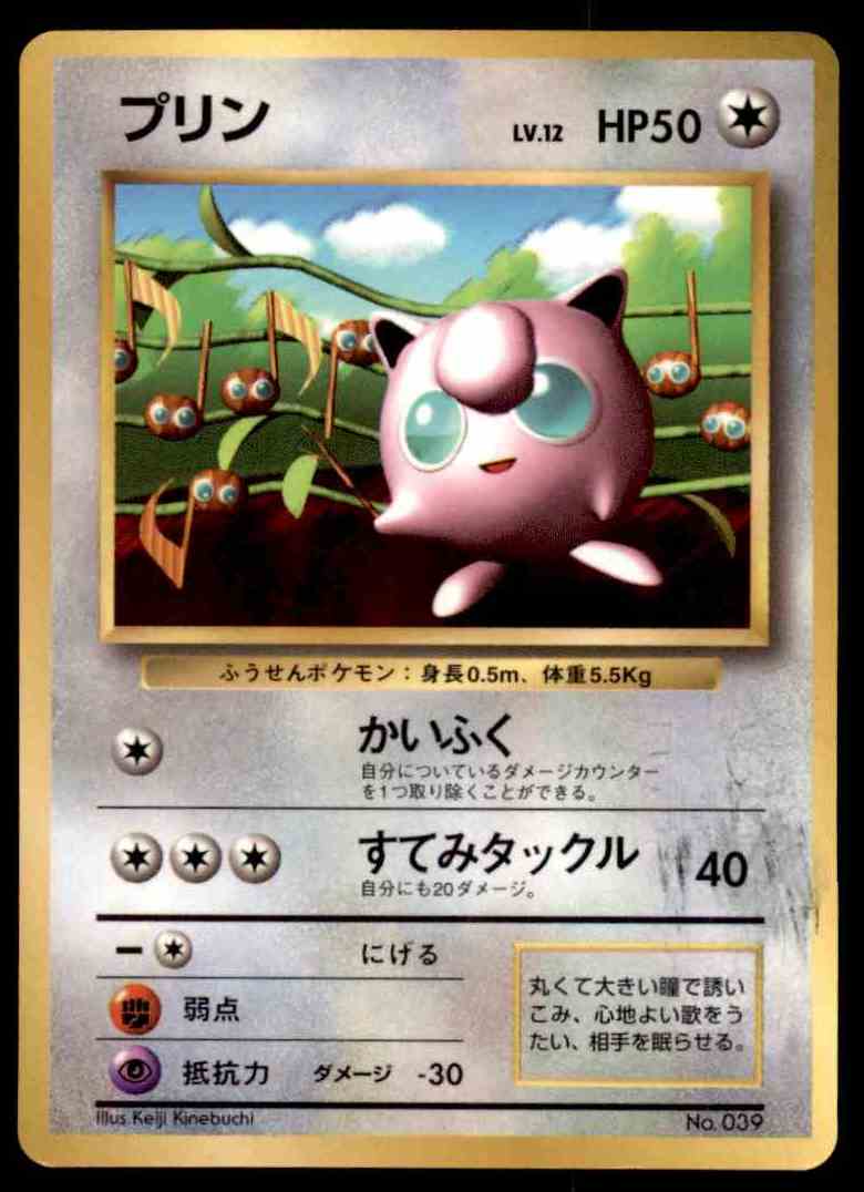
@azulryu , coro Jiggly is actually probably my personal favorite of his–certainly top 3. A true masterpiece. Reminds me of playing Banjo Kazooie as a kid. Probably one of my most nostalgic recall effect cards I can think of!
I guess I’m glad I forgot to add it to the gallery above, thinking only of set cards, so you could mention it
Also, I never even realized that this stuff was even CG hahahaha! Not that I thought about that kind of thing as a kid, but even as an adult, I always just treated it as normal card art. I never really considered it as good or bad. But looking back now, I can agree that he is a paragon for his time. To make designs that look that good in 1996 is incredible.
Agreed, they are simple compared to the dynamic stuff of today, but we have so much more ability to creat today as well, it only makes sense. I feel there isn’t much point in arguing whether his art is “good”. By today’s card art standards, the base set foils are boring overall, just a standard pic of the Pokémon and a standard background of another dimension. Don’t get me wrong, I love them, but my point is that there is always a natural evolution. For that reason, things must always be segmented, observed and compared within their natural state/time period. Of course, by doing this nostalgia glasses taint a lot of the rational decision making, but hey, nostalgia is the name of the game for Pokémon. Definitely more than a few iconic arts, as well. It can’t be understated how he helped propel Pokémon forward.