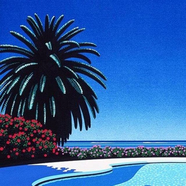
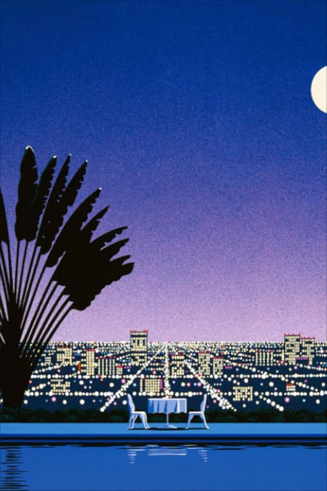
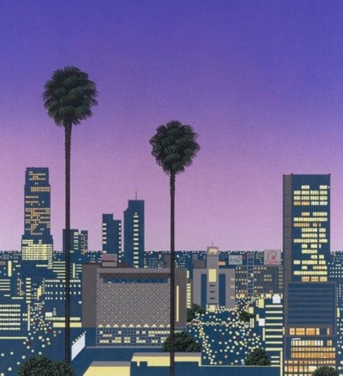
It’s got that grainy sky gradient aesthetic with the tropical plant silhouette, empty city vibe with lights and simple shapes and colors. I was just picking up a similar vibe.
Not a direct answer but clearly an admission of inspiration! Really cool anytime fine art bleeds over into Pokemon. I really like the city pop aesthetic so it adds a lot to what would probably otherwise be just another alt art.
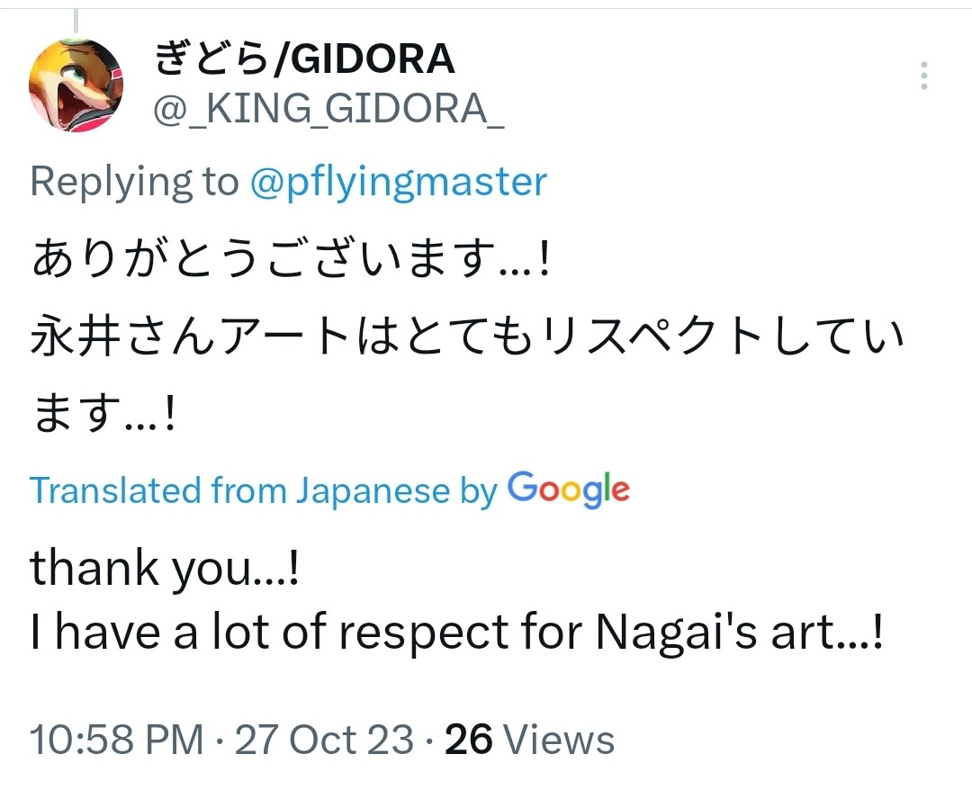
Just a little anecdote I wanted to share. I’m sure many of the artists enjoy hearing from fans too
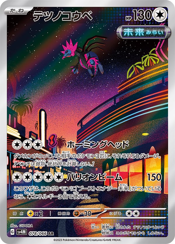
It really is some fantastic art. It was a head turner the first time I saw it on koala’s thread. I thought, wow that looks so much like an airbrushed vice city, and I love it. It’s even better really, combining the cosmos and 80’s urbanity.
I’m familiar with that city pop urban aesthetic and Hiroshi art! They were one of the reasons I started drawing again, since I wanted to create city pop/future funk/vaporwave artwork, back in 2015.
I picked up some oil paints but I wasn’t able to do anything cool like that at the time. They’re truly gorgeous illustrations and design pieces.
It’s cool and interesting to see this style still inspiring others.
It’s interesting because GIDORA’s style is normally very clean and bright and smooth, so its an obvious departure from their norm. You love to see artists emulate a different style and branch out!
This is so cool! I love it when the card artists interact with fans and share some insight on the process. The Iron Jugulis is my chase card from this set, GIDORA did such a fantastic job.
On another interesting note, I think it’s cool how GIDORA has now illustrated a three headed dragon whom I’m fairly certain was based off of or at least partly inspired by the Godzilla character King Ghidora