One interesting question that Arita asked the panel guests on the Sunday at Toronto regionals is what elements in his artwork people using to identify a work as his own
For instance, when I see a pack being opened I basically know what cards are illustrated by him before even looking. The question is, what features of the art makes it his?
I have my own thoughts but I’d prefer to hear from others before skewing the answers to what I already think. If this thread is interesting enough to people we can do it for other artists too.
I’m not an artist so it’s hard for me to pin it down. But I guess it’s just experience seeing his artworks for years and years that I’m able to recognize it. If I had to try to be specific, I think his artwork has a more realistic approach than others. Often the environments are much more detailed and full of various colors and the Pokémon are expressive and usually interacting with the environment.
Someone more artistically inclined than me can explain this better but the colors and shading feels soft to me. I’m not sure what other word I can use to describe the feeling it invokes but it’s always the first thing I notice.
I really cant do this with Arita, he has such a great portfolio that a lot of his cards go unnoticed until I see the illustrator. Other artists are easier for me to identify for me, all the artists I can comfortably identify are favorites of mine, so maybe that plays a role as well.
For most of it for me, it’s those pencil strokes. A ton of his art has those pencil lines in the shading, giving it some grit. There’s also a sort of precision or realism around the movement of the character and detail of the environment that looks characteristically like his art.
I get a little more lost between 2004-2010, because he did things with CG like the western Deoxys pack artwork, the Unseen Forces theme decks (and packs?), and the Diamond & Pearl theme decks (not sure on packs again). His Japanese HeartGold/SoulSilver Collection artwork is also more void of those pencil lines that I tend to look for.
Artist here. I would best describe his work as looking like pencil + colored pencil, even though he says he works digitally. It’s instantly recognizable by the volumetric rendering (shading) and rim lighting (which I’m also addicted to using, it’s fun). He uses a lot of blacks/grays in the shadows which emphasizes the pencil look. Overall he has excellent understanding of form and light.
I have to agree with @SeasidePokemon Arita just has this more realistic look compared others. His work looks like its draw to be a painting hung up on a wall or a mural in some great hall. He has this mixture of straying away from the innate cartooniness of pokemon while and grounding these creatures into their habitats or locations which gives off the as said above more realistic appeal. Makes Pokémon feel like they are real folklore that people have made stories about and drawn throughout the years.
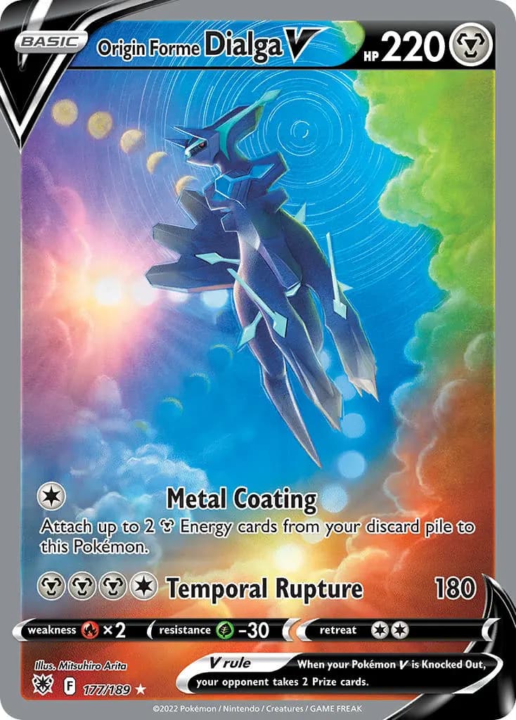
I’ll echo what’s been said above that I’m no artist, but that’s my two cents on it. Heres some example of cards I really think show off what I mean:
I may be an uncultured swine because I cannot easily differentiate Arita as an illustrator. Now if you were to ask about sowsow or Atsuko Nishida, I can tell immediately.
I feel Arita has a more “Western” style than other Pokemon illustrators. I don’t know how else to describe it but it’s more grounded in realism and allows his work to instantly stand out from his contemporaries.
As an Arita fanboy I see a lot of valid points. the realism of his drawn world is very high. It is his style that I imagine the Pokémon world in more than any other, all other artists rather feel like interpretations of the world that he actually brings to life.
From a more technical standpoint:
Arita uses many ‘dutch angles’, or wonky horizons, sometimes in combination with sweeping plains, and/or with fish-eye esque effects (rounded horizons) to pull your eye into the center.
He is known for his combination of pencil and digital medium. The shadows and highlights generally have a grittyness that I think comes from his digital editting. This is unmistakeble for his art.
Speaking of highlights and shadows, I feel like he has a great idea of lighting, but almost always uses soft lightsources, so there are never any harsh lines to differentiate shadows, or highlights.
He uses low angles or at eye-height for the Pokémon a lot.
If an artwork shows part underwater part above water it’s most likely him (Masago with the Blastoise comes to mind, but I don’t really know if anyone else does this).
He uses highlights and outlines as high contrast areas to differentiate the Pokémon from background. This ties into backlighting a Pokémon, so a highlight can be placed at the edge of the Pokémon, then followed by an outline to make for high contrast regions.
He has done a good amount of 3D work as well. It is hard to differentiate these from others, especially because his 3D artwork has changed dramatically.
Many great technical points already mentioned! If I could state my opinion, it’s to say his illustrations have the look and feel of physical print mediums. Specifically, think of the finish of 80s - 90s magazine ads / posters. The colors are vibrant but not loud, and there’s a slight fuzziness that adds to the realism.
This thread is really inspiring me to finally start on my own collection thread, I was planning to dive into the details of the artistic composition of cards I’ve collected since that is pretty much the main reason for my acquisitions!
yup, hes mentioned that western art pays more attention to three dimensional form and light and eastern/japanese has historically paid attention to shapes/2D
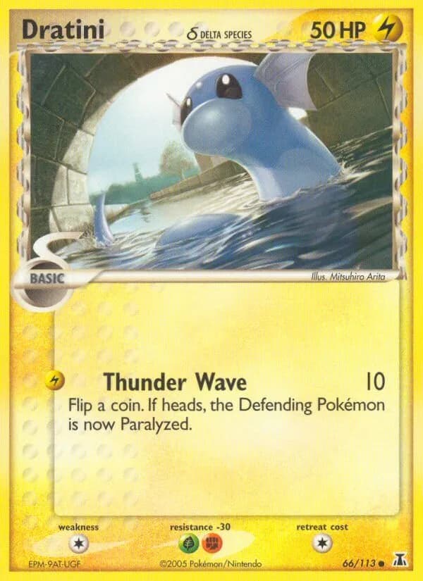
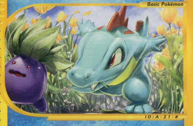
I see that he thinks a lot about lighting which gives a heightened sense of form and realism in his work - which direction the light is coming from, what’s in shadow, and how quickly the lights transition. Many other artists are more abstract or simplified when it comes to lighting (not that that’s necessarily a bad thing!). I notice he also plays with rimlights and highlights a lot, usually to introduce multiple light sources and to create a more realistic atmosphere. Below you can see that the contours of Totodile’s knee and the underside of Oddish are rimlit.
Another thing he does that I don’t see other artists do is create very detailed backgrounds - something that I think is unique to his work is the level of immersion in his environments. in the Dratini posted above you can see each brick is articulated and rimlit along the bricks’ edges, as well as the forms of each wave. In the below Totodile card you can see he put SO much detail in the flowers/grass - as well as the detailed clouds above. He’s mentioned before that he’s looked at Western artists, from Norman Rockwell to James Gurney, which might explain his attraction to realism.
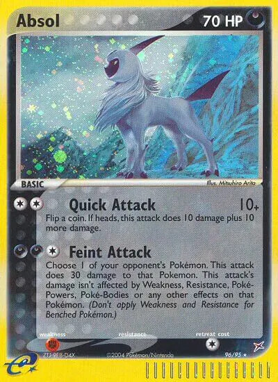
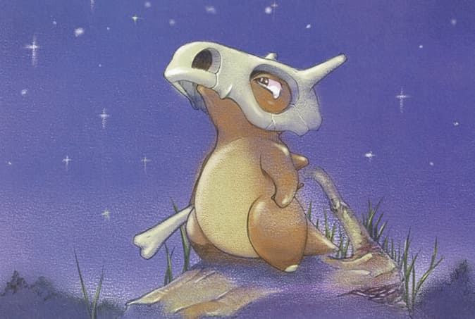
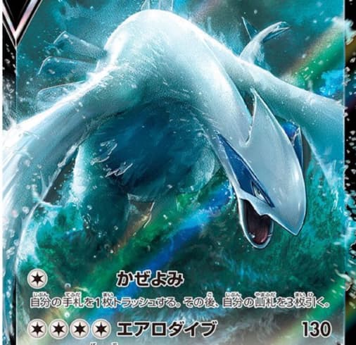
He also sometimes introduces 2D elements to his work in contrast to the smoother rendering, like linear outlines or hatching. You can see below there’s a clearly drawn contour around Cubone. I think he makes an effort to vary the weight of the line as well- some areas have a more noticeable outline, and some less. This adds more visual variety and interest IMO. You can also see this in his most recent Lugia as well; around the head you can see contour lines, and on its back it’s super soft and atmospheric.
Something he also (usually) does is use a rougher texture in his pictures, I suppose to simulate physical media. Again, the background in the Cubone is a good example of this. He’s stated that all his work is physically drawn then colored/finished digitally, and I personally really like the grainy/rougher look - overly polished work feels too stiff. (There was a period when he did CGI/super smoothly rendered cards that I didn’t like as much)
I could keep going on as I’m a huge Arita fan…like how he can depict a Pokemon as if in a cartoon from one card (Totodile) and as if from a nature documentary in another (Feraligatr from e-series), mood, color etc but I’m sure others have commented /will comment on that lol.