I agree 100000 percent on Nishida. Very easy to tell.
3 Likes
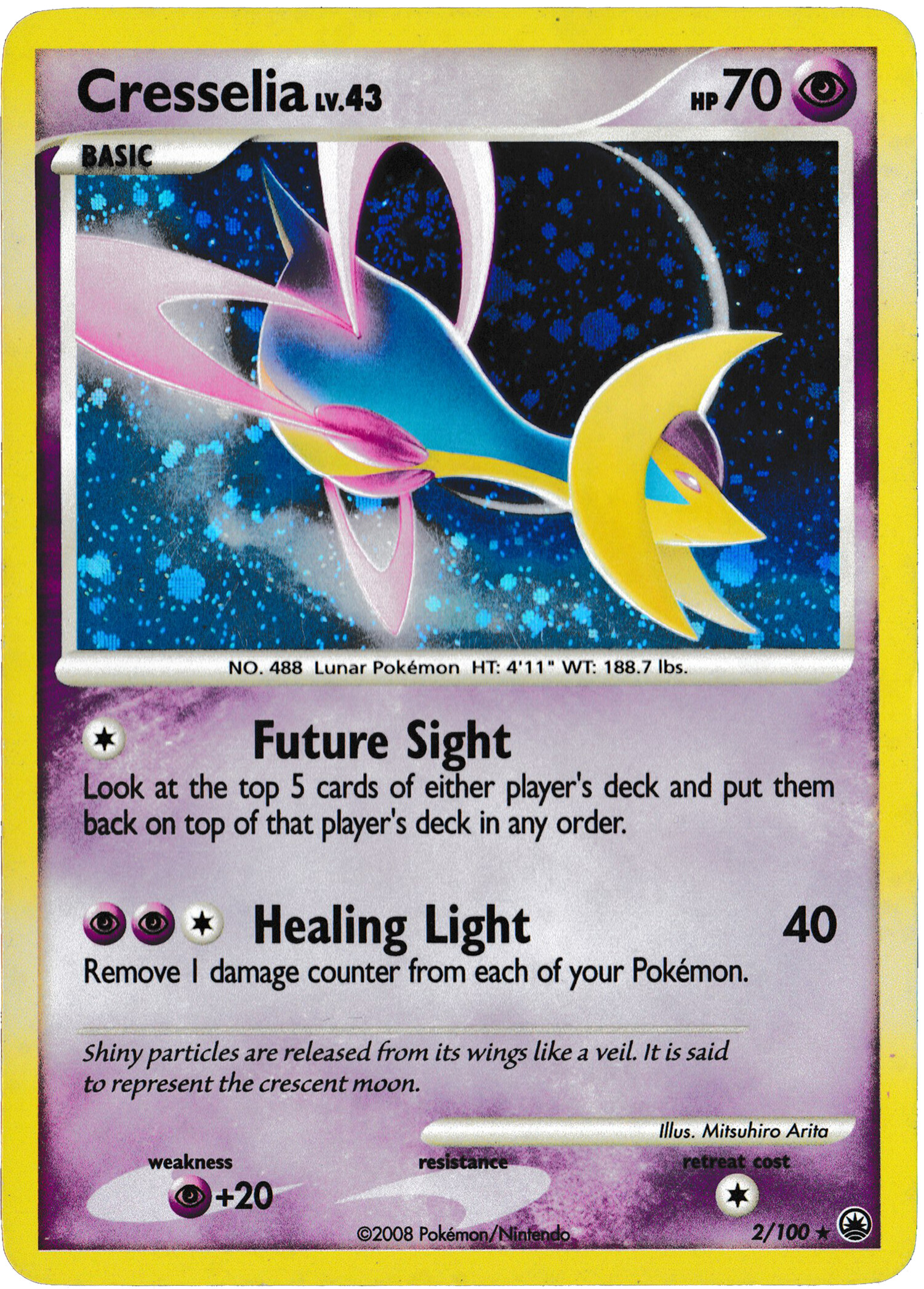
My eye always goes towards the white accents in Arita’s art:
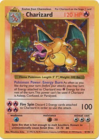
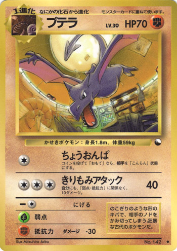
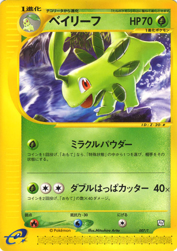
The white accents I’m referring to are on Charizards neck, shoulder and knee, Aerodactyl’s head, Bayleef’s head, and Crabrawler claws. Some of his full art designs are more detailed and realistic but those white accents are the first thing I notice with Arita.
11 Likes
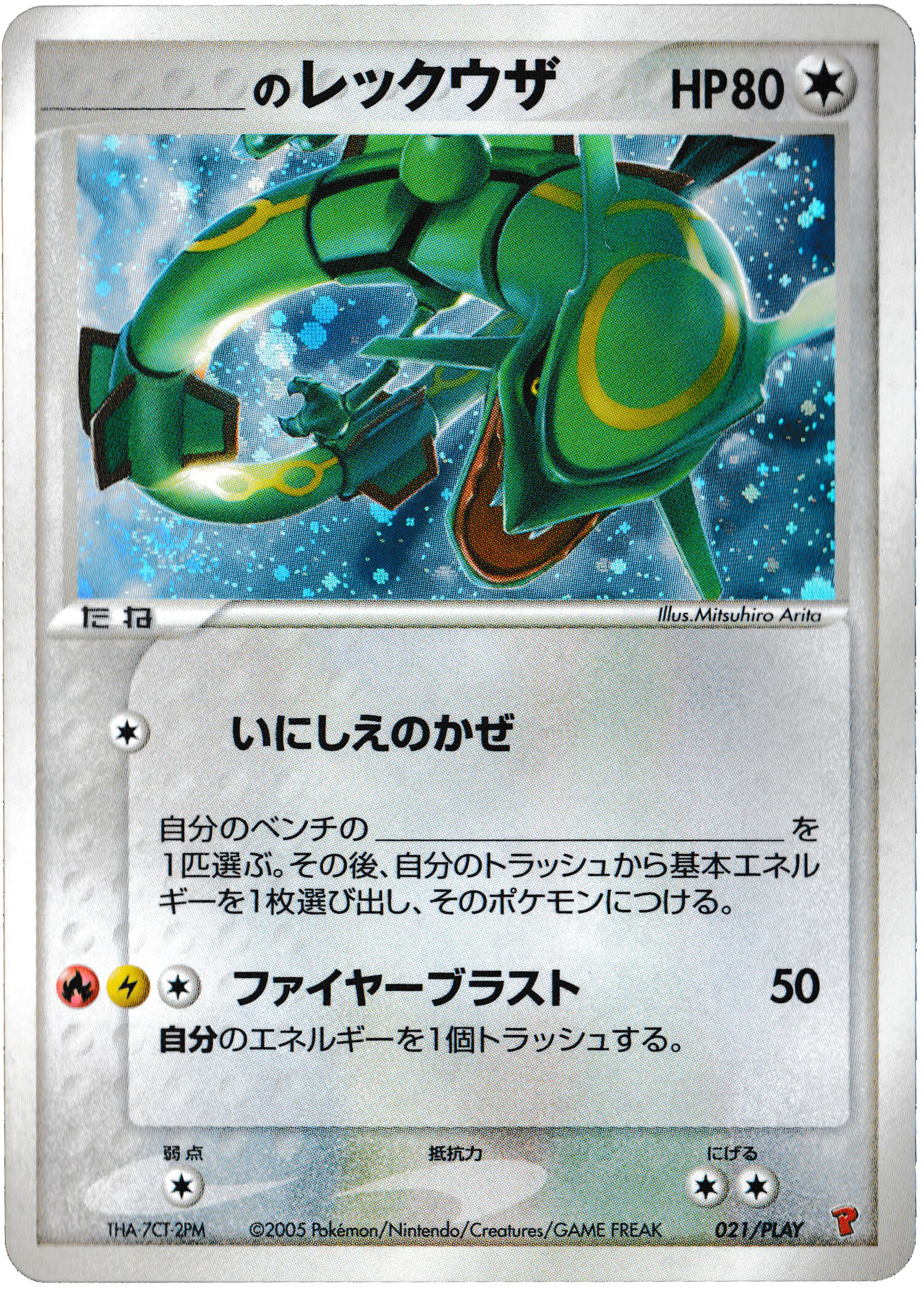
the answer is actually a lot easier than you think. the bold white highlights are a staple and dead giveaway of arita’s style. once you see the somewhat pen/sketch style art with bold white highlights, you can almost guarantee its arita.
3 Likes
ah pratte beat me to it
3 Likes
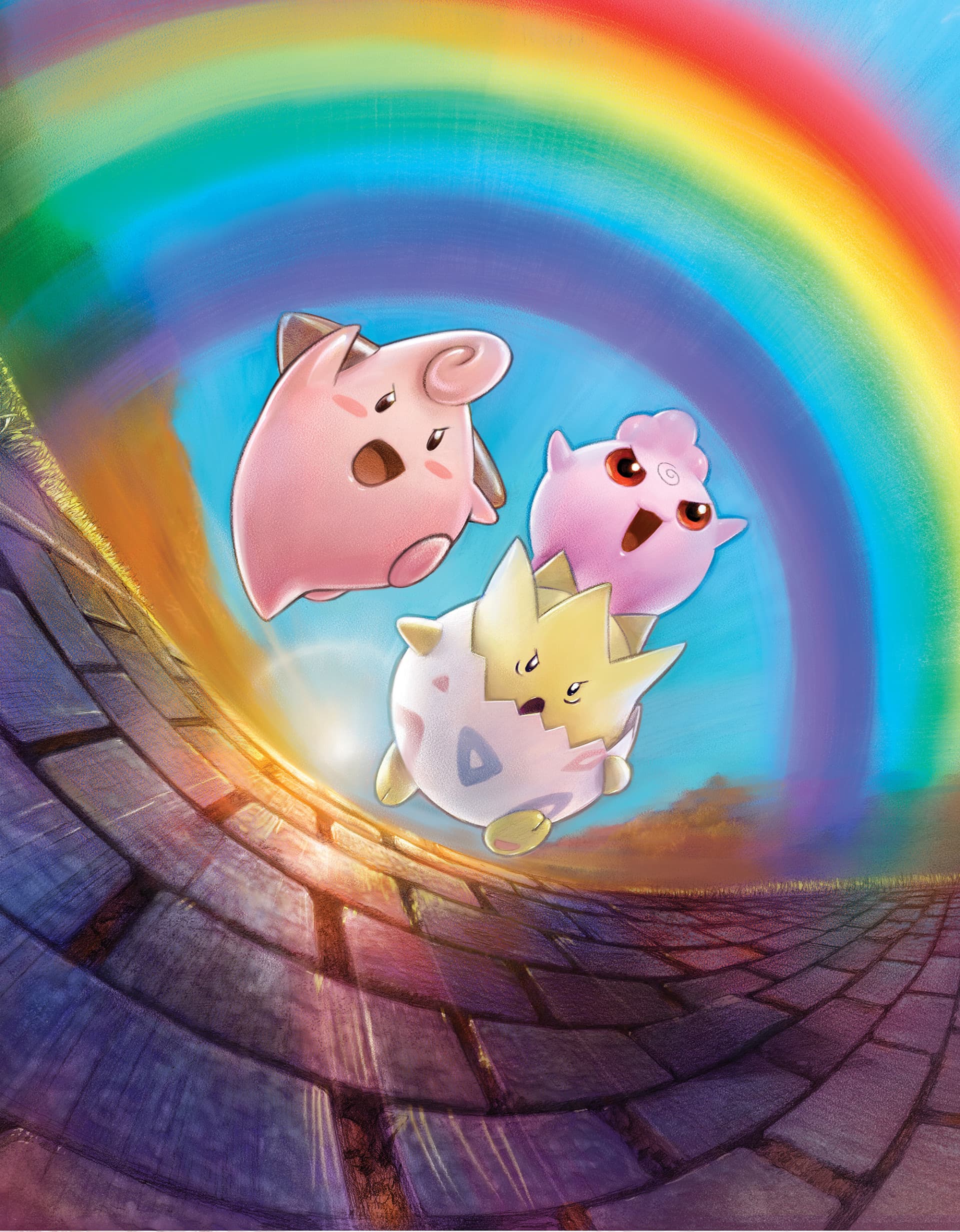
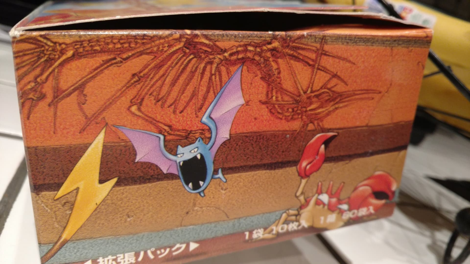
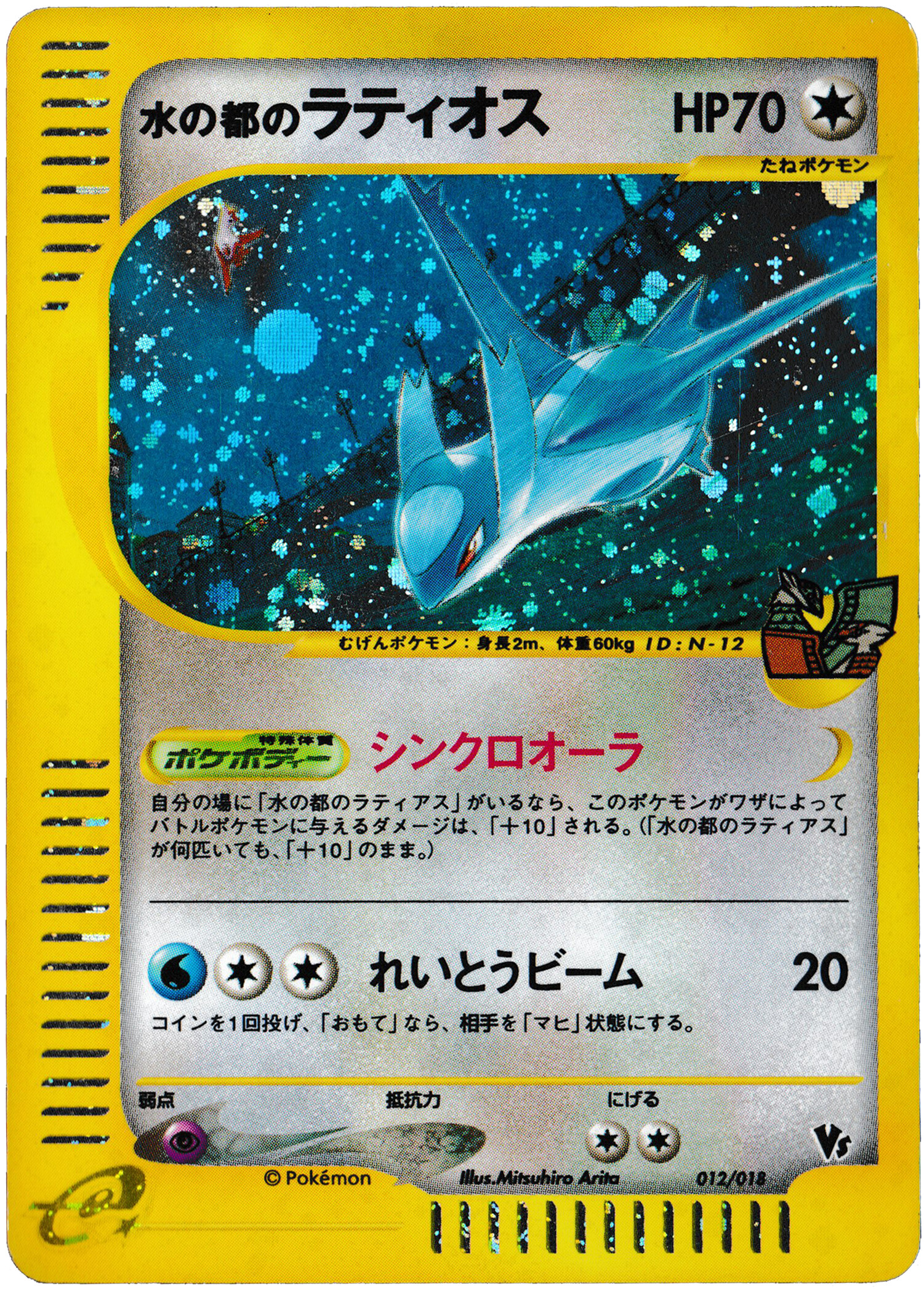
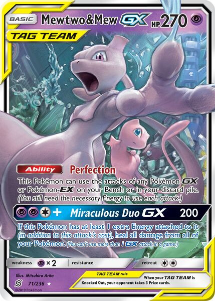
Arita’s art has a HIGH level of consistency in his light/shadow, shading, and technique. (He uses computers to smooth out the tones.) Attention to focal-length and depth of field. Sometimes, it looks almost totally CG, until you get into it in HD. Overall, the art usually screams “arita”. He also uses a filter to give a consistent underlying texture or stippling to his artwork, as if it were drawn on the same paper.
You can see the “stippling” on the tag team fairies, and in golbat’s wings on the fossil box: