@gengaranimal , YES! I love that card as well, such a beautiful pose for Lugia. Only got one copy, but need to acquire a binder copy one of these days. Bummer it never made it to English, but also kinda nice at the same time I suppose. I didn’t even know it existed until this year. Light Ninetales is so chill and relaxing, thats the one to look at for falling asleep for sure. Light vaporeon is also a ray of sunshine hahaha!
@thatpikachuguy , Can’t go wrong with a cheap and easy to acquire classic. What’re your thoughts on the “jungle” not jungle pikachu from the intro packs? Those are pretty sweet if ya ask me.
@pottsinator , My god!!! that is ridiculous! True though, it was like a 5$ card for a heck of a long time. Nice job on picking that one, probably made a killing after selling haha! How many do you have remaining?
@brendantheclayboy , Couldn’t agree more with this choice. I’ve always had a huge appreciation for that card. The pure green background feels very audacious and outstanding when compared with everything else of the time. Isn’t it also the first instance of a trainer on a card? At least in terms of English set cards?
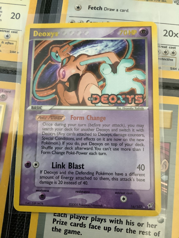
@kingboo64 , Definitely solid choice. The card that I picture the easiest when I think of a deoxys card. This is one of those cards that I was actually super jealous of my little sister over as a kid. She got the promo version and I coveted it hard. Pretty sure I did a bum trade with her to get it, but then felt bad as an adult when looking through my childhood stuff and just gave it back to her hahaha!
@bbqcat , I’m not the only one who loves this card! This card is the reason I bought several of the movie sets! That and the Lenticular, but still mostly I loved this card. Thoughts on the blastoise from the set? Atsuko is one of my favorite artists, but not really a fan of the Blastoise personally.
@candle , damn, pages of it! that sounds intense! Are you talking about the one with the winner stamp? It is pretty epic art though, can’t disagree there. nice posing and I’m also one of the people that thoroughly enjoys the e series borders. Not sure what it is, but I’ve always been a fan. I feel like it makes your eyes work harder to enjoy the image and therefore appreciate it more. Odd explanation, but yeah.
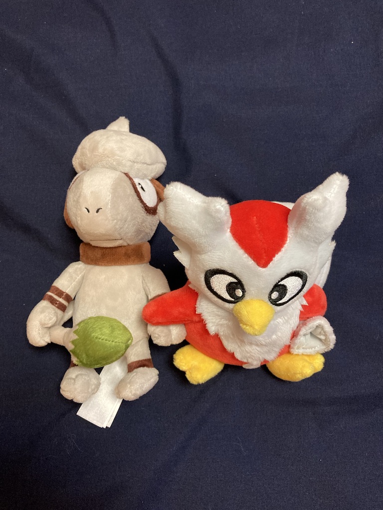
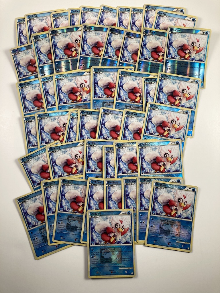
@connorc , Solid, I feel like these two Pokemon are at the top of the underrated favorites for people. They’re quite unique ideas for pokemon and just overall really fun characters and personalities. That delibird is beautiful, great choice with the reverse for it as well. I feel it fits the water typing of the card, and the ice typing of the pokemon super well. Makes it feel more like the winter wonderland that it should.
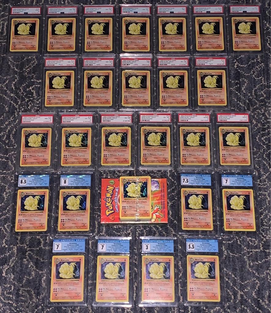
@oldskoolpokemon , WOW! I’ve wanted one of these for a long time, but could never pull the trigger because there was always something else more pressing to me. Kudos to this collection, definitely one to be proud of. even if only for terms of value as far as I know. Funny enough, I’ve started somewhat of a shadowless Ninetales collection over here even though I love in Japan. I found like 3 of em for good prices on Mercari and said, why not. Beautiful card, can’t go wrong.
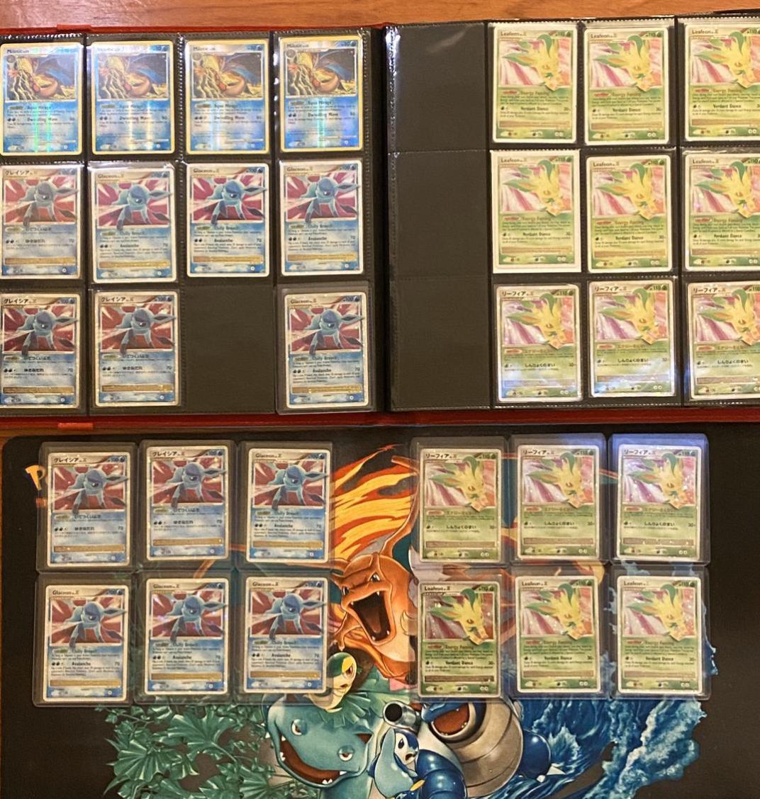
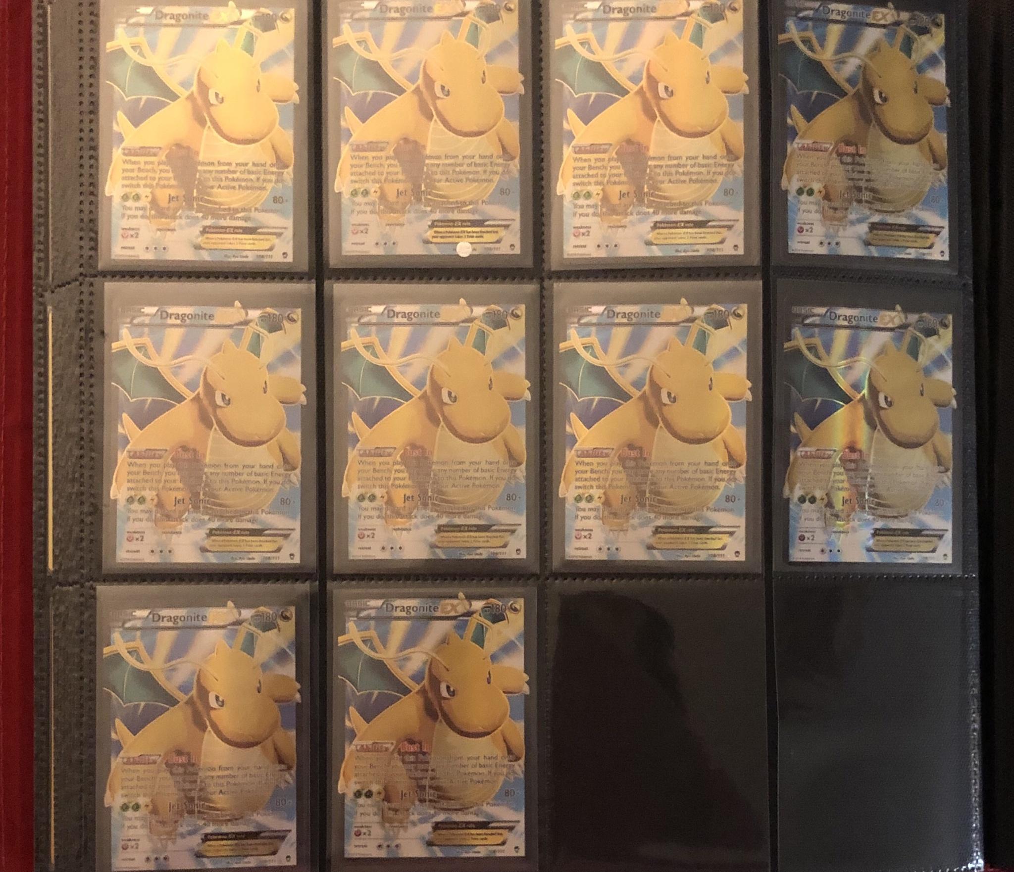
@rybatony , I didn’t appreciate the cards when they came out, but it’s funny what time and completing collection goals will do to one’s mind and desires. When I stop being overly obsessed with my era of cards and really truly look at the art work of more recent stuff, I realize what I’m missing. Hence my “I"m too easily swayed to love a new card” thing in my profile quote. Nice choices, the dragonite especially. I’m kinda burned out on Charizard, no pun intended. But Dragonite deserves all the love he can get. yeah, doing the Elm would be cool, he has such nice use of colors thanks to the three starters, it would make for a vibrant page for sure.
@vic , That milotic, big yes for me. Absolutely stunning art. I should’ve bought more of em. Just glad I got at least one for now though. I love how the ocean looks like it could just be clouds and the Milotic is flying. of course it isn’t but it appears that way. The dichotomy of black to white is also very interesting. Actually, ya know what? Are they clouds? I’m observing the card right now and see the mountain behind Milotic that looks eerily familiar to Mt. Fuji just because it’s so perfectly conical. not to mention it’s only the top of the mountain, and fuji often has cloud covering the top. Hmm, what’s your take?
Thanks everyone for posting here, I really enjoyed looking at some more arts and seeing what people binge over. Gave me a little more appreciation for arts that I already love, and others that I had yet to appreciate enough.