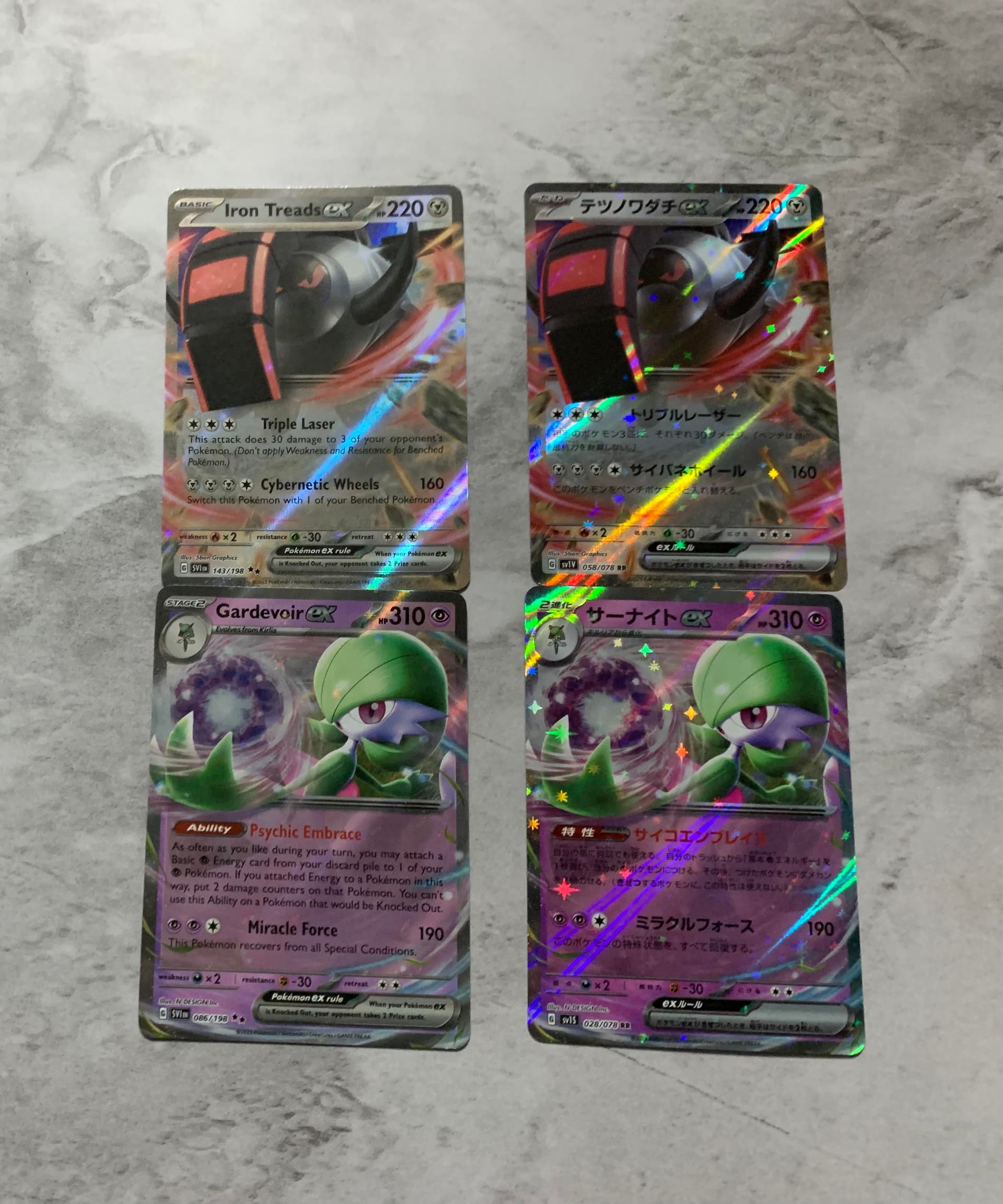
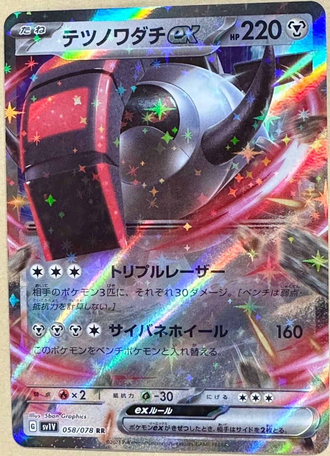
saw this photo on reddit and I was shocked to see the difference. made me sad a lil bit on how different the english prints are compared to japanese
10 Likes
Some people said, that with TPCI switching to the silver borders, the interest in Japanese cards (at least outside of Japan) will go down. This picture is the perfect example why I am convinced that this won’t happen. Japanese cards are superior in so many aspects.
19 Likes
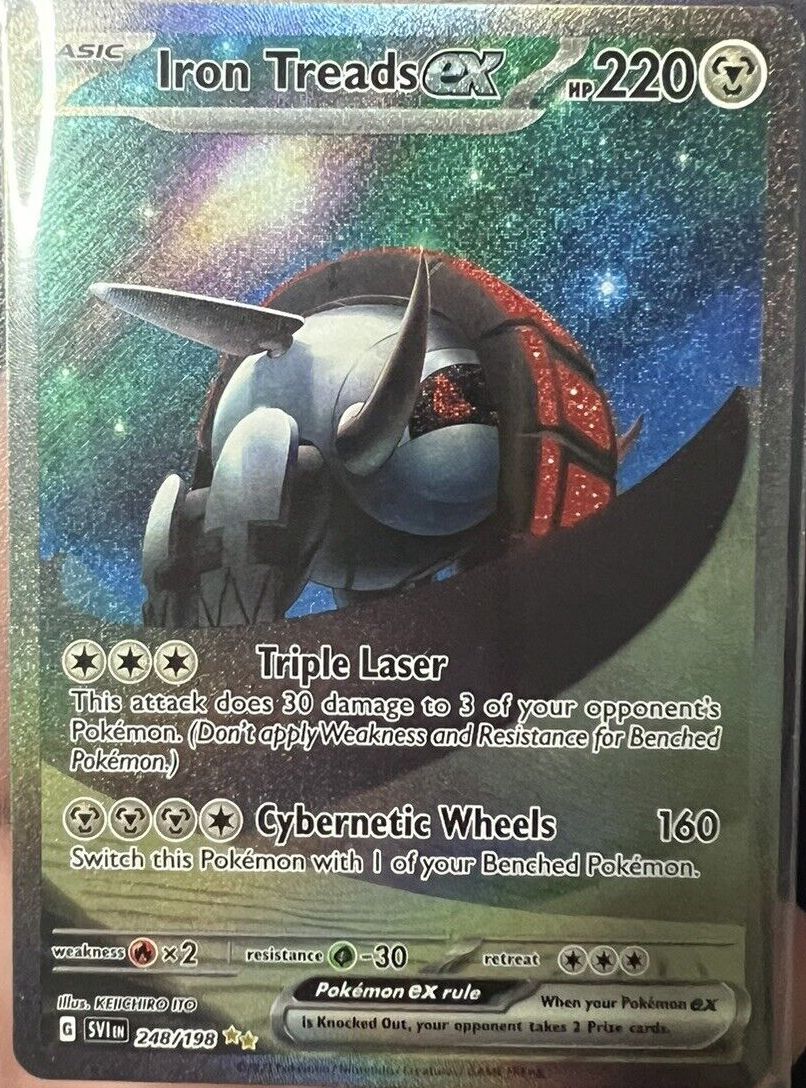
I cannot unsee the world championship deck borders on these new cards ![]()
4 Likes
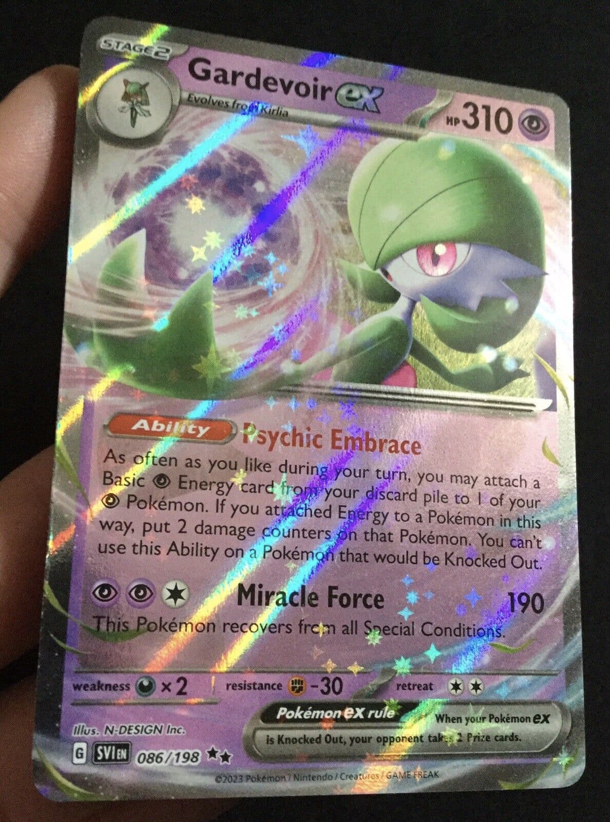
The stars are there by the way. Just that they are very understated/can only be seen at certain angles.
4 Likes
I feel the same ![]() I almost prefer the yellow border because of this. But it’ll probably go away with time.
I almost prefer the yellow border because of this. But it’ll probably go away with time.
The difference here is so stark. I don’t have that many Japanese cards, but I didn’t realize it was that different.
what’s your opinion on the whole english vs japanese print on ScV? I have yet to see either personally and am very curious
Yeah They are indeed very different and for me the jp version is better ![]() but as a collector of both the Japanese and English versions it is sometimes hard to choose because the American version is obviously better to order, but for jp version you need pay a hefty premium to Scalpers since you never get the enough original price of the box.
but as a collector of both the Japanese and English versions it is sometimes hard to choose because the American version is obviously better to order, but for jp version you need pay a hefty premium to Scalpers since you never get the enough original price of the box. ![]()
1 Like
English cards looking fake lmao
1 Like
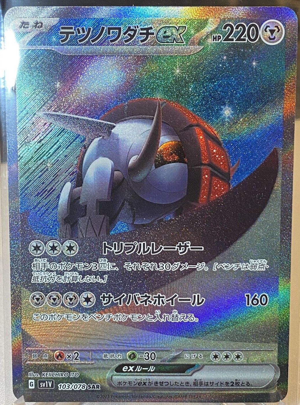
Higher res and with better lighting. As usual the colours on English holofoil cards are less saturated, but everything else including the combined star & diagonal sheen holofoil pattern matches up.
2 Likes
Honestly I’m not a fan of the stars on either of the languages in this case
3 Likes
The qualities in printing that I want to see are not perceivable in pictures. I’d like to see the card stock, clarity of finish. I can see the colors are more vibrant on the JP versions, however, I wonder if it’s consistent or variation in printing… I want to see more for comparison. I’m not doubting. Just reserving judgement.
Even Thai, Indonesian, Traditional Chinese and now Simplified Chinese from Sun & Moon onwards have card quality identical to Japanese, because they are all printed in Japan. After 12 years of full arts in the tcg, it’s safe to say that Japan does not share their printing methods with facilities outside the country (TPCi, Millenium Group). ![]()
1 Like
Agreed with @pfm.
I am not a fan of the stars in general. The pattern reminds me of the WCP gold stars.
1 Like
Well, yes, but if we’re explicitly talking about ScarletViolet, then it remains to be seen if quality and design differences persist.
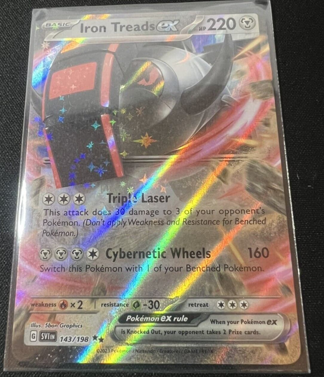
On that Iron Treads card, is the JP version supposed to be that blue? hue of one is certainly different, and from those pics, I kinda like the EN one better… (which I’m surprised to say.)
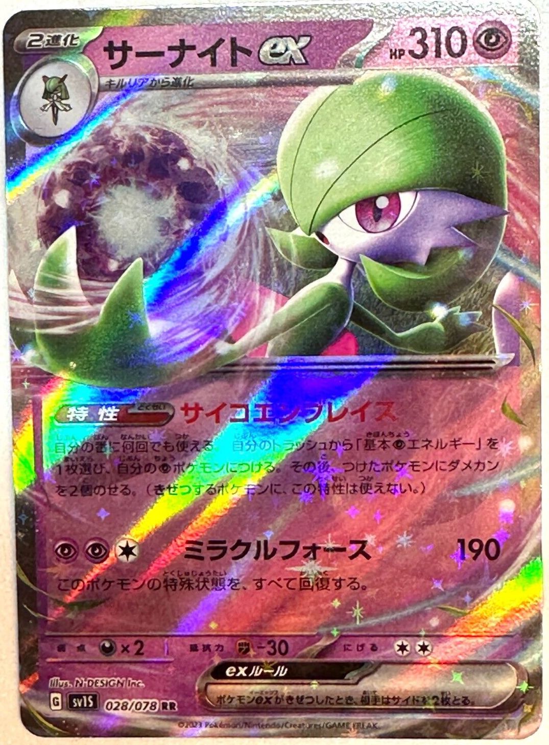
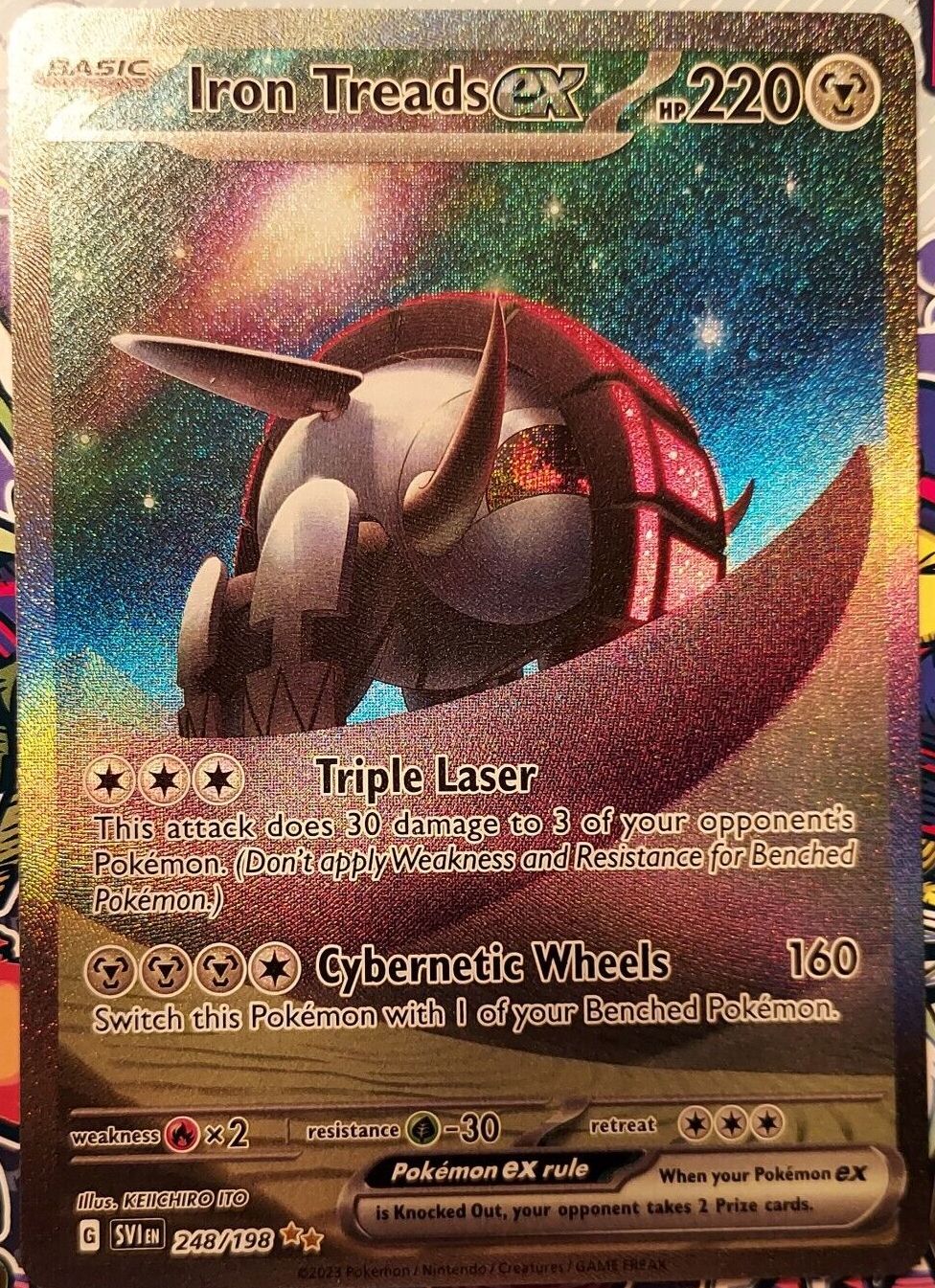
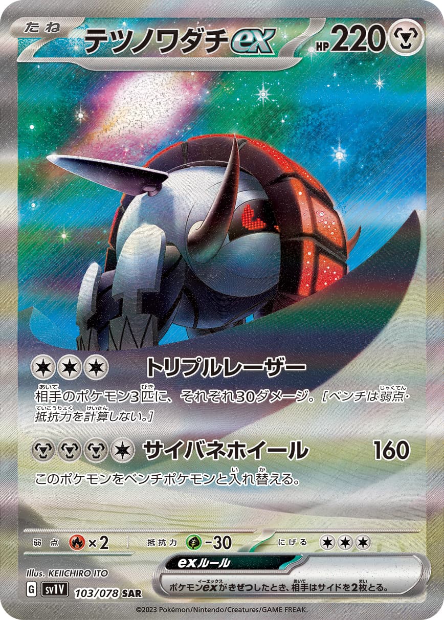
Here’s the official image for JP
It’s hard to standardise the lighting conditions and image quality based on what I can find so far
2 Likes
Oooooo! Now THAT is what I want. ![]()
Seriously though, I might have t pick up both languages, now that they’re silver borders, just to see the differences. I’ve been getting JP for my artist collections because of those silver borders, but now…
the spacing on the name is really throwing me off (on English)
space between Iron and Treads should be smaller and a bit more portional between Treads and ex. but this is just my ocd speaking
Correct me if I’m wrong, but this doesn’t look terribly different at least.
mentioned this on discord, but i think as long as you don’t mix/match tpc/tpci’s print styles, i think these will still look decent in a binder
2 Likes