There’s a lot of different kinds of energy in the collecting space today: positive, negative, upset, excited, water, you name it.
Going with that theme, I will post an energy type, and you post your favorite card of that energy type. Feel free to include why you enjoy the card! The post with the most likes after an appropriate amount of time will win bragging rights and the wonderful bobbrob designed badge:
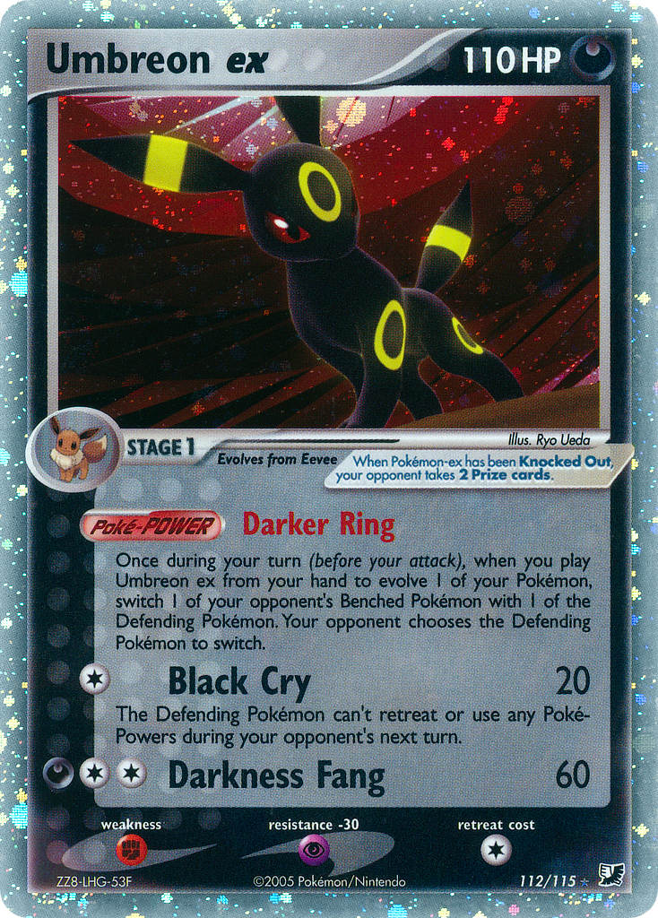
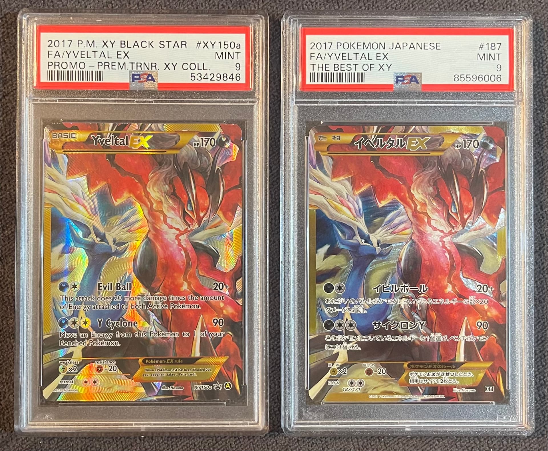
Limit your entries to one card per post, and three posts per person max. Please write out the card and set name in text in addition to the image posted for posterity in case images break.
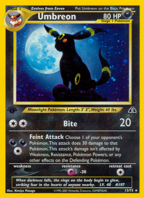
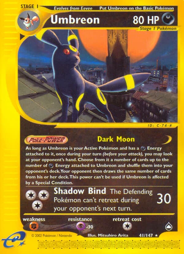
A classic, it perfectly captures Gen II themes and vibes. The sunset on the ruins, the cautious nature of Umbreon, the blessed and warm palette. It is simple but effective! Thankfully not even holo, so please don’t stonk this.
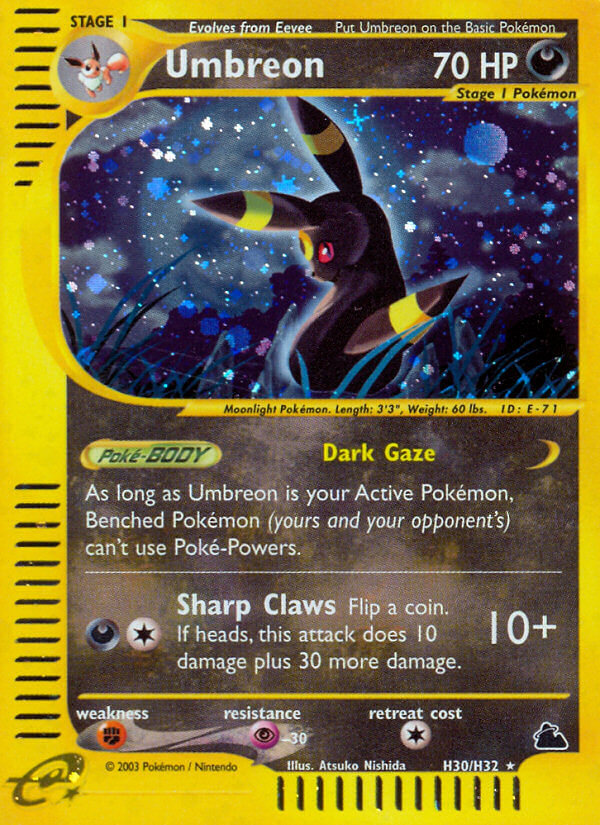
I love when artists put their own spin on a pokemon. The anatomy of neo discovery Umbreon feels so much more like a real animal, and can’t beat that lighting
Typically Greninja is classified as a water type and there are a very few cards where it is classified as a Dark type. I think it happens whenever it is depicted more as a ninja, which is also the case in this card. The cool smoke effects really lean heavily into the ninja aspect of this Pokemon.
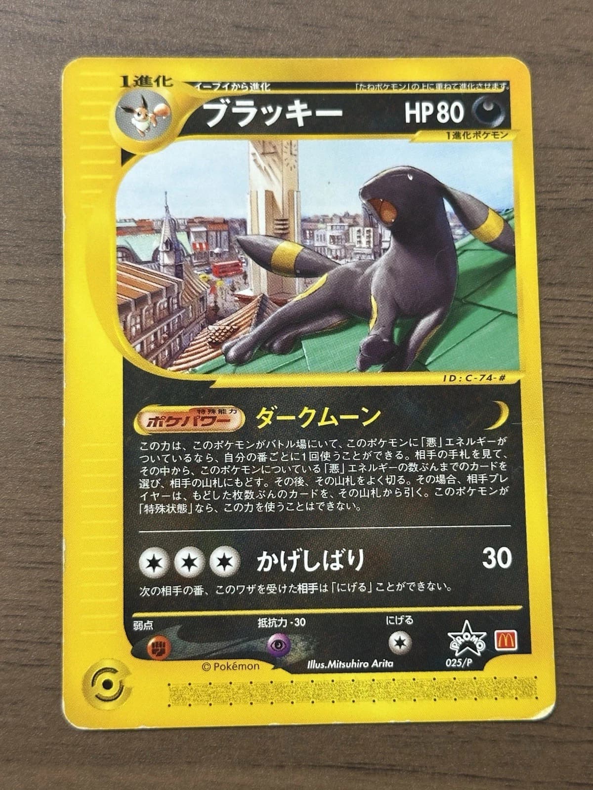
This card was given as a promo at the Charizard Mega Battle event held in Japan in 2014.
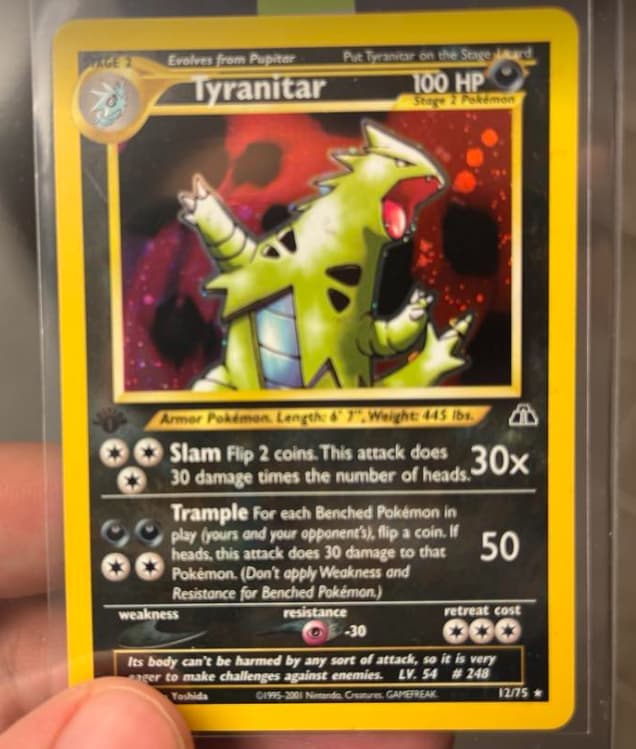
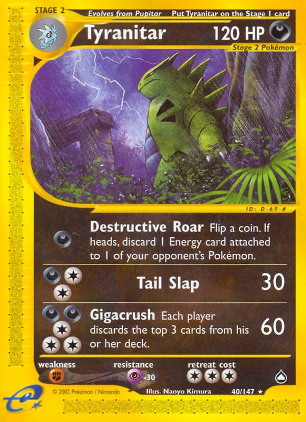
Really reminds me of Godzilla movies, which is fitting since Tyranitar is based on Kaiju as well. The plants in the foreground and lightning and ruins in the background also suit this Dark-Type Kaiju Pokémon.
Umbreon has a lot of amazing artworks, so I understand why it’s so popular, but these early Aquapolis and Skyridge Umbreon are still my favorites. I love the ‘active at night’ ‘asleep during the day’ contrast of the first two cards in the same city.
And imo the Skyridge one is THE Moonbreon card. I honestly kinda dislike the first Neo Discovery one (even in Japanese, where it’s moon is actually round instead of an oval). And although the modern Moonbreon VMAX is pretty good, it’s also not THAT good. And it being overhyped/overrated makes me like that artwork less instead of more.. The Skyridge Moonbreon is amazing though. A large moon in the background; an original look over the shoulder pose of Umbreon; and the grass on the foreground. I’m usually a bigger fan of non-holos since you see the artwork better, but in this case I’ll go with the holo, maybe also because I pulled it as a kid.
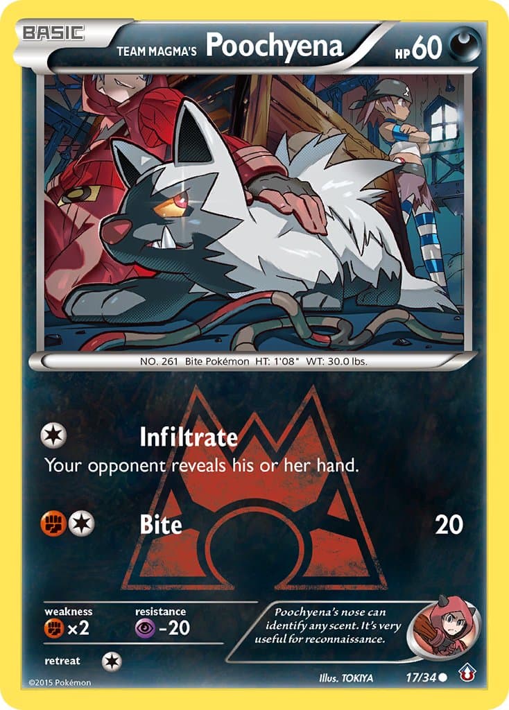
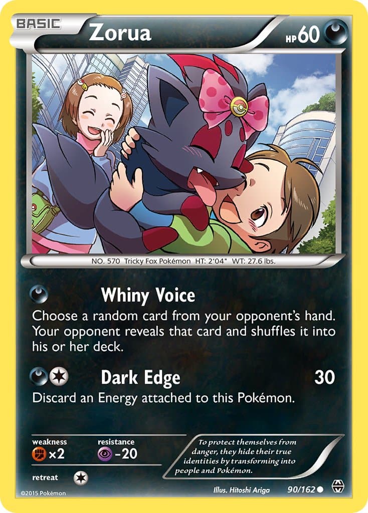
As for the Zorua and Team Magma’s Poochyena, as mentioned more than once before, I like Pokémon and human living together. The Zorua is very striking, since it’s so unlike a Dark-Type Pokémon to be cute, and the anime art-style, buildings in the background, and pink ribbon on Zorua makes it a great artwork. As for the Poochyena, the Double Crisis set is my favorite for a reason. Apart from the Trainer cards, every card in that mini set is a banger. I like how the Team Magma trainer and Poochyena are infiltrating the Team Aqua base in this artwork, hiding behind some crates, but raring to fight the Team Aqua grunts.
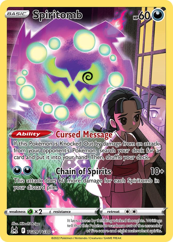
And last, but certainly not least, is one of my favorite FA CHR cards. The semi-translucent Spiritomb; the flames in the foreground; but most of all the reflection of the girl with glowing eyes due to reflecting Spiritomb’s light purple light, makes for one amazing artwork.
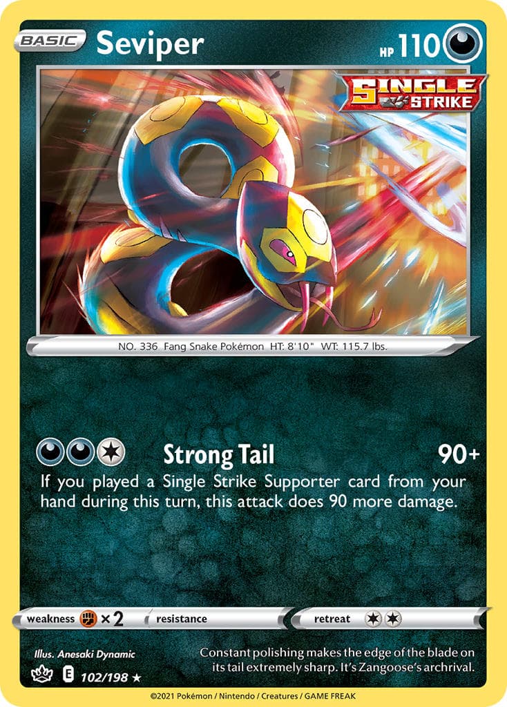
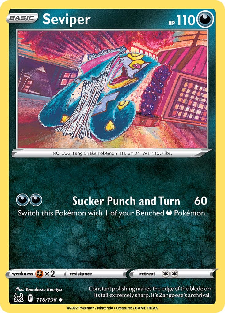
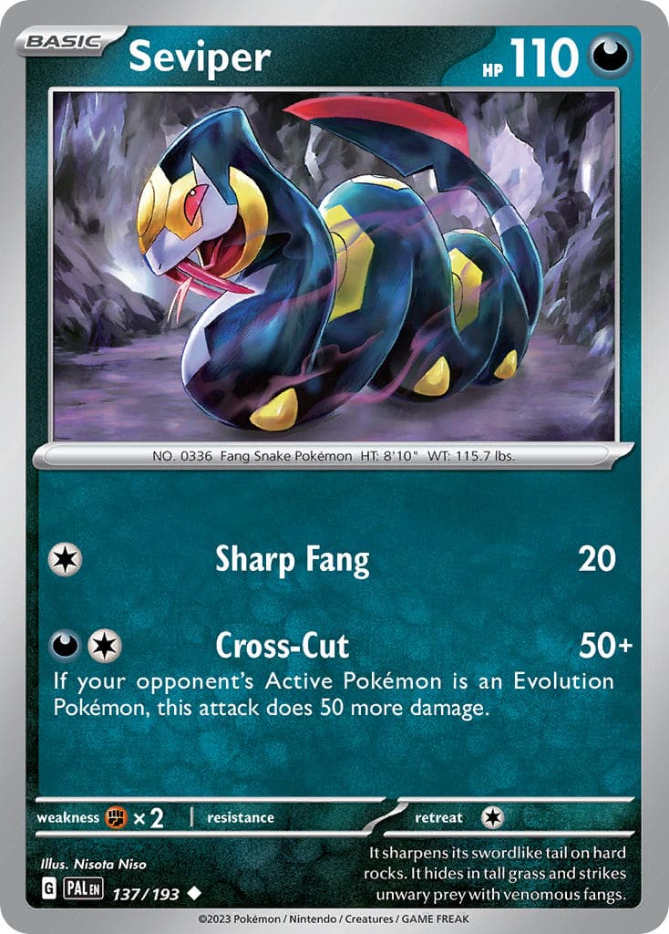
And of course a shout-out to all Dark(Poison)-Type Seviper. Of which the one from Scarlet & Violet base is my favorite:
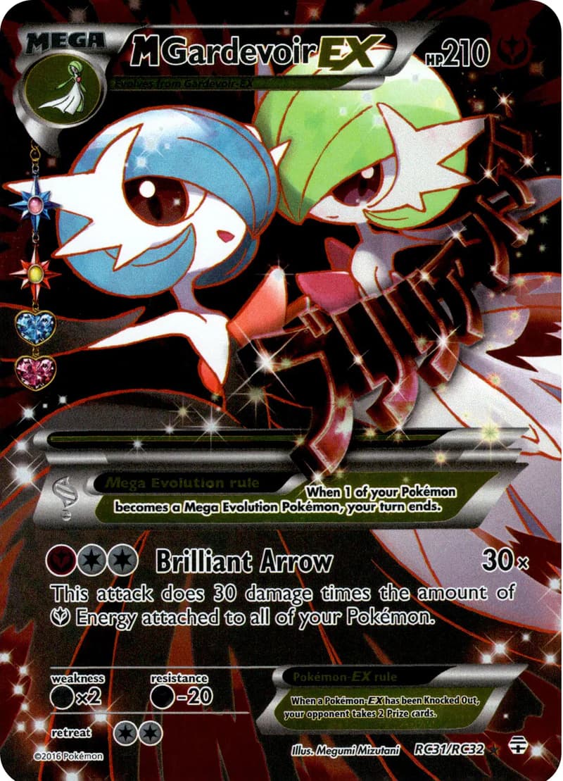
Man this is probably the toughest energy for me, since none of my top mons are dark type. But if I had to choose it would be this beautiful M Gardevoir EX from Generations. This card is very stunning despite not having texture irl


