Fun read I just noticed on my lunch break.
From an archival & preservation standpoint, this is really fascinating.
Fun read I just noticed on my lunch break.
From an archival & preservation standpoint, this is really fascinating.
I saw this yesterday too. It’s really cool. It makes sense why some of that original work is so distinct looking compared to later generations - it isn’t! Just poor scans that became dominant
I see that they’ll be slowly uploading these to Bulbapedia. I’m really curious and happy to see hd scan of really iconic artworks.
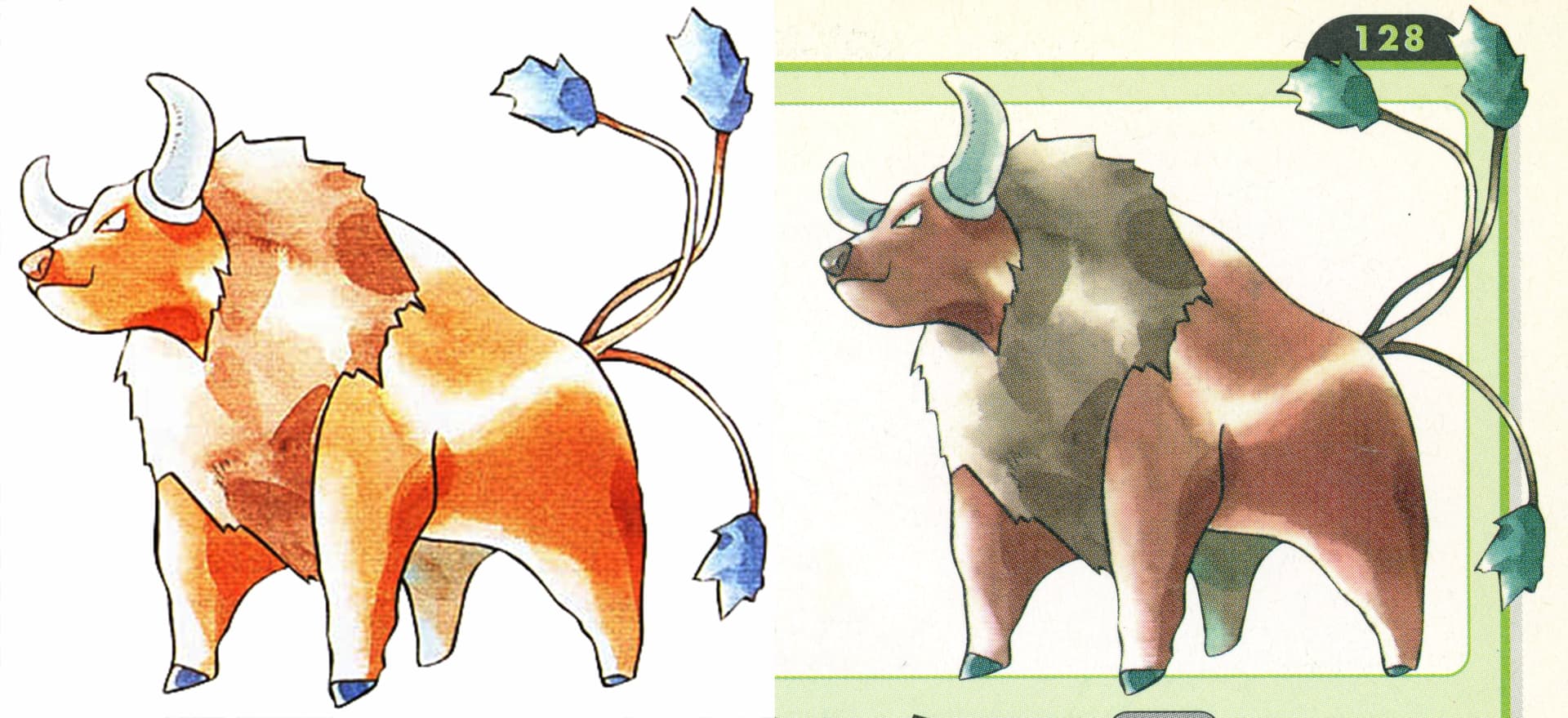
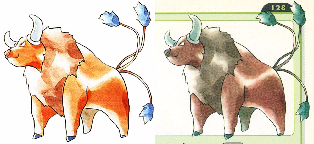
The difference is striking for some pokemon. Original sugimori’s colors are a lot less washed out than what I expected, and his typical white “shading” not so prominent.
Been following this and think its really cool. Looking forward to seeing more!
Oh lord… pretty groundbreaking discovery tbh.
I feel a bit weird saying this, but I like the “wrong” illustrations better and I have the feeling that the (way) heavier “white shading” and different color palette definitely has contributed to the legendary, distinct status that’s nowadays inherent to Sugimori’s art.
“Sugimori’s watercolor art really stands out from a lot of official video game art these days, especially with the few official scans where you can see the small details and human imperfections which remind us that the art that we admire is all made by people…”
Ken will always be the goat to me
I love 'em both. If you’ve always had a lot of original hardcopy material, from American guides to vintage Japanese products, you’ve always known this, and appreciated both nevertheless!
It’s like the blown out ones are larger than life representations in a way, a happy accident. They really are gorgeous. It also shows the texture of the paper in a different way, you can see the strokes very clearly. And the color is beautiful. Think of them as alt arts, or even shinies?
Zoomers want to arrest him for stock art crimes but Sugimori’s watercolor art and unique character designs give me nostalgia like nothing else.
Pokemon just wouldn’t be the same without him and it’s great his work in their original, unaltered state are being discovered.
Watercolor Pokemon art will always be my favorite. ![]()
Oh man this is insane. Been a good year for scans, between this and multiple collections release of high quality NES and SNES manual scans.
Maybe Scyther is yellow after all! ![]()
Shadowless vs Unlimited colour scheme
The difference is crazy. Seeing the detail and color of the original pieces is awesome, but, maybe because they’re so nostalgic, I kind of like the lower-fidelity images a bit more. Maybe because the colors and supposed-style are so different, giving them a feeling of uniqueness. But it’s great that the original art is coming to light and that it’ll all be preserved!