I remember this same question when Black & White came out. And then again when XY came out. etc. etc.
Each generation has ugly Pokemon and nobody likes change. Some of the ugliness of these Pokemon will be overcome by engaging gameplay or fun characterization in the anime.
Over 22 million sales for SV speaks otherwise. Just like ultrabeast the paradox aren’t meant to make sense. The story is incomplete as of now, when the second Dlc drops we’ll have an idea how any of these Pokemon in Area Zero came to be.
Sales has nothing to do with the quality or excellence of their designs, even more accurate when refering to Nintendo product and even more accurate when referring to pokemon.
You could release a new gen with only 20 new pokemon, 10 of them in the shape of an ice cream and the game will sell millions.
I said it before: anything after Gen 4 looks like a cheap lazy knockoff. And the last couple ones feel like they were made by an AI in the fast option.
I’m not a fan of it , the way the Pokémon look with there future robot look / prehistoric look is making me question the idea jar is running out back at the Pokémon Lab
Now Gen 1-3 I love and I didn’t really think Gen 4 would be great but as @Dyl said it grew on me with time.
The other Gens … eh not so much lol don’t see my preferences changing on those
Gen 9 definitely took some getting used to for me, the gamut of odd/ugly designs was a downside. But since playing through the game, seeing more art of the mons, I’ve warmed up to a few more of them. But SV has some really good designs among the dex too. Surprisingly I think the strong point of SV is it’s characters. They are more well written (IMO) and designed and very likable.
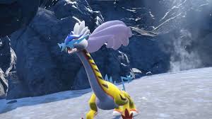
Gen 5 is definitely my least favorite Gen of designs as some have also said, but yeah I’ve really enjoyed this regions mons overall. Raging Bolt is definitely an acquired taste let’s all be honest haha
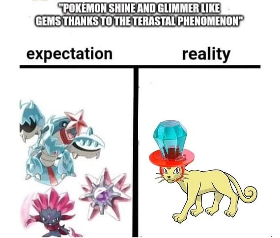
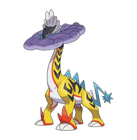
Yup. If we are talking about designs of Pokemon, the base game mon are largely very good imo. The tera mechanic isnt the best, but thats its own thing, separate from the designs of the new Pokemon. The rehash of old legendaries is always going to be a point of contention. No one is going to look at Long neck Raikou and think “yea this is better than the OG”. Some are better than others, but people always prefer the originals in these cases. They are also dlc/special raid Pokemon that arent really part of the main story of SV.
Implying that the tera crown mechanic makes the new pokemon designs bad isnt fair imo.
I don’t know if I’m in the minority, but I quite like the paradox Suicune when it was revealed. And, to be fair to good ol’ Raikou, I do think the concept art looks much better than the 3D model preview we got. The proportions look off when compared to the concept art—is the head too big or something? Or maybe it’s an unflattering perspective.