I like cards with limited color palettes. Post some with me!

This is a niche thread idea.

Sometimes a Pokémon card uses only 2 or 3 colors in its design, including the full frame of the card. I tend to think of these as “duochrome” or “trichrome” cards — similar to the concept of monochrome.

Check out this Pikachu. This card is a very pure example of the idea. This entire card is yellows, orange, and silver. The energy costs, the background foil, the card border, the featured Pokémon, all come together cohesively with very limited colors.

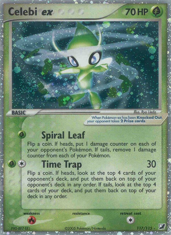
Check out this Celebi. Here is another one I like. This whole card is greens and silvers, with the one red outlier down at the weakness to fire. However sometimes this ends up feeling like a contrasting accent and enhances the vibe.

Check out this Dewgong. This is one of the earliest examples of the phenomenon, and the color selection is a little wider while still being very limited. Everything is blue, yellow, and gray. All the yellow framing containing the blues and whites has always been striking to me. There are some subtle touches here — like the fact Dewgong’s fangs are yellow. You end up with a blue and gray piece with all these golden yellow accents and I think it looks so cool.

————

Can you think of other cards like this? I feel like this is one of those card styles that’s very “know it when you see it.” If you try to set too strict of criteria you end of disqualifying cards that suit the vibe even if they technically exceed the two or three color definition. So don’t focus too hard on counting colors — this is a vibe thread!

25 Likes

I feel like Magmar lends itself well to this.

This Expedition card in particular suits the brief quite well I think.

18 Likes

I feel this thread in my bones. I think you and I have a similar love for limited color pallets. This is also why I love the EX era.

These are some that come to mind!

20 Likes


10 Likes

Very fun idea!


I think Tanaka’s style really suits this thread!


14 Likes


6 Likes

This type of card has continued into the art rares/alt arts/illustration rares, etc etc etc.


Some non full arts I like:


9 Likes


please note I only read the title and not the OP :slight_smile:

15 Likes

so, not like these?


7 Likes

Those belong in a rival polychromatic++ thread.

8 Likes

One of my favorites

9 Likes

Nice thread idea, simple and limited colour palettes are what make older cards so much more charming and eye-catching imo.

image

4 Likes

My life before being turned into the ex era of holos was barely living at all. Exquisite cards.

2 Likes

Thankfully, no one posted my favorite all time card. The gold perfectly matches the gold borders, with just highlights and hints of color. All other gold borders are inferior.

8 Likes

10 Likes

11 Likes


4 Likes

Roses are red, :rose:
but these Pokemon cards are blue…

One of my fave non-chase cards, Vulpix Vstar, so beautiful yet undervalued:

Edit: OMG I actually forgot about Glaceon.

4 Likes

Love all the green and holo on this one.

If only the Blastoise had a blue holo instead of the purple/green it has now, that would have been perfect too.

12 Likes

I have a few to share, starting with 3 first!


You can feel the heat emanating from the image, the atmosphere is rendered very well here through the color scheme.


Likewise, the cold mountain air is “visible” in this scene.


Of course, how can I not share a Gengar?

Fun thread thanks! I’ll post more later on heh

14 Likes