This is the only one I have ever found. I shared the card’s picture once back on Pokegym, but it surely has been a while. It came with the original FPO cards purchase back in 2013~
7 Likes
Sorry for bumping an old thread but I just got scammed and I want to share to avoid other people from experiencing the same thing. I purchased an FPO card and everything looks real - at least from the front and back.
But I got curious and did the old fashion flashlight trick and guess what I noticed.
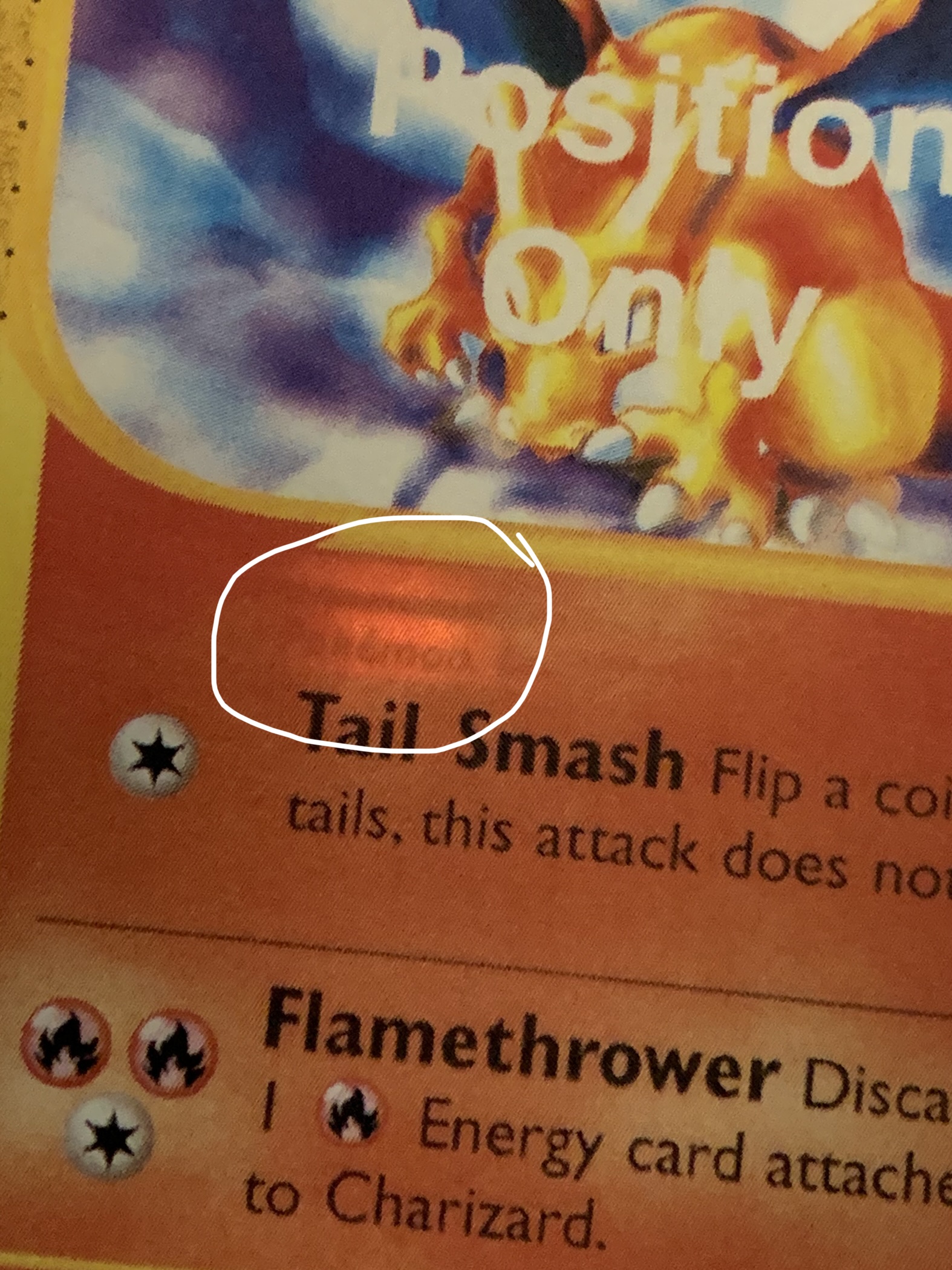
Yeah… someone glued the FPO picture onto a real pokemon card. That is why the back looks real. Just watch out… I hate people sometimes.
4 Likes
How much did these run you back in the day?
Whats the quality of the front sticker like IRL?
Definitely different which is why I did the light test. The front of a real Pokémon card feels smooth and both front and back should have the same feeing to them.
The fake still feels like cardboard but it is not as smooth (likely due to the glue used) and the surface has a different touch / feel compared to the back.
2 Likes
Given PSA’s stance on AA and “extra copies” Pikachu illustrator, will PSA decertify existing FPO slabs?
Don’t they already do?
Really? I only remember PSA stop grading FPO cards. Didn’t know existing slabs are decertified too. Thanks for the info!
Someone on the Discord was saying that PSA went out of their way to try get the FPO slabs they grade back from them.
1 Like
@davie - I’d have to go back through and find my invoices but compared to what they are today… it would be peanuts!
1 Like
Welcome back Gav. But as you probably should know, don’t bump threads that are over 2 months old, unless you have something constructive/new to add. ![]()
Greetz,
Quuador
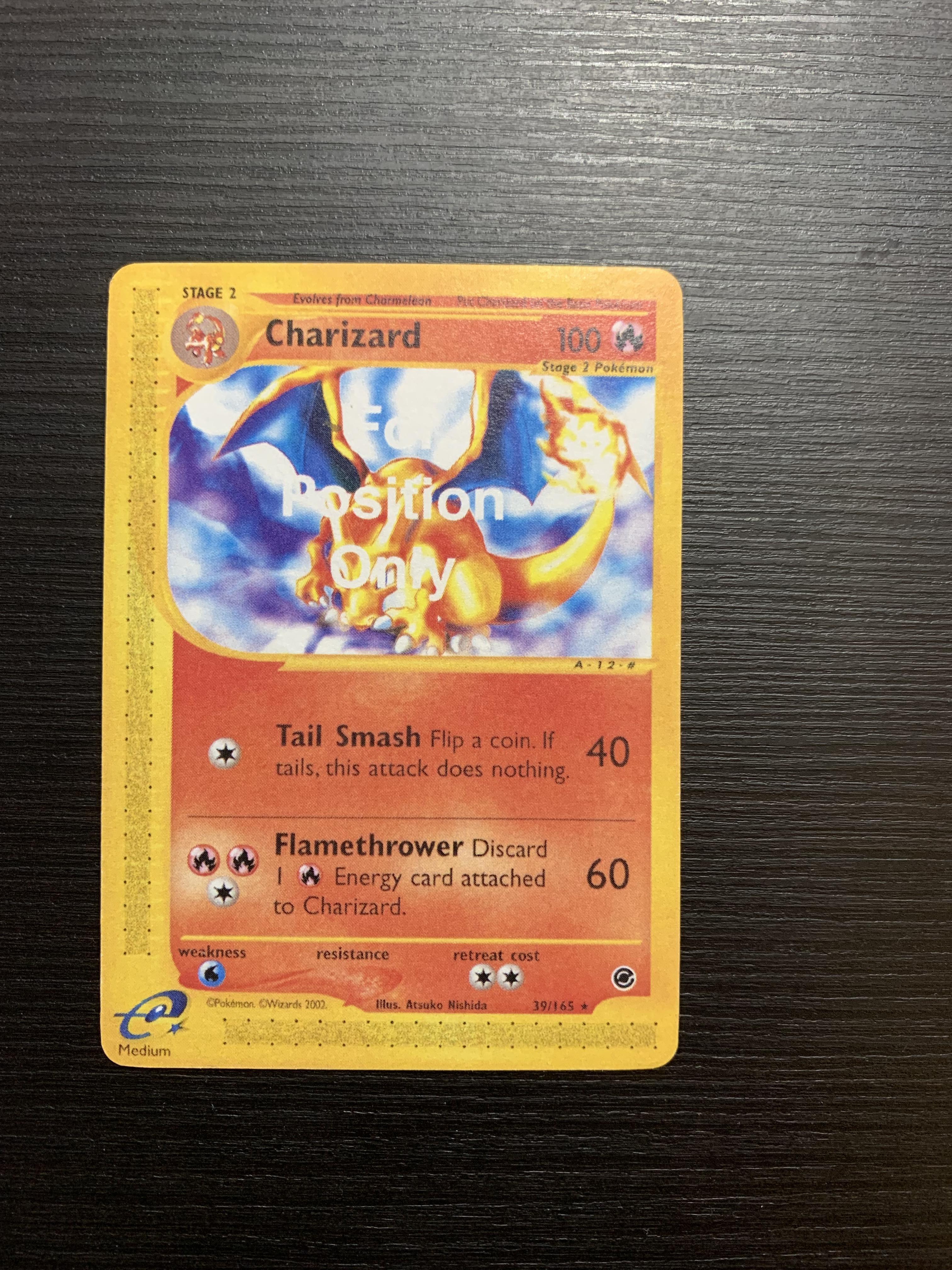
FOR POSITION ONLY isn’t related to the position of the artwork, or which artwork was selected.
I DO think the Pokemon FOR POSITION ONLY cards are test prints, for a variety of reasons, but not because they say FOR POSITION ONLY.
FOR POSITION ONLY doesn’t mean that something is a test print.
Most FOR POSITION ONLY cards are Filler Cards.
A Filler Card is what occupies the unused spaces of a sheet, and is intended to be thrown away at the print facility. Occasionally they don’t get thrown away, and accidentally slip into sealed product, so they’re pretty rare to find outside the print facility, and people do collect them.
More about FPO
What we’re talking about here, is digitally creating the sheet layout inside WotC headquarters, way before anything gets printed.
Going way back to the early 1990’s, the sheet layout software had a grid on the monitor, with a space for each position on the sheet.
If you wanted a sheet position to contain a card, you needed to do two things.
- drag the .tiff image file with the combined art and card frame into that position
- drag the .eps text file with all the words and symbols into that position
When the sheet position was occupied, it would have an X on the monitor.
You couldn’t see what was in that sheet position, you could only see the X to tell you that something was there. It was almost like working blind.
So you really had to focus, to make sure that each position contained the correct card image, and ALSO that you’d assigned the correct text to each image.
On top of that, the file you were dragging didn’t always snap into position correctly on the grid. It might be about a quarter inch off center, and you wouldn’t know because it would still show the X.
So proofreading was really important. They’d do a black and white print out on thin paper for proofreading in the office. In the really early days it was regular sized paper, but they soon got a larger format printer that could do quadrant sized paper (still thin paper, not cardstock).
Occasionally they’d still miss something, either because they didn’t catch it during proofreading, they missed it in the long list of stuff they were supposed to fix, or they messed it up accidentally while trying to fix something else.
Because each sheet position was filled independently by layering two files, you could get situations where two identical cards on the sheet actually had different text alignment, or in some cases one copy might have entirely the wrong text that had been meant for a different card. Oops!
Having the card image and card text as separate files was handy for creating sheets in multiple languages. You could retain all the images and sheet layout while deleting the text. Then you’d have to assign the correct translated text to each sheet position.
The early sheets were all 121 cards, 11 x 11.
By the time Pokemon came around, the sheet layout software was much improved.
First you’d select the sheet size, by populating each position with the same digital file, so it was a whole sheet of the same “card”.
At first, that “card” was just plain black with no design at all.
Then for each sheet position, they’d link that position to the digital file for the card that’s supposed to be there. They could see the card on the screen, which was neat.
The black positions weren’t done yet, and the other positions contained a card image.
Because each position linked to a digital file, you could link multiple sheet positions to the same digital file, and those sheet positions would have identical cards, which greatly reduced mistakes.
Solid Black was used for Magic, because Magic has black borders. This way an off center cut in the print facility would be less noticeable, because there’s not a gap between cards on the sheet.
Magic was doing this in 1997.
When Pokemon came along in 1998, it had yellow borders, so solid yellow was used to populate the sheet layout.
Cards are printed on sheets, but sometimes you don’t need all the sheet positions.
For example, if sheets are 11 cards x 11 cards = 121 cards, then you can put two 60 card Theme Decks on a sheet, and you’ll have one sheet position leftover.
That leftover sheet position remained solid black (or yellow for Pokemon), and isn’t assigned another card image.
Then WotC tells the print facility to throw away all the solid color cards, they don’t go into the sealed product.
These physical cards that are supposed to be destroyed, are called Filler Cards, because they fill the unused spaces of the sheet.
However, the earlier digital version of these same Filler Cards are called FOR POSITION ONLY cards, because they’re only used temporarily to help the typesetter see the sheet positions on the computer screen.
Because they’re digital, they’re not physical cards at all, they’re just a digital design that fills the card space.
The problem with having a solid color design being used FOR POSITION ONLY, is that when you start and the whole sheet is the same color, it’s really difficult to find a specific sheet position where you’re supposed to put a specific card.
You can’t count X spaces over and Y spaces down, because solid color means you can’t tell where the edge of each sheet position is.
So the typesetters have used a variety of FOR POSITION ONLY card designs over the years, to make their job easier or more enjoyable. It’s something the public is never supposed to see.
They might use blank white with a colored border, a big X, the brand logo, the word DISCARD, or whatever they want.
You can look at filler cards to get an idea what the various FPO designs have been.
Kat was the typesetter for Expedition, and it looks like she was using the bold white lettering FOR POSITION ONLY while creating the sheet layout.
It looks like she had it as a text layer over all the sheet positions.
Maybe she’d remember something about these cards.
White ink is used on foil cards to mask the areas that aren’t supposed to be foil.
They call this White Underprinting, or WUP for short.
But that’s a special thing for foil cards, and most cards don’t use white ink.
White is typically the abscence of ink, which reveals the white cardstock underneath.
So white in a digital card design, typically generates as a knockout during color separation for printing.
Knockout means that all digital layers beneath the white are deleted, so the blank cardstock is exposed.
That’s what happened with these Pokemon FOR POSITION ONLY cards. They were sent to color separation without toggling off the FPO text.
This could happen by accident, and would be a HUGE expensive mistake on a regular print run, but I don’t think that’s what’s going on here.
These cards have enough differences from normal cards, that I believe the FPO text was intentionally left on the card.
I do think these are Test Prints, but I can only speculate on what was being tested, perhaps it was multiple things.
Test Prints are usually done for a new process or material, and they probably would have needed to make sure the E reader codes worked, so a test for the E reader codes makes sense.
But Test Prints aren’t normally inside booster packs. That’s an unnecessary step before sending Test Prints to WotC for review.
Based on what I’ve seen with WotC Magic test prints, these Pokemon FPO cards could be a quality test for a new print facility. Before commiting to an expensive full print run, WotC wants to know if the facility is qualified to do the job. Can they match the quality of existing print facilities, or is it just going to be a bunch of marked cards? Do the E reader codes work, and also the quality of the packaging.
I recommend taking a closer look at the booster packs themselves, vs a normal booster pack.
It would be nice to know which print facility these came from.
WotC doesn’t send regular production print files to a new facility that’s not under contract.
This is to ensure that the new facility isn’t able to create unauthorized cards.
Magic has Test Prints from late 1994 and through 1995, where WotC was looking for a new print facility. These cards are all intentionally different from regular cards. One series has intentionally mismatched art and text files.
From 1996, Magic has a new facility test that is Test Print Netrunner cards (different card game) inside Chinese Magic 4th Edition booster packs that are different from normal production packs.
The limited card selection and the way the cards repeat inside the pack, reminds me of your Pokemon FPO Expedition cards inside Legendary packs.
These may have been created while Expedition was still in the process of being typeset.
The missing HP on Charizard is very likely a mistake, but the rest seems intentional.
10 Likes