Exactly. Most have overlooked the accessibility to their recommendations not realising what they spent when they started collecting is naturally at there lowest capital budget and product awareness. Its actually one redeeming factor to modern product, having both looks and be cost effective.
Wanted to point the Shedinja is one of my favourite cards, thanks for highlighting it’s radiance to shine on a subject like this. As a Pokémon it’s criminally overlooked in the tcg when it has got an absolutely unique quality shown to be a dangerous niche to play against in VGC’s featuring the Ubermons.
I disagree here. There are cards for every budget so far in this thread. Actually a lot of the cards in this thread come in at the price of a few modern booster packs in NM condition. Nowhere in this thread does it mention budget or newer collectors either.
On a side note, received this today, one of if not my favourite pokemon and very affordable. I love the art. Puggo approves
Fair enough, I placed my perspective as a subjective which was from where I started collecting with set holofoils that fill all personal criterias as an introduction instead of a reintroduction which is what makes your post resonate to me. You can’t go wrong with EX Dragon.
***EDIT***If I include more higher level guns that hold niche value are the Movie mon’s that make the present style pre cut before generation transition. Easily the greatest example is Illusion’s Zorua and Zoroark with the HeartGoldSoulsilver aesthetic and a perfect swansong to that era while also being gateway to the then next gen.
Japanese Lugia 038/PCG-P is one of my all time favorite artworks and has a fairly low pop report of only 24 total. It was released to coincide with the Pokepark grand opening in 2005.
Here’s an unpopular opinion for the split legend cards I guess. Despite having the best artwork ever, I have never bought or plan to buy them because I hate sideways cards. Also I hate how the artwork is split into 2 cards, ruins it. Also also, I hate how the text is at angles and stuff, looks ugly and messy to me.
(I think) Its a 7/11 special where the PMC wanted to introduce to the Japanese player/ fanbase that there are other languages that are pokemon tcg is being printed in.
On the back of the pack it says that its to introduce the children to their international counterparts and get exposed to the international audience
So the PMC introduced 8 other languages that the cards were being printed on (at the time of 2010):
English
Italian
French
Korean
Spanish
German
Polish
Portugese
With these languages, they introduced artwork ‘associated’ with each language/ country
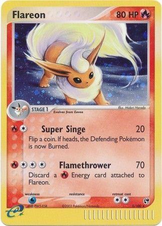
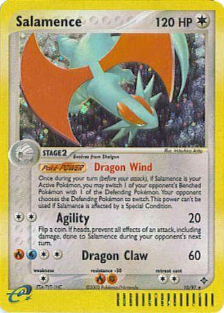
I think some of the most underrated cards in the entire TCG (not so much in terms of what they’re worth, but in terms of how beautiful they are) are the early EX Series holos. So much attention is paid (and rightfully so, IMO) to the e-Series holos, but I find many of the early EX Series holos to be equally if not better-looking:
I believe that the early EX Series holos in particular are unfairly overshadowed by the exs. But the holos have so much more to them than the exs, IMO. They are rarer (for the first three sets), the vast majority of them are rookie cards, and the art is much less muddled. Some of the exs have kind of clunky, CGI art, but very few of the holos before TMTA do. One thing that I also like about them relative to the e-Series holos (which I also love, FWIW) is the fact that the e-Reader border is only at the bottom. When it’s on the left and bottom side, it makes the card appear weirdly off-center to me. But the early EX Series holos are just so clean, simple, and beautiful. No other cards eclipse them aesthetically, in my view.
I only notice this now, but those in your picture are not the glossy 1996 versions you’re referring to.
Glossy with incorrect Ken Sugimori illustrator is from the November 1996 CoroCoro Comic
(released October 15th, 1996)
Non-Glossy with corrected Keiji Kinebuchi illustrator (which are in your picture by the looks of it) are from the Easily Understand How to Play Pokémon Card vol. 1 from November 1996
Glossy with corrected Keiji Kinebuchi illustrator (which I’m still missing and only heard about a few weeks back) is from the 1998 CoroCoro lottery magazine, which was limited to 2k copies from what I’ve heard