Wondering what people consider the set cards that maybe don’t get the shine they deserve and are a little understated in pictures, however, in hand blow you away.
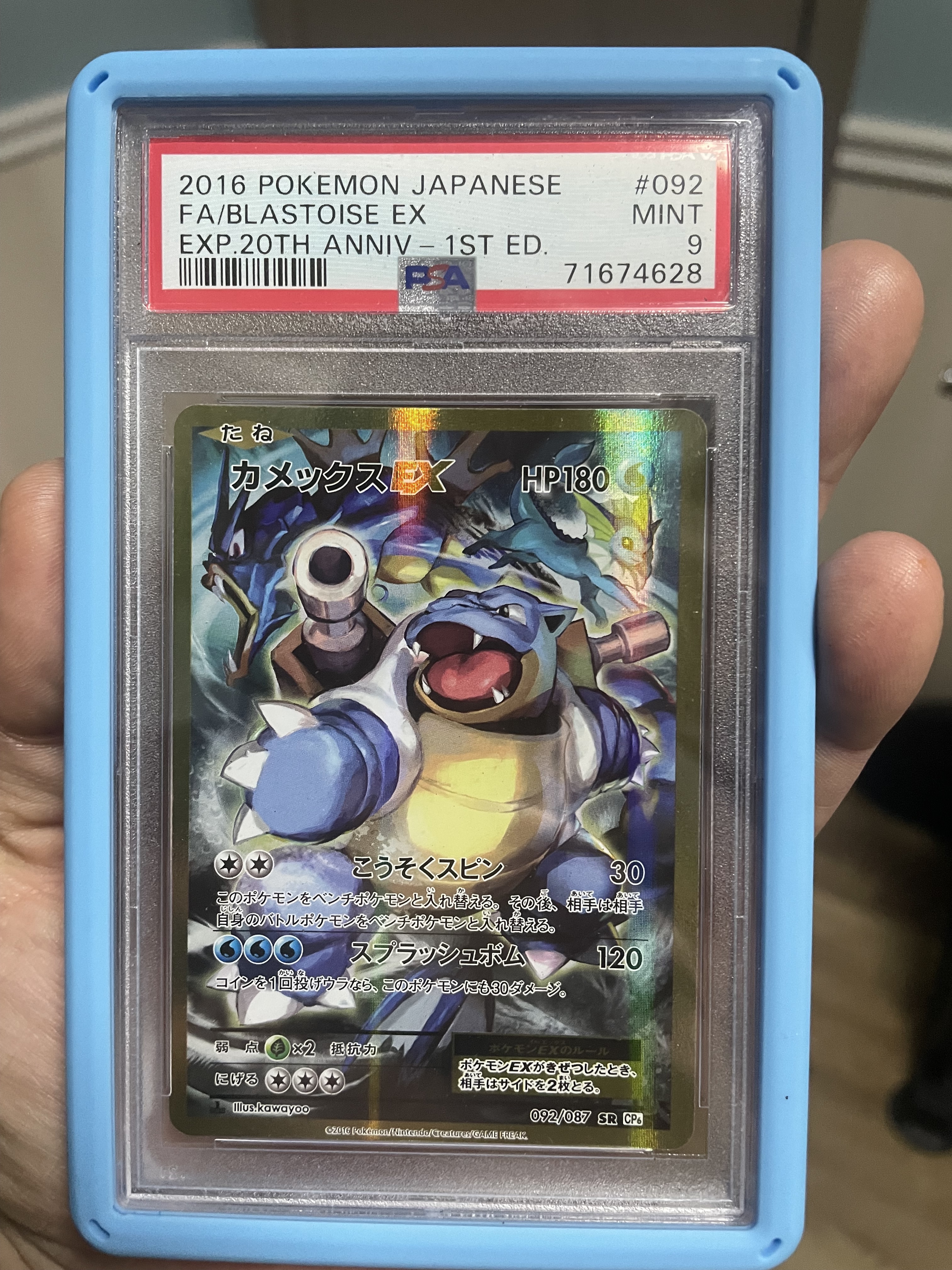
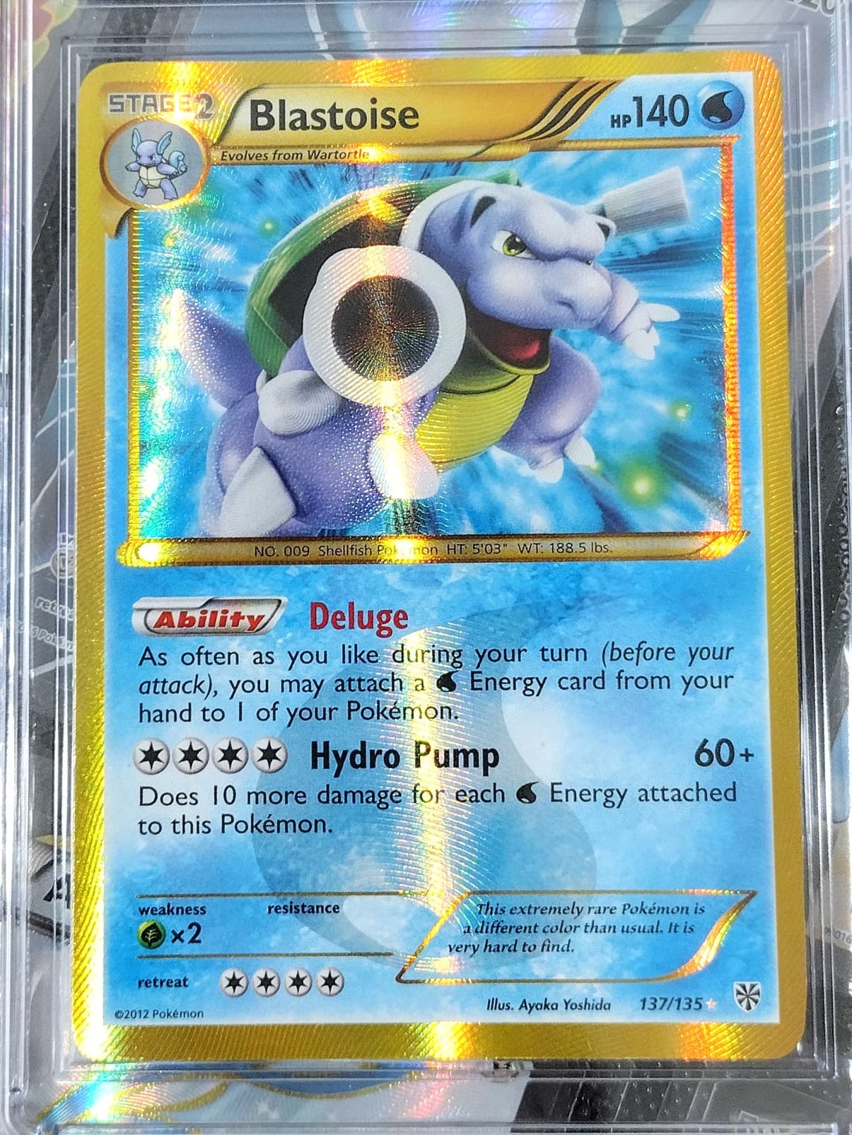
Being new to the hobby I’m sure there’s a lot of cards I’m simply unaware of and don’t have a huge collection to date, so a small pool to select from but would say the FA Blastoise ex from the 20th Anniversary set is probably what’s surprised me most from purchase expectations (bought mostly due to price) to how it looks in person.
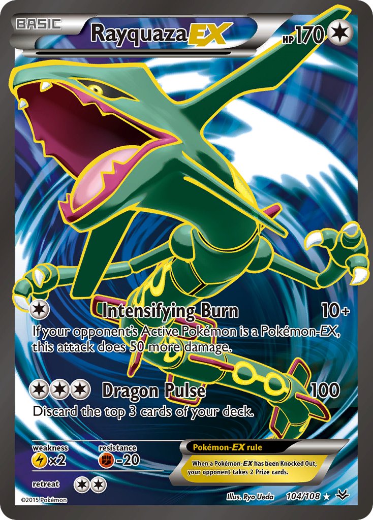
I’ve started looking back to XY era and picking up some full arts. So far I’ve only got Roaring Skies Rayquaza EX but man the texture on that card is amazing. Are they all like that? It’s so much more pronounced than current day.
I was completely unaware of XY/BW series so I’ve gotta be honest when I first saw them they were too different of a style to enjoy and I just skipped over that section on the app I use.
I’m growing an appreciation for them now and that Rayquaza is one I’ve gazed at a few times over the past week. There’s also a Kyogre that goes very hard.
Im gonna go with an old school answer and say neo 3 shining magikarp. It has the typical holofoil with the shining mew sparkle holofoil on top of that.
Going to challenge myself and not give a Gyarados answer.
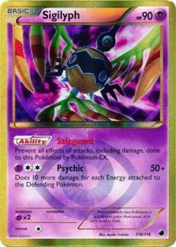
Honestly the Plasma Freeze Sigilyph is such a gorgeous card. The gold and purple color combo, the texture, the way the card just shines and shimmers when you reflect in the light.
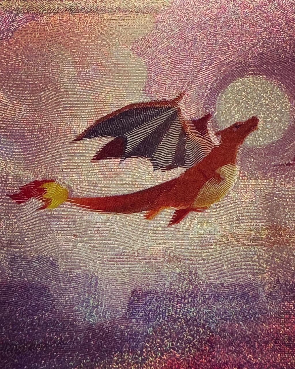
I wanted this card when I was allowed to hold the Charizard version at the Himeno signing event last year. Honestly I’d get them all but the cards are so expensive so I gathered at least my favorite. Pictures do absolutely no justice.
BW and XY full arts are indeed SO much better than modern equivalents. They went downhill in the GX/Sun&Moon era imo with much more generic, subtle patterns that all look the same. Also, they kind of override the fact that the art itself is essentially CG which looks 100% more “meh” on newer full arts.
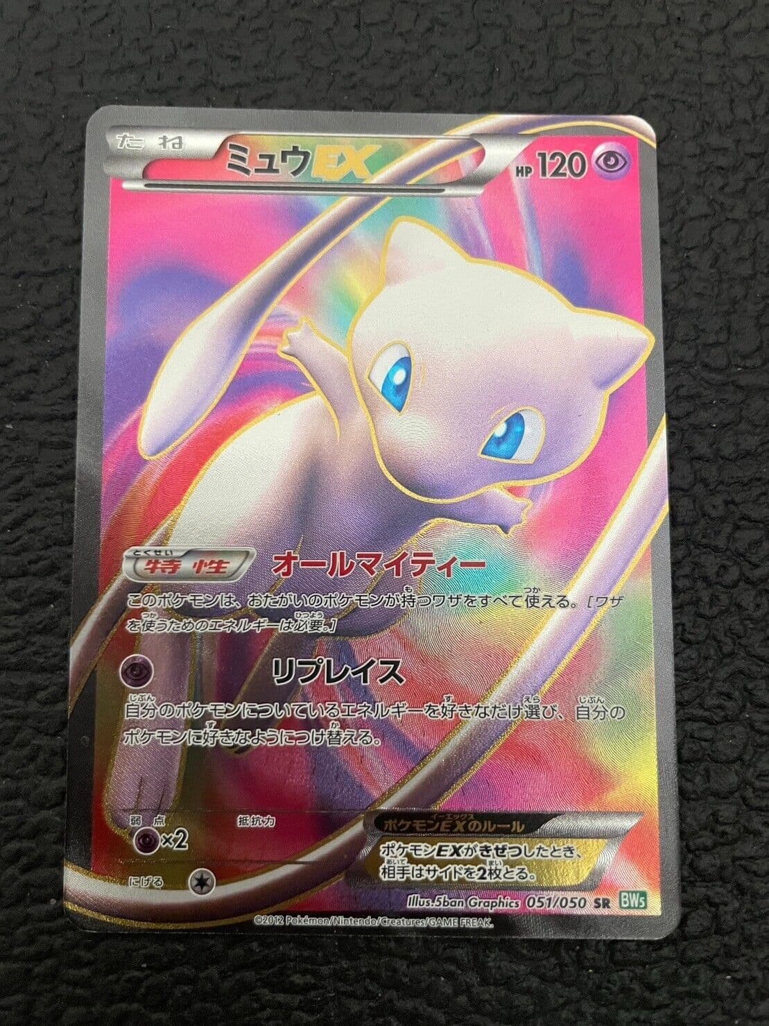
I mentioned it in a different thread recently but I had the Espeon EX full art from Breakpoint and the texture pattern ane and colours are incredible.
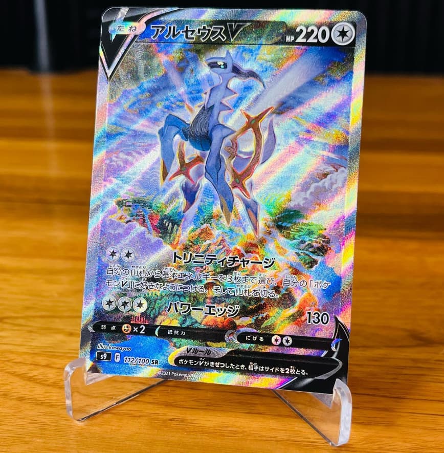
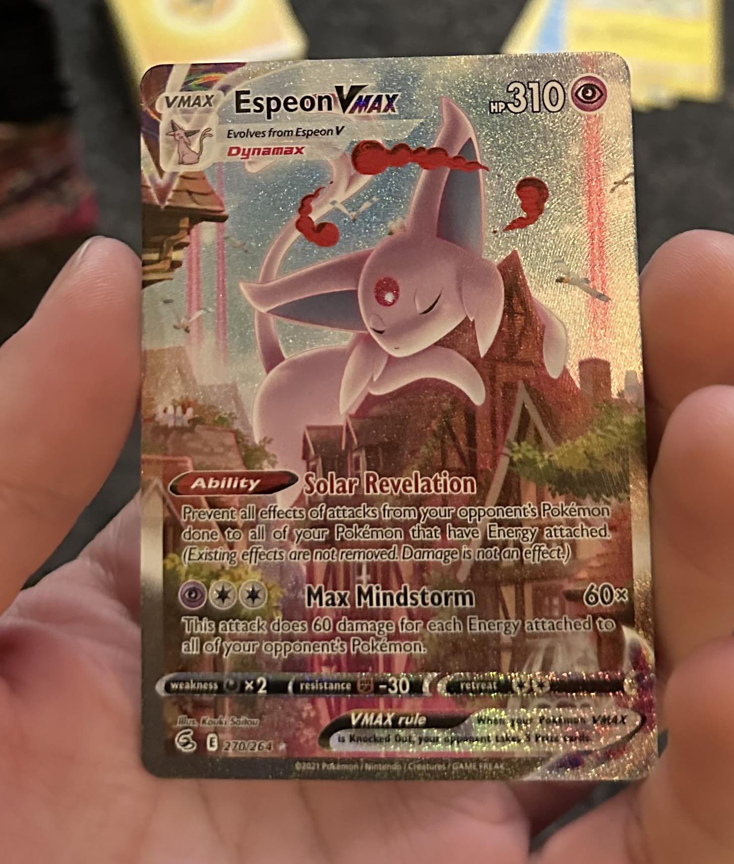
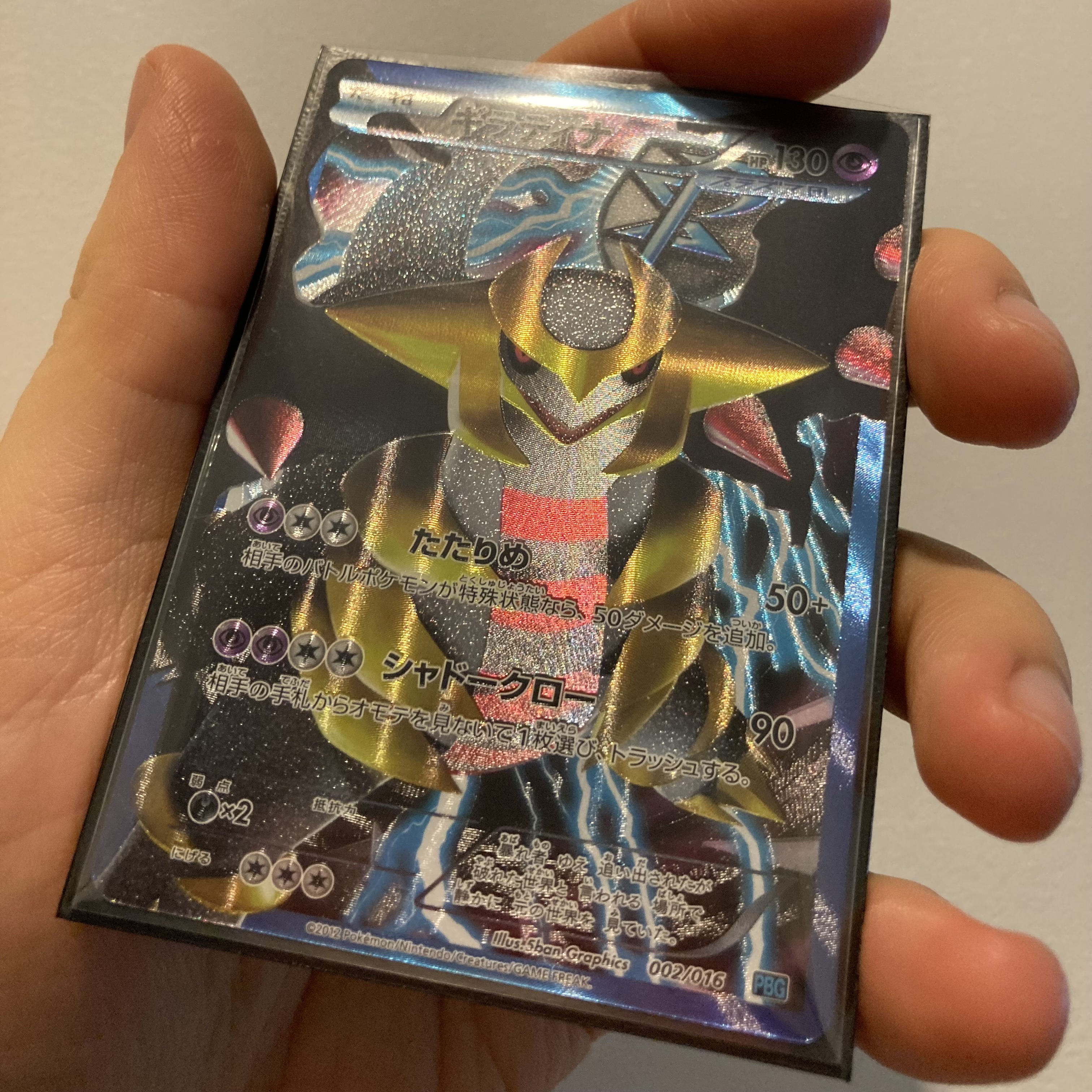
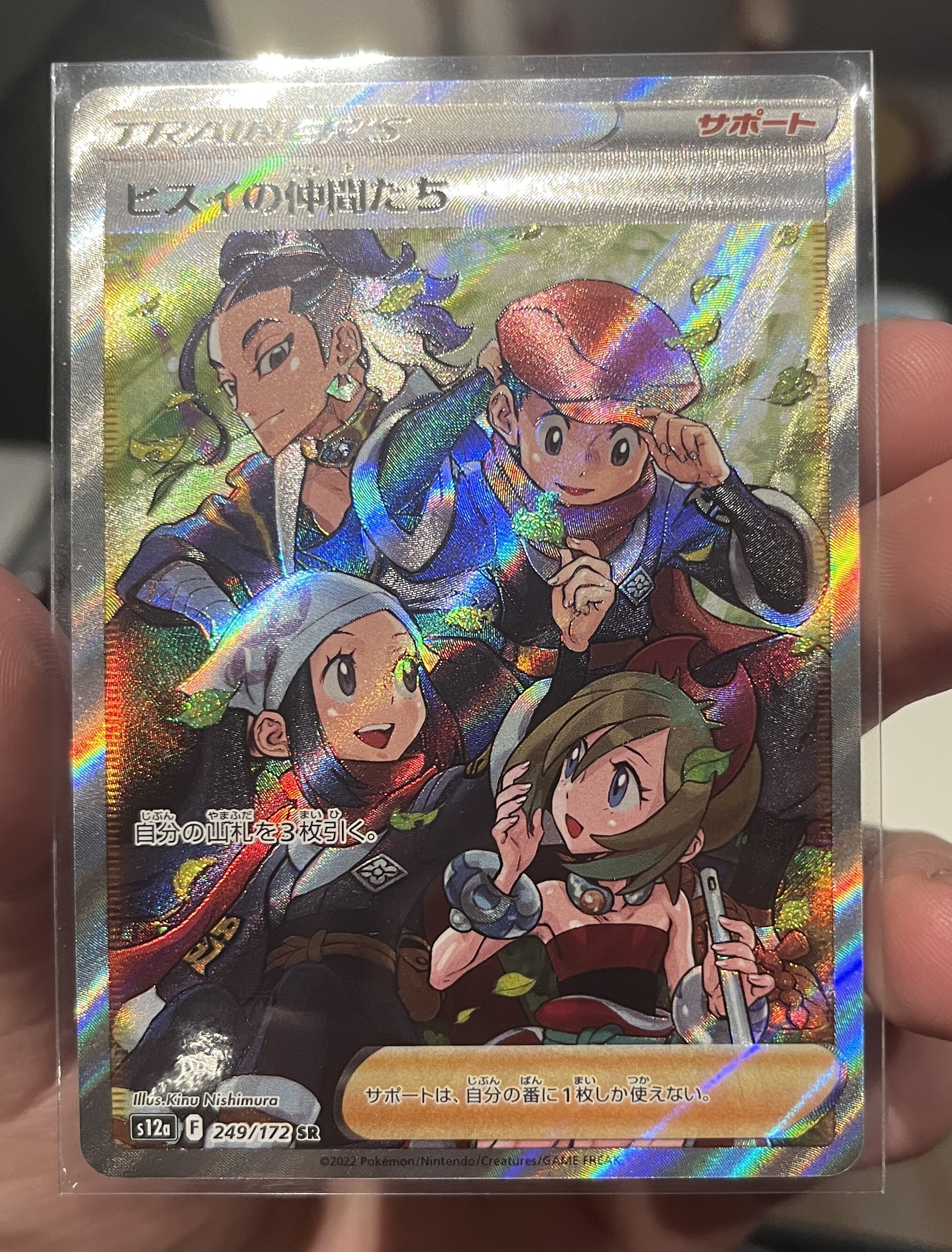
One of the favourites that I STILL have (and highly recommend) is this beauty:
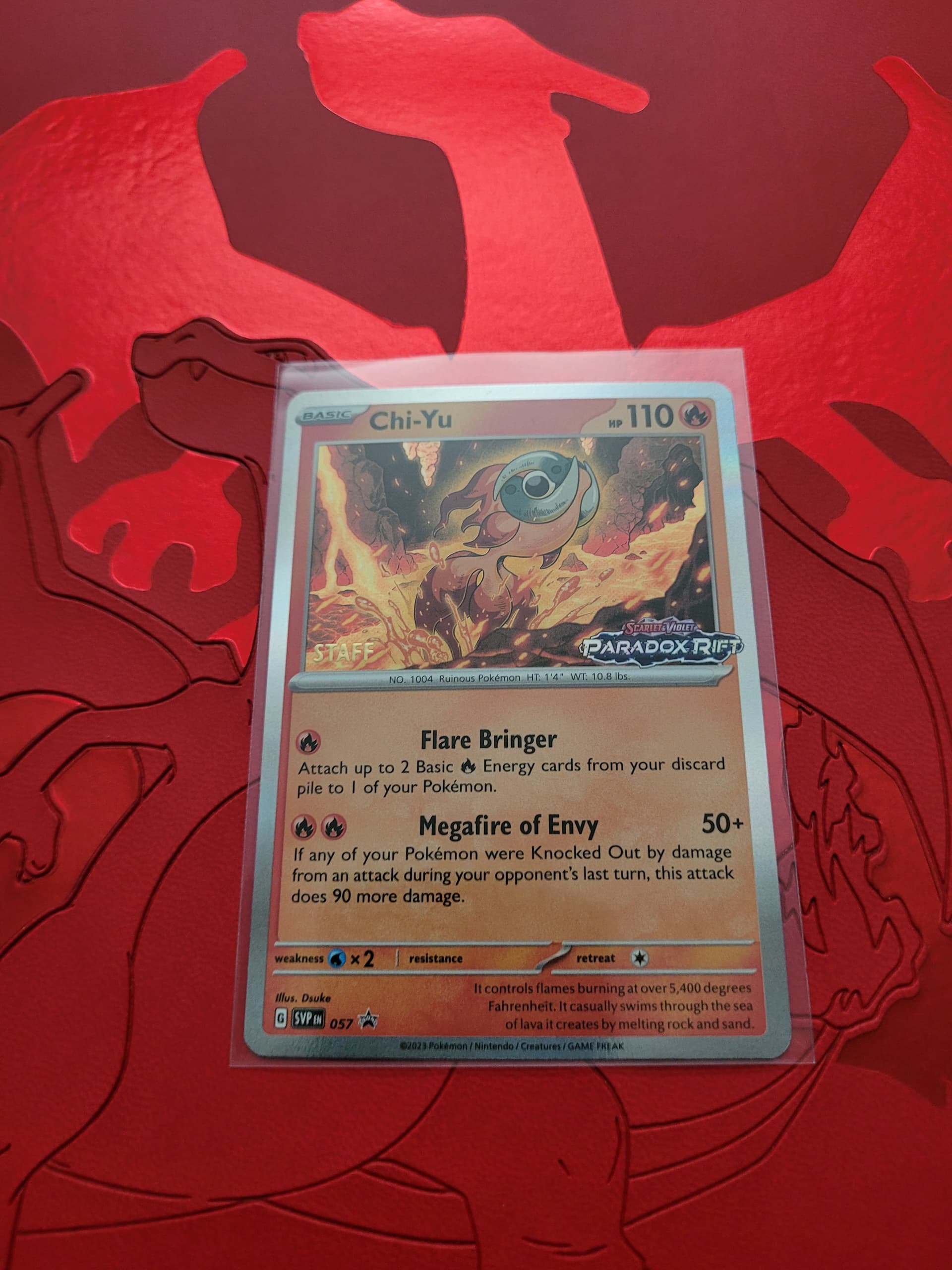
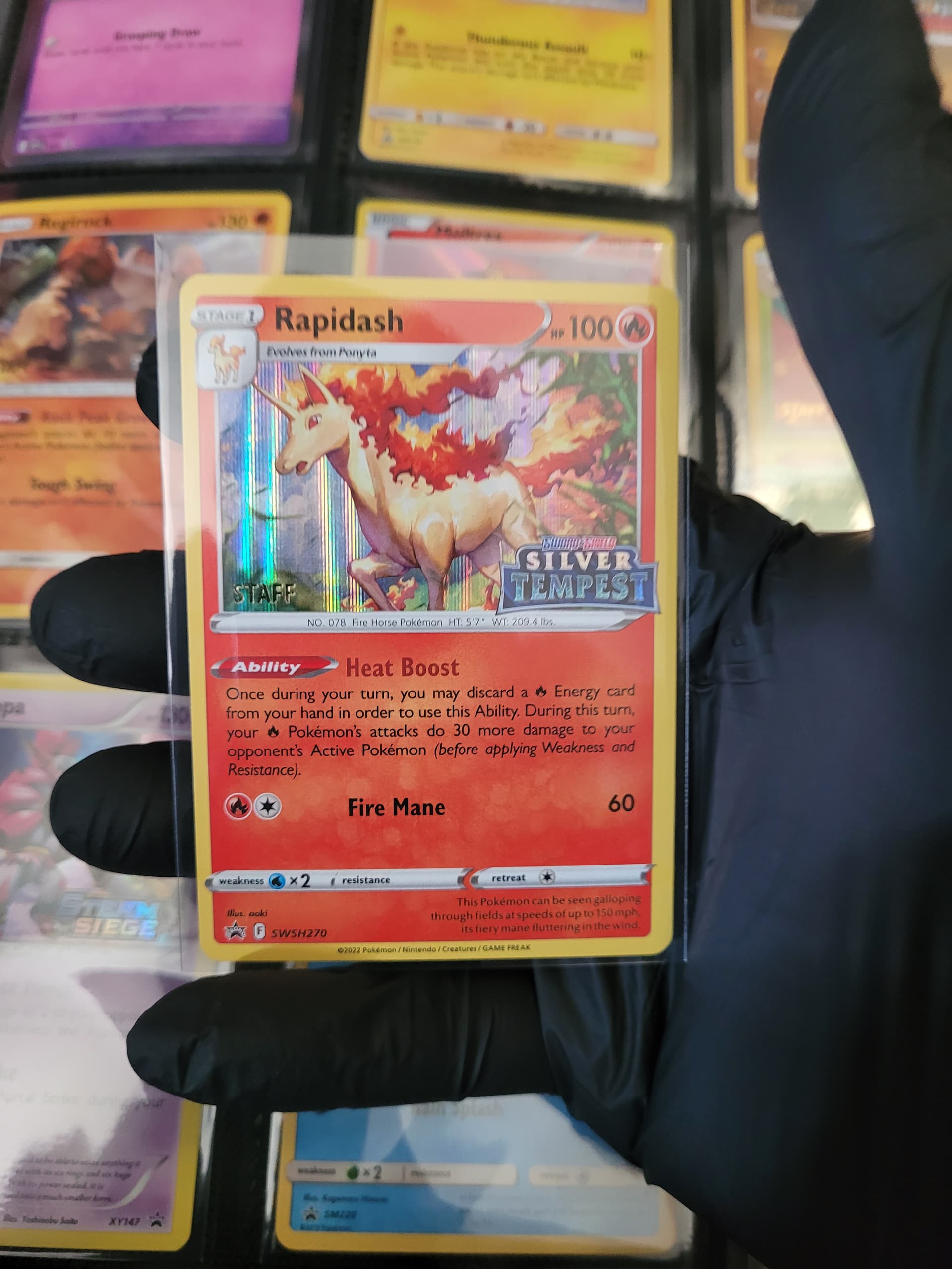
Im going with these two. The chi yu honestly just blew me away once i saw him in person. And the rapidash. Holy moly it really is beautiful up close. Really love the paint/brushed look it has.
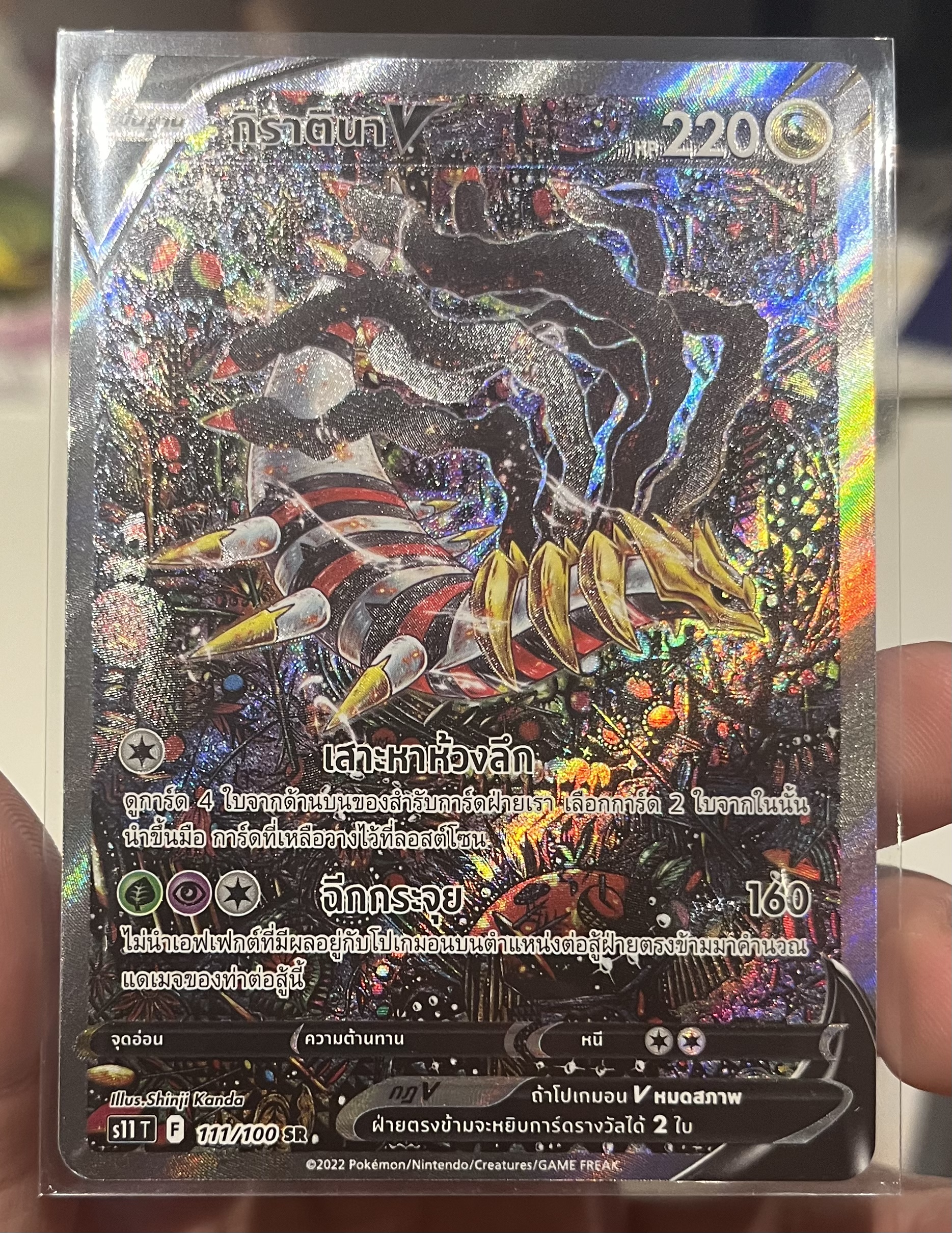
Do you guys have in-hand texture pictures of any of those cards?
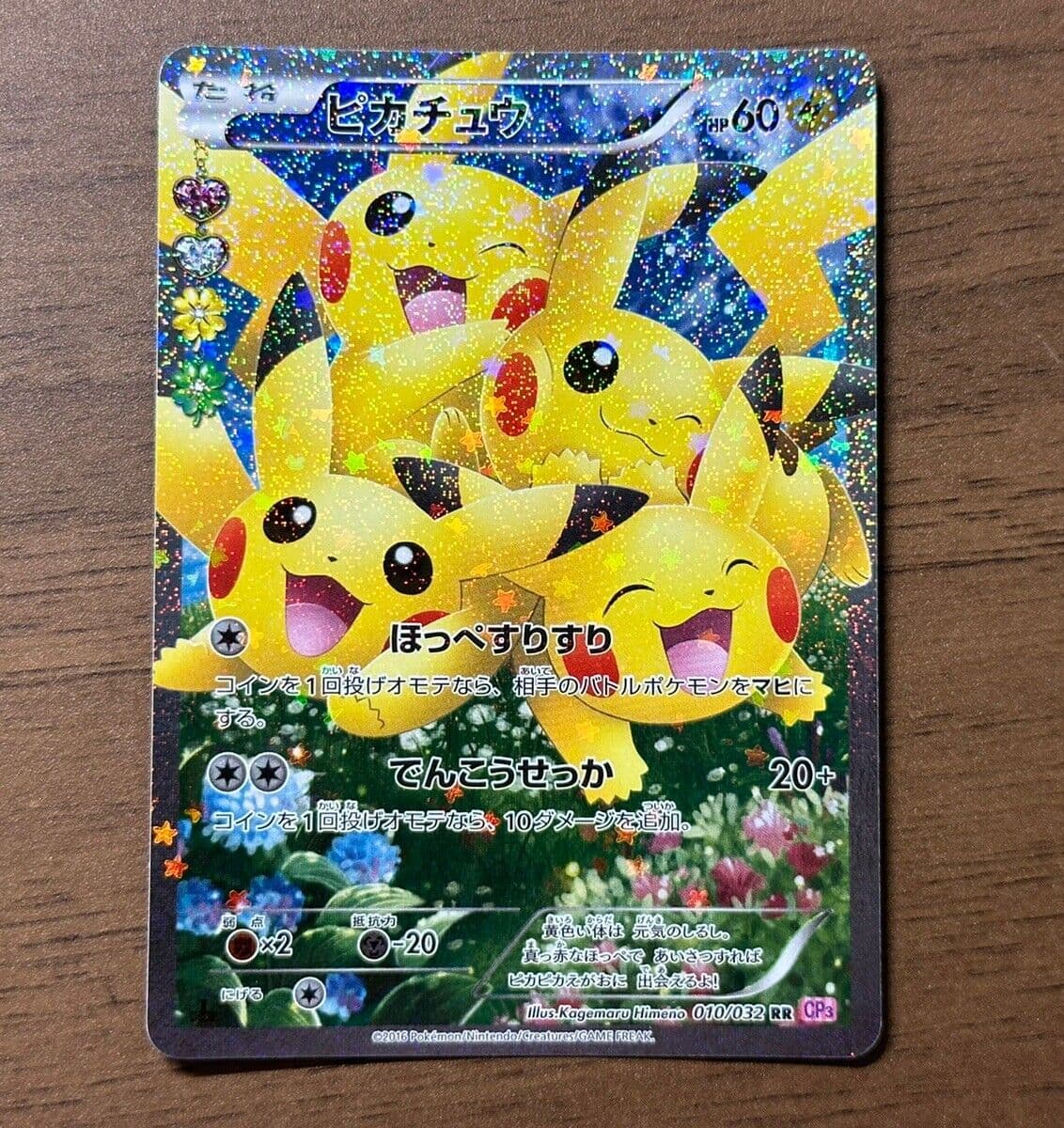
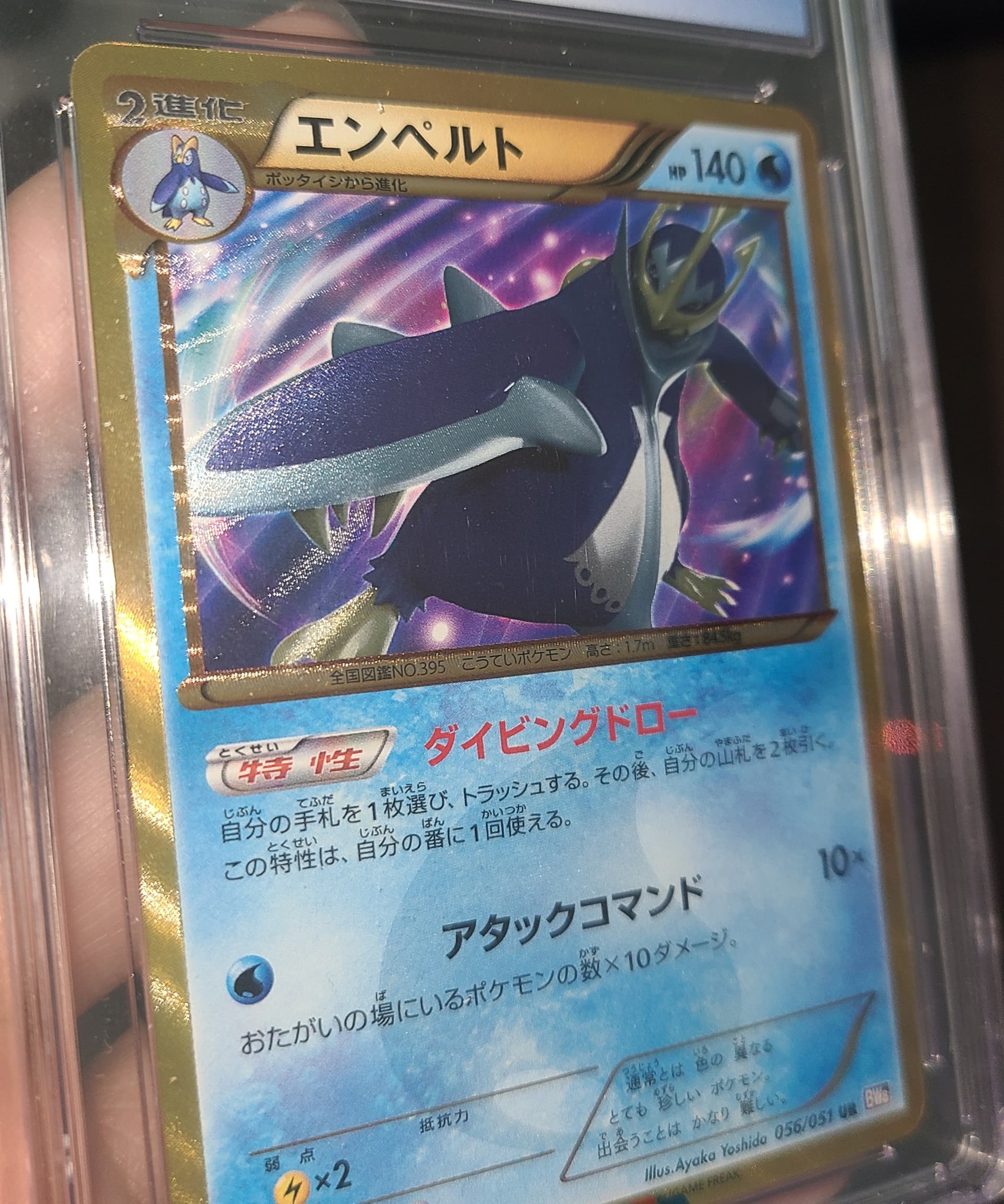
This is Pikachu from Start Deck 100 from Primal Lugia
I don’t know if all SR cards get that kind of detail but I feel like the “drop off” is just because they have been around for 10 years now and are bulk cards. Or maybe it’s because SM era really destroyed any allure with its monochrome backgrounds for each type and it never recovered.