I spent some time on Sunday gathering data and visiting with the typesetter to clarify a few things.
This is going to get a little technical, but I’ll try to keep it simple enough that everyone can follow along.
Here’s what I found.
First you’ll need to know some basic info about how cards are digitally created, and then printed.
Various people gather and create the assets used for the cards.
Assets are things like the card frame, artwork, rules text, font choices, various symbols, card names, card back, etc. This is like the ingredients used to make cards.
The typesetter assembles all these ingredients for each card in the set.
The typesetter does this digitally, using software that works in layers.
For example, the artwork can be the bottom layer, and the card frame goes over it like a picture frame. Then all the various words and symbols go on top of the card frame.
For anything that overlaps, you can change the layer order, to control what appears on top. If you’ve ever used Photoshop, you’re probably familiar with this concept.
The original assets used to assemble each card, are constant tone, which basically means that they’re solid color.
For example, the original artwork was made with physical paint, and the artist could blend different pigments however they wanted to create any color.
Then the art is scanned, so it can be worked with digitally in the computer.
This original art digital file is still constant tone, so the colors blend seamlessly, and you can see the brush strokes. It’s a very high quality image.
The digitally added words are also constant tone, and can be any color the typesetter chooses. (or any color the boss tells the typesetter to use)
Every card has a wide variety of constant tone colors to start with.
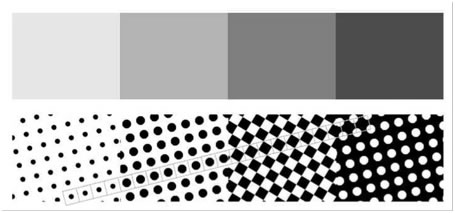
But the cards have to be printed on a printing press, which uses half tone CMYK printing.
CMYK is Cyan, Magenta, Yellow, & Key (blacK)
Basically, you have to take the beautiful constant tone card image with all the colors, and figure out how to replicate it using only 4 specific ink colors.
This image isn’t an ideal example because it’s a black and white photo, but this illustrates how you lose some of the details by limiting yourself to 4 colors.

On a printing press, each color is on a separate printing plate, and they’re applied one after another.
Each printing plate gets fastened to its own section of the printing press, called a Color Unit. The Color Unit holds the plate, ink, and everything to make that color work.
The 4 Color Units are connected together, so you feed the blank sheet in one end, and it will pass through all the Color Units until it comes out the other end.
It’s not possible to physically blend two ink colors together on the press.
Instead, blending is simulated by changing the size of the tiny ink dots.
The ink color is the same, but because there’s less (or more) surface coverage, it creates the illusion of a different shade.
Struggling not to get too technical here. ![]()
Computer software is used to convert the constant tone card image, into half tone CMYK that the printing press can use.
During this conversion to half tone, all of the original layers used to create the card image, are converted into only 4 layers. (a layer for each ink color)
Basically, any part of the image that was hidden behind another layer, gets deleted.
White areas become a “knockout”, which means they’re just blank so that you can see the white cardstock.
Whatever color is printed first on the press, imagine that the other 3 colors now have a hole there, so they don’t cover up what was previously printed.
The 4 ink layers fit together like a puzzle, to replicate the card image.
Because each ink color is applied separately on the printing press, you can have problems where the printing plates aren’t properly aligned with each other, and this creates an image that’s blurry or out of focus.
The alignment of the printing plates relative to each other, is called Registration.
Registration is adjustable, and must be dialed in before production starts. (this is called Make Ready)
Because the printing press is a bunch of moving parts operating at high speed, the Registration adjustment can get out of whack after awhile. From what I’ve seen, this starts to happen somewhere around 10,000 sheets (detectable under magnification), and becomes more likely the larger the print run gets. The average person isn’t looking at cards under magnification, so the press might run quite awhile longer until the image quality is blurry enough that they need to make an adjustment.
Registration issues are a normal thing that everyone expects, it comes with the territory.
If there’s a hard line between colors, you can get a noticeable white gap between the colors during a Registration issue. This happens a lot at the edge of letters.
To avoid these white gaps, the typesetter will apply Trap Settings.
Trap Settings expand the size of the words, to be slightly larger than the Knockout in all the other ink color layers.
This way, even if Registration isn’t perfect, you don’t get the white gaps.
It means that the press can run longer, and the Registration can get further out of whack, before it’s bad enough to be noticable with the naked eye.
There’s one more thing we need to talk about.
Sometimes 4 ink colors just won’t get the job done.
Whatever you’re printing, might need a special ink color like metallic gold, or neon pink, it could be anything.
This is called a Spot Color.
Having a Spot Color, means you need a printing plate for that special color, and another Color Unit gets added to the printing press.
For example, the solid yellow border on most Pokemon cards is a Spot Color. It’s a different color of yellow than the typical CMYK Yellow ink.
The press can have more than one Spot Color if you need it, but adding Spot Colors increases the cost of the print run.
.
Ok, that’s the basics, now let’s talk about Pokemon. ![]()
We’re mainly talking about Wizards of the Coast English 1st Edition Base Set here.
Everybody calls the black 1st Edition shape a “Stamp”, and that’s fine, but for this discussion you need to know that it’s not actually a stamp.
The black 1st Edition shape was applied as a Spot Color. It’s printed on to the card, using a separate printing plate.
The idea here, is to save money.
If they had CMYK plates for 1st Edition, and also CMYK plates for the cards that aren’t 1st Edition, that’s a total of 8 printing plates they’d have to buy.
Instead, they chose to use the same CMYK plates for both, with 1 extra plate for 1st Edition, so they only have to buy 5 printing plates.
It was a good idea, but didn’t exactly work out as planned for a few reasons.
- they were in a hurry to get the finished product to market and mistakes happened
- management kept changing their mind about how the cards should look
- there were delays with getting changes approved by Creatures in Japan
As a result, new plates had to be made whenever something was changed.
The size / shape / darkness of the 1st Edition “stamp”, is not caused by a pressure adjustment on the stamping die, because it’s not actually a stamp.
For an example of something that IS a stamp, and does have a pressure adjustment, take a look at the E3 symbol on the E3 Pikachu promo. That’s called a Hot Stamp, and is applied to the card with heat and pressure.
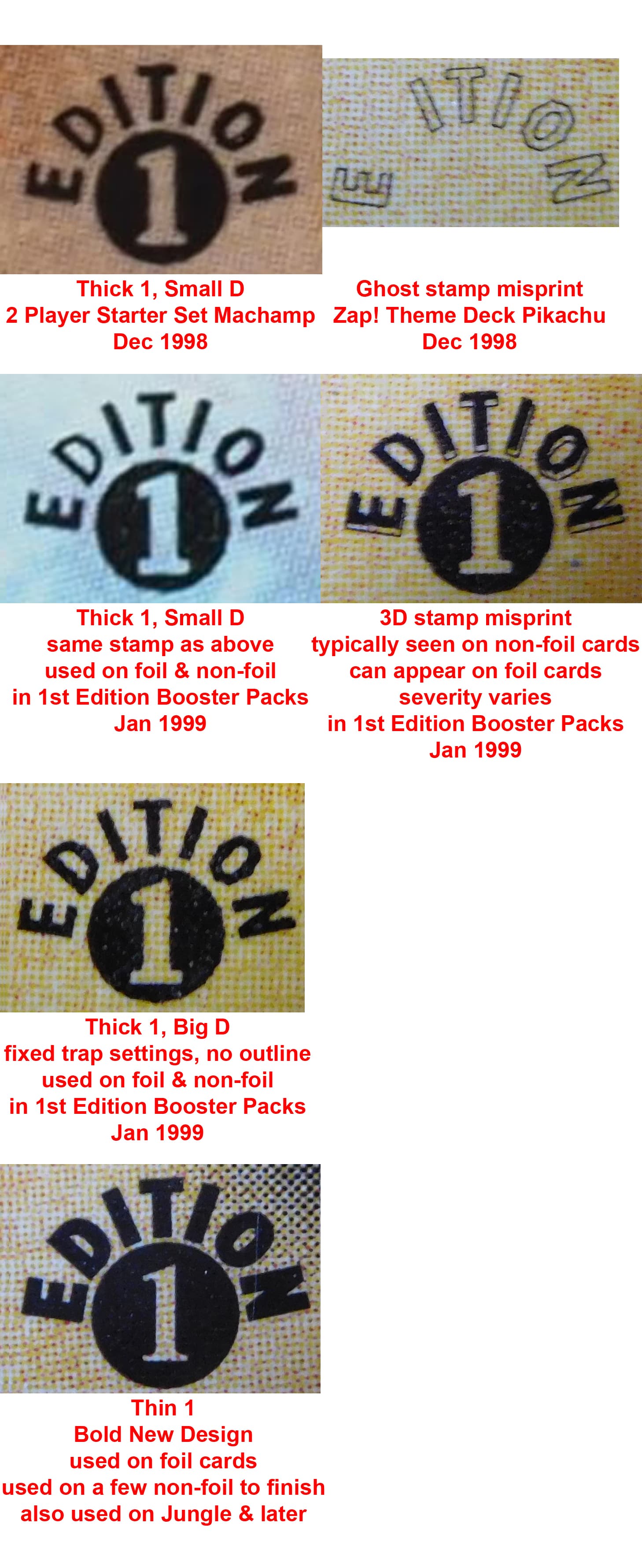
The earliest version of the 1st Edition stamp includes a misprint.
Misprints can be divided into two categories.
- “Design Error” This is a problem that occurred at WotC, and is on the printing plates, so it will affect the entire print run.
- “Facility Error” This is a problem that occurred at the print facility, and will affect a relatively small number of cards.
The earliest version of the 1st Edition stamp has a design error.
Here’s what happened.
During the software conversion to half tone CMYK, some kind of software glitch placed the Trap Settings for the 1st Edition symbol on the K printing plate, instead of putting them on the Spot Color printing plate with the rest of the 1st Edition stamp.
If the plate Registration is perfect, this error wouldn’t even be noticeable.
But the glitch also deleted the Trap Settings for the letter D for whatever reason, and as a result, the letter D appears slightly smaller than the other letters.
The earliest English Pokemon cards available to the public, were the Demo Boosters.
This was a small trial print run, just to catch any potential problems, which was packaged and used to promote the upcoming release.
It’s Shadowless cards that are not 1st Edition.
The next product available to the public, was the 2 Player Starter Set, and four Theme Decks. The Duelist Magazine (published by WotC) announced that these products might be available as soon as November 1998, but it looks like printing was occurring November 30th, so they didn’t make that goal. The public would have received these in December.
They were Shadowless cards that are not 1st Edition, except for 1 card.
The earliest 1st Edition card available to the public, was Machamp from the 2 Player Starter Set.
These early Zap! Theme Decks contained misprint Pikachu cards with a “Ghost stamp”.
The Ghost stamp is from the Trap Settings being on the K plate, and is part of the same software glitch.
This Pikachu is not a 1st Edition card, it’s a misprinted Shadowless card that was released before most of the 1st Edition cards.
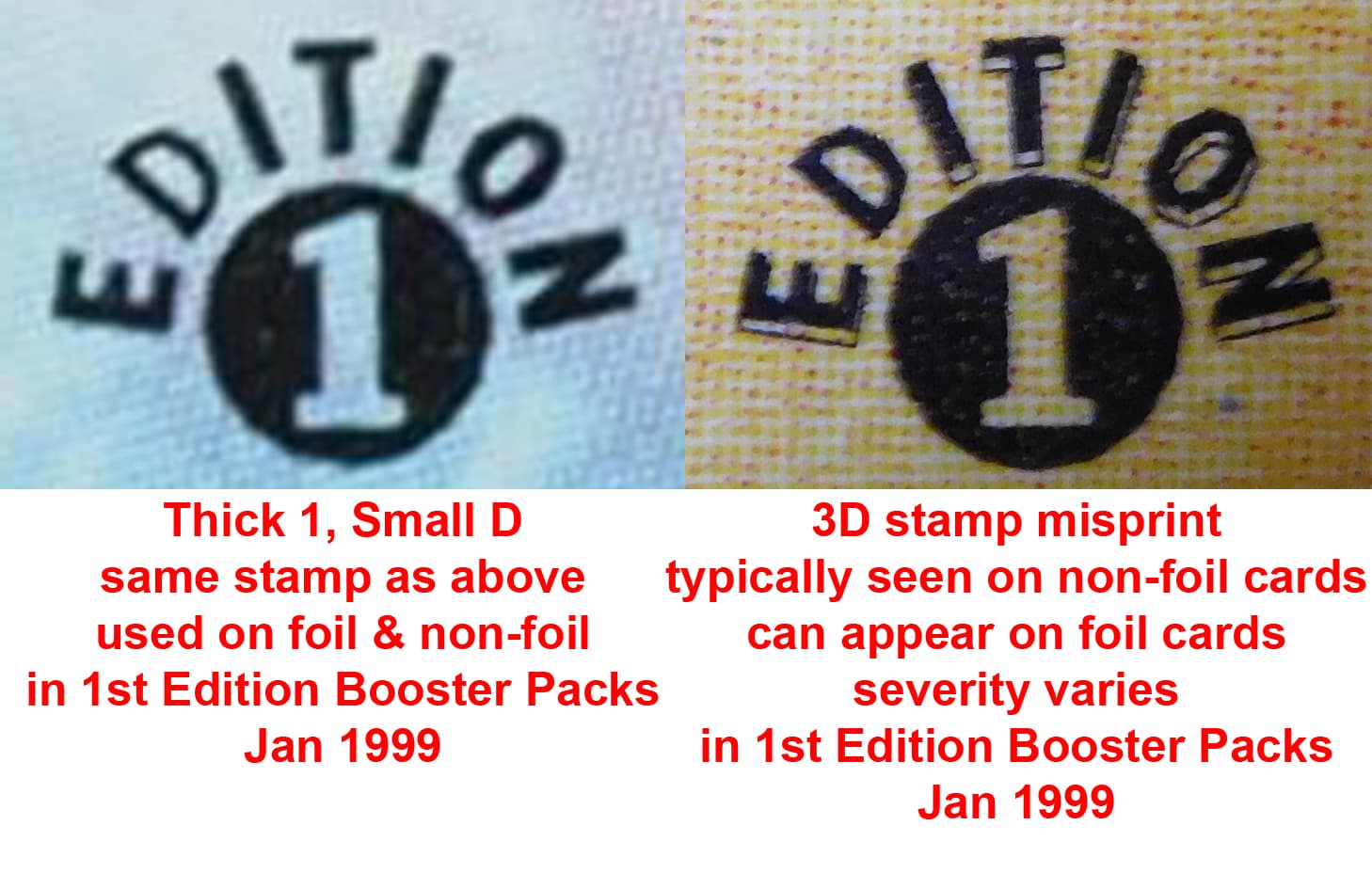
The earliest version of the 1st Edition stamp, which had the small D, was also used for the earliest 1st Edition Booster Packs available on January 9th 1999.
It was used on holo cards & non-holo cards.
The non-holo cards have a WAY bigger print run than the holo cards, so there’s more issues with Registration shift on the non-holo cards.
With the Trap Settings being on the wrong printing plate for this early 1st Edition stamp, Registration issues become more noticeable, and create a 3D stamp effect.
This 3D stamp is a misprint. It’s both a design error (wrong plate) and a facility error (Registration error). Since design errors affect the whole print run, and registration errors are extremely common, I wouldn’t expect a big premium from misprint collectors, but it does look cool. The severity of the Registration error can vary, so extremely severe examples might fetch a premium if you’ve got something that’s really out of the ordinary.
They’d never intentionally put the outline on the K plate to indicate the location of the stamp on a different plate, because of the extremely high (practically guaranteed) likelihood of Registration errors making the outline visible.
The plate with the 1st Edition stamps applies them to the entire sheet at once, not one card at a time.
If the Registration is off (and it will be), nobody would really notice if the outline wasn’t pointing out the problem, so it’s better to not have the outline.
A big print run takes longer to print than a small print run.
If you’re in a hurry to get a product to market, you can place a small order to get started, and then (more or less immediately) schedule a bigger order for restock.
This way, you can sell product while the restock is being printed.
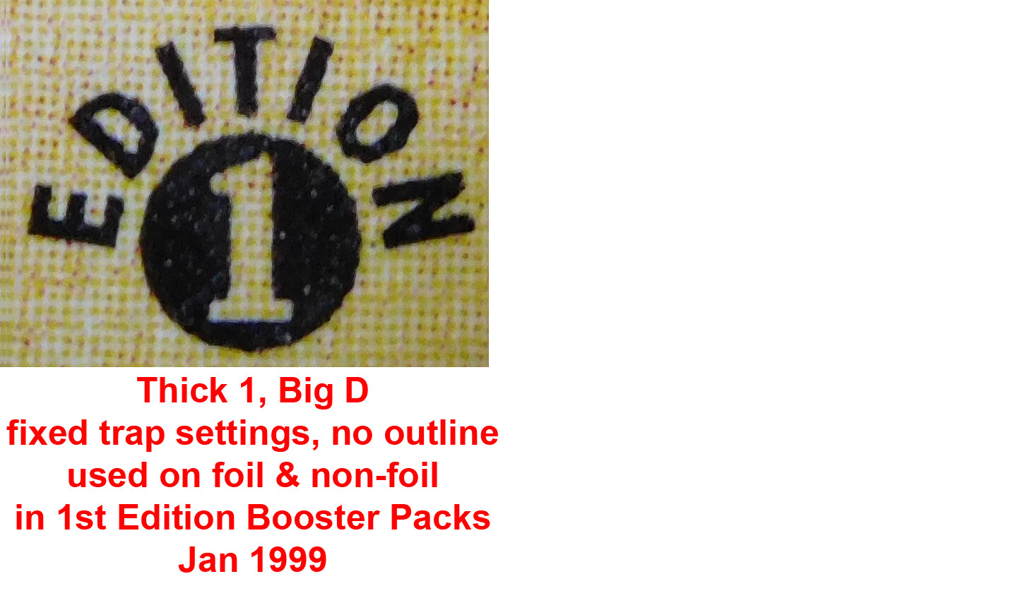
For the restock, they fixed the Trap Settings problem with the 1st Edition stamp.
This is what it was supposed to look like, with the Trap Settings on the correct printing plate, and the D properly sized to match the other letters.
I think it’s used on both holo & non-holo cards.
Sales were better than expected, and WotC decided to print more 1st Edition.
By this point, management had decided to update the 1st Edition stamp to a more bold design, so that it would be more noticeable.
This primarily appears on holo cards for the last print run of 1st Edition Base Set.
It also appears on a very small number of non-holo cards.
It’s not clear why this symbol wasn’t used on all the cards in the 3rd print run, but the answer is probably a last minute change or a mistake.
It’s also possible that the holo cards were printed at a different facility than the non-holo cards.
It’s unlikely that the print facility had enough non-holo cards leftover from earlier, to supply another entire print run. They do print about 3% extra, so that quality control can destroy some without shorting the order, but that’s nowhere near the amount of extra cards they’d need to supply another print run. These are big print runs.
This last 1st Edition Base Set stamp continued to be used for Jungle and subsequent sets.
The 2 Player Starter Set sold well, and were also reprinted, so I’m pretty sure Machamp has all 3 styles of 1st Edition stamp.


(the image below didn’t display as big as I wanted here, but I’m going to leave it here in case anybody wants all of them in a single image, easy to share)
.
Other Misprint Stamps
Grey Stamps
Because the “stamps” are printed as a Spot Color, and are not actually stamped, the Grey Stamps are unlikely to be caused by a lack of pressure.
A variety of things can cause this error. Press speed can be a factor. It’s probably low ink, or a problem with the plate itself (possibly only affecting specific sheet positions, because the plate applies stamps to the whole sheet at once)
It could be a problem with the ink viscosity.
Fountains solution spilled on a sheet prior to the stamp being applied can cause this.
“Offset” from the sheets being stacked wet can cause this.
“Ghosting” is another type of misprint that can look like this. It’s residual ink on the blanket from not cleaning the press well enough between runs.
I don’t have enough data.
Smudged Stamps
This is caused by too much ink buildup over time.
The press needs to be shut down and cleaned.
It can also be a problem with the rollers that apply fountain solution and ink.
Press speed is also a factor. You get more ink at slow speeds, like near startup and shutdown. It takes a little time to get the press up to full speed.
Back Stamps
This is a type of misprint called “Offset”
The sheets are coming off the press fast, and being stacked before they’re completely dry. Humidity & temperature also affect how fast they dry. (it’s pretty cold in December & January)
The “white back imprinted stamp” looks like a misprint called “Picking”.
Ink viscosity is something most people don’t think about, but it’s critical for proper press operation.
Viscosity is how thick or thin (runny) a liquid is.
The press applies each color one after the other, without drying in between.
The only way this works, is if the first ink is thickest, and the ink gets a little thinner in each of the following Color Units.
Let’s walk through an example.
First Color Unit, Cyan is applied to the sheet, no problem.
Second Color Unit, Magenta is applied…
- If the Magenta ink is thinner, it will release from the plate and stick to the sheet that’s wet with Cyan ink.
- If the Magenta ink is thicker, it will stay attached to the plate and pull the Cyan ink off the sheet. This is called “Picking”. The thicker ink is “Picking” up other inks.
Ink viscosity can be a delicate balancing act.
Nice image, this misprint is called a “Hickey”.
The best explanation for this, is my YouTube Video, where I explain them and demonstrate how they’re made.