I start my discussion of the Thick vs Thin holographic cards at the 3-minute mark.
Basically, the theory I assert in the video is that the “Thick” 1st edition base set cards were printed before the “Thin” 1st edition base set cards - and thus arguably the true 1st edition base set cards.
The theory is based on just one thing - the fact that some of the Thick and Thin 1st edition cards have subtle differences in color. The Thin 1st edition cards are an exact match with the Shadowless (non-1st edition cards), and the Thick 1st edition cards are slightly different. (And when I say the difference is slight, I mean it - you may not be able to tell the difference in my video. But if you have both cards yourself, hold them side by side and look carefully, you can see what I’m talking about.
What do you guys think of my theory? Like I said, there’s no hard proof that Thicks were printed first, but I think it just makes a lot more practical sense that Wizards of the Coast slightly changed the color of some of the cards when they changed the 1st edition symbol, and then when they ended the 1st edition print run and went on to the shadowless run, they kept the exact cards they already had (minus the 1st edition symbol). This makes a lot more sense then if they switched the color when they changed the 1st edition symbol and then gone BACK to the previous colors when they started printing the shadowless cards.
So do you guys think my theory makes sense? And even if you knew that Thicks were printed before Thins (along with the fact that Thicks are 2.5 to 3 times more rare than Thins), does this matter to you, or would you still find them both equally desirable?
Oh wow, looks like my theory was proven before I could even get a proper rebuttal or heap of skepticism!
Do you by any chance have the link to the video you’re referring to?
Edit: Never mind, just saw it! Wow! So basically this was officially confirmed for the first time just a couple of months ago huh?
(Shows that it’s “Version 2” at 3:50 in the video, and since this is a Thin sheet, that would definitely seem to confirm that the Thin cards were the second version)
We’ve known for a while that the thin stamp was the ‘second print’. I didn’t know it was ever in doubt.
If you want an information dump here’s what I can remember off the top of my head about base set:
The first print run, where the cards were produced by wizards, consisted of Thick, Thin, and Shadowless cards (you mentioned a color difference between the cards, the only thing I can think of is the ink started to run low or someone made a conscious decision to save cost by lowering the amount of ink used. Knowing how Wizards operated it would surprise me one bit if they lowered their ink usage during a print run to save on cost.)
The second through sixth print were unlimited cards
The seventh was 1999-2000 copyright date cards
The stamping process happened after the cards were produced and the only difference in the stamp variants is the amount of ink and pressure used.
There’s 6 variants of English Base Set cards, Thick, Thin, Gray Stamp, Shadowless, Unlimited, 1999-2000. (There’s also Trainer Deck and error prints but since they weren’t consistent to all 102 cards I won’t consider them.)
There’s a few ‘test sheet’ of shadowless cards that’s known about. I’m not sure if it’s been confirmed real or not, but it’s worth noting.
Yeah I actually did know about the incredibly rare non-holo Thin cards such as the Wartortle, I just neglected to mention them because they’re pretty much in a different category as far as rarity is concerned.
Interesting that you prefer the Thin. I started collecting the Thick because I think they look better, match the rest of the base set, and like the fact that there were the *true* first cards to be printed. As a collector I always want the first version of whatever was printed. Honestly I feel like that’s kind of the whole point of the first edition cards.
That said, I guess Wizards agreed with your assessment that the Thin cards looked better, since they made that change early on and never went back in all subsequent sets. I disagree with the aesthetic taste but to each their own.
Good point about the fact that the difference in color could just be a printing issue. Now I’m curious if anyone else here has a Thin or Shadowless Blasotise that they can compare to their Thick Blastoise.
I’m also going to take a closer look at some of my other Thicks and compare them to my Shadowless cards.
Another thing - all of my non-holo 1st edition cards were pulled from the same box. All of my Uncommon Pokemon cards are gray stamp, but none of the other cards have a gray stamp. Clearly all of my uncommon cards came from the same sheet.
You’re going to have to look at the cards very closely under bright lighting. When comparing the Thick Blastoise and the Thin Blastoise, you might notice that the blue on the Thin Blastoise (on the Blastoise itself, not the holographic background) is a darker shade than the blue on the Thick Blastoise. It’s subtle but quite clear on my cards. Just a question of whether this a matter of low ink situation or if there was actually some kind of difference in the print run generally.
Also, two more questions I have arising out of what cullers mentioned:
1 - How did people know that the Thick 1st edition cards were printed earlier than the Thins prior to a couple of months ago (when we got to see the uncut Thin sheet with “Second Version” written on the bottom)?
2 - Speaking of saving costs on ink, do you guys think this is why the Unlimited run of these cards seem so faded in comparison? I’ve always thought the Unlimited colors seemed really dull and bland in comparison to the standard left by 1st edition / shaowless cards.
Just looked at my shadowless and check about 50 different 1st edition thick and thins I couldn’t tell a difference I did see it on your video. I’m going to assume it’s just your card either being slightly sun faded or a low in ink print.
Your second question boggles me. Because if you compare them, the 1st edition/Shadowless is actually way more dull than unlimited. Also they have a shadow and bold font which required even more ink than a 1st edition stamp. The only thing is that the artwork in 1st edition/Shadowless has higher saturation and warmth adjustments, hence the green wings in the 1st edition Charizard vs teal wings in unlimited.
Edit:
Here is a picture comparing the Unlimited card’s darker more vibrant platform to the Shadowless’ more lighter platform:
Just checked. You’re absolutely right. My thin stamp blastoise is a darker shade of blue compared to the thick blastoise. Mother of god. Not sure what if this means anything but still pretty cool
Aha, I knew it! So if there really is a difference in the printing of the Thick (“Version 1”) and the Thin/Shadowless (“Version 2”) Blastoise, that would seem to indicate there actually was some sort of difference in the printing process aside from just the difference in the stamp.
Now I’m curious to hear other people weigh in with comparisons between their Thick & Thin/Shadowless Blastoise cards.
Yeah good point, it was just a thought that popped into my head for a hot moment but yeah, obviously you’re right.
I just always thought - going all the way back to 1999 when I was just a kid - that the illustrations of the 1st ed./shadowless cards had much nicer colors than illustrations of the unlimited cards. Using the example you just gave, I think the more orange tones of the shadowless Charizard look much nicer than the more yellow tones of the unlimited version. I feel the same way about pretty much all the unlimited cards - the colors changes all felt like downgrades to me.
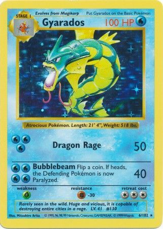
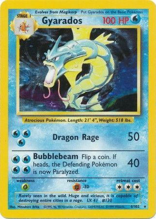
Here’s another good example - compare the shadowless Gyarados to the unlimited Gyarados.
Do you see how the colors of the shadowless Gyarados seem so much more vibrant?
I don’t really get how anyone could think the colors of the unlimited Gyarados were an upgrade.
In my opinion the Japanese Version is perfect. The unlimited Charizard is too yellow, the 1st edition one is way too orange, but the Japanese one is just right. Of course they were not going to let the English variant be superior:
I agree with you @hyruleguardian. The shadowless/first ed prints had a nicer look to them. The unlimited prints look washed out and dull in comparison.
I wouldn’t argue against the Japanese base set cards looking even better than the 1st ed. / shadowless cards. Overall, I would agree. Some of the illustrations have even more vibrant colors. One good example is the Venusaur - the flower on Venusaur’s back is much more vibrant in the Japanese version, and it makes it a slightly nicer looking card (one of my favorites either way!).
I think both the Japanese and the 1st ed / shadowless English designs are A+ stuff. Several of the Japanese cards are better, some are pretty much exactly the same, and one or two of the 1st ed / shadowless cards are actually a step up from the Japanese cards (Gyarados comes to mind).
Japanese Charizard vs the 1st ed / shadowless Charizard is interesting, because it’s by far the most dramatically different design, due to the Japanese 'Zard having the flame part of the illustration not being holographic so that it pops out of the illustration. It leads to a very different look. I honestly can’t say which one I think looks better; they’re just different. In my opinion they’re neck-and-neck for the best looking Pokemon cards ever printed.
In comparison, both the Japanese and 1st ed / shadowless cards blow the English unlimited cards out of the water, in my opinion. I really don’t know what Wizards of the Coast was doing there.
And going back to the more important thing in this thread…
I realize it’s commonly acknowledged that the 1st edition cards and the shadowless cards were all part of the 1st print run - but that doesn’t necessarily mean we know everything about how these cards were printed, does it?
It seems to me that there are some differences in the printing between the Thicks and the Thins/Shadowless cards that are coming to light.
tony and I both have exactly the same difference between out Thick and Thin / Shadowless Blastoise cards. I’m curious to hear from other people who may be able to compare their Thick Blastoise with their Thin / Shadowless Blastoise.
What could this mean?
YouTube currently has both uncut sheet for the Thins and the Shadowless cards. At the bottom of both of these sheets it says “2nd version.”
I don’t believe anyone is known to have a Thick uncut sheet, so we may never know for sure, but do you guys suppose that the Thick sheets may have said “1st version” at the bottom of them?
Good to know cullers. So far the count is two people who have noticed a difference (the exact same difference, that the Thick has a slightly lighter shade of blue) vs one person who has not noticed a difference. We’ll have to hear from a few more people before drawing any conclusions.
As for Gary’s Thick sheet - Good to know! I’ll have to ask him if it says “1st version” or “2nd version” at the bottom of the sheet.
")