Hello everyone, today I wanted to start my first thread by asking a very common and obvious question we ask ourselves when starting a collection related to an illustrator. The question is this: What do you look for when you start collecting cards related to an illustrator? Originality? Shapes and colors? Any detail is interesting to start noticing things we didn’t before. In my case, I’m currently collecting cards from Tomokazu Komiya, Aya Kasube, Kawayoo, Sowsow, Sekio, and a few others, with short collections.
12 Likes
Hmm, I generally start collecting an artist after a lot of independent moments of enjoying their artwork. At a certain point, after I’ve thought “oh wow I love this artwork, who illustrated it?” a bunch of times, it’s time to start picking up more of their cards. I tend to gravitate towards artists with distinctive/colorful/cute/illustrative styles like Miki Tanaka, Sumiyoshi Kizuki, Atsuko Nishida, Shibuzoh, Sowsow, and several others.
12 Likes
I would consider if:
-they have a distinctive style that resonates with me: there’s a point where you realize “damn, I really like >70% of their art, I love their vibe”
-they illustrated many pokemon and cards in general, so it’s never boring
-they have some variety in their artworks or it’s cool to see the progression of their art skills
-bonus: they are still active today
Personally, I like colorful and charming artists like old Kizuki or Yukiko baba, but I also enjoy the more “dynamic” Kusajima and Himeno.
10 Likes
I really value how an artist uses environments. I think they can really make a card 10x more charming and interesting. Perfect example would be the Southern Island cards.
Background environments can also make a Pokemon feel more mysterious or intense. One artist I think that does both spectrums really well is Kusajima.
Charming:

Intense/mysterious:

11 Likes
I don’t have any illustrator collections, but I agree with what @slowqueen said: over time you see nice artworks, and when you look at the illustrator of the cards, you eventually starts to notice a pattern in the form of “Oh, this artist yet again. I seem to like a lot of their artworks. Let me see what other cards they’ve made. - Oh, I like this and this one they made as well!” That’s how it went for me with my five favorite artists: Naoyo Kimura, Mizue, Mitsuhiro Arita, nurikabe, and sowsow.
My two favorite artworks in the entire TCG are these two:
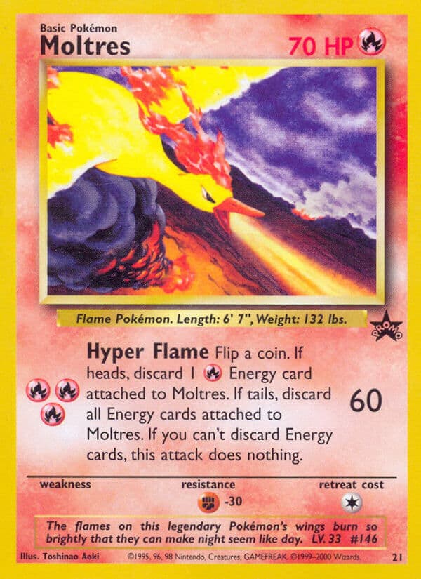
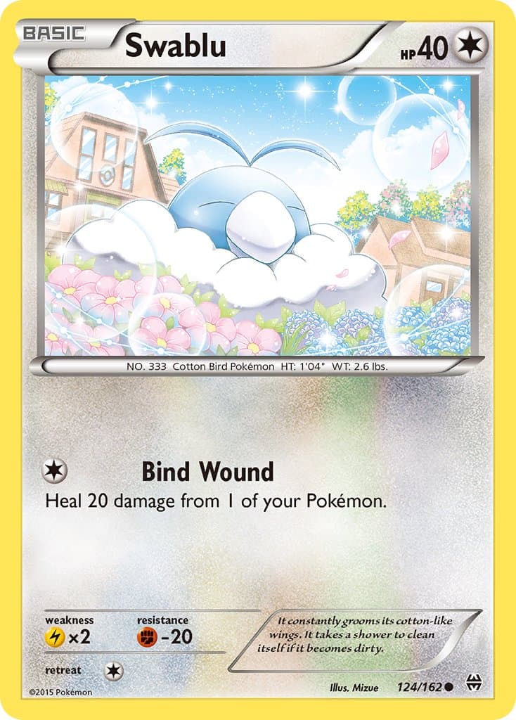
Moltres because I love the yellow and red on the darker background (and nostalgia from receiving it at cinemas as a kid also partially plays a role), and Swablu because it’s so damn cute. I also just love Pokémon with beautiful backgrounds in general, either in their natural habitat, or working/living together with humans.
From those two favorite cards in general, I looked at other cards they’ve made, and especially Naoyo Kimura has some bangers during the WotC era: the entire Southern Island set; the Light Jolteon & Wigglytuff of Neo Destiny; the matching Zapdos/Articuno promo with the Moltres above; the three legendary catdogs of Neo Revelation; the Tyranitar of Aquapolis; etc. etc. Loads of his artworks are among my favorites, and he’s therefore my favorite illustrator.
As for your questions in general, I think it differs per person. As I mentioned, I especially like a ‘realistic’ (aka non-abstract) art-style of Pokémon just living their lives.
But I know Tomokazu Komiya is likely one of the most loved illustrators here on the forum, for his paint-like art-style, colorful and busy backgrounds, and usually unorthodox-shaped Pokémon themselves.
I also know a lot of collectors for Yuka Morii’s and Sachiko Adachi’s clay Pokémon artworks, or Asako Ito’s yarn Pokémon.
Everyone has different tastes, and therefore also different reasons why they like certain cards, and in extension, certain illustrators. 
Greetz,
Quuador
9 Likes
This is definitely a personal preference. I agree with much of what’s been said.
For me some things that really resonate.
Illustrators that show expression and mood with their art. It’s why Komiya is a favorite of mine.
A unique style. Himeno
and more recently the vibrant expressions of Kanda
Subtle and soft contrasts that create size and a wide world view - like KATO
4 Likes
Depth in the illustration and scene, lots of detail, stand-out style, creativity and uniqueness.
Arita first stood out to me for his shading and light use. Sometimes, it looks real. He also captures dynamic poses and action in hiw work very well, and it makes the card feel like a photo, more than a portrait. I dislike portrait cards, like the base set “stock” cards, for example. He’s also super consistent, not perfect but consistent over nearly 600 illustrations.
Kawayoo, Kusube, and Sowsow have unique styles and I’ve wayned a bit on them lately, but they still stand out. Not many other illustrators with styles like theirs.
Metazo has a unique dreary or washed out style, like a dream.
Teeziro has an kinda early monet impressionist vibe that I like, with a lot of vibrant color and contrast, like kawayoo and kusajima.
…And of course Komiya has a style like no other. Some may LOOK like his, but they lack the kilo of acid that Komiya dropped before illustrating most of his cards. IDK what the actual ef is going on in some, but it’s gloriously chaotic, and sometimes disturbing or wack. Reminds me of the absurdly busy work or weirdness of artists like Gaudi and Dali.
6 Likes
I’m a simple Dragonite who loves watercolor and watercolor-like mediums such as gouache. Atsuko Nishida, Kagemaru Himeno, Ken Sugimori, Narumi Sato, Mitsuhiro Arita are some illustrators that come to mind.
8 Likes