It’s already been mentioned but the WEB set will forever be one of my favourites and most of the cards in that are reprints but the the e series style layout.
3 Likes
Stormfront/Intense Fight in the Destroyed Sky Charmander line.
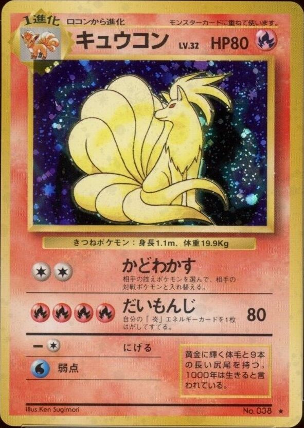
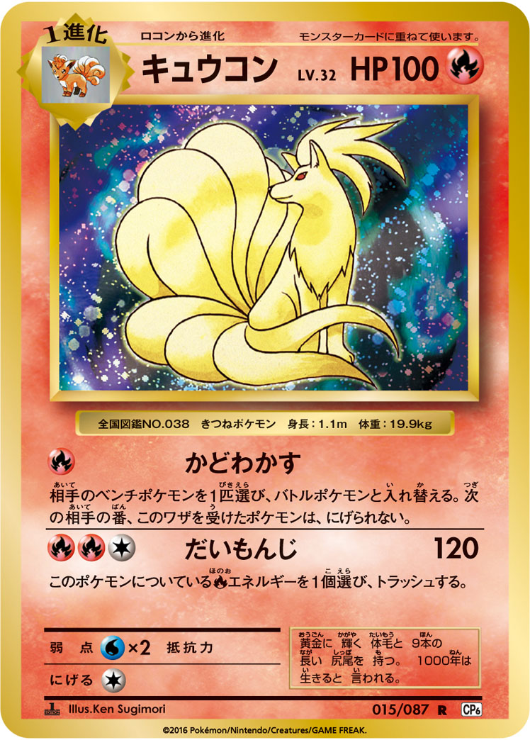
My favorite is without a doubt this one below. This artwork is my favorite, so it’s amazing they’ve reprinted a holo version in the Japanese Pokémon Web set (I sometimes forget the English promos came before the Japanese Pokémon Web holo versions for these artworks).

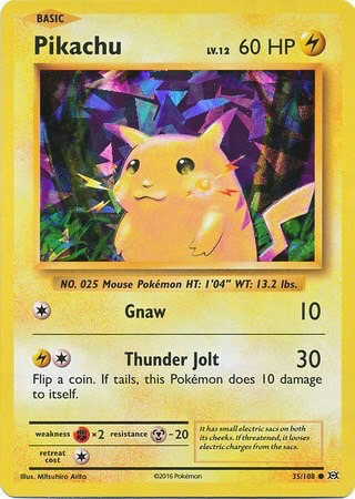
All the Pikachu Base Set reprints are cool as well. Primarily because it’s so iconic and there are so many of them. It’s not the most reprinted card in the Pokémon TCG for nothing. ![]()
And a more obscure one that comes to mind. Which isn’t exactly a reprint per se, but more a different translation from the original English card. The effects and texts mean the same thing, but the words used have been translated differently to Dutch, which is pretty cool imo (the first one was released in Australia and the second in The Netherlands and Belgium).

And one more that comes to mind: the 229/BW-P full art promo is a reprint in terms of HP, attacks and texts and such of the Black & White Secret Rare:


Greetz,
Quuador
8 Likes
recency bias, but I have a mild obsession with this card. it just looks so good in person. might fill a whole binder with it while it’s cheap

3 Likes
“celebrations charizard” - said no one ever ![]()
![]()
In all seriousness, I really like the E-Series makeover the Expedition MasterBall got as compared to the original print.
2 Likes
Those Giratina’s are so lovely! Did we ever get those in the US?
The left one yes; the right no.
1 Like
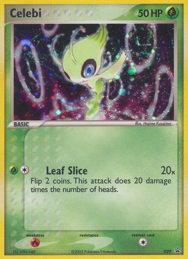
I second @thsigma on the EX Emerald energies. They look great and, like the unown subset in Unseen, they are a welcome surprise when you open boosters, like an extra treat that doesn’t take holo slots but still feels very special (more so than reverses imo.)


9 Likes
On the topic of cards reprinted as holos, I always forget the “cracked ice” Pikachu from XY Evolutions exists. This is a cool card, even for a card that’s seen multiple reinterpretations.
Hard to find a good pic!
4 Likes
I dig Legendary Collection reverse holos. They’re my favorites for now.
1 Like
I actually really like the Dark Vaporeon holo that was only non holo in Rocket. Looks really nice as a holo.
2 Likes
These are my favourites.
The Gengar legendary collection reverse holo. Gengar is my favourite and the original fossil card is what hits me right in the nostalgia. It was the first card I started collecting as a kid, and wanted everything Gengar possible.

Already mentioned, but the Rocket’s Zapdos Card. Celebrations is what dragged me back into collecting because the artworks of some of these reprints was so familiar to me. I’d been out for years and because of the recent hype, I started seeing images of my childhood collections and it dragged me back.

Finally, just want to give some love for snorlax and the XY black star promo.

5 Likes
Bulbapedia’s worst tendency to treat multiple cards as the same card has actually come through for me today. I became aware that Celebi #50 from the WotC era of promos was reprinted in 2005 with holofoil.
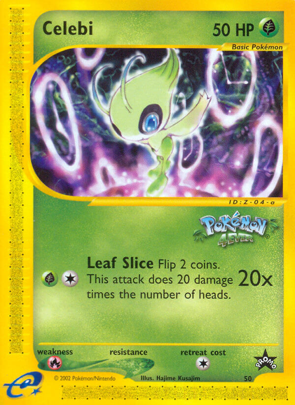
All around a vastly superior version of the card. Cleaner frame, no obstructing anime stamp, a foil treatment, kind of the perfect reprint. I appreciate the card a lot more in this format!
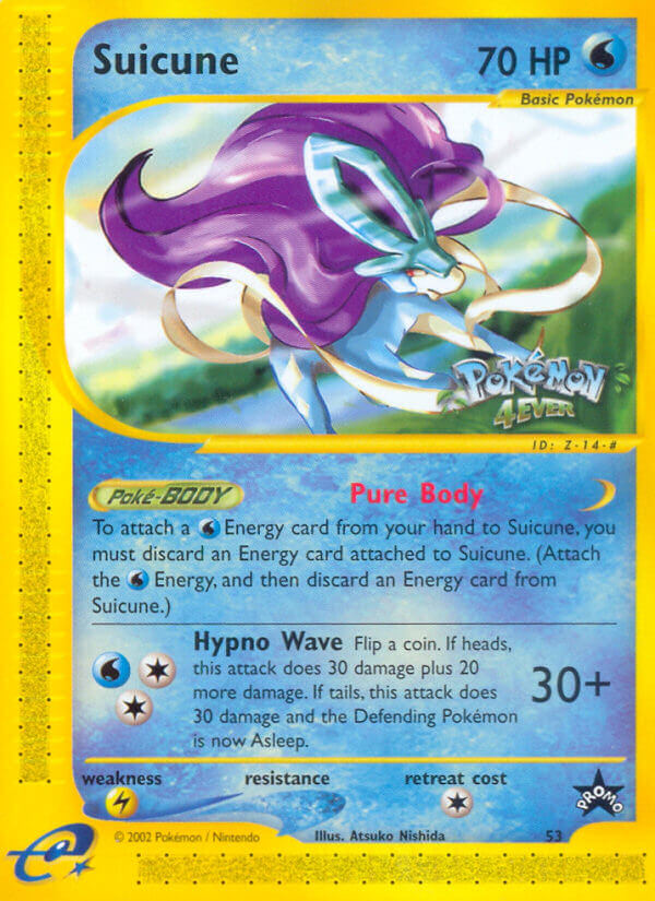
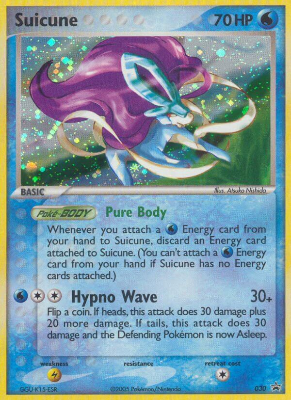
Edit: And for good measure, Suicune #53 got the same treatment as well.
3 Likes
I actually like it with the stamp more, but only because it isn’t in the artwork itself, but the card description. My biggest pet peeve with stamps, especially the ex era Reverse Holofoils for example, is that they obstruct parts of the artwork. The Suicune you’ve also posted is an example of this, but since the stamp is below the artwork in the Celebi I actually like that portion more than without stamp in this case.
I do agree that the overall card is cleaner on the Nintendo promo.
Greetz,
Quuador
1 Like
I have a really mixed relationship with stamps. Usually I do not like them because they feel like they’re “on top” of the card, which I feel creates an additional barrier between me and the card art. I often think they are an obstruction.
I also do not like the Pokémon anime and generally don’t like anime tie-ins in the TCG or games, so usually that’s a negative aspect to me.
But I really like subtle stamps like the W Stamp promos or the holiday calendar snowflakes. I think those are super classy.
Not sure if it counts as a reprint but I like the Lunar New Year sowsow pikachu because it doesn’t have the stamp
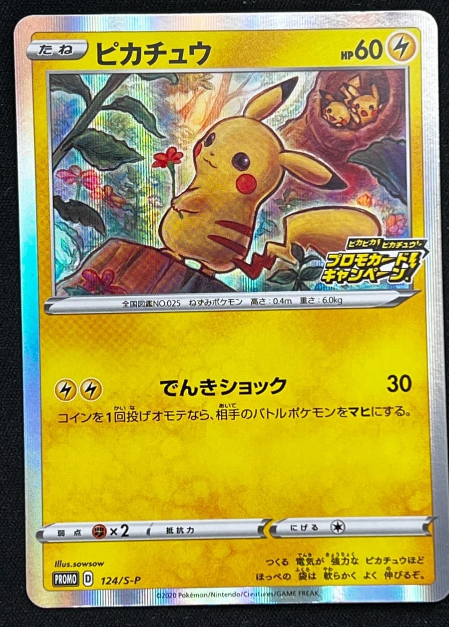
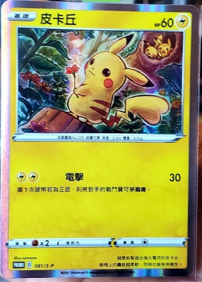
Japanese vs Chinese
It’s a bit of a gender reveal too ![]() . Obviously the Japanese is suggestively female but there is still plausible deniability
. Obviously the Japanese is suggestively female but there is still plausible deniability
5 Likes
Really good example for this topic because it illustrates a more niche definition of a “reprint” that still introduces a different card to consider with different qualities.
Also probably the best example of why I usually don’t like stamps! You don’t get the whole picture! ![]()
3 Likes
I think this is the best answer, honestly. These cards are definitely underrated. It turns almost worthless energy cards that people throw away into beautiful holographic cards that are great on display.
I think these cards can be used to compliment every collection, for example having a holographic electric energy looks great next to a bunch of Pikachu cards, a holographic water energy looks great next to a Gyarados collection, etc.
Personally I think the best reprint energies are specifically the Energize Your Game Cycle cards, which are reprints of the original energy cards.

5 Likes