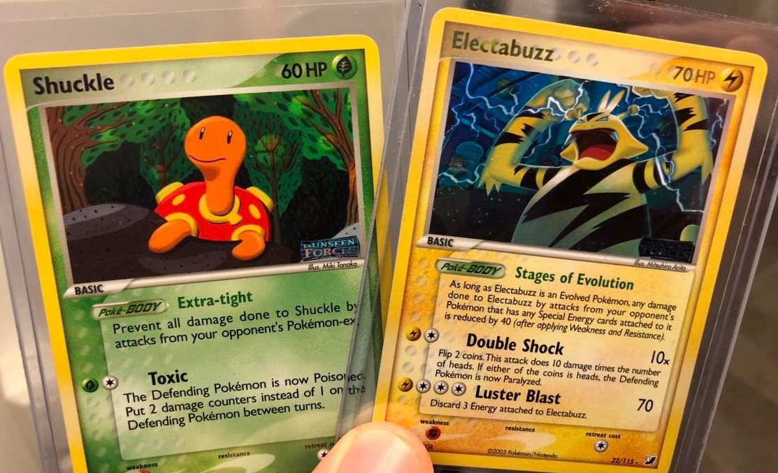
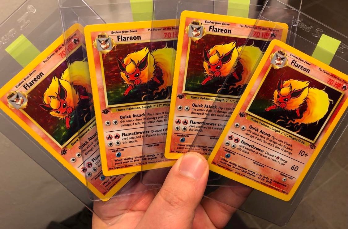
those are some beauties. why so many of the same though?
8 Likes
Thanks! I prefer having many of those I like than having one of everything. It also just happened that way because I built my collection mostly through opening booster boxes and packs.
7 Likes
wow, this vaporeon is beautiful. Nishida is one of my favourite artists (i apologize if not using honorifics is disrespectful, i dont really know how to properly use them!)
7 Likes
Not disrespectful at all!
Nishida is great, love her unique style.
7 Likes
Never really much of a Shedninja fan, but man, the artwork on this one is niiiice
9 Likes
@davie, Yeah, great artwork. Himeno managed to make it look in natura and supernatural at the same time. The thing above Shedinja, is it the sun, a portal or a supercell? I love it when they manage to capture that interpretative angle.
7 Likes
![]() Gorgeous artworks. One of my favourite sets. They really pop out… Congrats!
Gorgeous artworks. One of my favourite sets. They really pop out… Congrats!
8 Likes
@c0ll3ct0r, sick cards
7 Likes
Curious to hear about your relationship with revers holos from this era, as these are a recent favorites of mine (:
Any reverses from Expedition all the way to EX Dragon or so
8 Likes
I have a love/hate relationship with them. On one hand they dilute things by making every card “special”, not a fan of that, and overall I’m not a fan of the style although I prefer the intense expedition-TMTA version to the duller version introduced in the DP-era.
That said, on certain cards I appreciate the effect. Usually if it is a card I really like, a non-holo exclusive or if I think the card should have been a holo in a set.
8 Likes
Oh I see, makes sense.
I don’t know why, but I always felt it’s cool to have a binder of just reverse holos, or having a normal → reverse → holo setup for a 3x3 binder. And the holos feel like “the real thing” so the revs don’t dilute them too much for me.
But great point. I personally love Shedinja ![]() It has some really beautiful cards from that era
It has some really beautiful cards from that era
7 Likes
I love the reverses from ex era
7 Likes
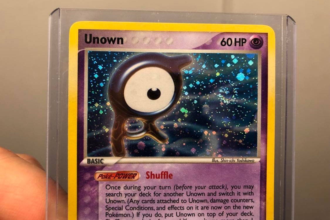
Unown A looking like it’s being pulled into the anti-cyclonic swirl:
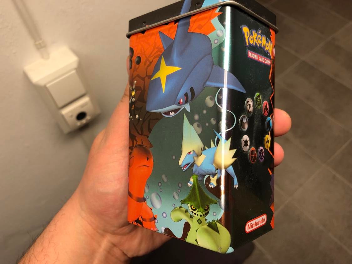
Pretty much a booster purist but I support retail pimping when it looks like this dusty old thing:
14 Likes
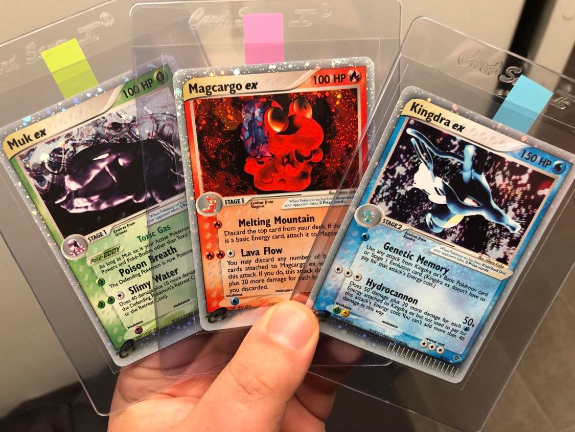
At the risk of exposing myself as a philistine, I actually can’t say I’m a huge fan of the rough ex aestethics (just not yet, maybe?).
But I love the layout of the early ex’s! The thick lower holo border really slaps! Another fine detail that English did better than Japanese in the ex era, in my opinion.
8 Likes
Totally, the thick border is very special. Another cool thing about it is how the first three sets have their own distinct version of it. Ruby Sapphire is straight sparkle, Sandstorm introduces frosting with a pretty pronounced line to it and then Dragon and TMTA have a more seamless transition but the frosting covers more surface area.
8 Likes
Bits and pieces from a random box:

Found a few of these in another box, had to take a picture of them:

16 Likes

14 Likes