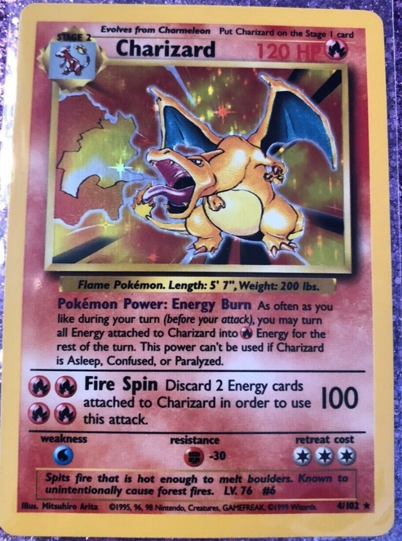
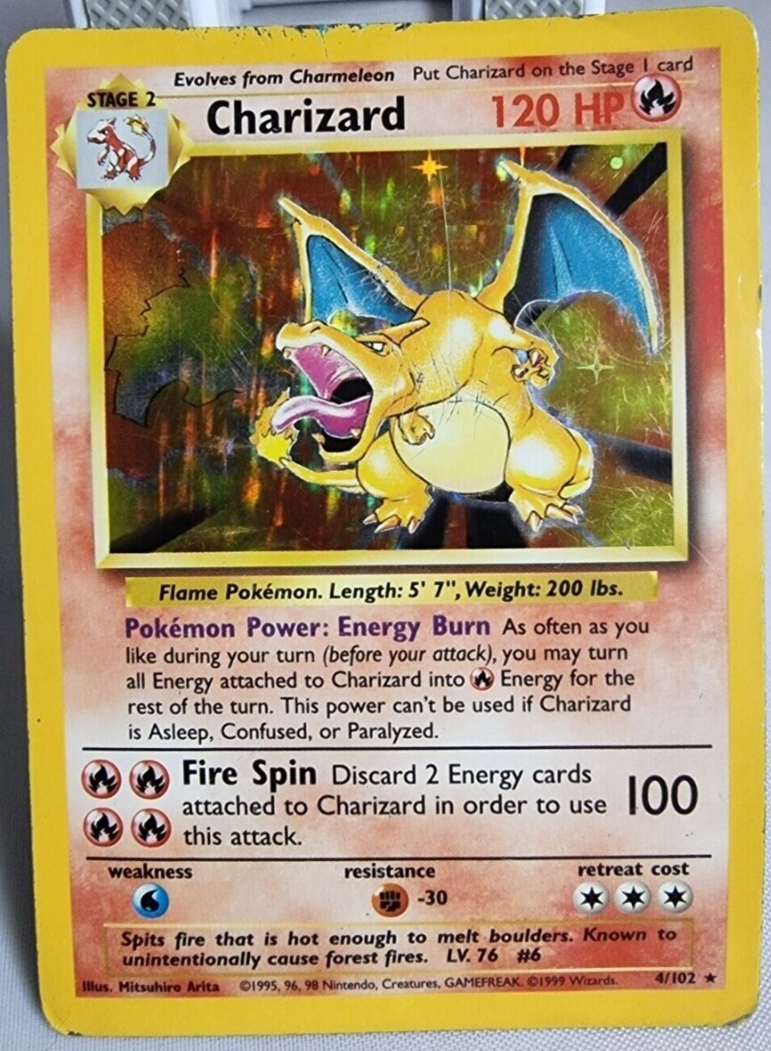
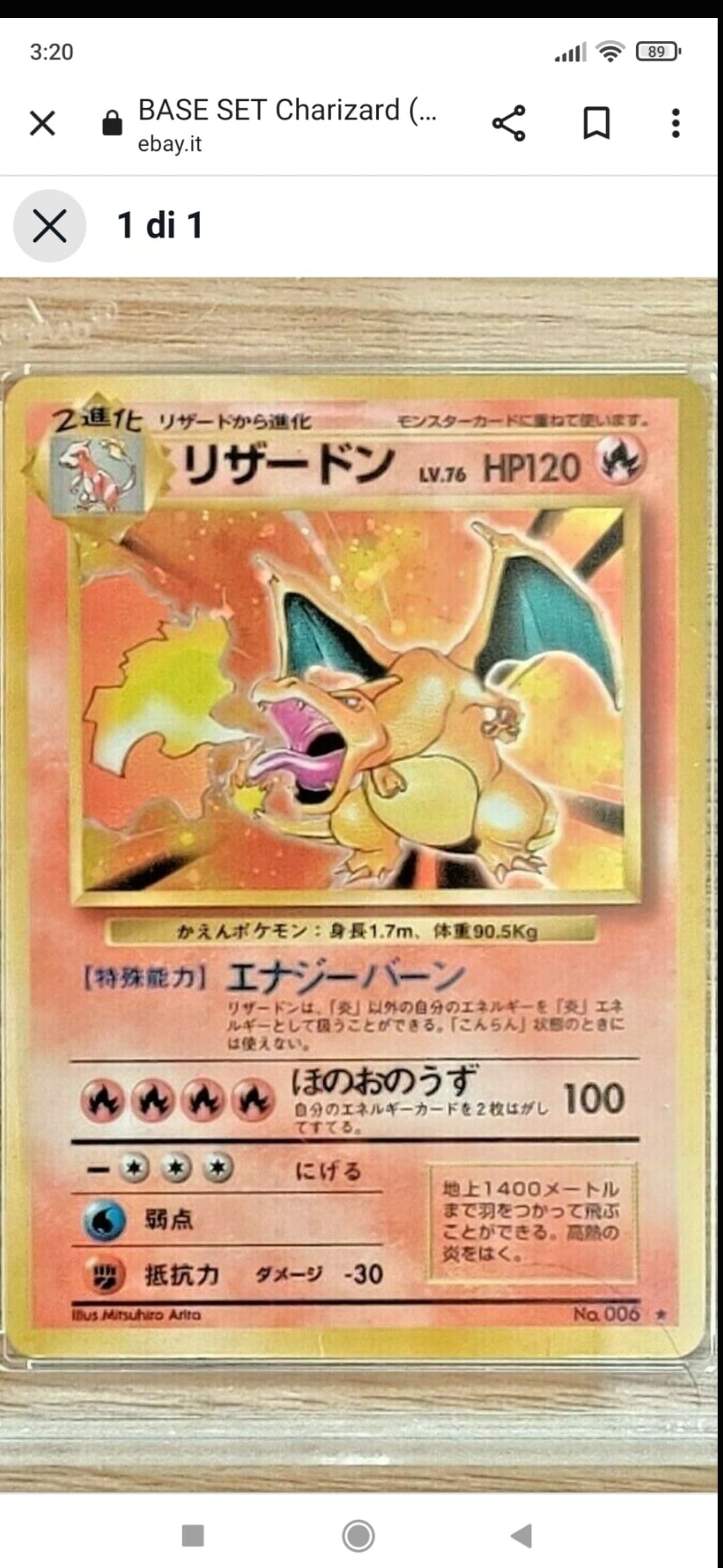
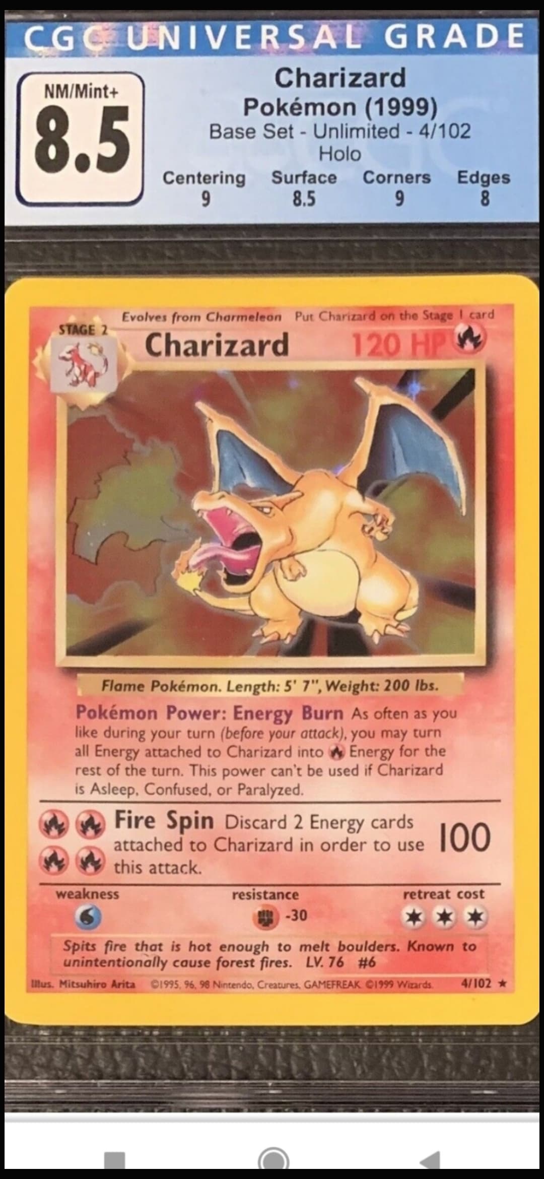
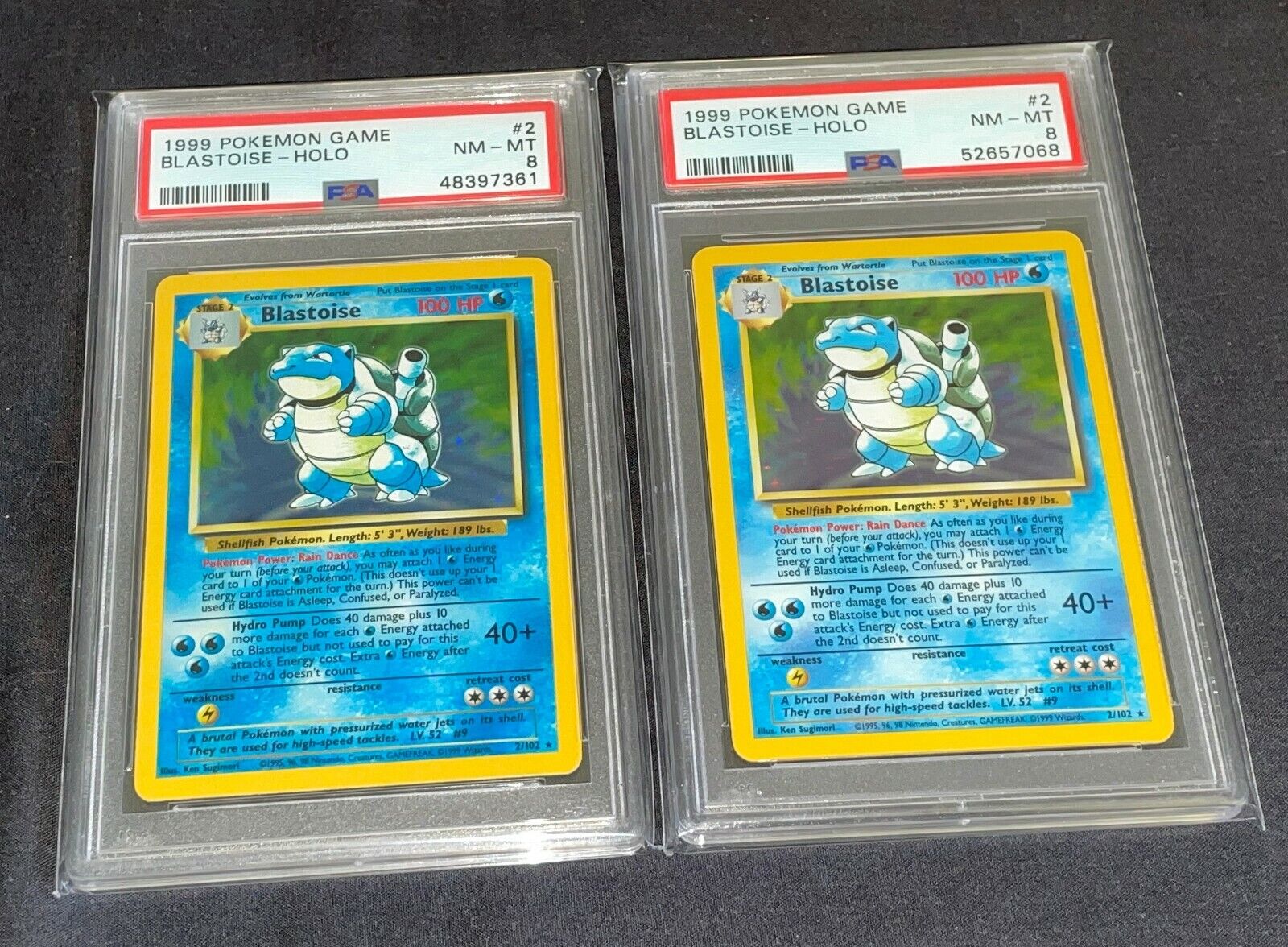
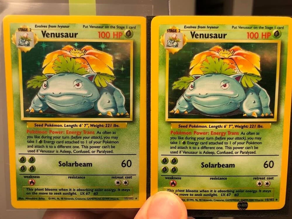
Hi, guys! Big fan of this forum, and especially of Gary, Scott and Rusty for a long time, but still brand new member. This is my first thread here. The goal of the thread is to gather all the slight (not albino level) color variants that lead (in your opinion) a card to be more desirable, valuable or aesthetic pleasant. The idea came to my mind after seeing a video (The FIRST, 1st Edition MEWTWO Pokemon Card !!! - YouTube) of Rusty showing a “Ruby” (magenta saturated) Base Set Unlimited Charizard. Please share your specimens, every image and opinion is welcome!
3 Likes
Welcome to e4! We’re happy to have you here.
To be honest with you, I do not see slight color variants fetching a huge premium nowadays. You might be able to find some interesting pictures in this thread:
Thanks for the reply, I’m following the thread you shared for a long time, it’s so interesting. I also opened two times the same thread by mistake, as you can see ![]()
1 Like
Hey, no worries. You can always ask @Admin or @Moderator to swing by and remove your other thread. ![]()
Alternatively, you can go ahead and delete your own thread by pressing the three small dots next to “Reply” and then press the trash bin icon.
1 Like
Resolved, thank you very much. Everyone who wants to post specimens, feel free to do it ![]()
2 Likes
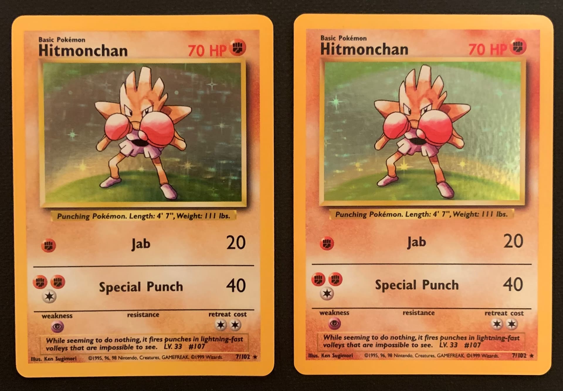
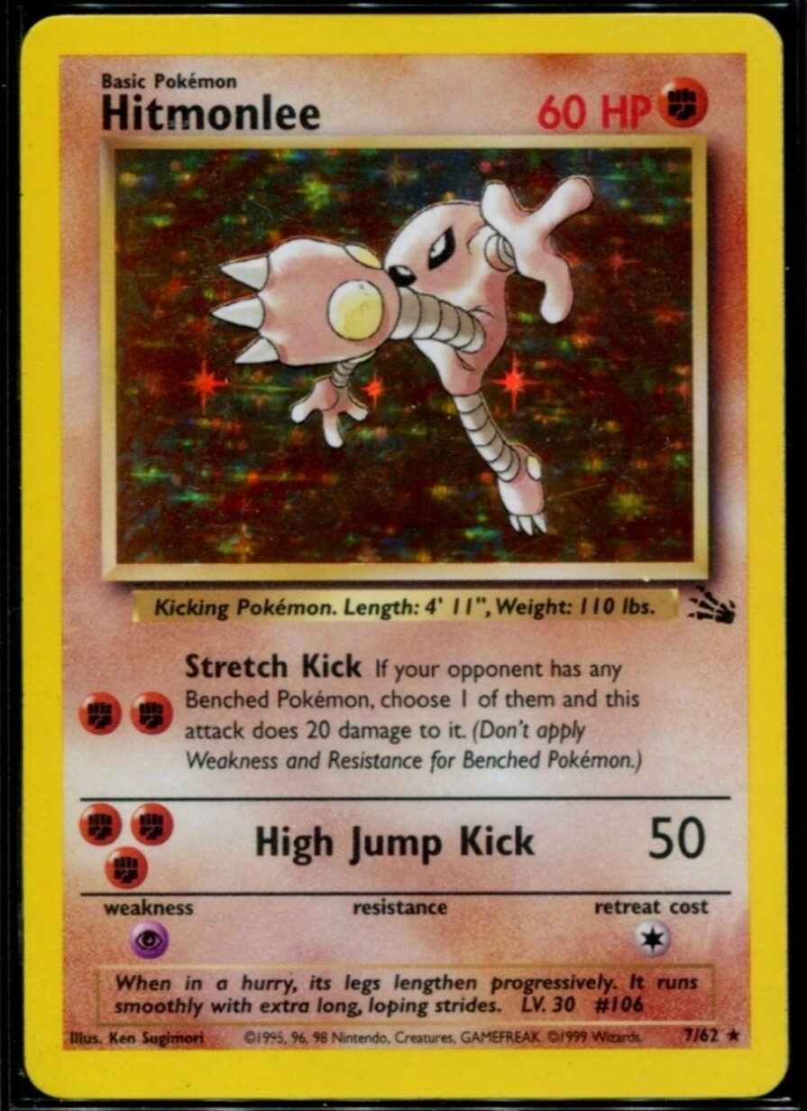
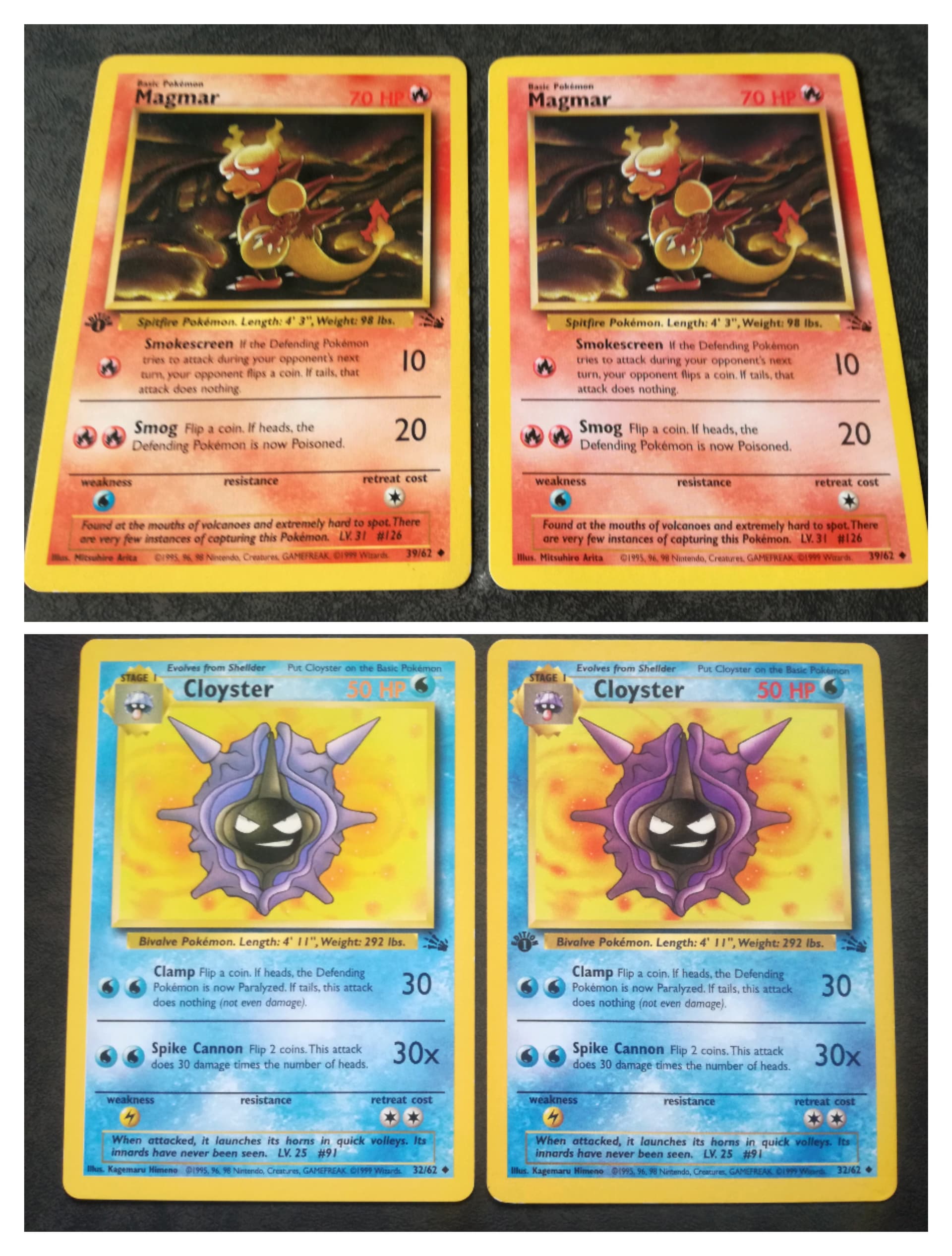
I’ve noticed a lot of variance in the unlimited run of base set, the Hitmonchan on the right is a bit more saturated:
1 Like
2 Likes

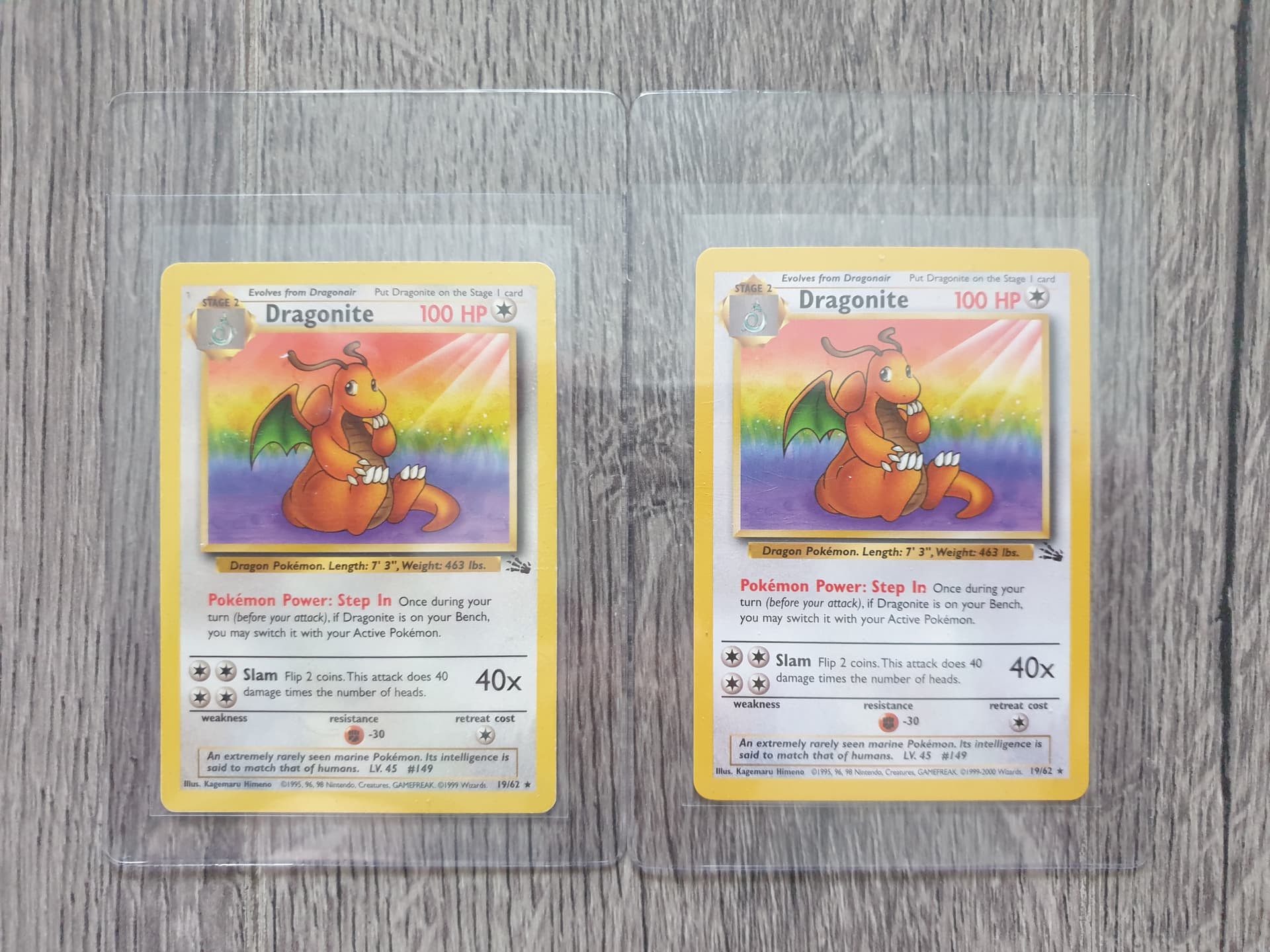
I have this Muk thats a bit darker on the border. You can really tell if you look its top left corner compared to the card behind it.


I also have this Geodude where the top/bottom border are a different color the left/right border. Its also quite offcentered too.


4 Likes
I had a pack from Brilliant Stars where every card was miscolored which I thought was cool enough to pull aside from the rest of my bulk. Not sure if this is common with modern or not since I don’t open too much
7 Likes
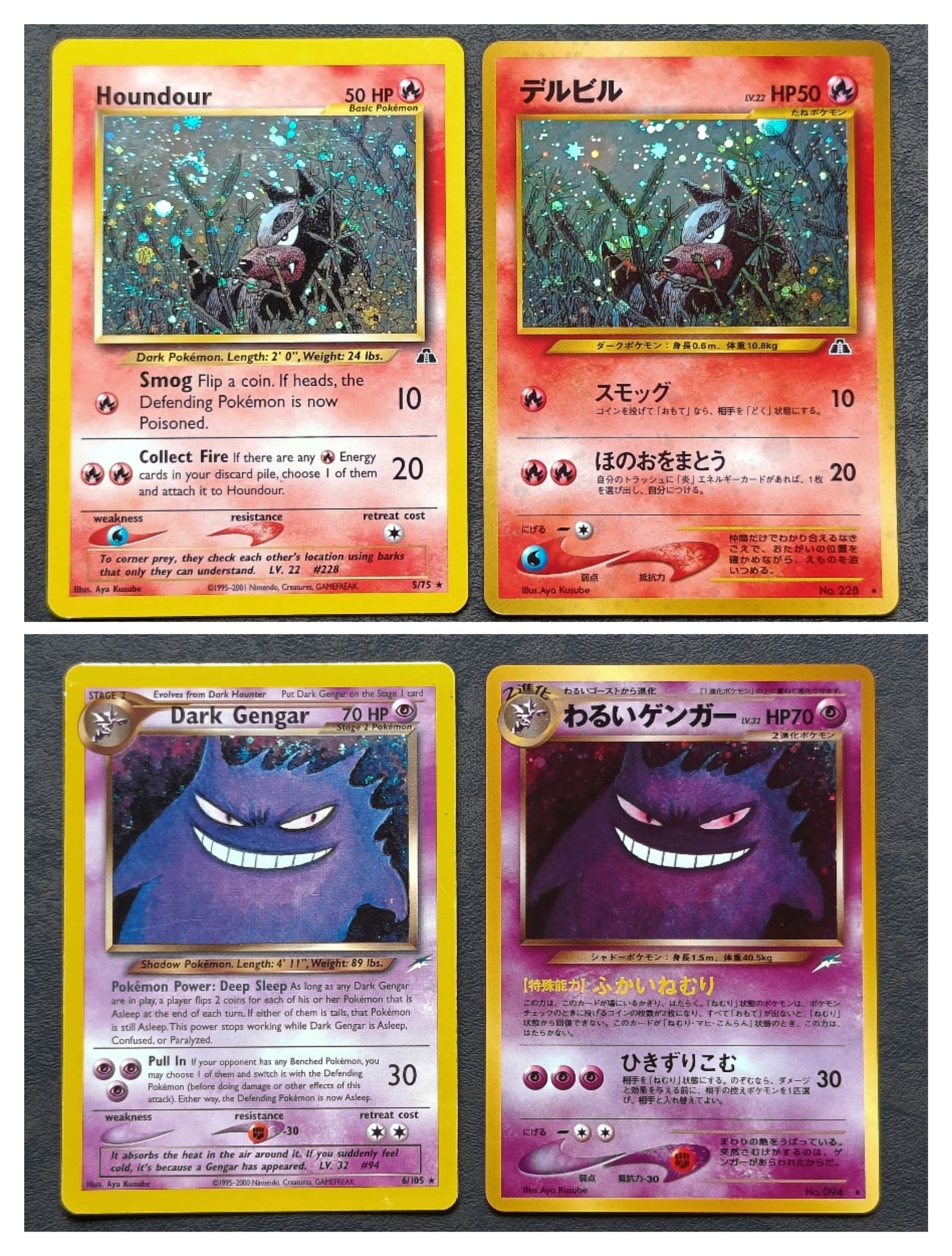
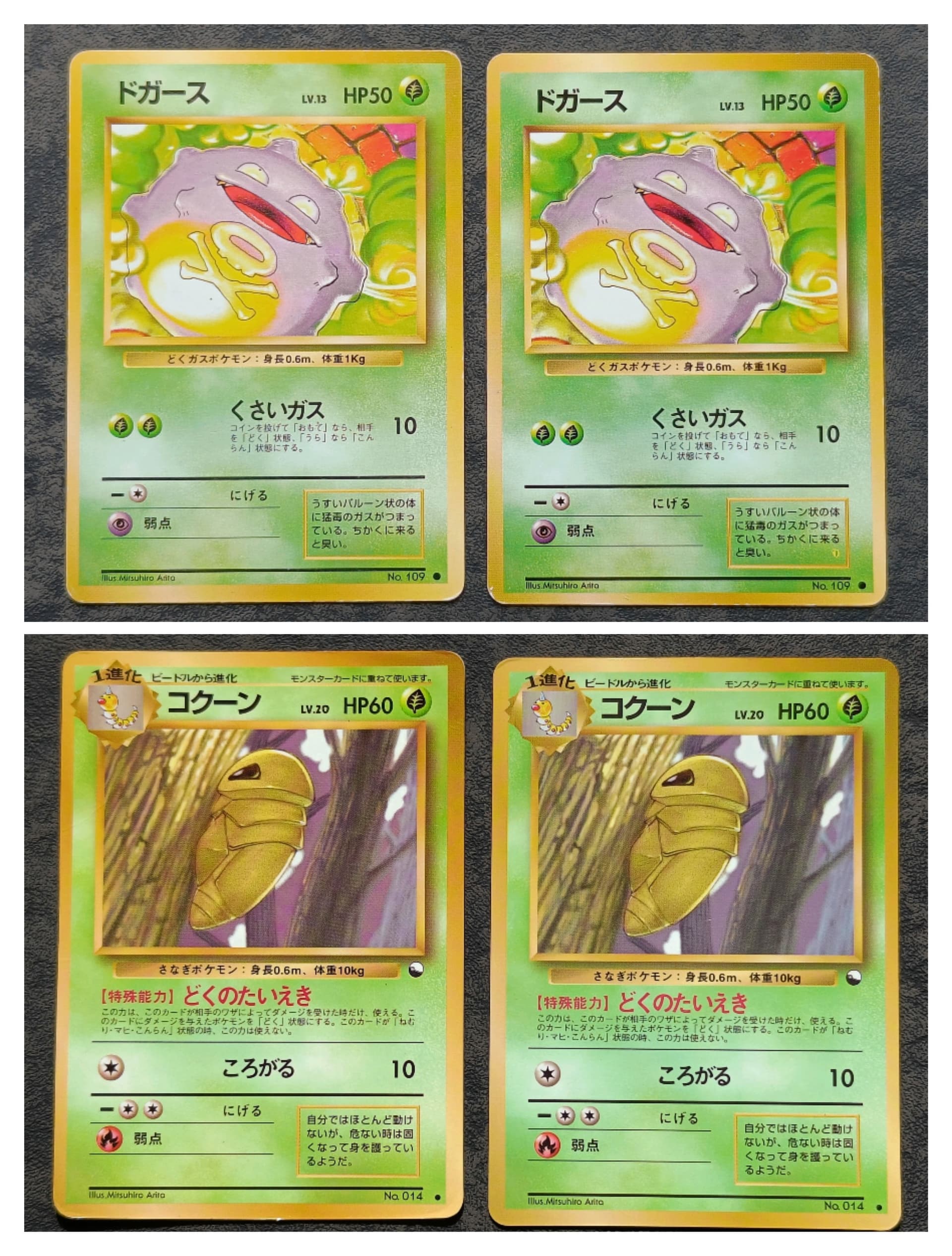
Great topic! I have been trying to learn about color variations lately and I agree that for some cards a specific color variation can greatly improve the feel of a card. Ink saturation is something I don’t fully understand yet but I know it can lead to some extreme looking cards. I will share some of the pictures I took before but I’m sure that I have more. ![]()
5 Likes
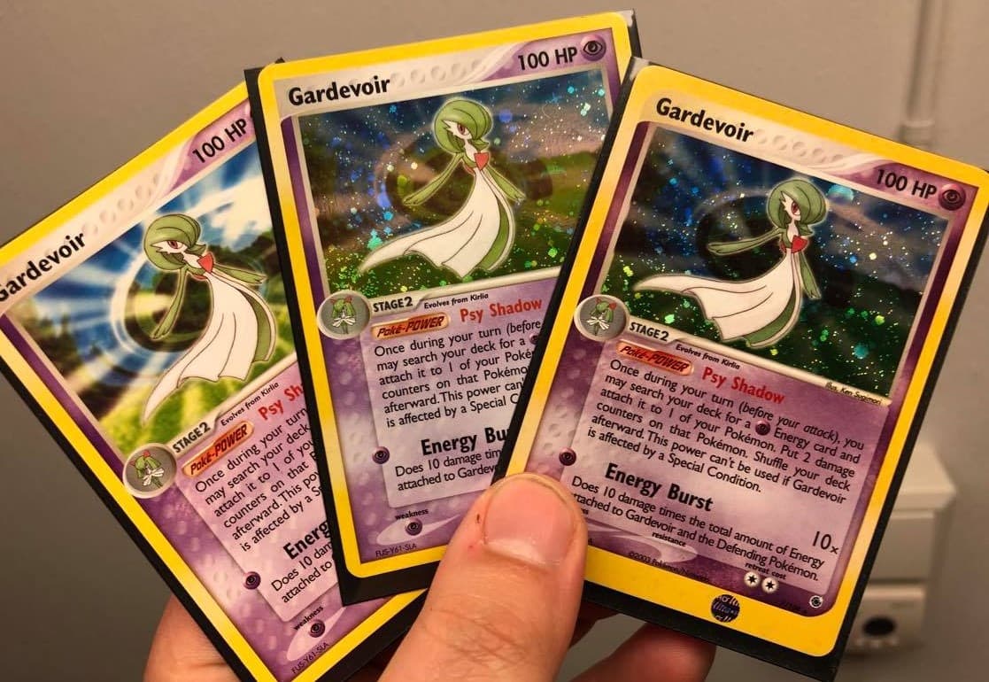
Here some modern ones:
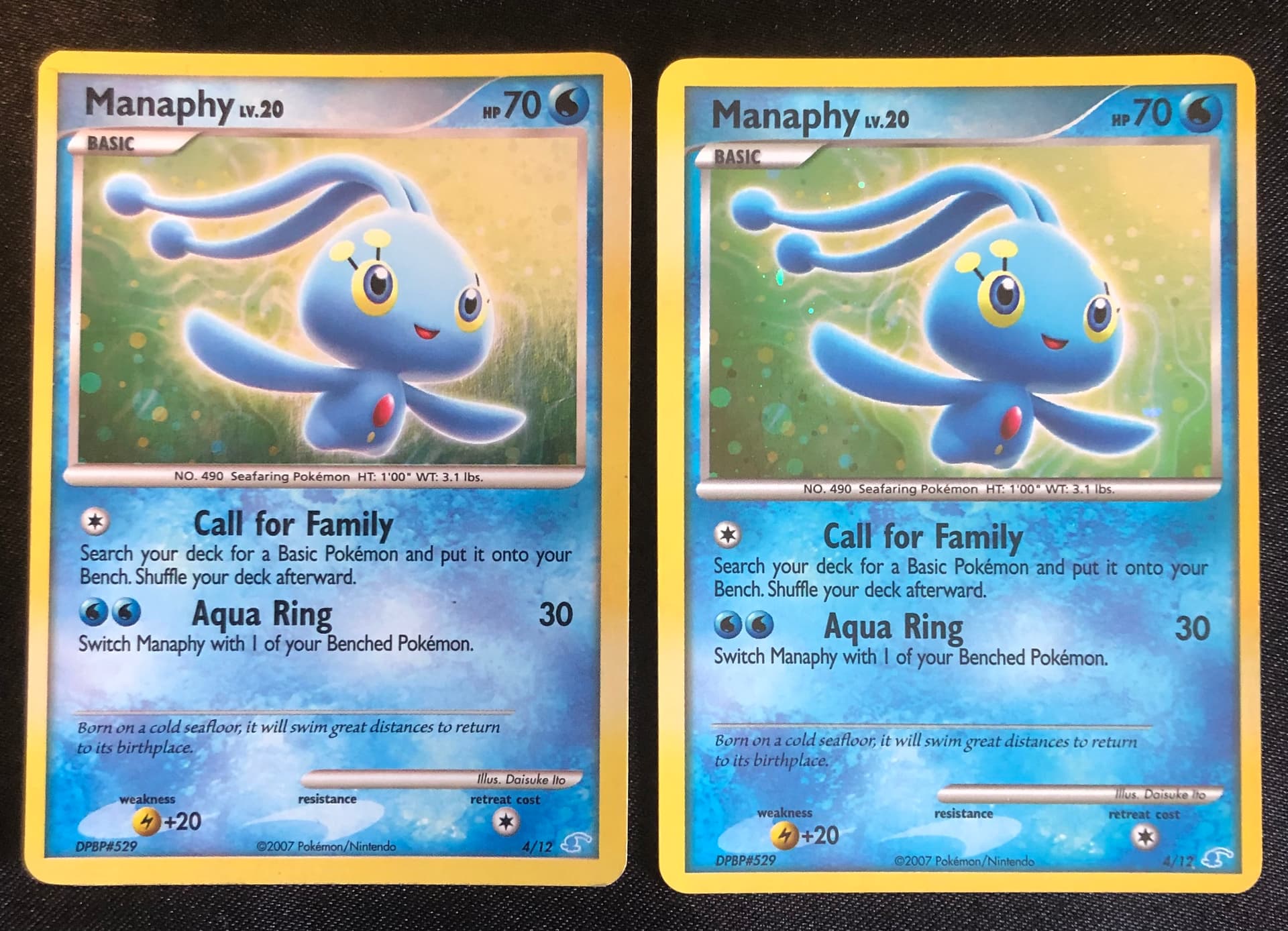
Top two are two minor purple color variants. Bottom two are the Blue and Maroon misprints (technically also ‘just’ a color variant, though ![]() ).
).
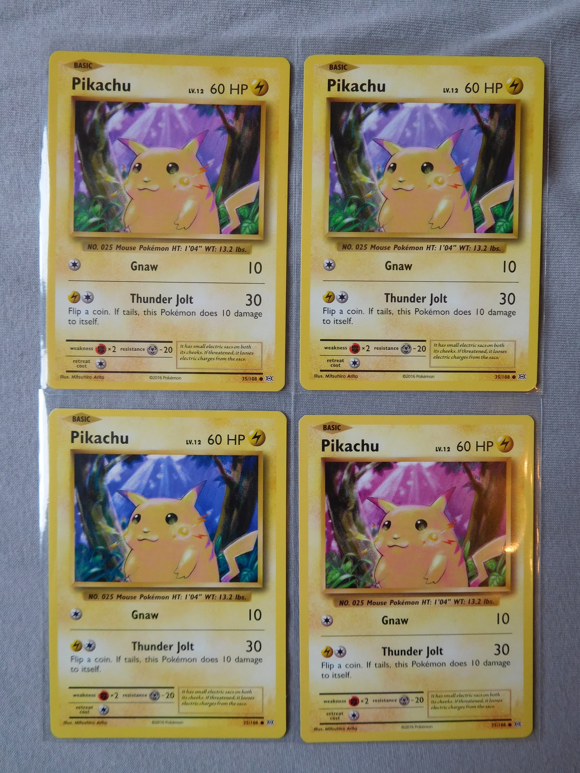
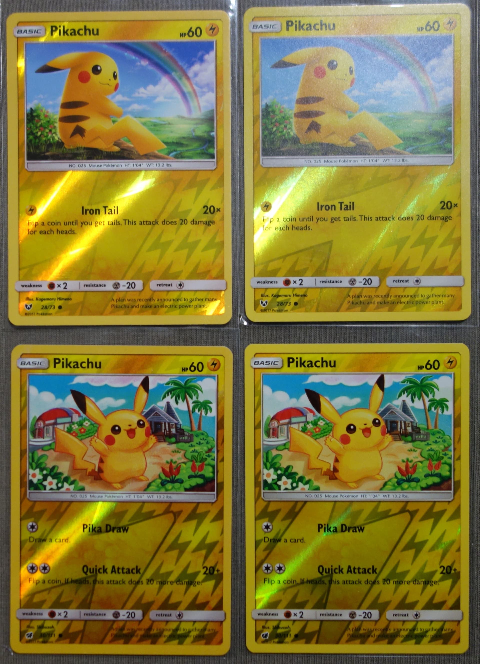
Here orange-ish vs yellow Reverse Holo Pikachus:
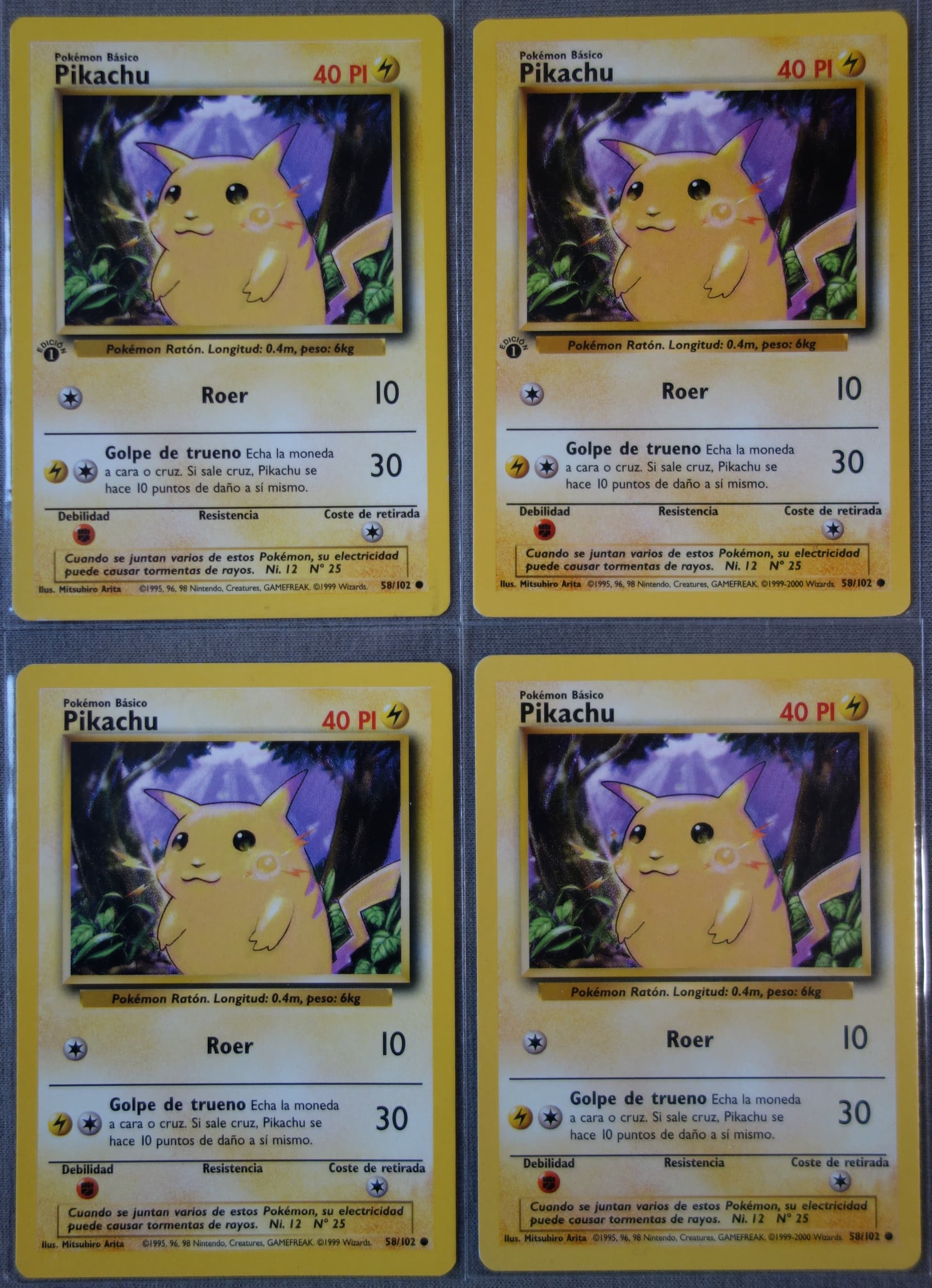
Base Set also had a lot of variants across the different print runs and languages. Here an example of the Latin American (©1999) vs European (©1999-2000) Spanish Pikachu cards, where you can see a pretty clear difference in the saturation of yellow:
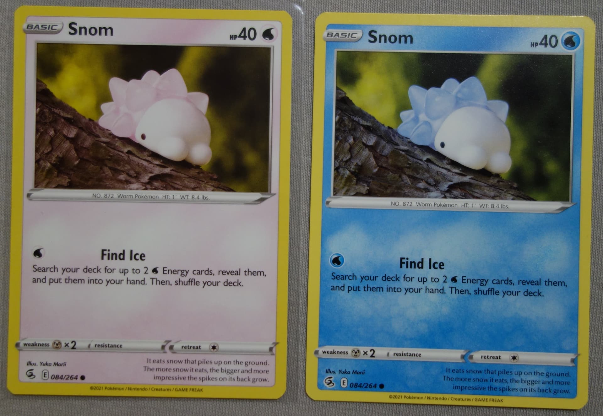
And one that doesn’t really belong here, but I just wanted to share anyway. This Snom is misprinted with its Cyan color layer missing. ![]()
Greetz,
Quuador
7 Likes
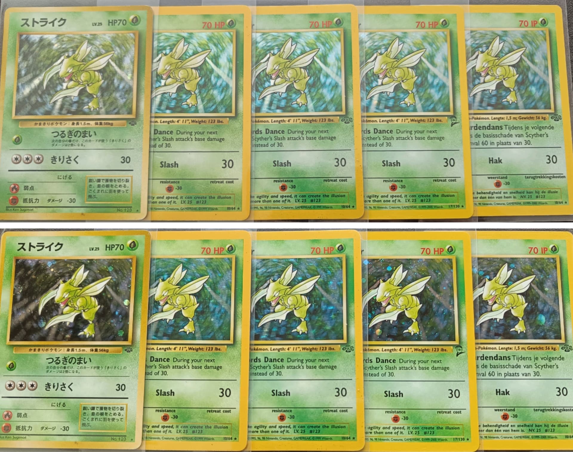
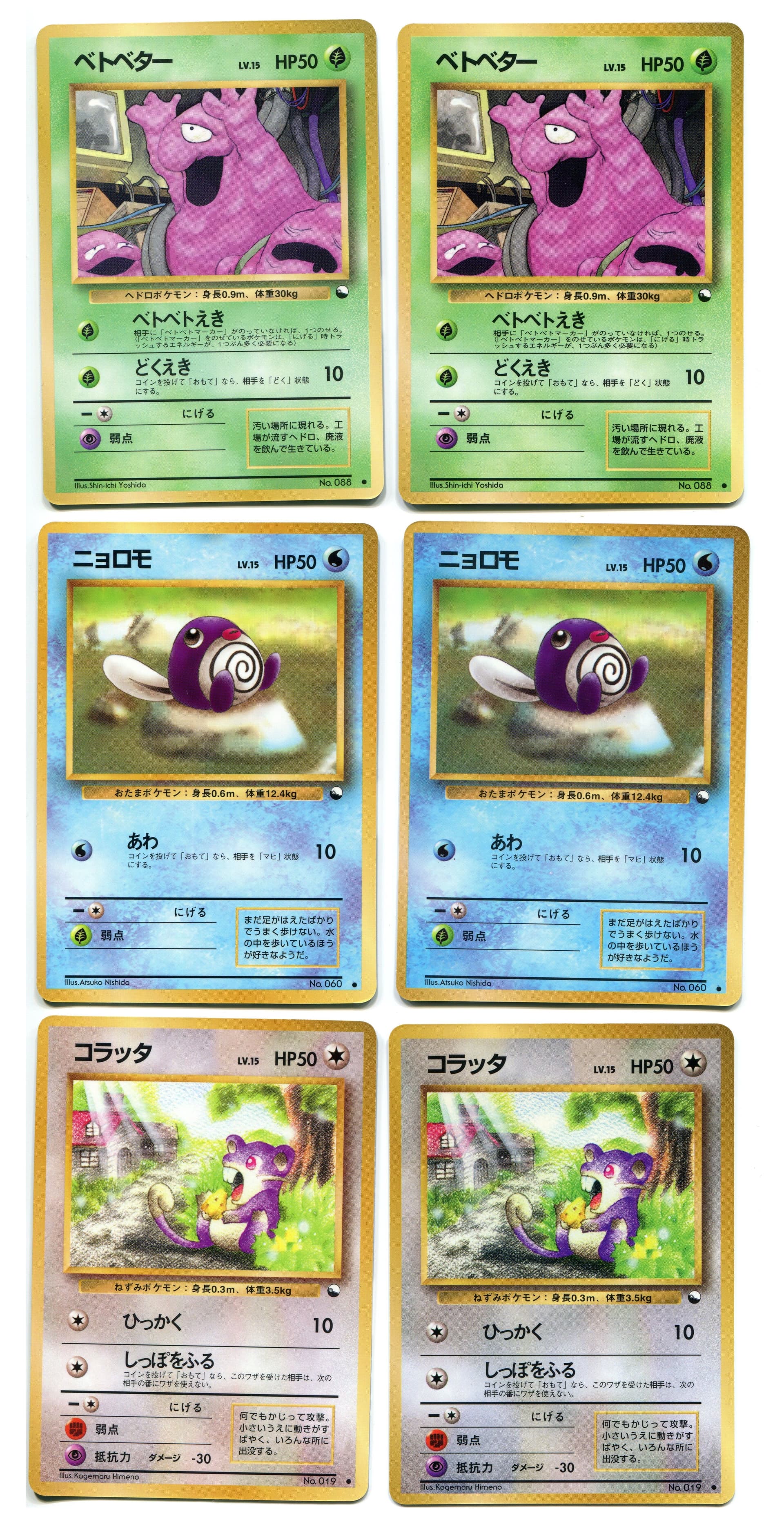
Here also an image I saved for an example of Japanese color variations:
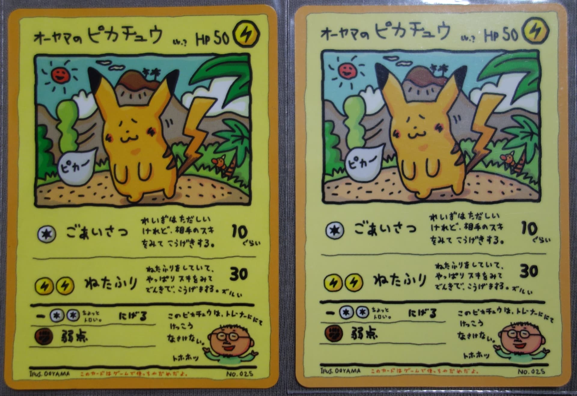
These above are from Vending Series 1, but the Vending Series 3 is actually known for having both a dark and light print run. Here the Ooyama’s Pikachu from both print runs, where you can see a pretty clear difference:
Greetz,
Quuador
5 Likes
What a great colour variety in your Pikachu collection! The Snom is also gorgeous, definitely a female one ![]()
1 Like