pfm
December 23, 2022, 6:04pm
1
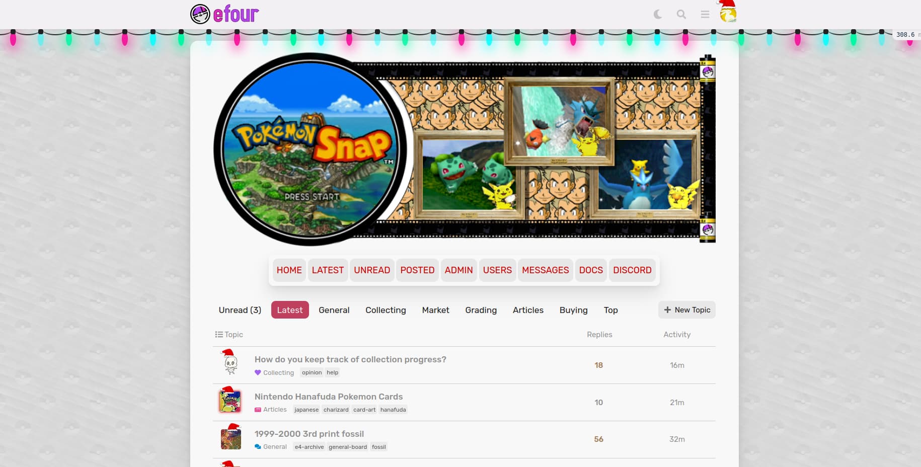
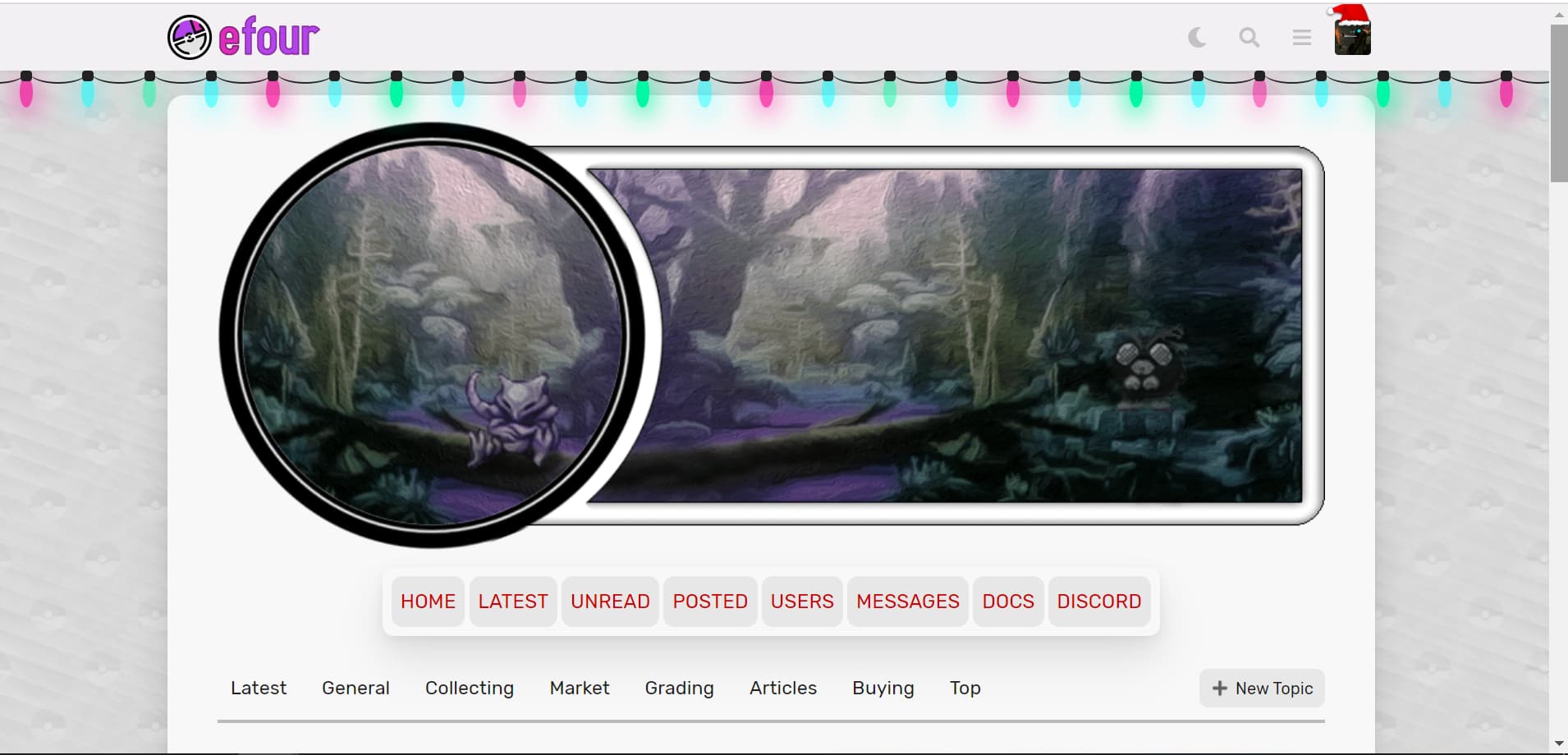
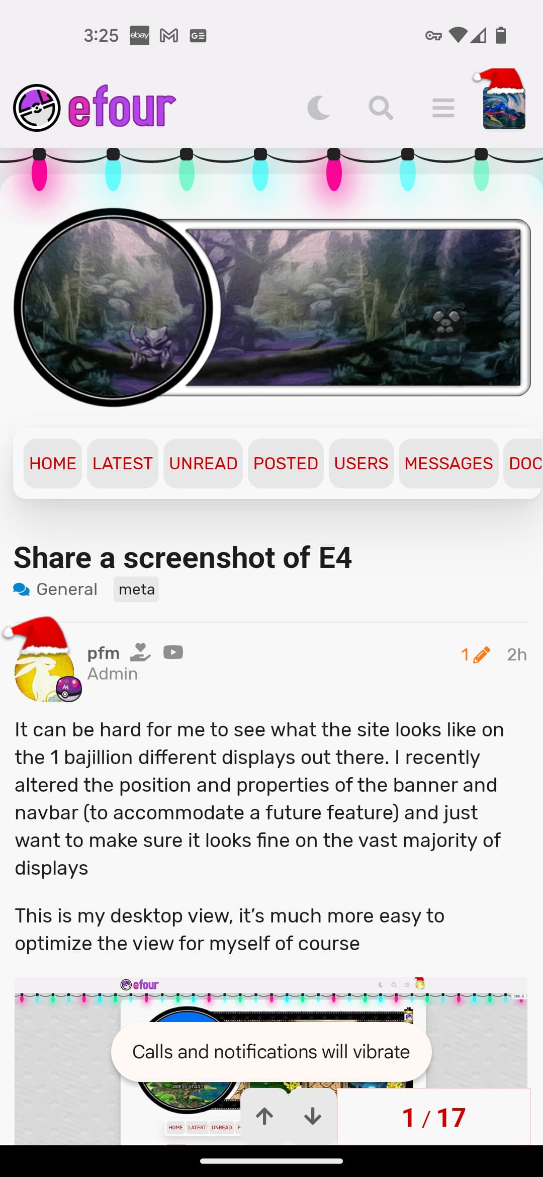
It can be hard for me to see what the site looks like on the 1 bajillion different displays out there. I recently altered the position and properties of the banner and navbar (to accommodate a future feature) and just want to make sure it looks fine on the vast majority of displays
This is my desktop view, it’s much more easy to optimize the view for myself of course
Feel free to share either desktop or mobile views
If possible please include your browser and screen resolution (desktop specifically)
1 Like
I have a feeling this is going to devolve into Light/Dark theme.
2 Likes
pfm
December 23, 2022, 6:10pm
4
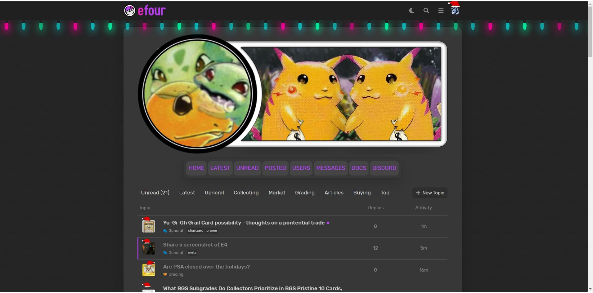
Did you purposely not choose the default dark theme?
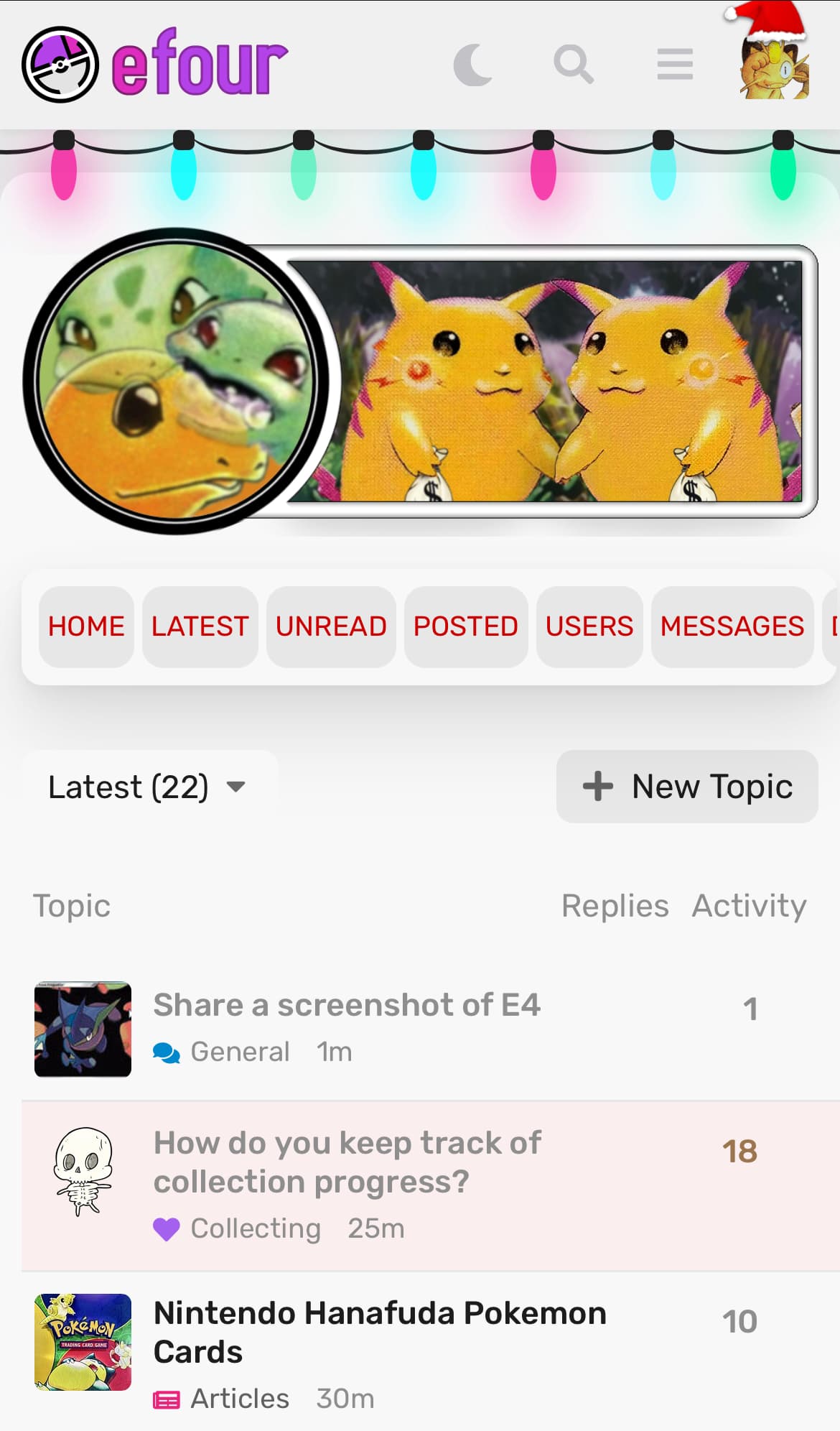
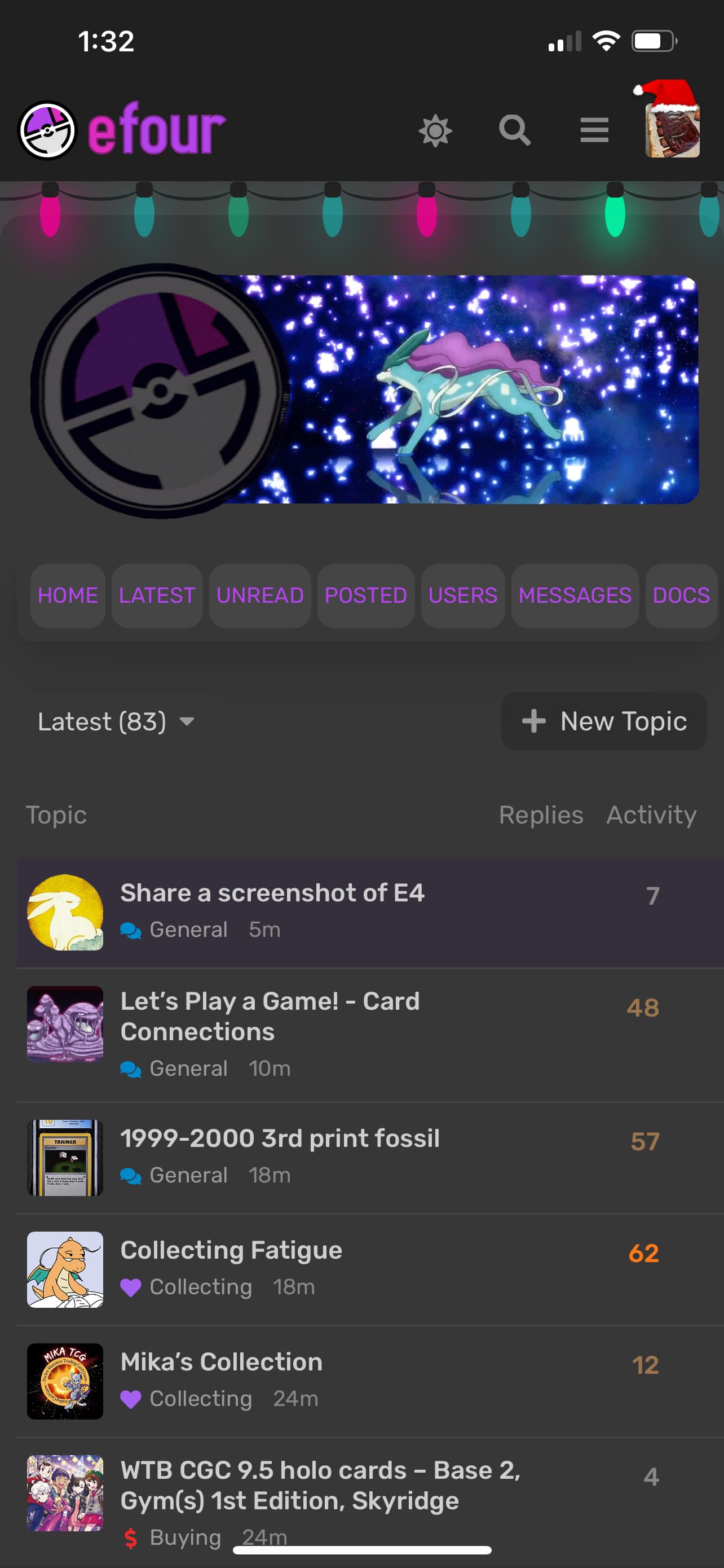
I pretty much use mobile exclusively. Unless I’m creating/editing a thread.
2 Likes
Alt dark is darker, much preferred.
1 Like
mika
December 23, 2022, 6:16pm
7
Hello,
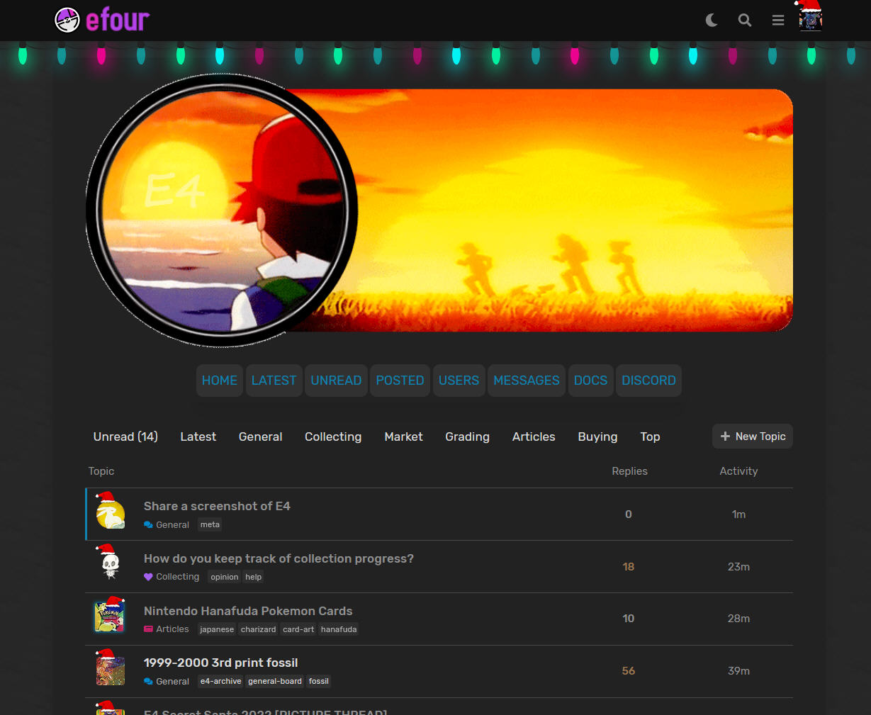
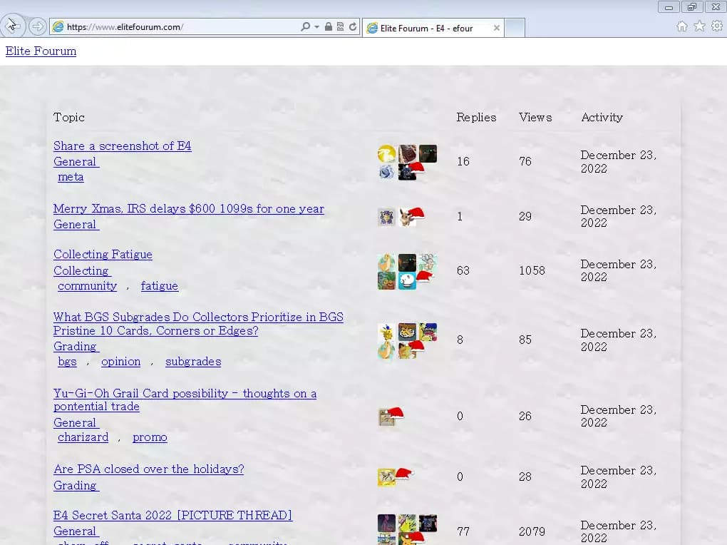
I’m currently on Linux (Ubuntu 22.04) , Chrome , 1366 x 768 Screen Resolution.
3 Likes
pfm
December 23, 2022, 6:27pm
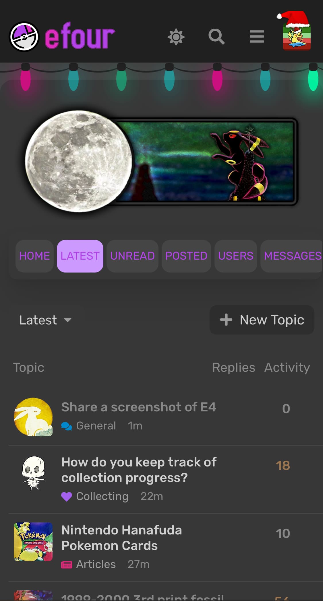
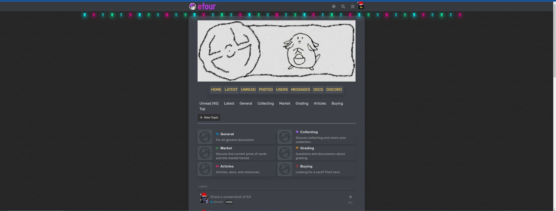
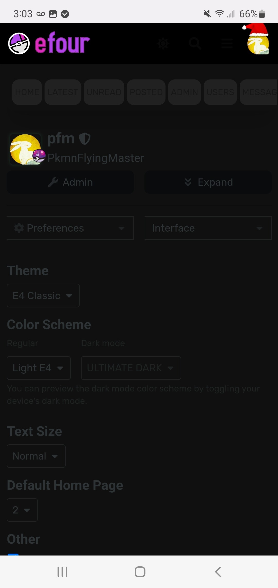
8
In that case, I just made a special palette just for you Elite Fourum - E4 - efour
Check out ULTIMATE DARK
zork
December 23, 2022, 6:49pm
11
normally i have 27 tabs between two windows open, but i don’t think we’re there yet in the relationship
1 Like
zork
December 23, 2022, 7:37pm
15
No, i’m just on a 3440x1440 – so I can track all the chorizord stonks
2 Likes
pfm
December 23, 2022, 8:04pm
16
Your browser must be adjusting the text color automatically because it was definitely meant as a joke and should look like this LOL
1 Like
Haha of course, well it looks great with white lettering.
I’m on Windows 7 using Internet Explorer 10!
14 Likes
niece
December 23, 2022, 8:26pm
19
Android phone - on the App.
2 Likes
You made sure to hide those kinky and dirty tabs don’t ya