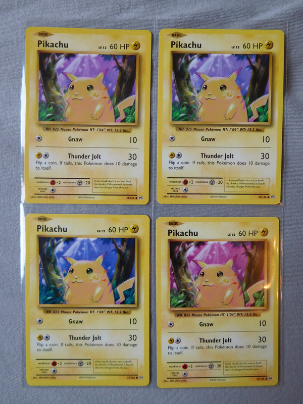
Hey guys, I’ll start by saying I’m not too knowledgeable on the Pokémon printing process, so this may be a common occurrence. During the course of the Scream promo I picked up double digits of each of the 5 available cards. Whilst going through them all today to determine which ones would be good candidates to send over to PSA, I noticed that 2 of the 13 Eevee cards I have are slightly paler or more washed out than all the rest.
Here is a screenshot of a 1,200 DPI scan I took of 1 of these paler cards I have next to a ‘regular’ card to show the difference, but I’m not sure how well it has come out after being compressed by Imgur:

There’s a fleck of dust on top of the Psyduck in the background of the card on the right - apologies for that. It took a good 20 minutes for my PC to process this scan, so I didn’t want to redo it.
I’ve digitally altered the image to show what the cards look like if cut in half and aligned on top of each other. The first image has the pale card on the left and the ‘regular’ card on the right, whilst the second one is the other way around:


I think the most noticeable difference is that the light reflections at the bottom of Eevee’s eyes are pink on the ‘regular’ card, whereas they’re more white or beige on the ‘paler’ card.
If this is a common occurrence with Pokémon cards then I’m happy to dismiss this as nothing too special, but I found it strange that 2 of the cards I own share this issue and are pretty much identical to one another in colour.


