Gotta love a well-placed swirl ![]()
3 Likes
Because i collect the pokédex i am stuck with the ammount of cards i can have in the collection wich makes me look for variations of a certain card to make it even more interesting and bring it to a higher level sort of speak and well placed holo patterns can really hit that spot i think. ![]()
5 Likes
I love that prerelease clefable error. You have great error cards feel free to show more my friend. ![]()
2 Likes
Thanks allot, much apreciated ![]()
Ye i’m really happy with that clefable, it has brought unique info into my dex collection. ![]()
I have posted my most valuable errors already but i do still have a bunch of interesting stuff left. I also keep my eyes open, not only for blank spaces in artwork but for cards with interesting errors/ information aswell.![]()
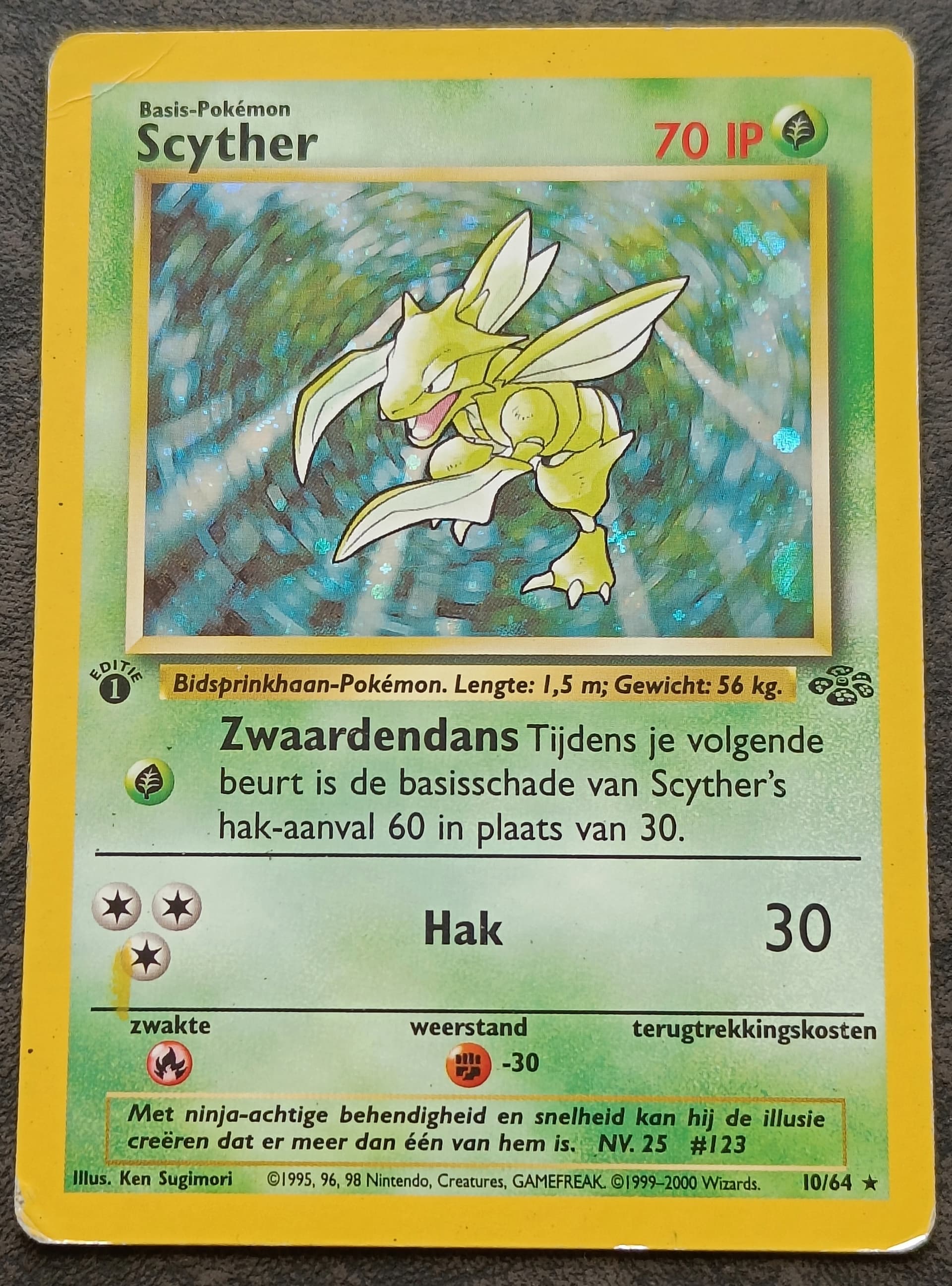
These two are my newest arrivals btw. They are in bad shape but they where cheap so yeh… Couldn’t resist hah. Been looking for the scyther for ahwile now because the ink error is repeating in 1st and unlimited aswell.
Scyther dutch (yellow ink error)
Alakazam dutch (ofcenter cut)
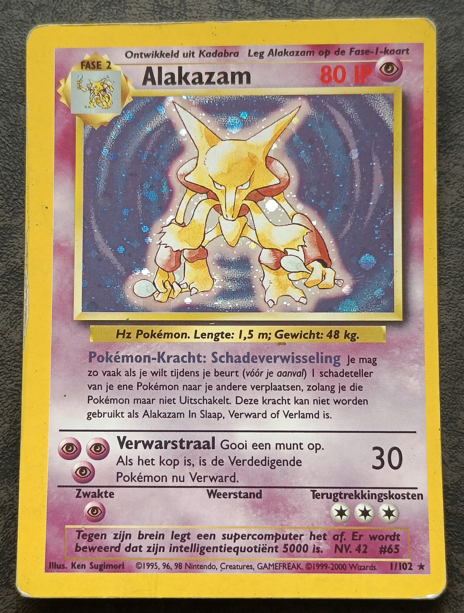
It’s because of this card i realised there was a blank space in the alakazam artwork.
Edit: I added a detail from Scyther in this post.

4 Likes
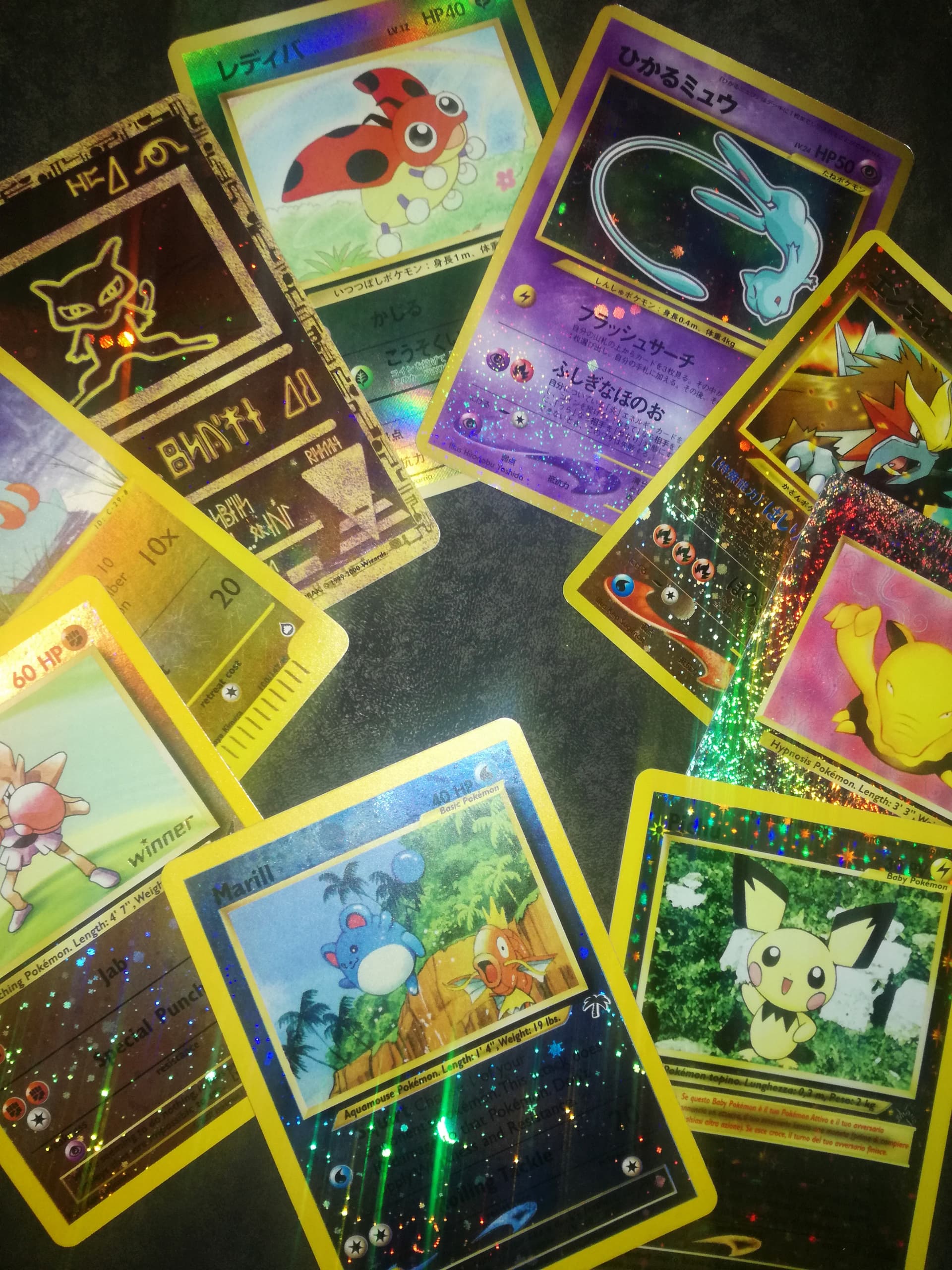
Batch of pictures No. 5 ![]()
I made some changes to the layout in the top post but did not change the text itself. I have noticed some problems with it so I will change it in time but not today. ![]()
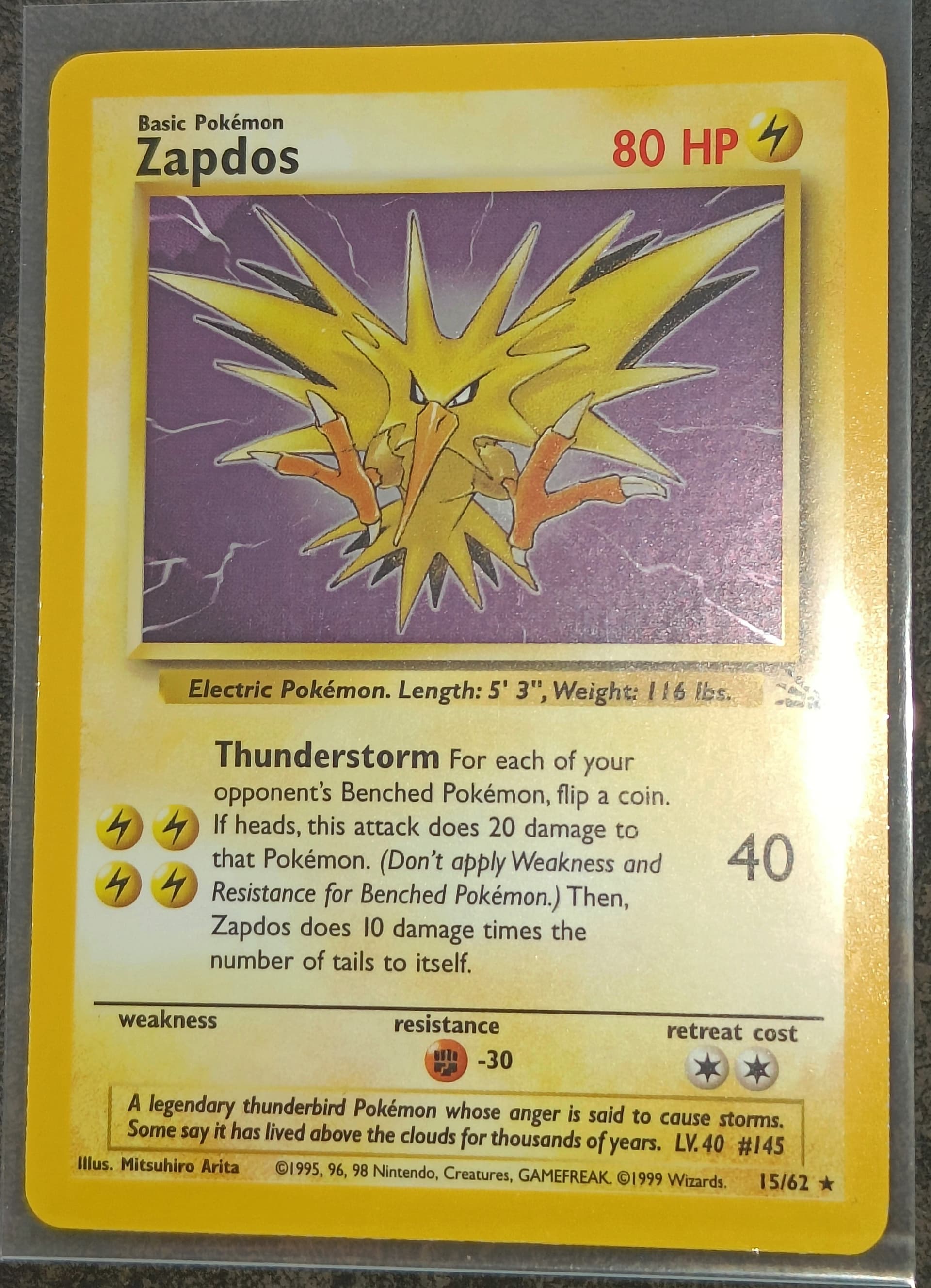
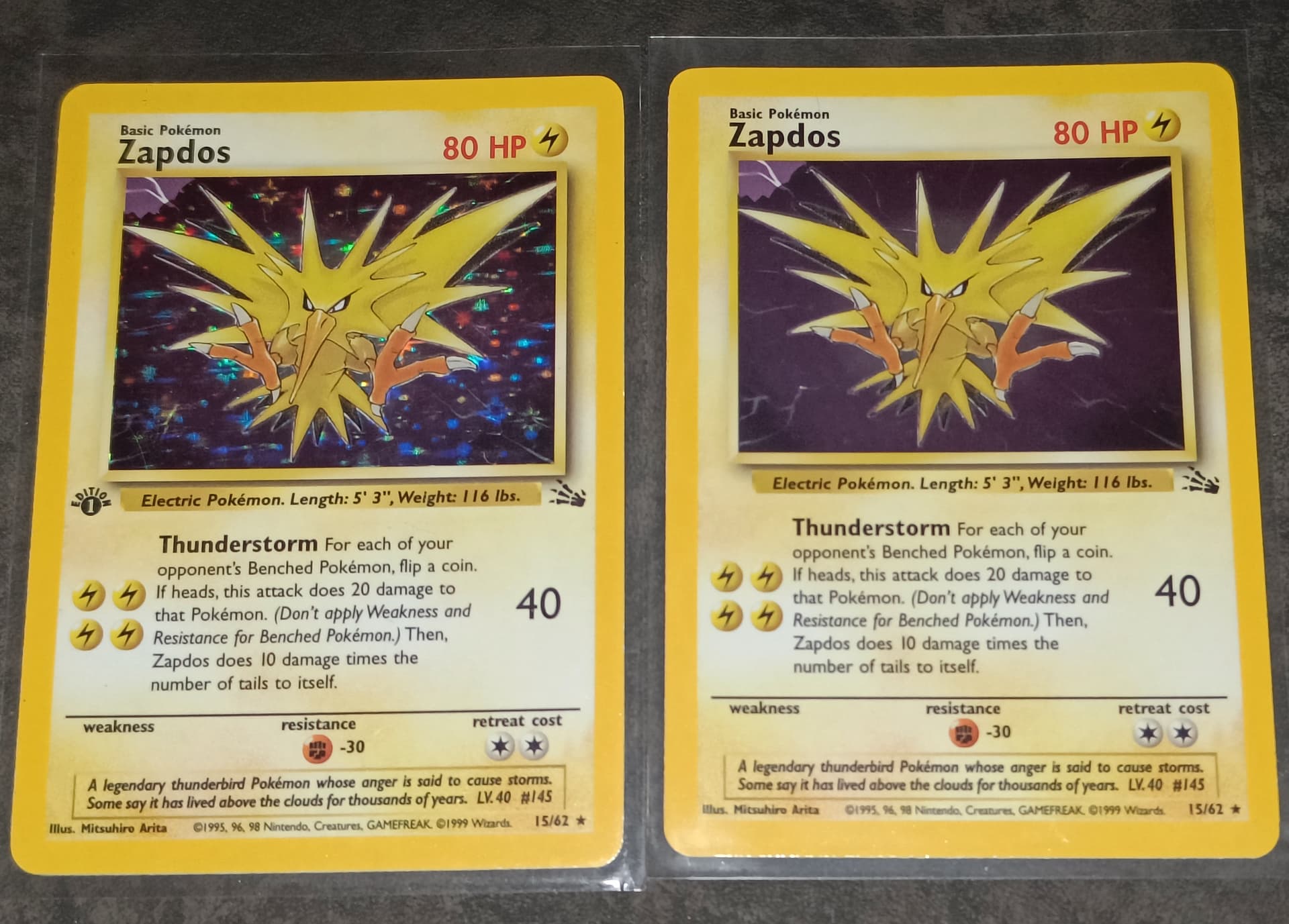
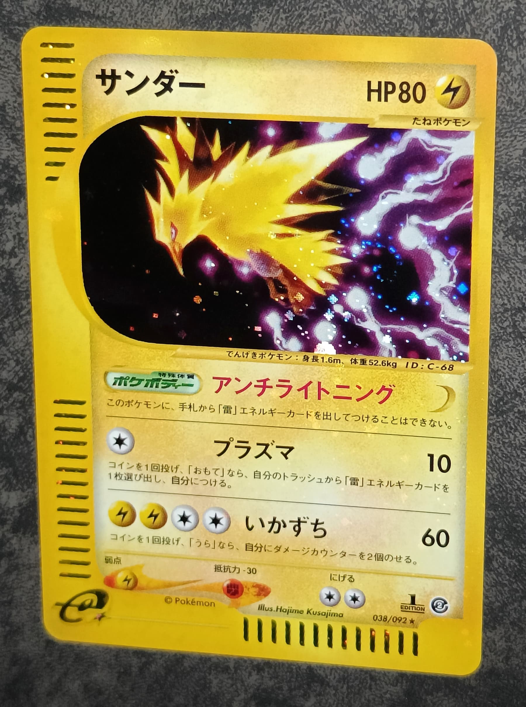
Zapdos (white layer evolution box error + mirror holo foil “error” means it has no stars)
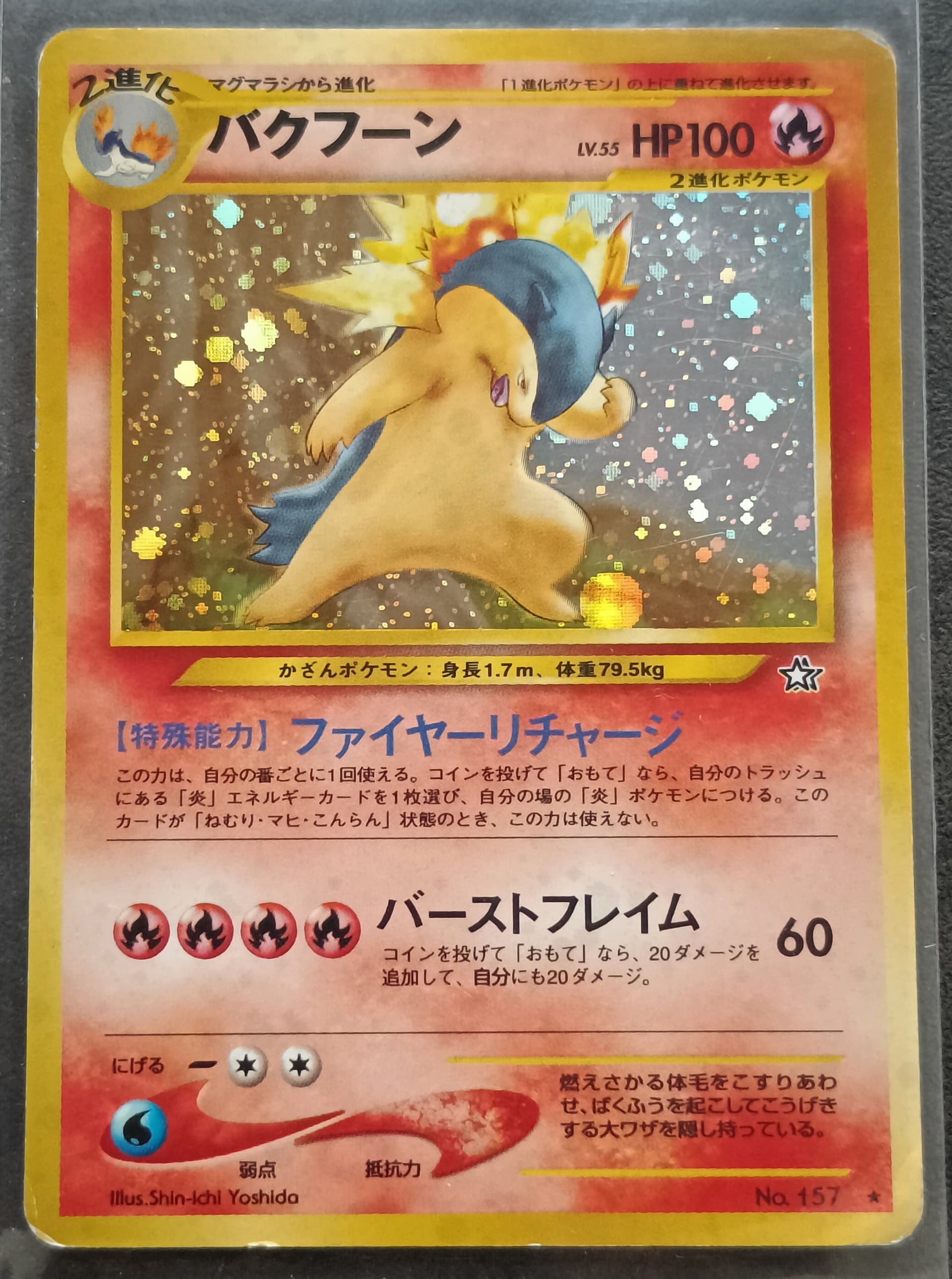
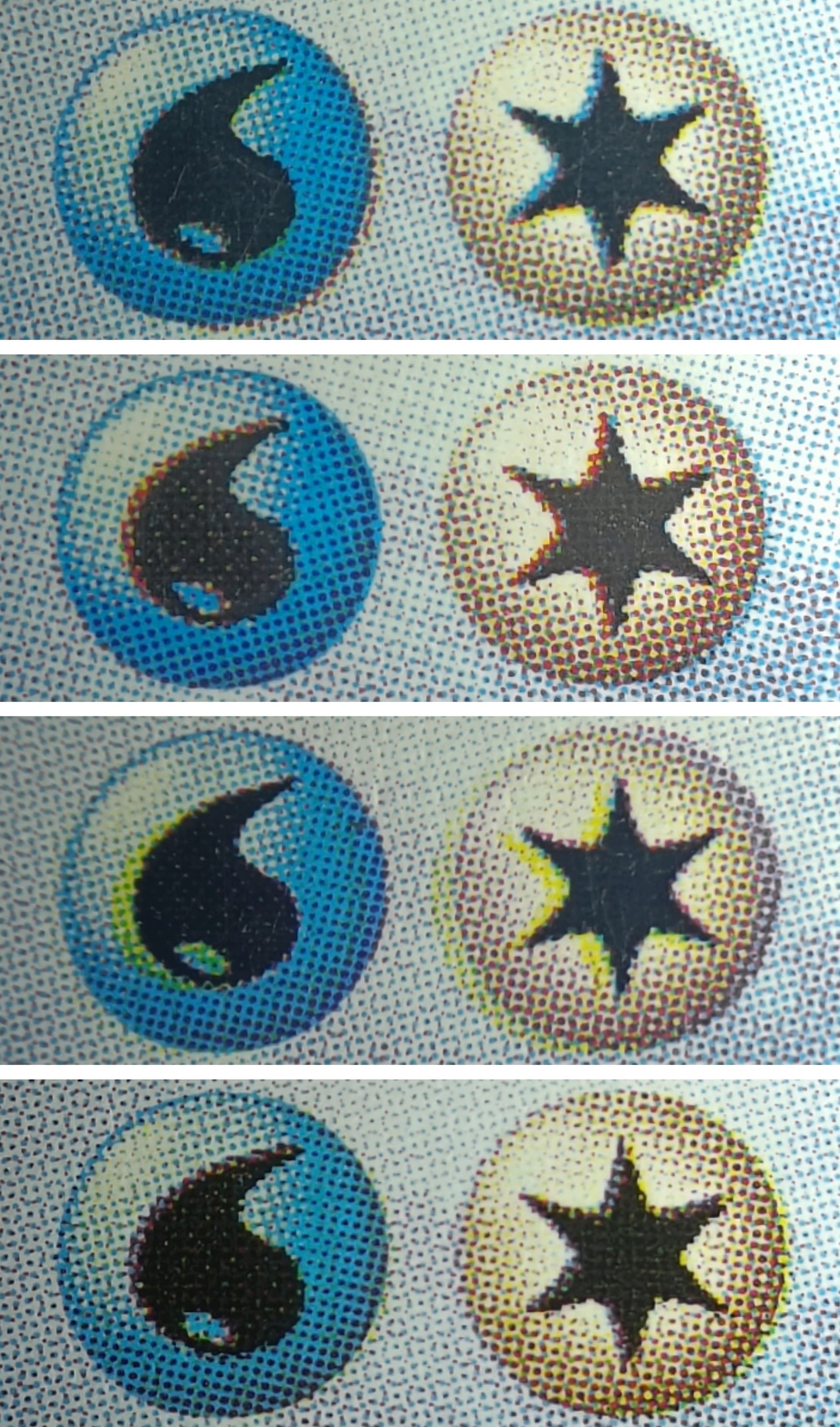
Typhlosion (well placed holo pattern, globe) he’s going to kick the football with his backfoot and hit a goal, I’m sure. ![]()
Pichu promo Italian (galaxy star reverse holo)

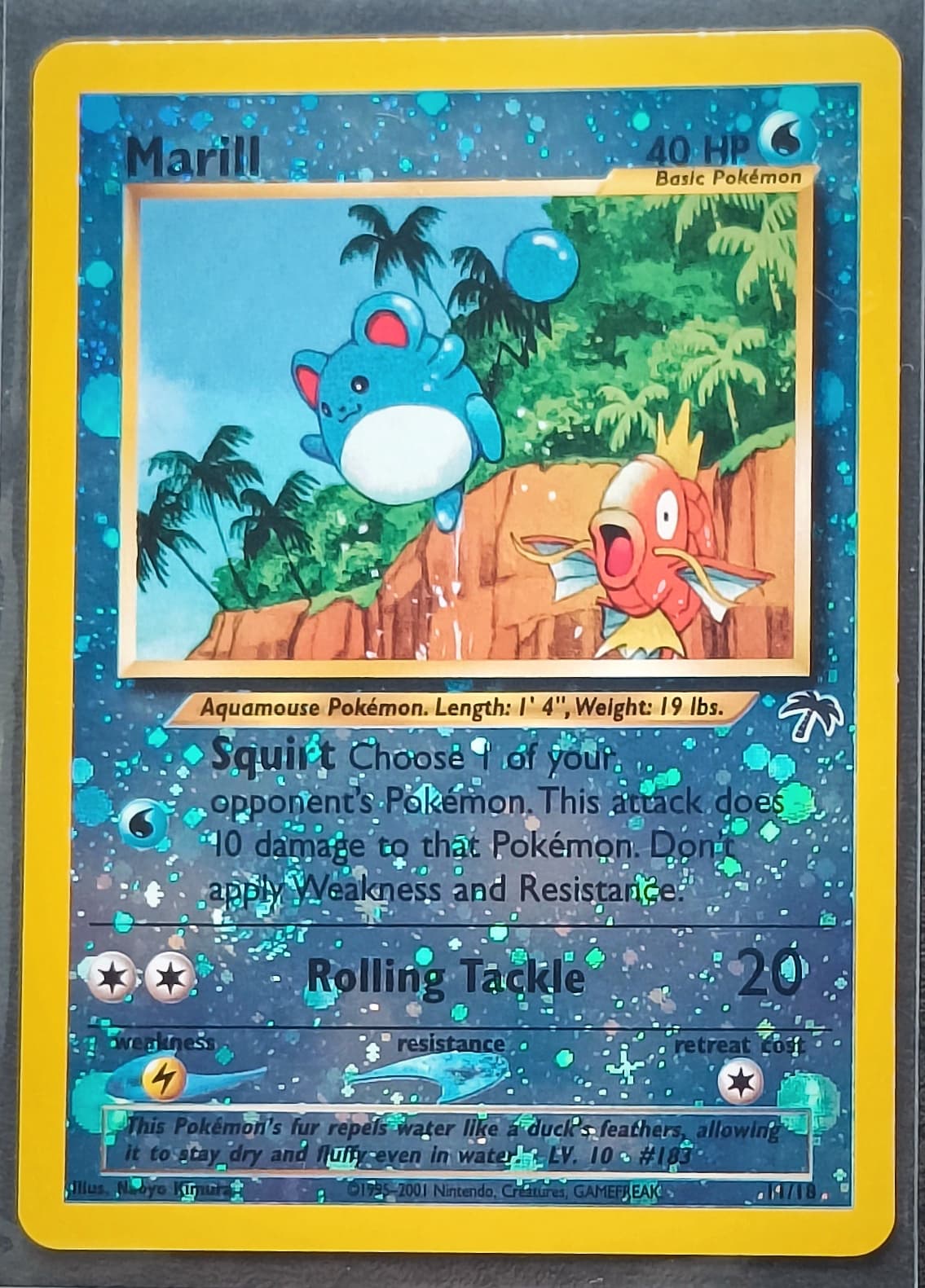
Marill (well placed holo pattern, 4globes)
Mantine (ofcenter cut)

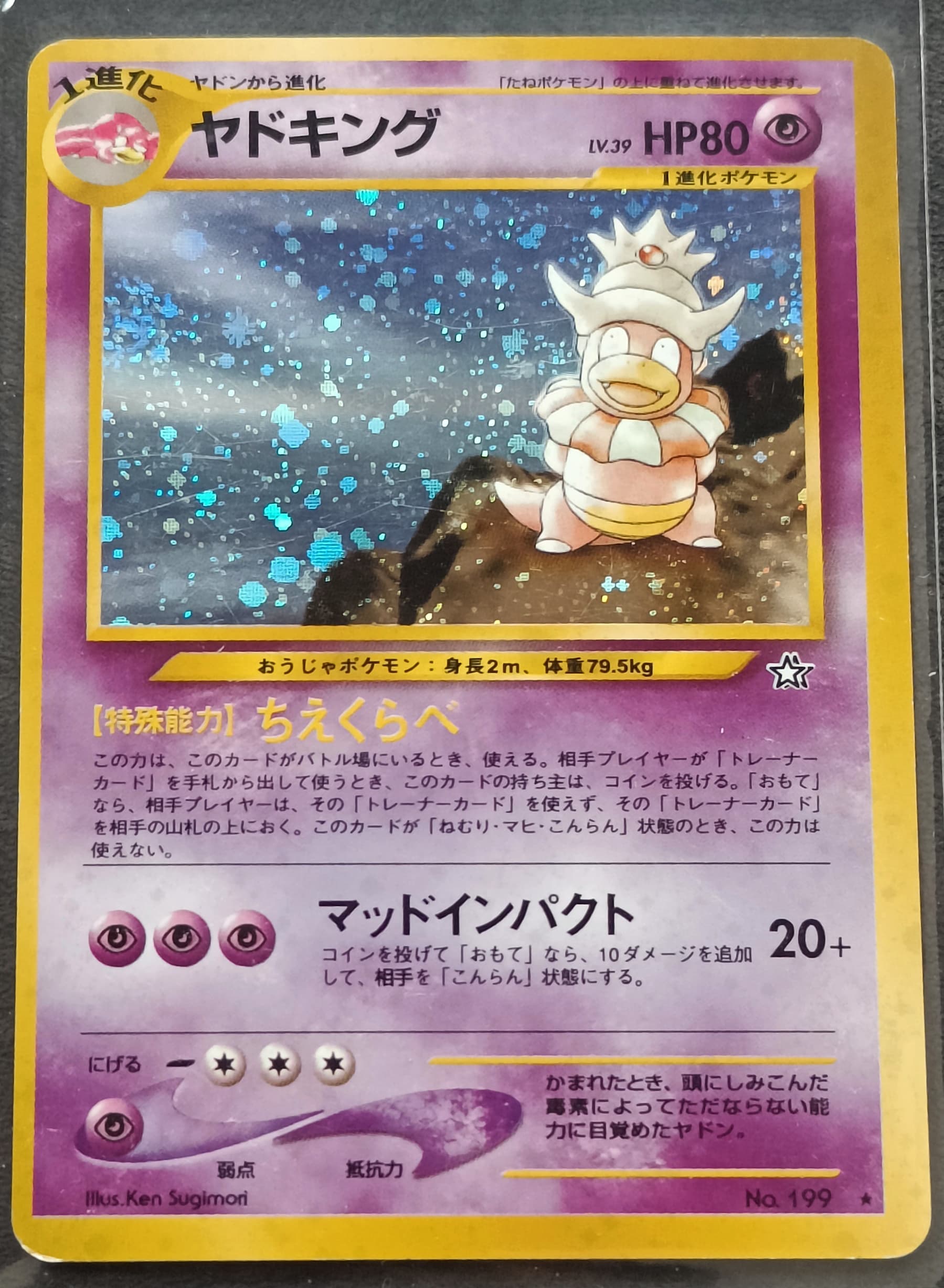
Slowking (ofcenter cut)
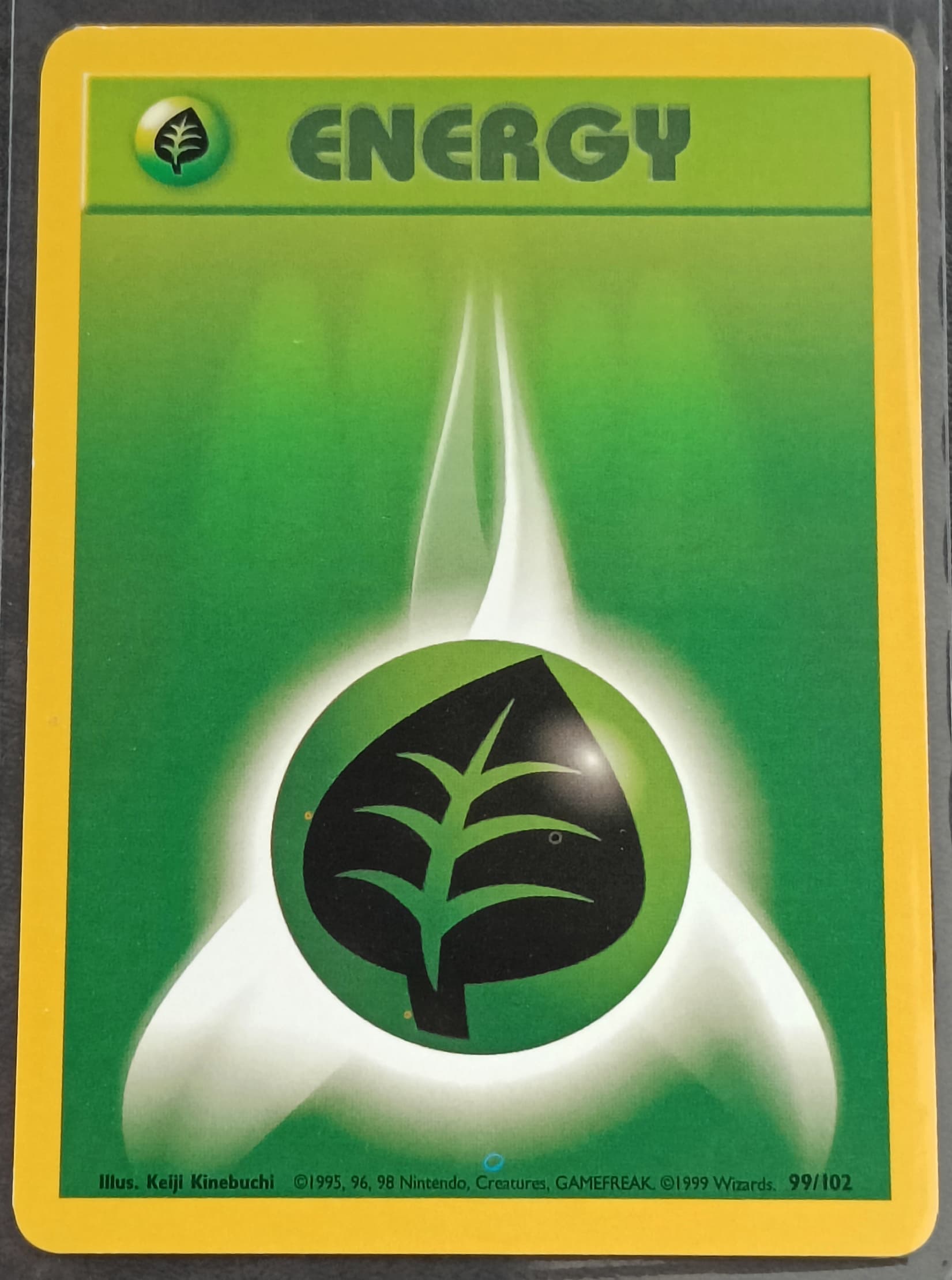
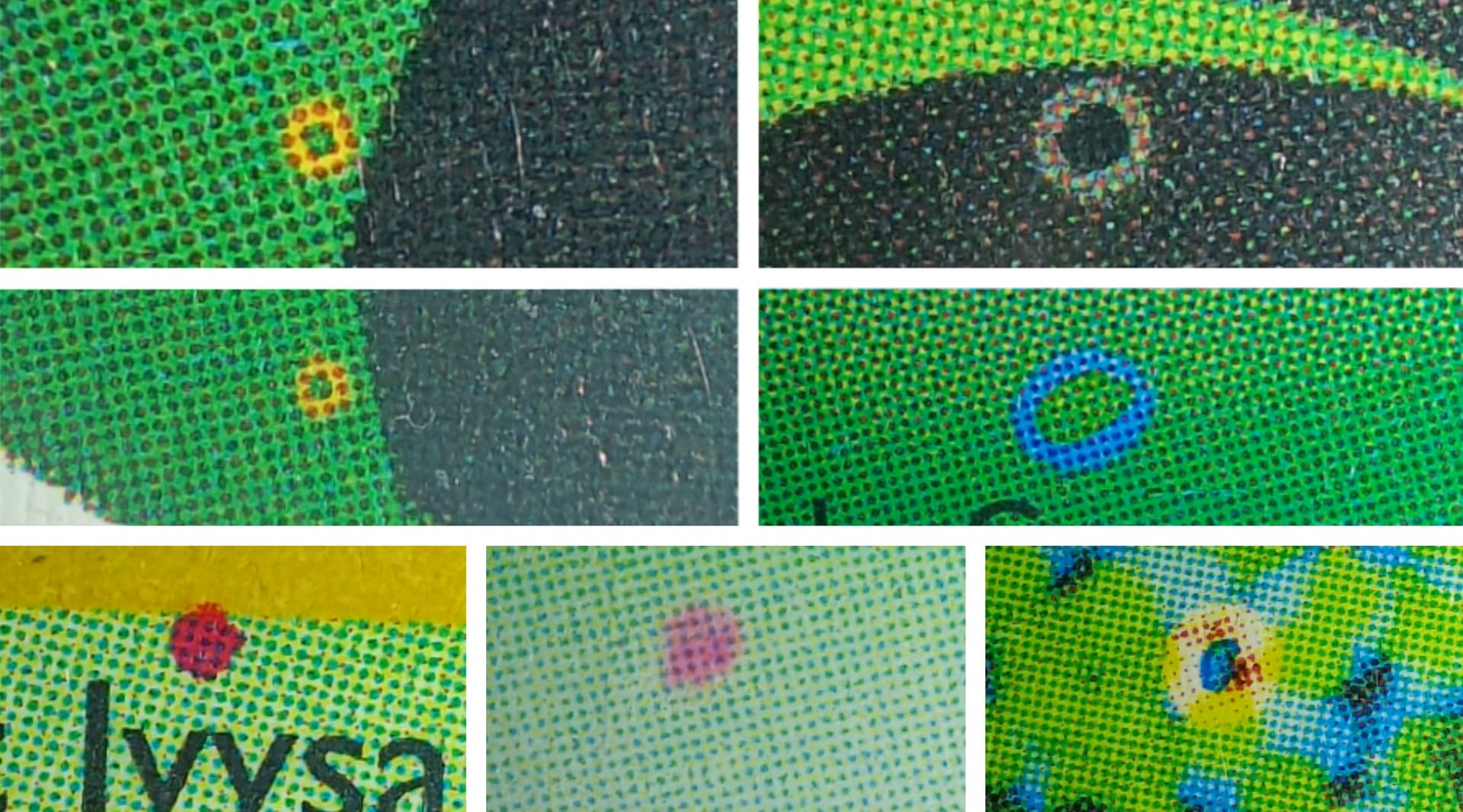
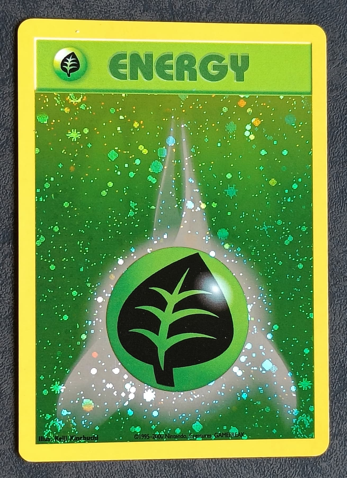
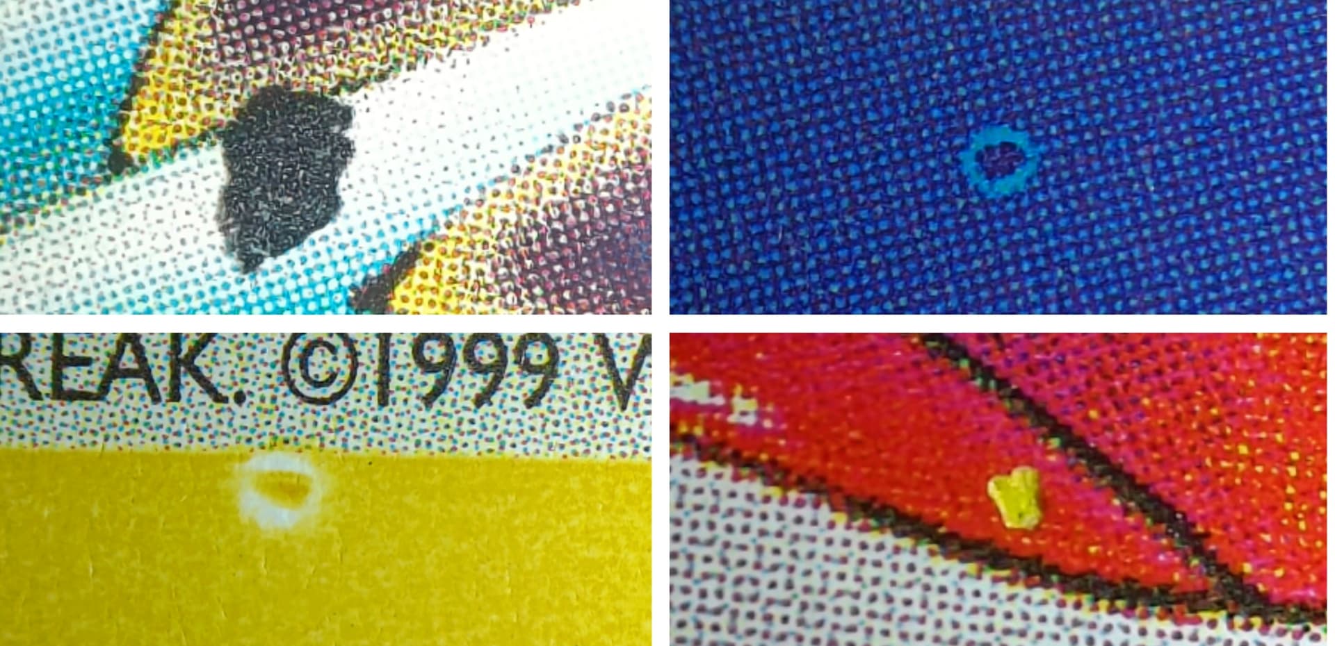
Grass energy (printer hickey obstructions on cyan, yellow and black layers)
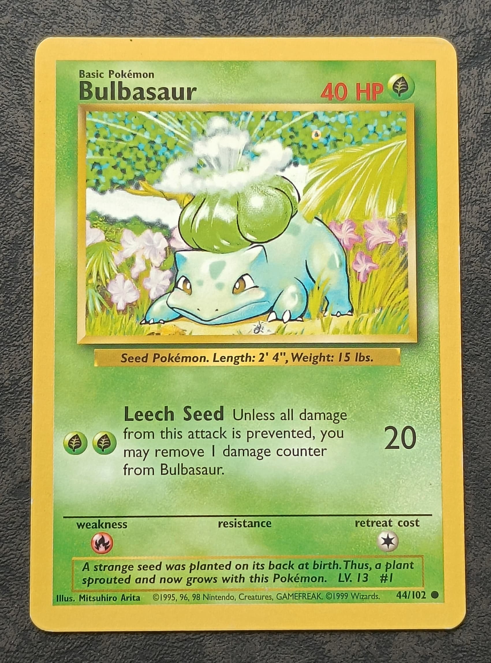
Bulbasaur (printer hickey obstruction of cyan layer in artwork)
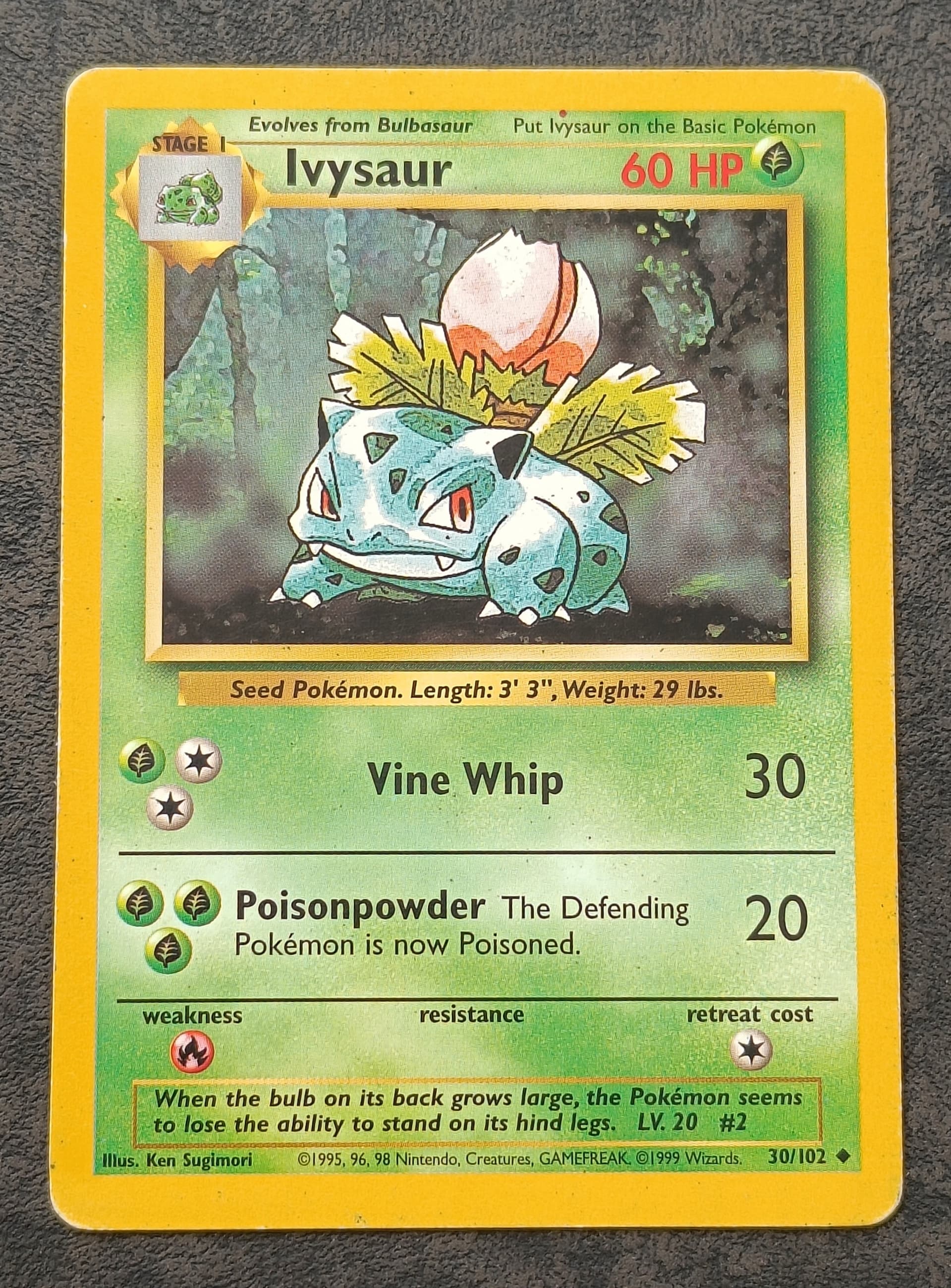
Ivysaur (additional magenta ink dot on top of card)
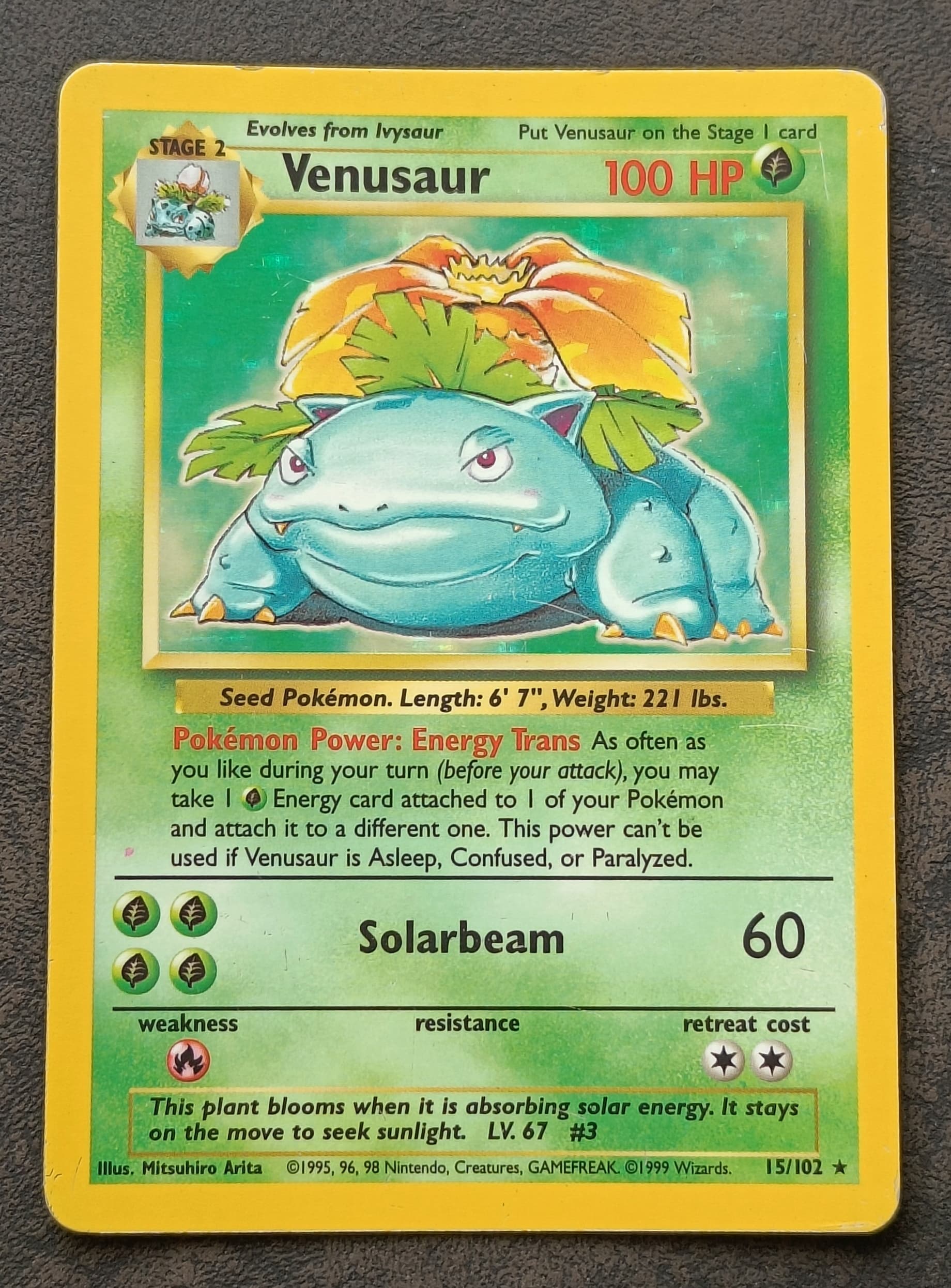
Venusaur (additional magenta ink dot on left side)
Victreebell (white layer error or holo bleed)

Sudowoodo (white layer error or holo bleed)
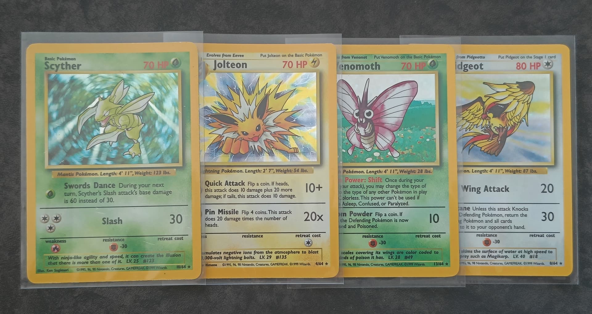
Jolteon (programming mistake, missing jungle set symbol)
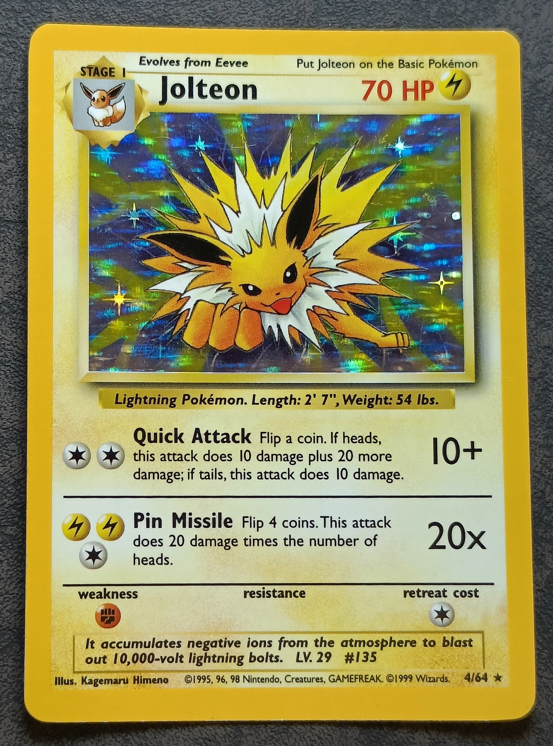
My missing jungle set symbol cards so far
Vaporeon
Sunkern promo
Omastar promo

I don’t intend to post every single card from my collection but I will post the ones I like even if they don’t hold that much information value. ![]() Thanks for watching!
Thanks for watching!
Edit: I added some details from cards in this post.
10 Likes
I like coming here. ![]()
3 Likes
Batch of pictures No. 6
Besides this post I have done multiple changes to the thread. I added photos to the top post of my side collections, I spread them out in between the text blocks with the intention of not having a giant text block and afterwards all the pictures. I hope it is not to messy but now i think people can go slowly through the post instead of skipping text to get to the pictures. ![]() I also made some small changes to the text and I have updated allot of pictures. The pictures are still not what they should be but they are definitely an improvement. ^^
I also made some small changes to the text and I have updated allot of pictures. The pictures are still not what they should be but they are definitely an improvement. ^^
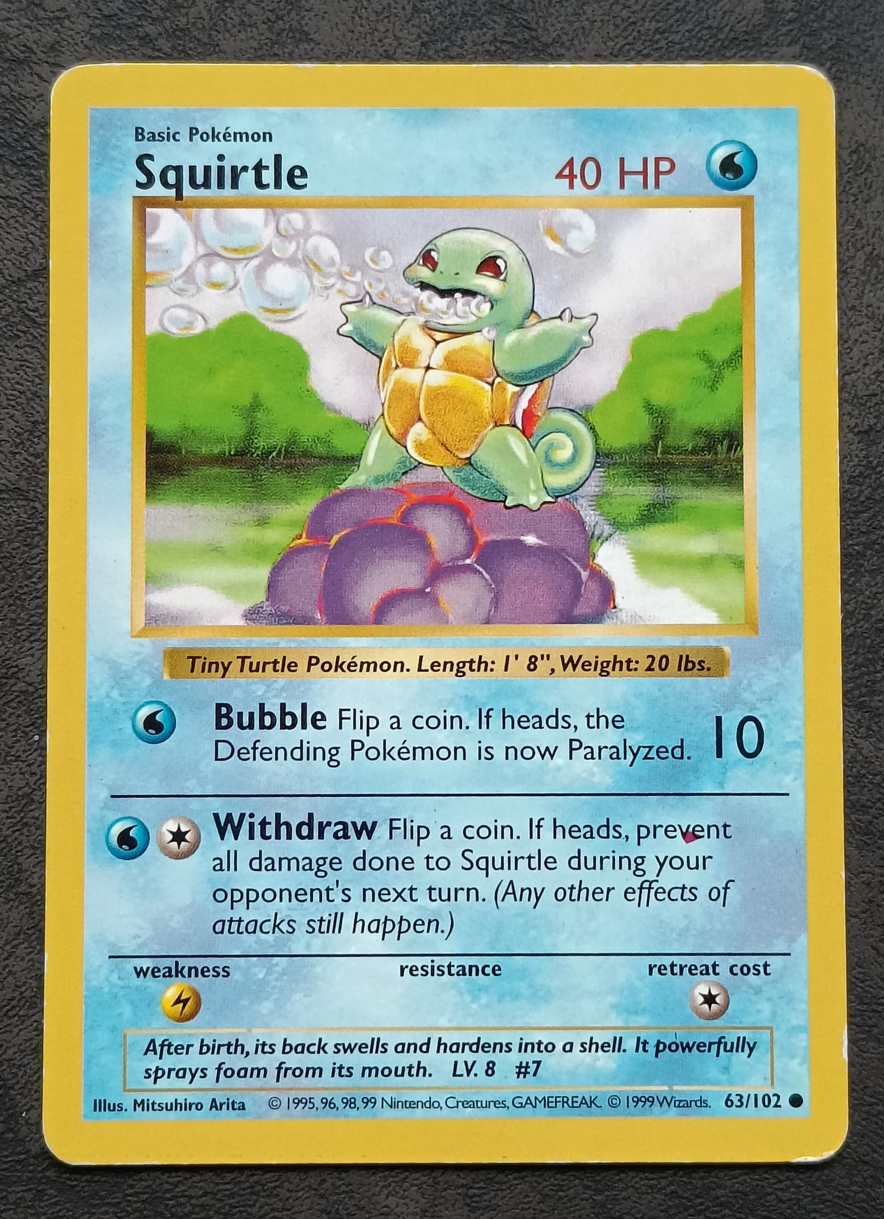
Squirtle (additional magenta ink dot error)
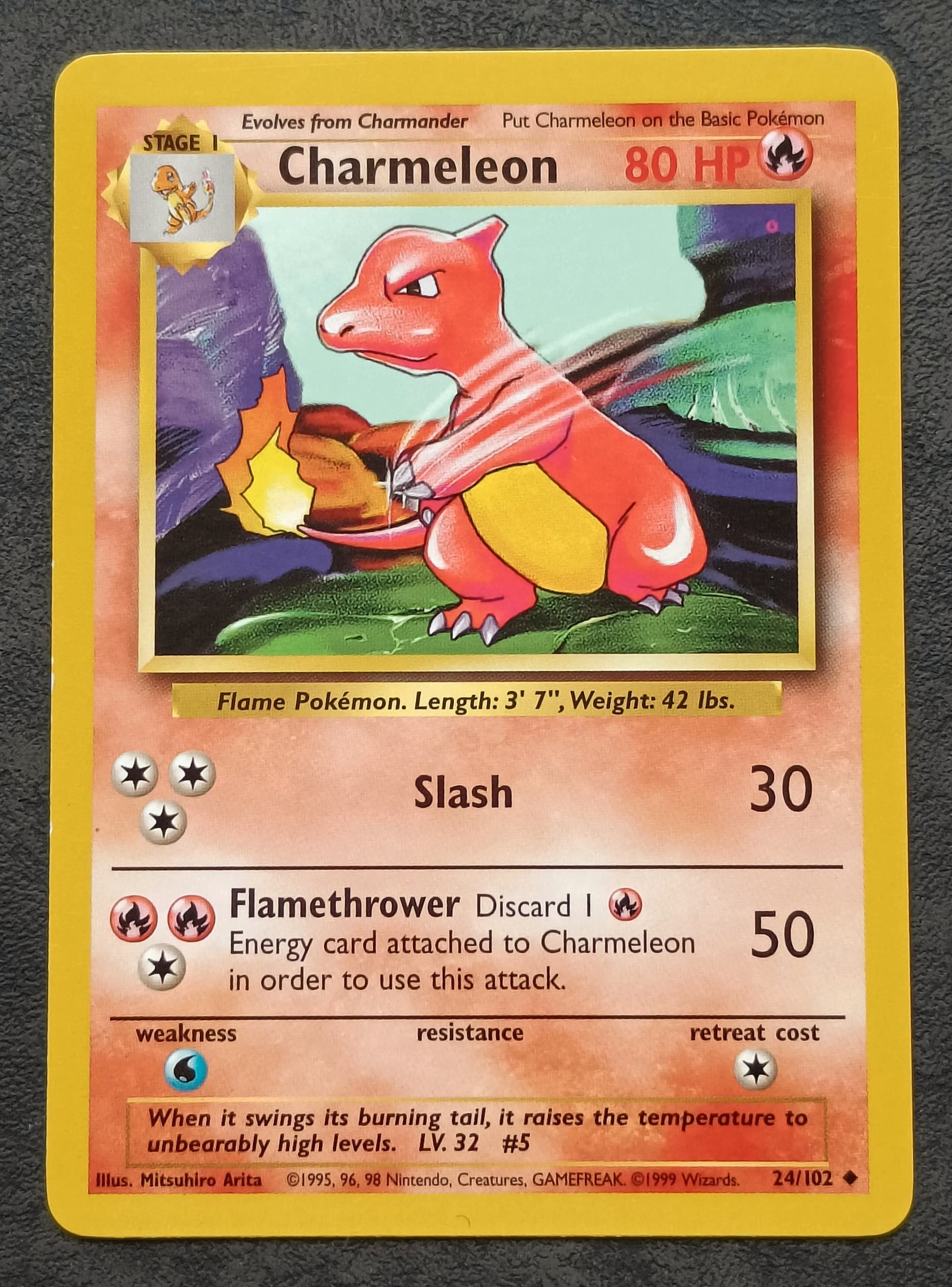
Charmeleon (printer hickey obstruction of the cyan layer in the artwork box)
Blastoise (additional magenta ink dot on left side)
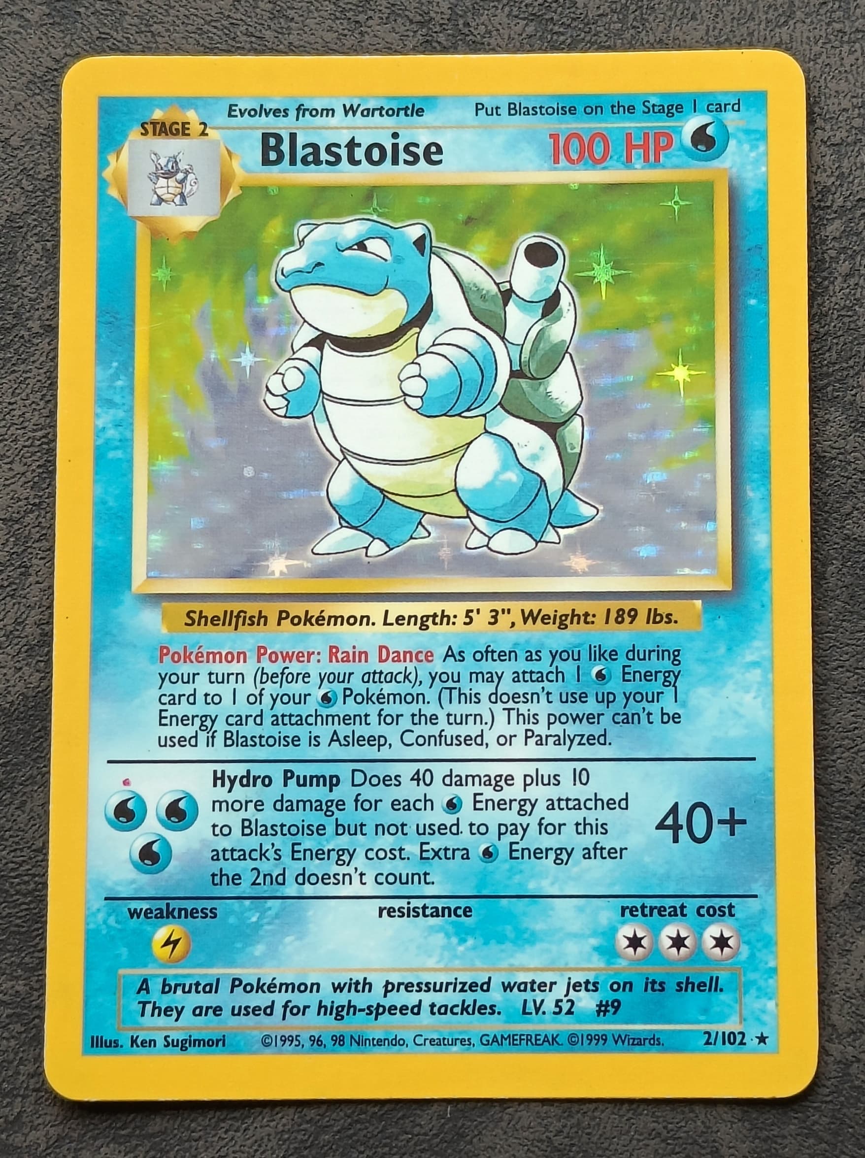
Blastoise (well placed holo pattern, globe) I do like the placing on this one but i don’t love it either.
Zapdos (white layer error or minor holo bleed)
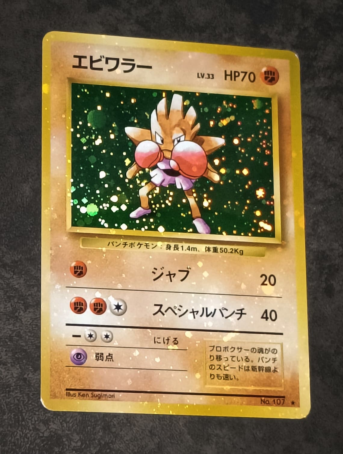
Hitmonchan (white layer error or holo bleed)
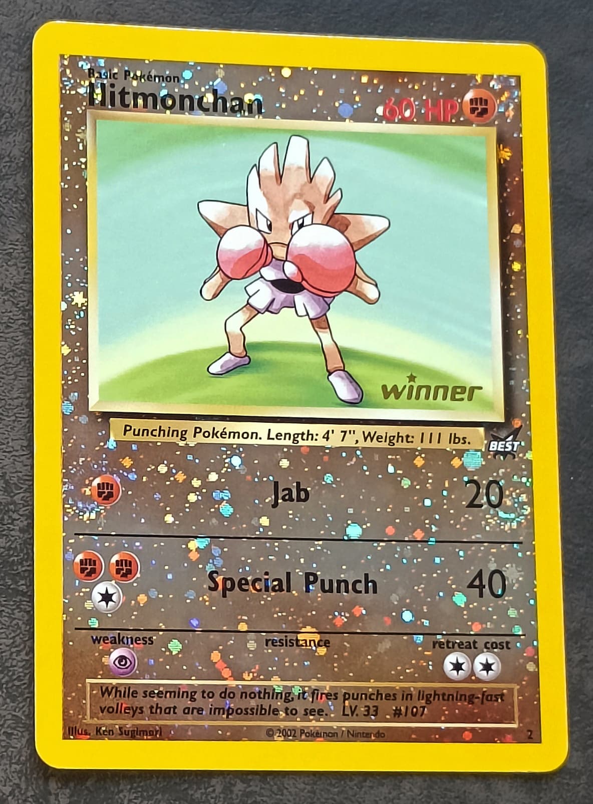
Hitmonchan, winner stamp promo (well placed holo pattern, 4 swirls)
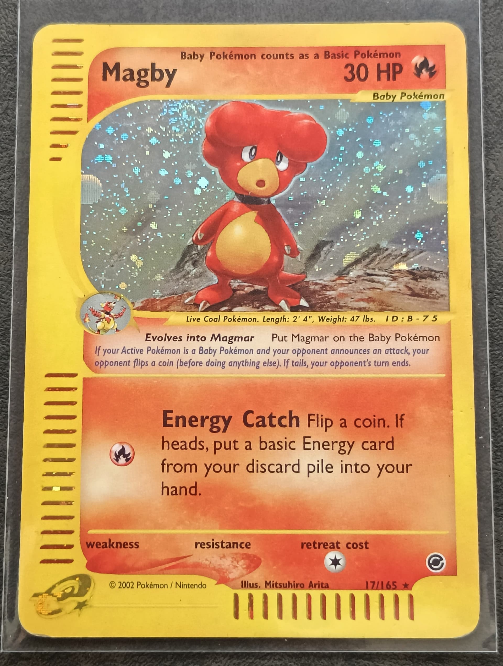
Magby (well placed holo pattern, partial 2 globes) I noticed that Magby’s evolution box is see through while the ones on other cards are not. Not sure why this is…
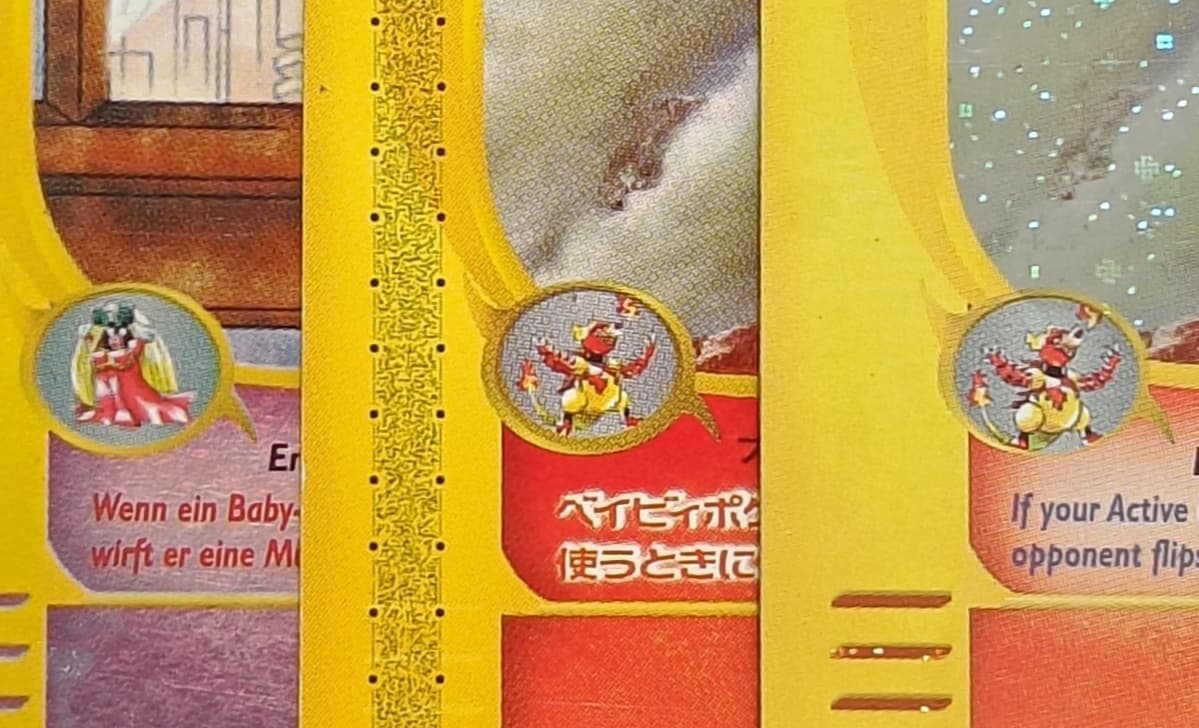
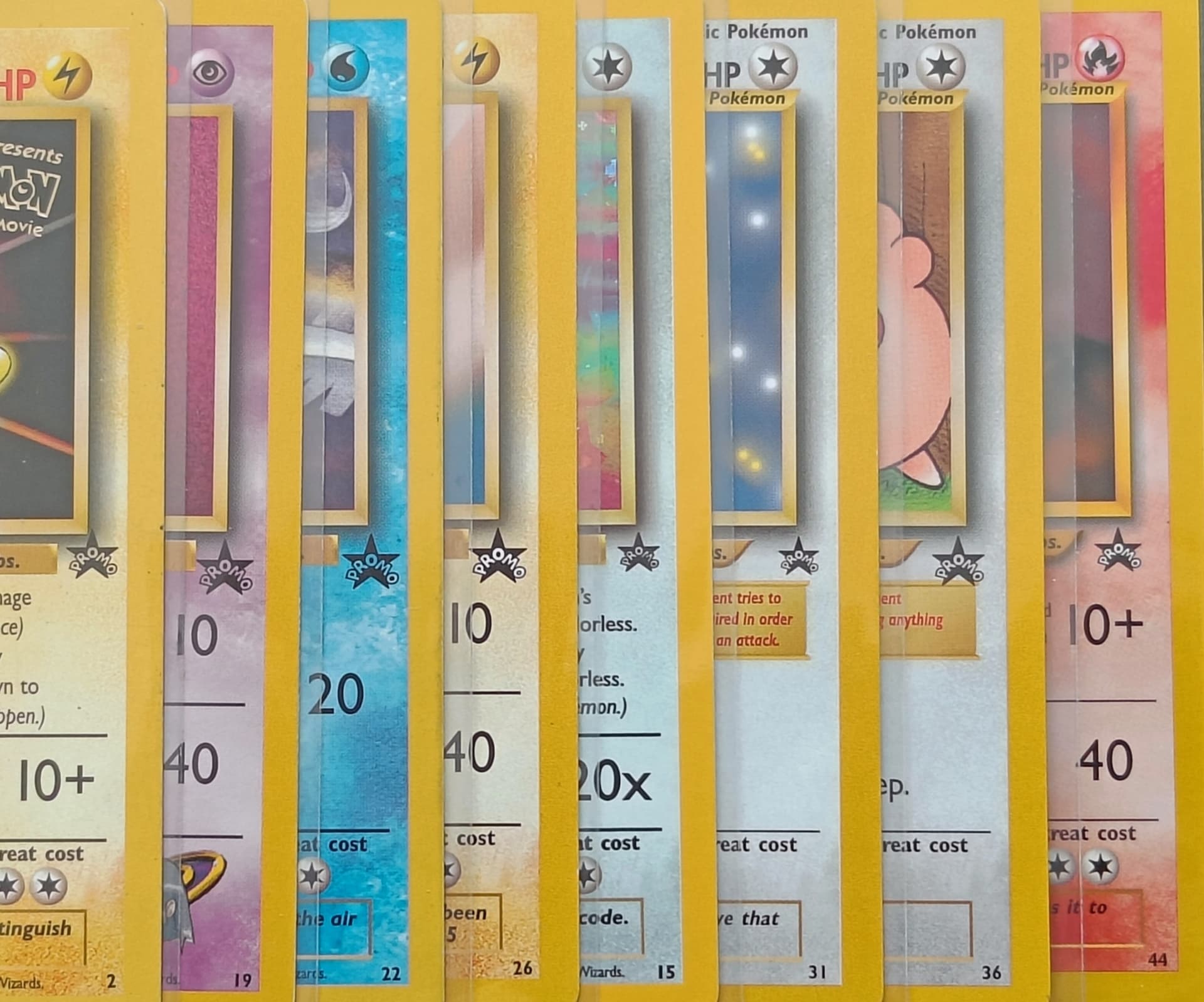
A while ago i noticed that they changed the size and placing for the black star promo set symbol allot.
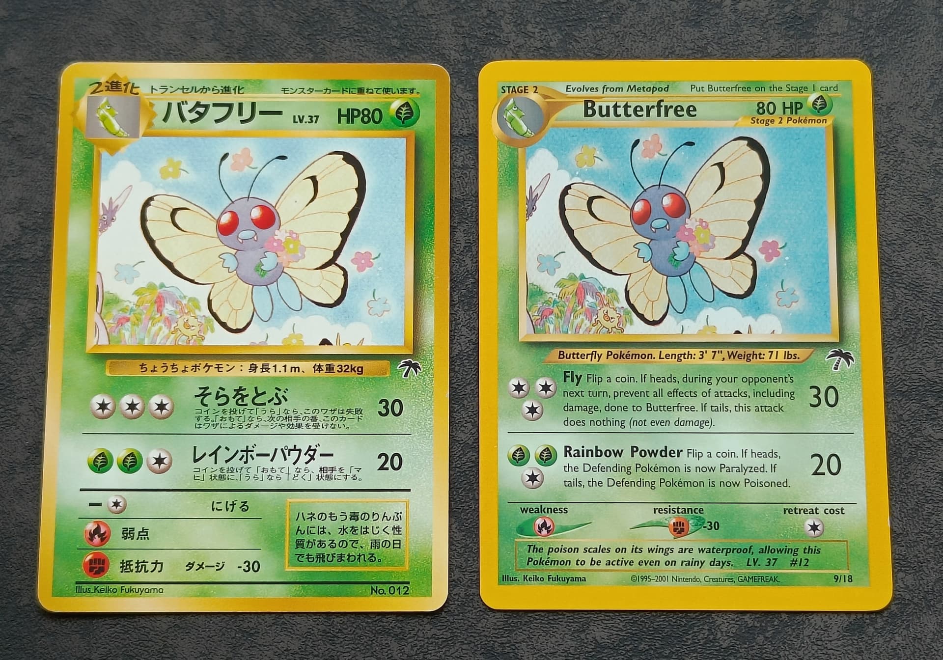
Butterfree (noticed that the Japanese version is big boy, bigger then the Wotc version) ![]()
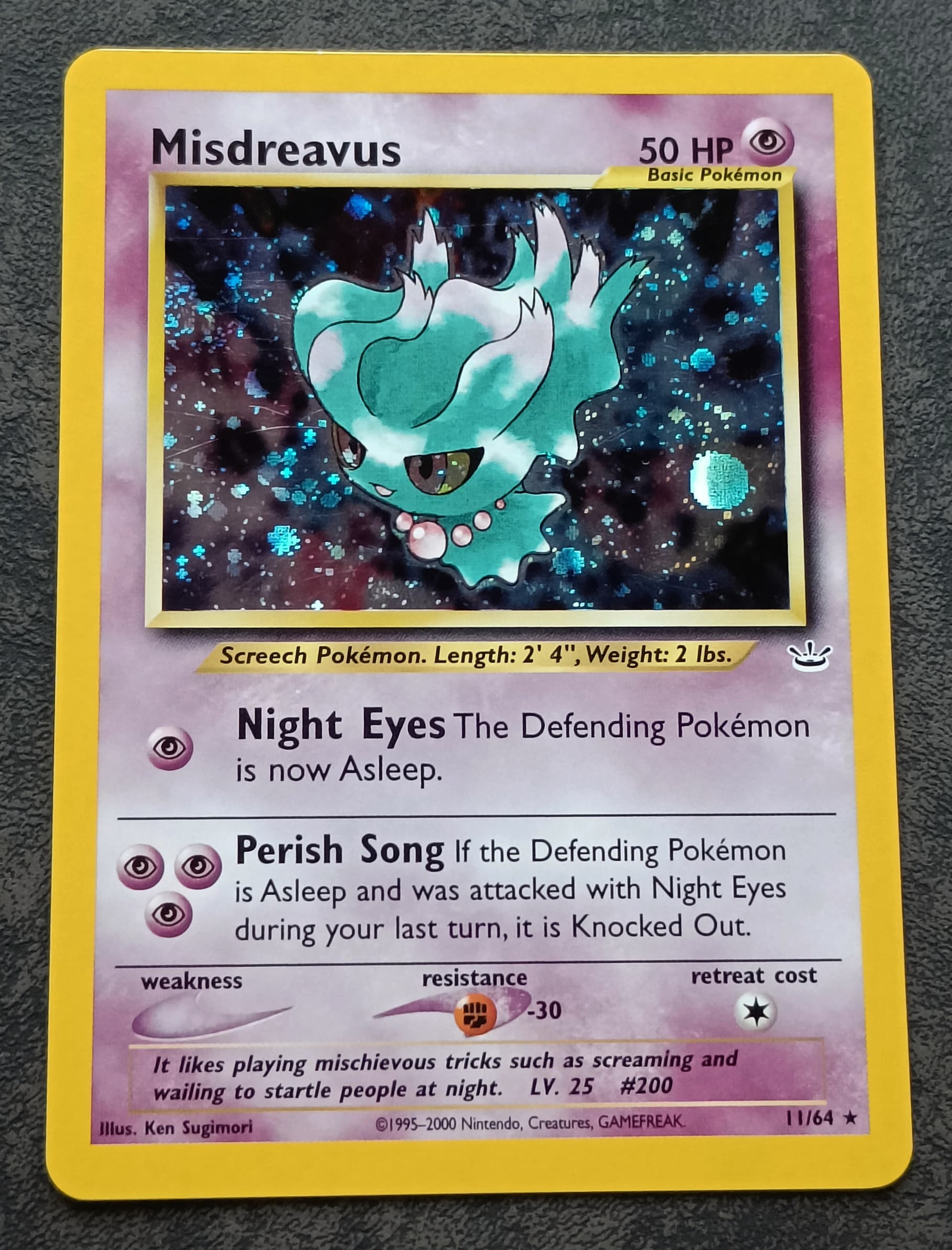
Misdreavus (artwork white layer “error” or triple holo?)
Some of my neo revelation holo variations so far.
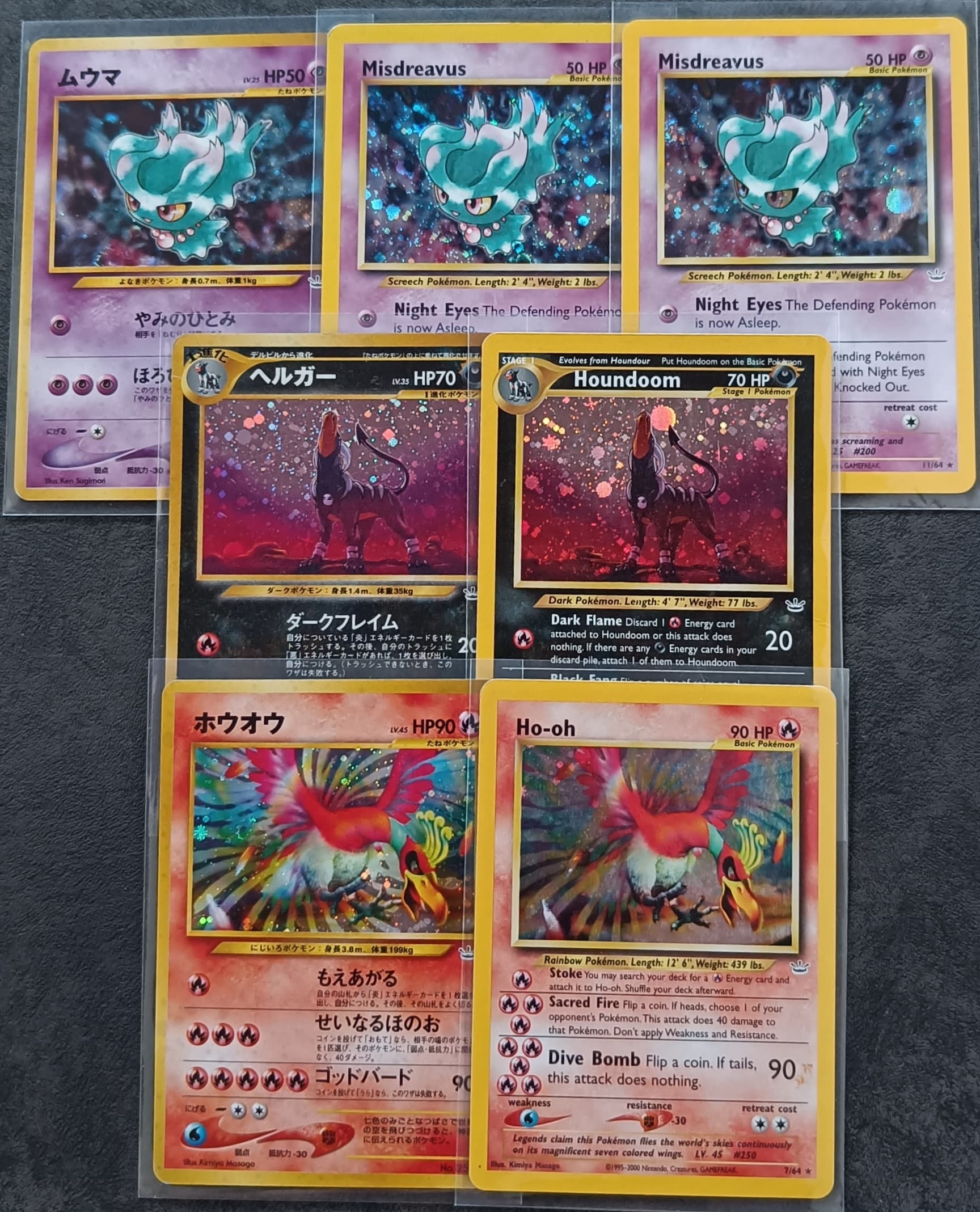
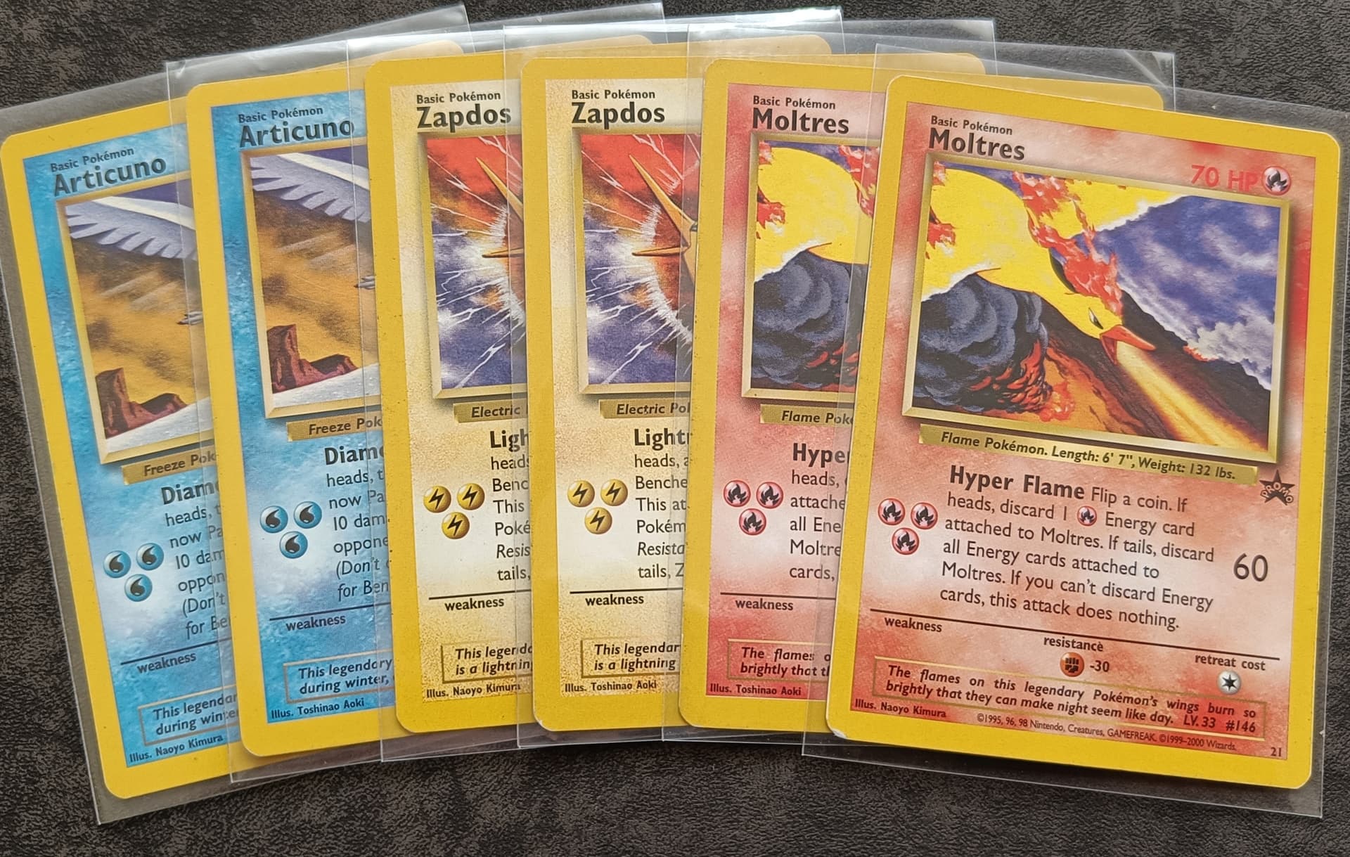
Birds trio promos (error and corrected illustrator name variations)
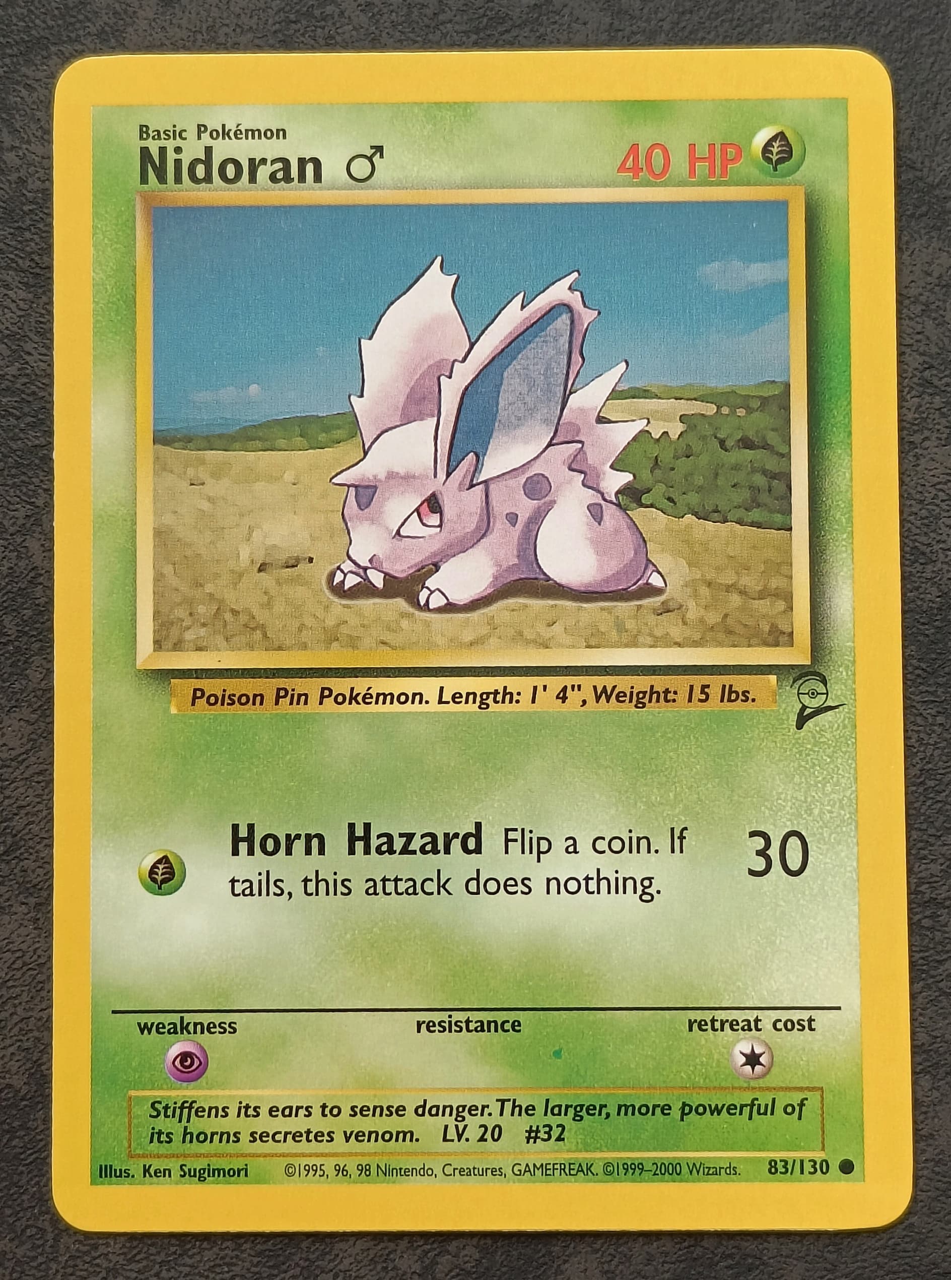
Nidoran (possible additional “green” ink error on bottom of card) don’t know yet if green is actually possible or if I’m mistaken but everyone has some cards that they think it might have an ink dot error and this is one I think might be an ink error. ![]()
Pikachu promo (possible black ink error in artwork box next to it’s eyes) here another one that i think might have an ink error but I don’t know for certain. ^^ (recently found a second error pika just like it meaning that it is a repeating error) ![]()
Neo discovery (ofcenter cut cards)
French base set (ofcenter cut cards)
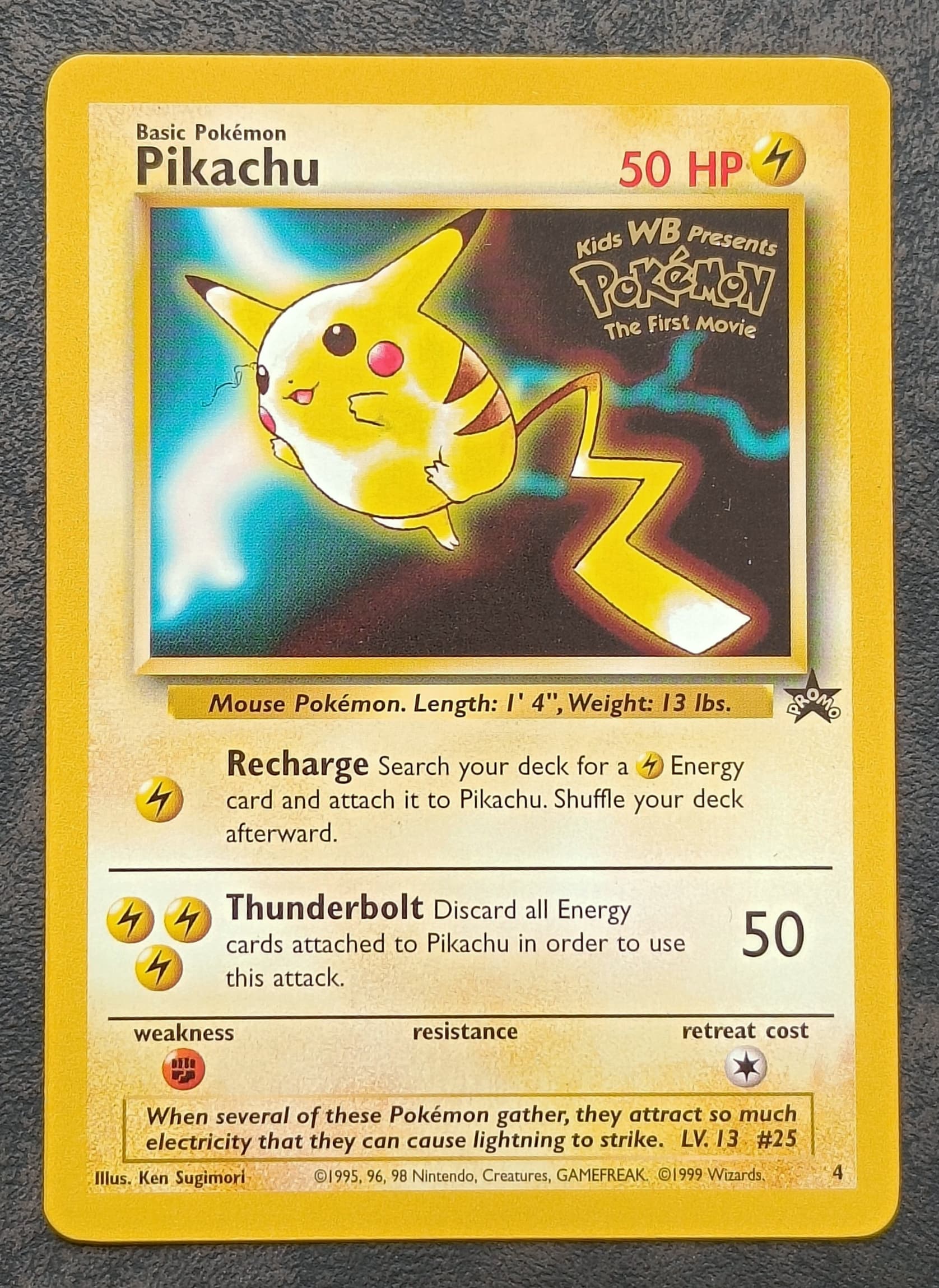
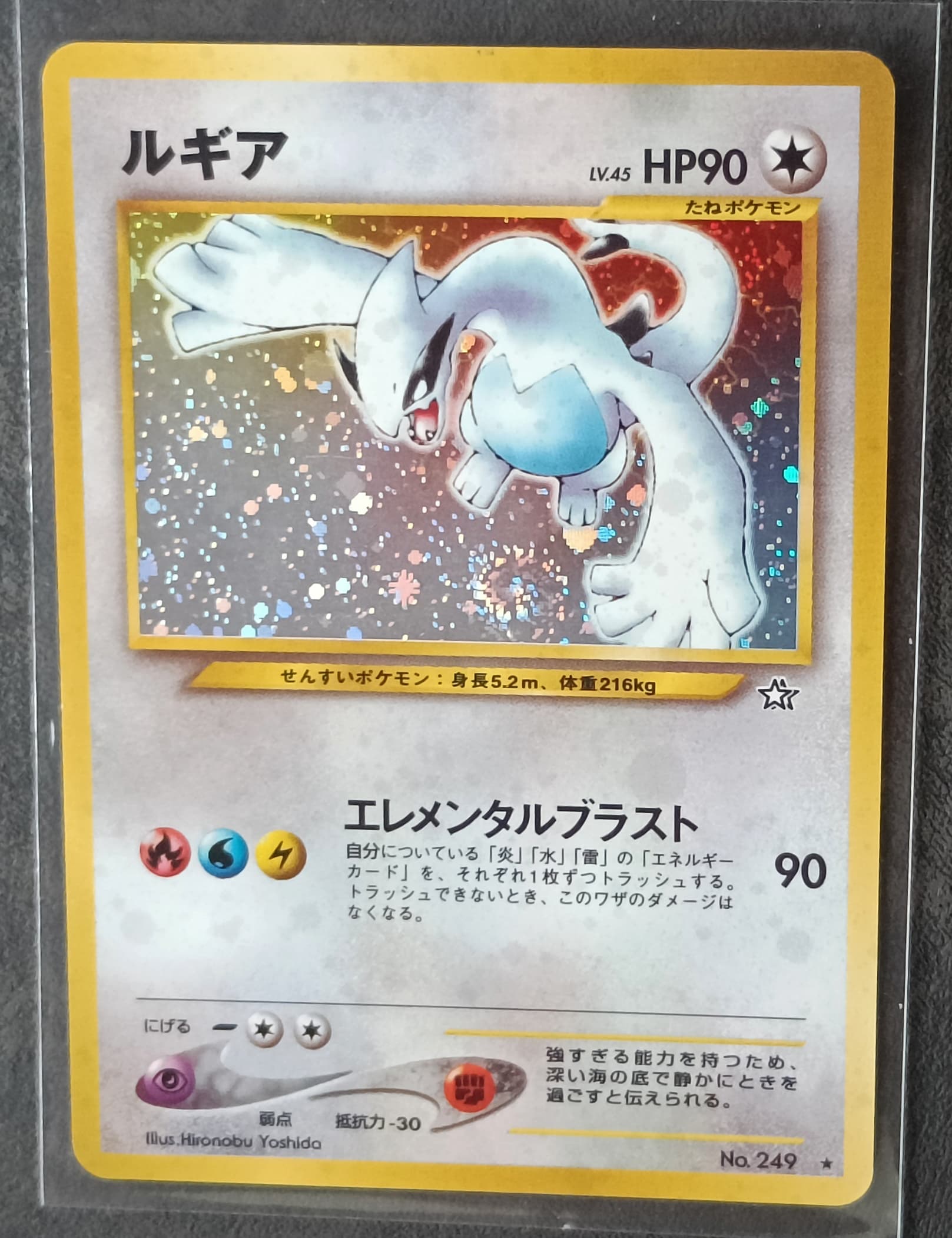
Lugia
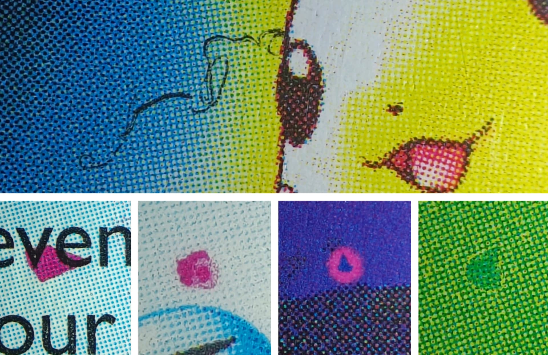
Having fun with my loupe and searched 4 cards that each had one print layer shifted a tiny amount. Placed in CMYK order
A while ago i did a “photoshoot” of my different reverse holo pattern cards and this one might be one of the better ones. Also just for fun ![]()
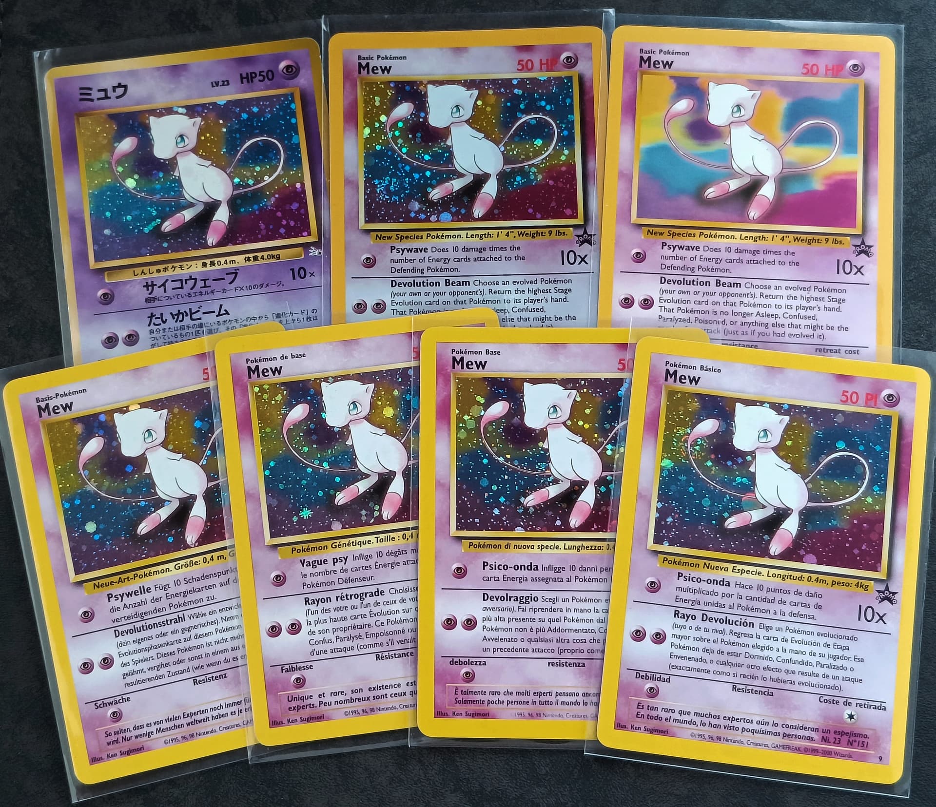
And to finish of todays post i present to you my small Mew army because everyone needs some Mew in their life. ![]()
I have put allot of effort in some of my pictures but it’s worth it. Thanks for watching ![]()
Edit: I added some details from cards in this post.
10 Likes
Theres too much to like here lol. Really enjoyed this.
4 Likes
I’m thinking of what cards i can post next and i have to think allot harder then before because many of the good ones have been posted already. I will try to keep it interesting for my next posts but yeh, i’m gonna hit a roadblock. ![]() Having fun with this tho. Hehe
Having fun with this tho. Hehe
5 Likes
I love holo bleed Neo Revelation cards, especially Ho-Oh. ![]()
![]() I try to pick them up whenever I see them listed for a reasonable price.
I try to pick them up whenever I see them listed for a reasonable price.
3 Likes
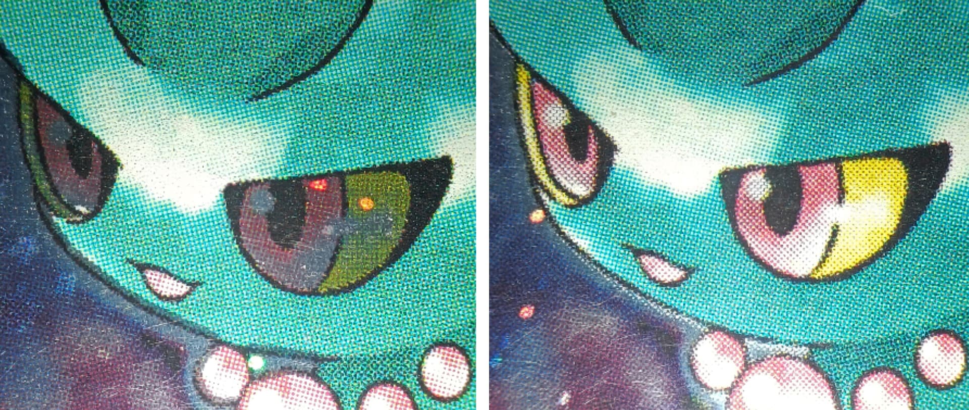
Yep I like them aswell and I hope to have more of them in the future for research purposes. I heard people say that they think there are three versions of the white layer and I think it might be true. There is the most extreme holo version where it reflects over the entire artwork box, you also have the version with not much holo visible and also a version between those two. If i had more cards i could really try to figure it out and take one of my nice side by side pictures to learn what is actually going on here. (Love those side by side pictures ![]() ) I also learned that these white layer differences happen in neo discovery as well but again i don’t have enough cards to prove it with a nice picture. Also do wonder if it happens with Japanese as well…
) I also learned that these white layer differences happen in neo discovery as well but again i don’t have enough cards to prove it with a nice picture. Also do wonder if it happens with Japanese as well… ![]() It is something i will work towards because if I can learn something from it I will find a way to show it of in my pokédex because that’s what my pokédex is, a massive puzzle filled with info. hehe^^
It is something i will work towards because if I can learn something from it I will find a way to show it of in my pokédex because that’s what my pokédex is, a massive puzzle filled with info. hehe^^
4 Likes
This is just stunning! Amazing research, amazing eagle eye for details, and tons of tons of tons of unknown/hidden/underground information. Simply love it!
3 Likes
Thx thx ![]() but don’t speak to highly of me man, people will think I’m more then what I am. I have been going hard the last 2.5 years but compared to long-term collectors I’m still in my rooky shoos.
but don’t speak to highly of me man, people will think I’m more then what I am. I have been going hard the last 2.5 years but compared to long-term collectors I’m still in my rooky shoos. ![]()
3 Likes
7th batch of pictures, coming up. ![]()
I also updated 3 pictures in the thread and added the link to some Pokémon music at the top post. I liked the idea of some music while reading this thread that is getting longer and longer. ^^
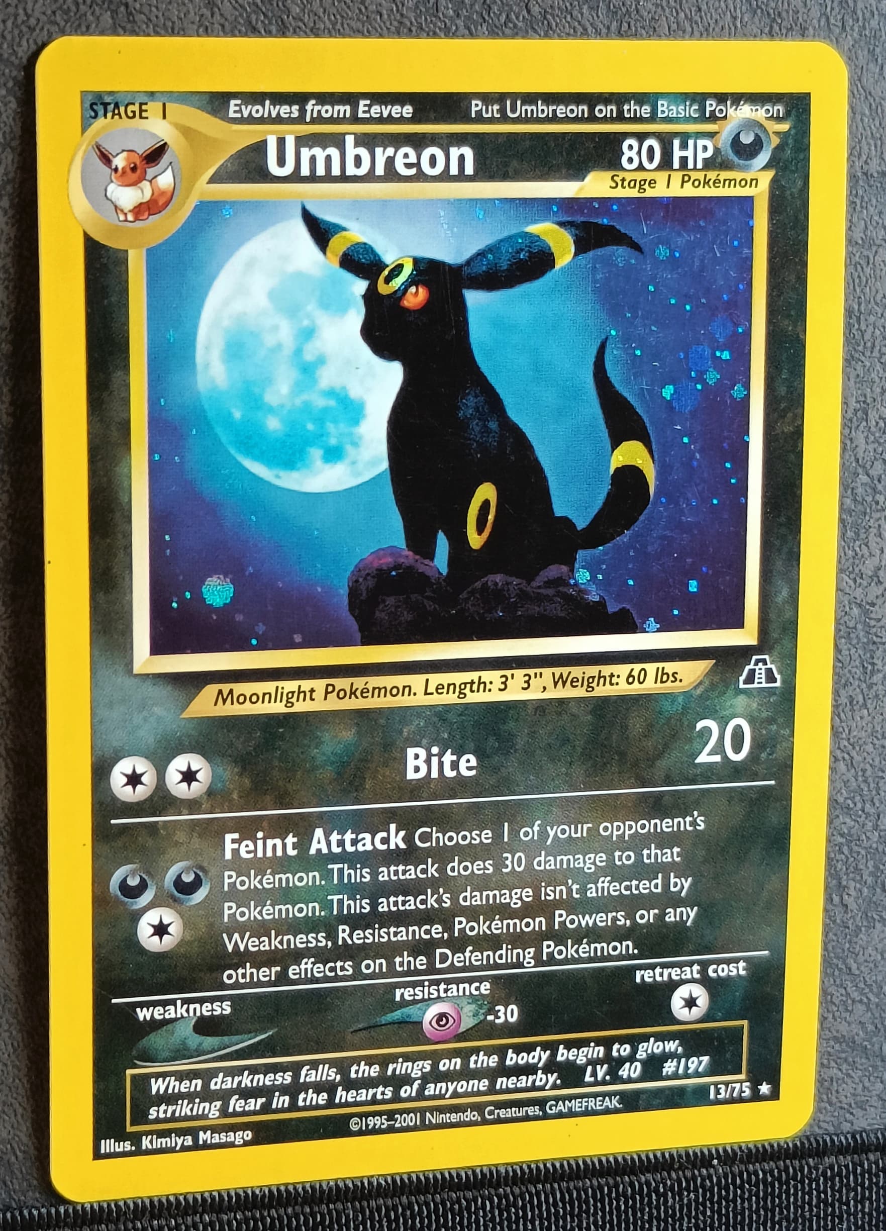
Starting of with Umbreon (one of the cards I still have from when I was a kid) ![]()
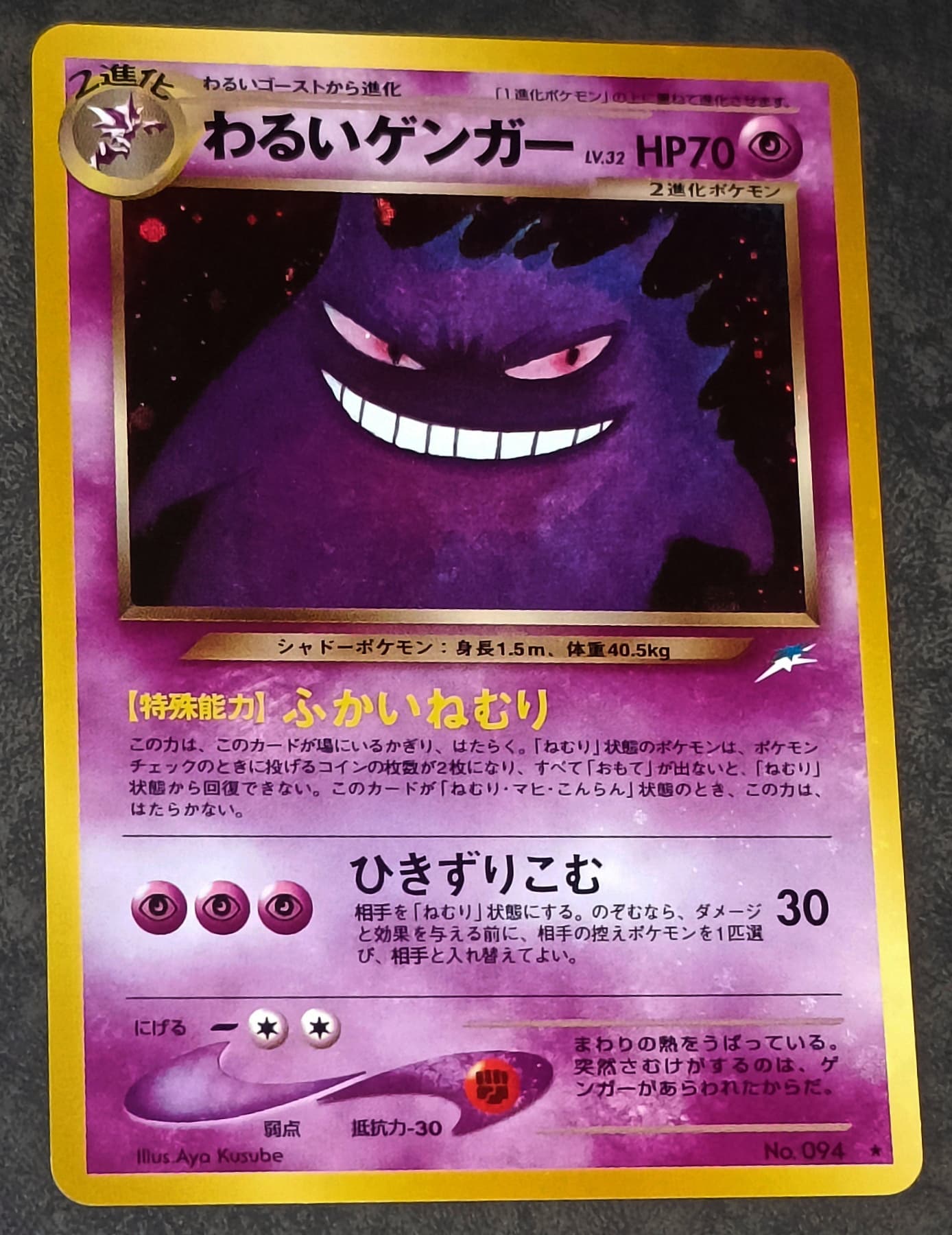
Gengar (white layer error or minor holo bleed)
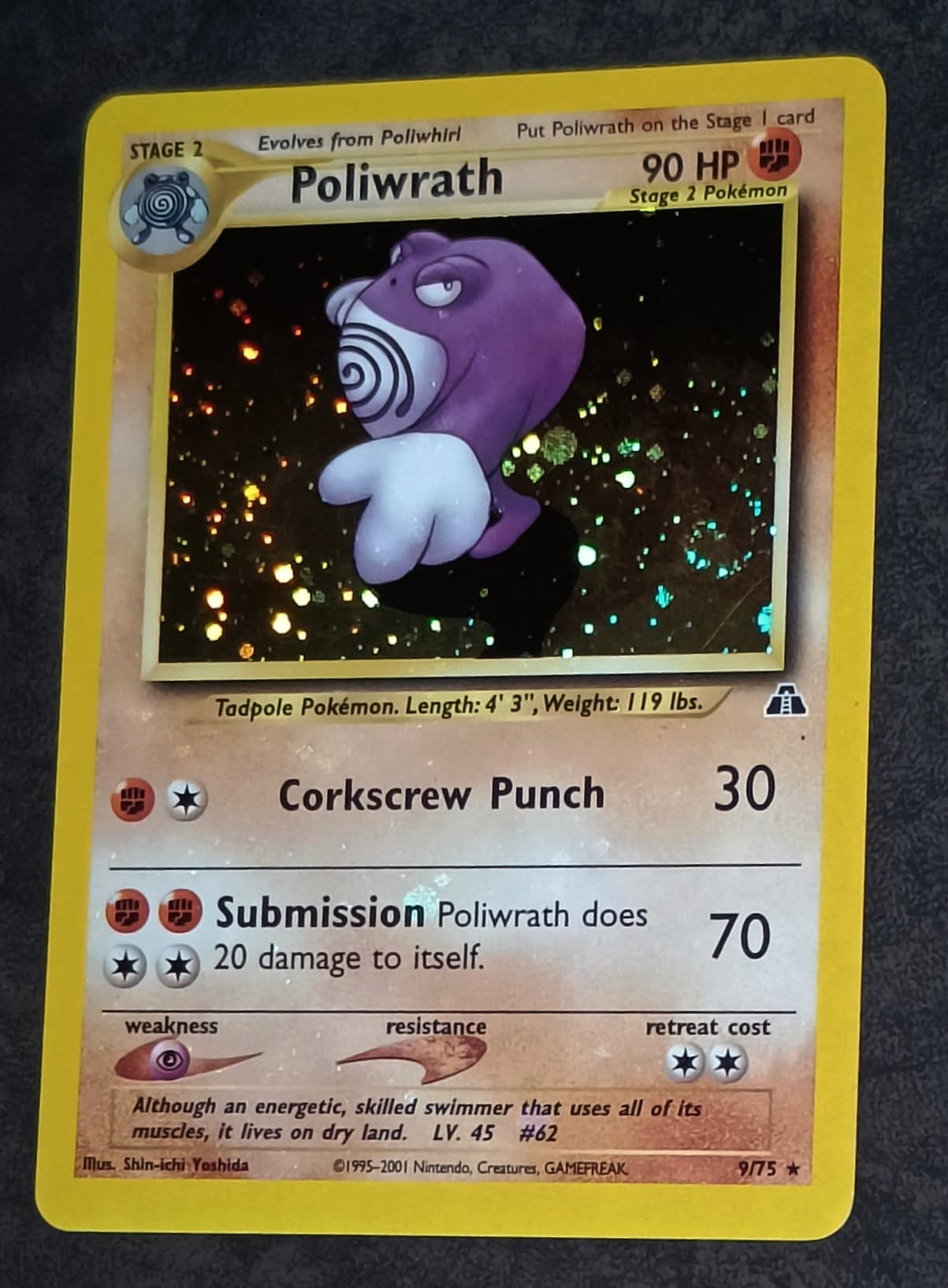
Poliwrath (white layer error or medium holo bleed) English holo bleed cards are allot more rare then Japanese.
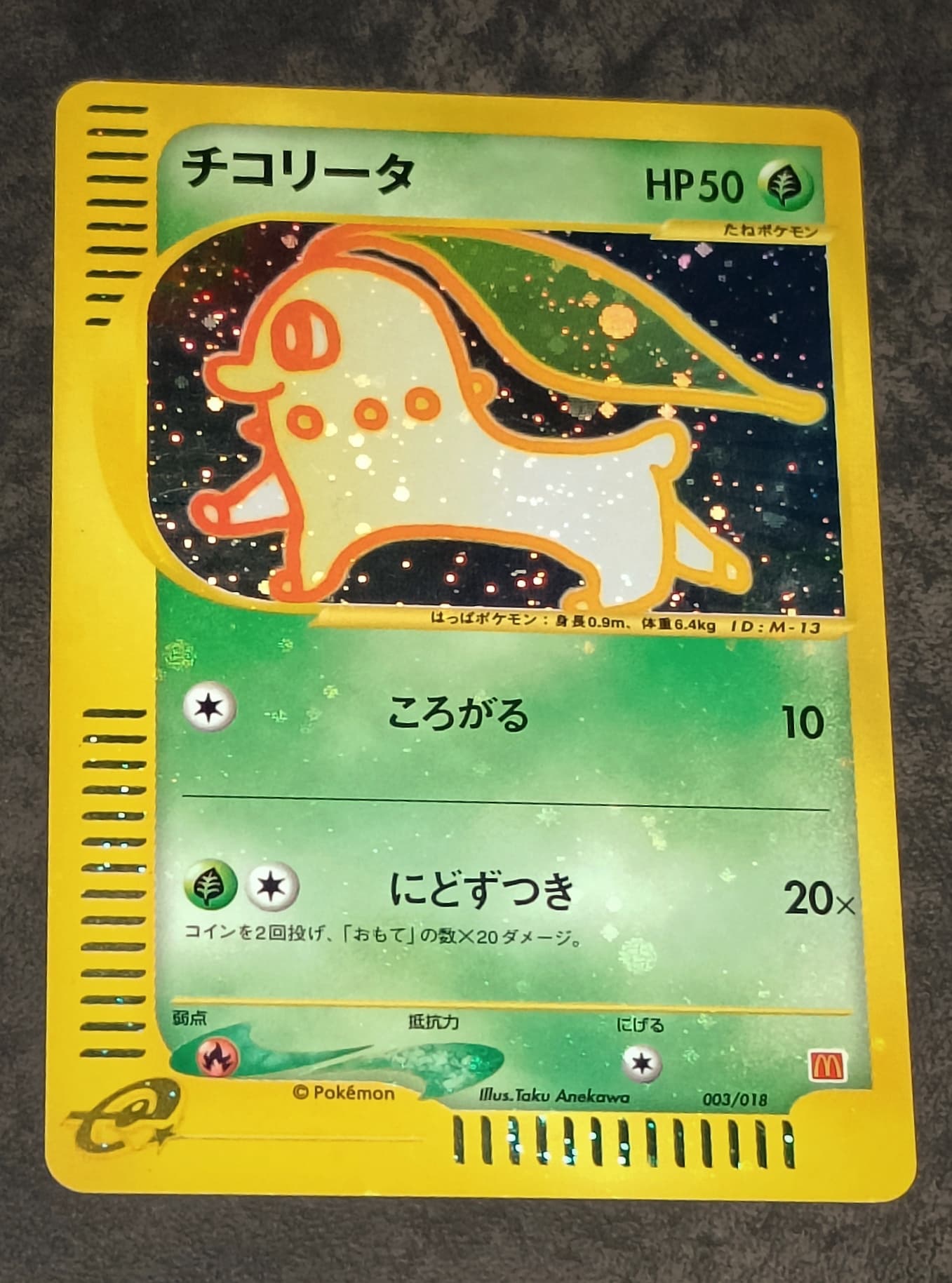
Chikorita promo (white layer error or holo bleed)
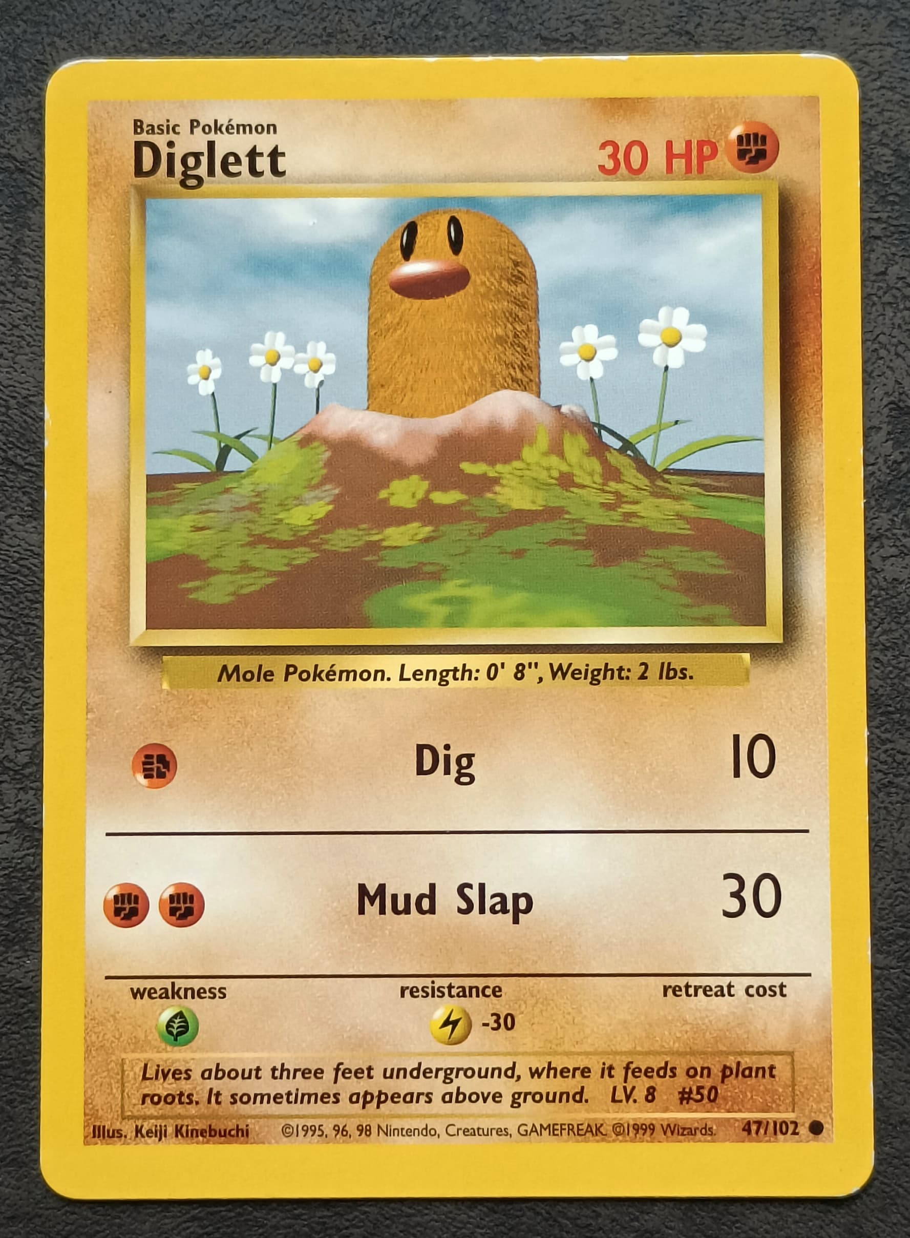
Diglett (programming mistake, sideways energy) I hope to find one with a printer hickey one day, would be a welcomed upgrade for my dex. ![]()
Unown O (straight corners, not factory cut card)

So I noticed that for the legendary collection reverses you also can have some sort of holo placing. These aren’t perfect but like the slowpoke if you get a “firework star” high up and centered below the artwork you can also see the core’s of 10 other “stars”. Like the Rapidash, if you get 2 “stars” centered below artwork you can see no other “star” core’s. This is nothing special but when put side by side it is noticeable. I like tiny information like this. ![]()

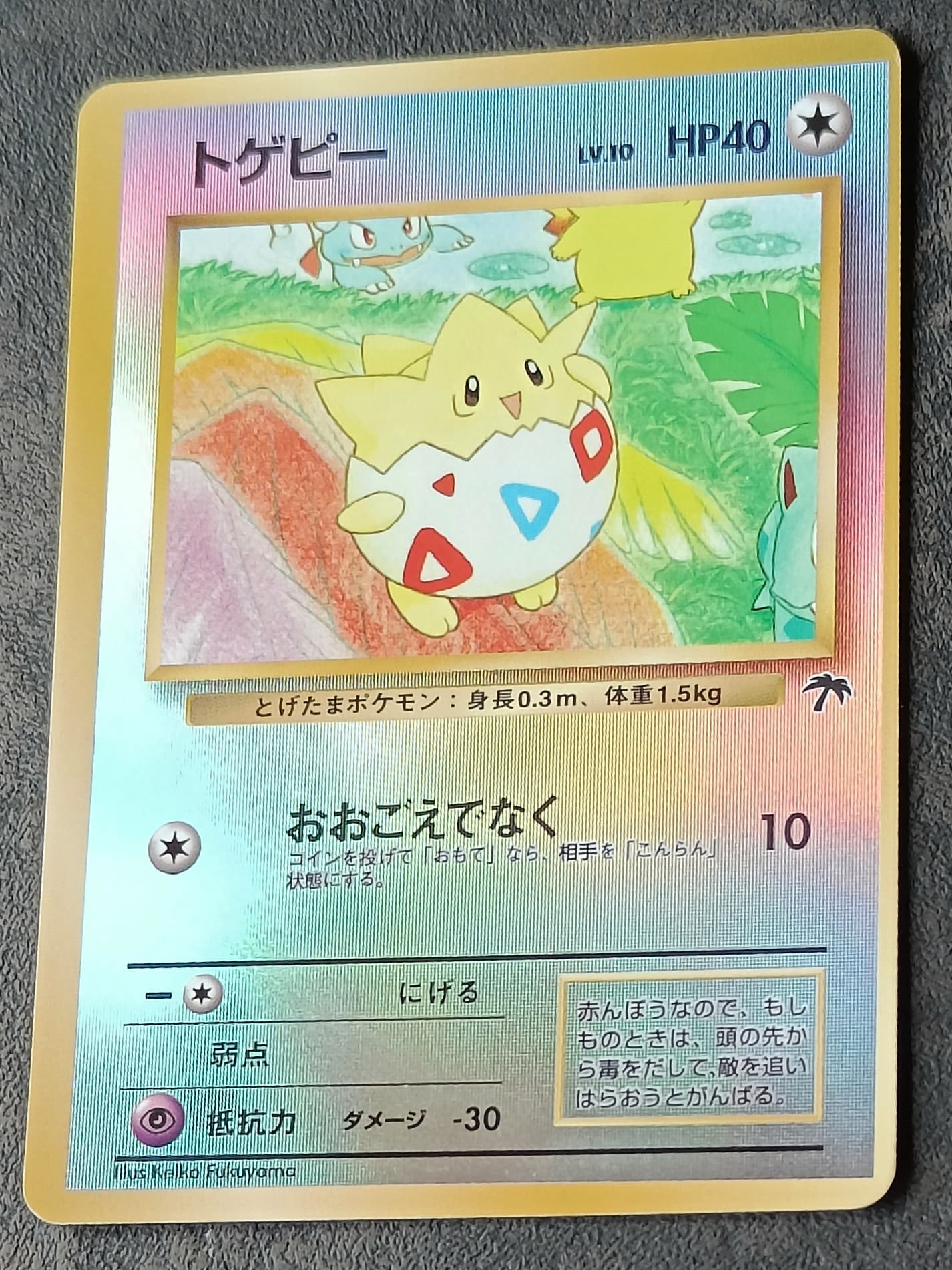
Togepi (ofcenter cut card)
Entei promo (well placed holo pattern, 4 swirls + 2 “print lines”)

Grass energy promo (well placed holo pattern, partial 3 or 4 swirls + horizontal “print line”) this one is very unique because half of the holo pattern is normal and the other half is actually faced upside down, making the swirls face one another wich i have never seen before. Making a picture that i liked was really hard with this one because catching 3 of the 4 foil layers on picture was extremely hard and i almost gave up on it. ![]()
Skarmory (well placed holo pattern, partial double swirl)
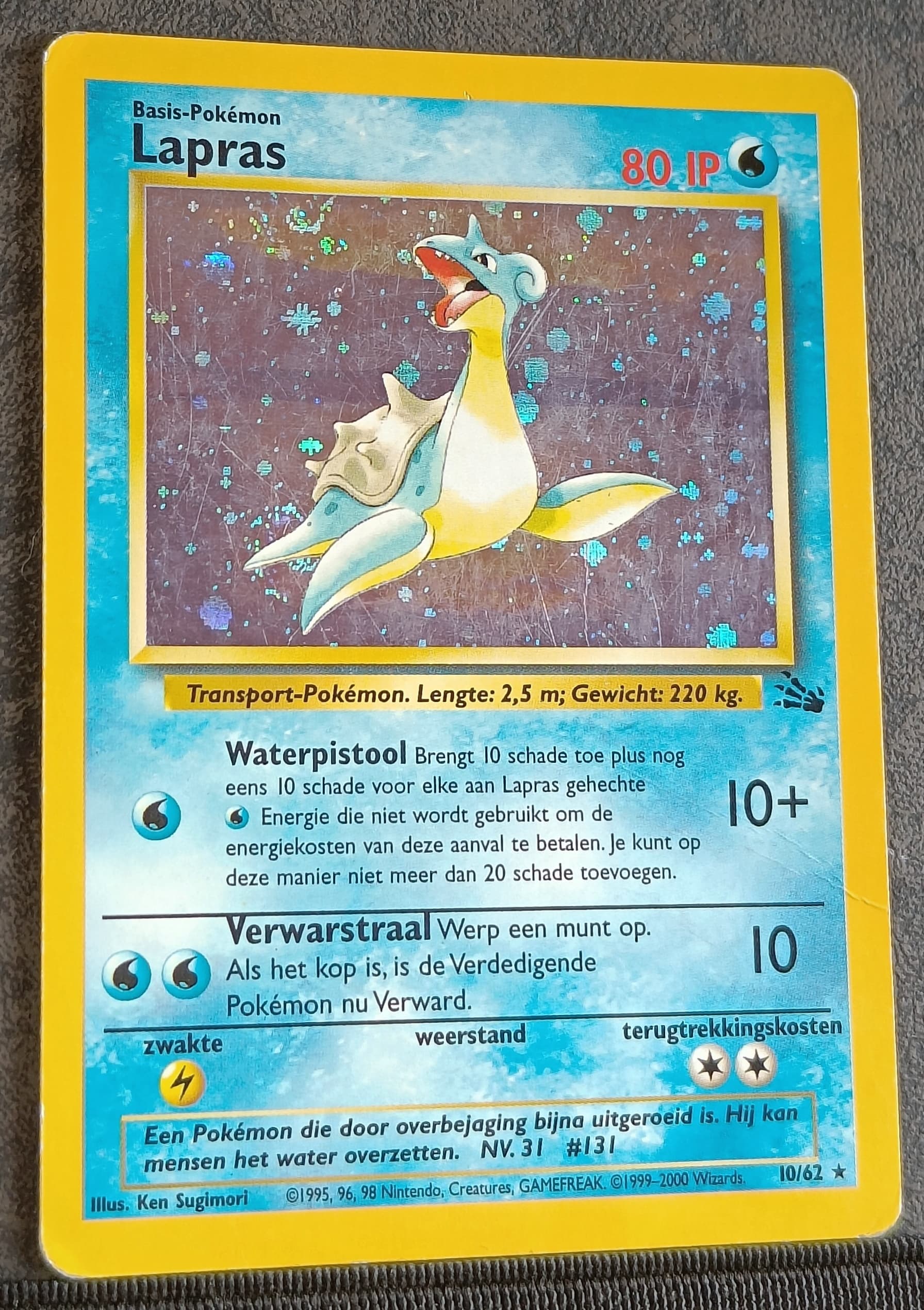
Lapras dutch (double swirl because of overlapping holo foil) Dutch fossil unlimited is extremely rare because there where far less unlimited cards printed compared to 1st editions, they where only printed for booster packs to go in the tempest (thunderstorm) deck and for the deck cards itself. Lapras is one of the least rare though because it was one of the deck cards.
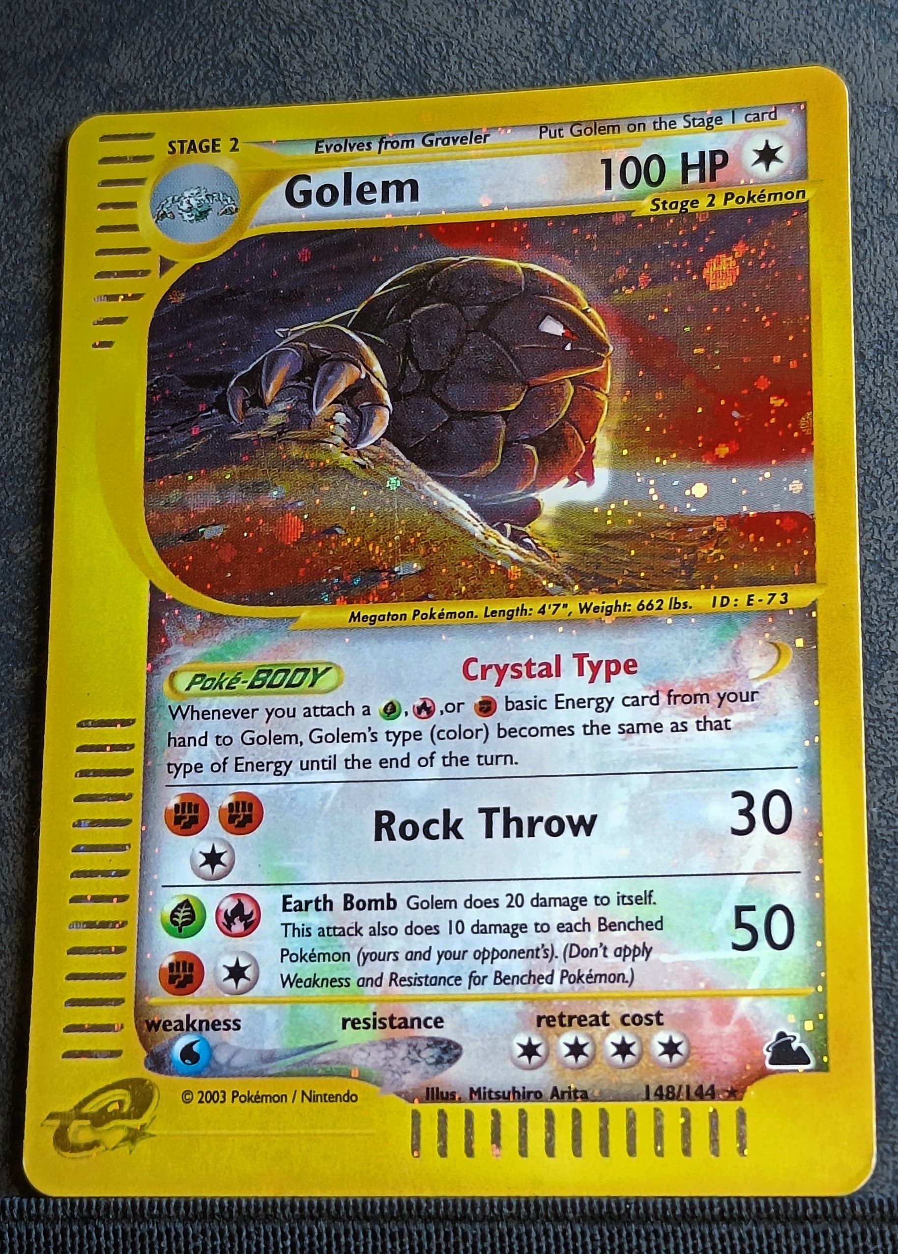
Golem
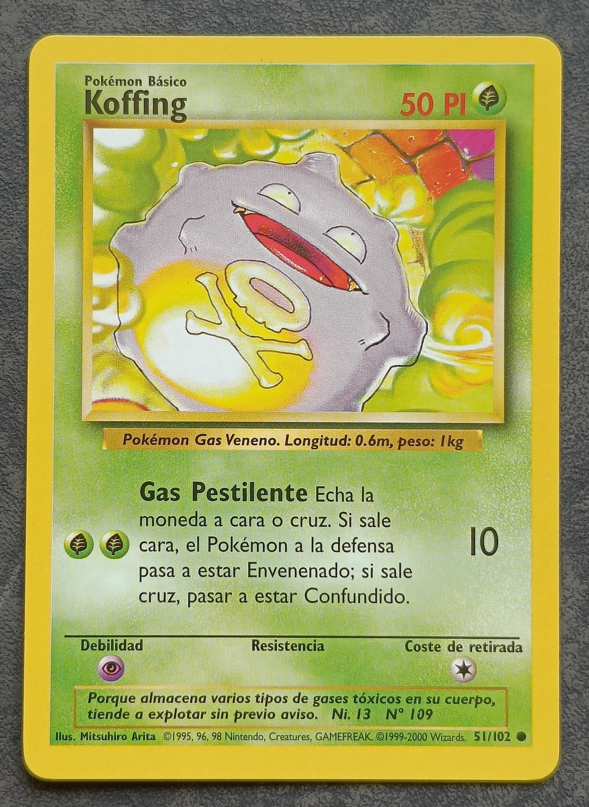
Koffing Spanish (yellow ink dot in artwork in his mouth) bon appetit Koffing ![]()
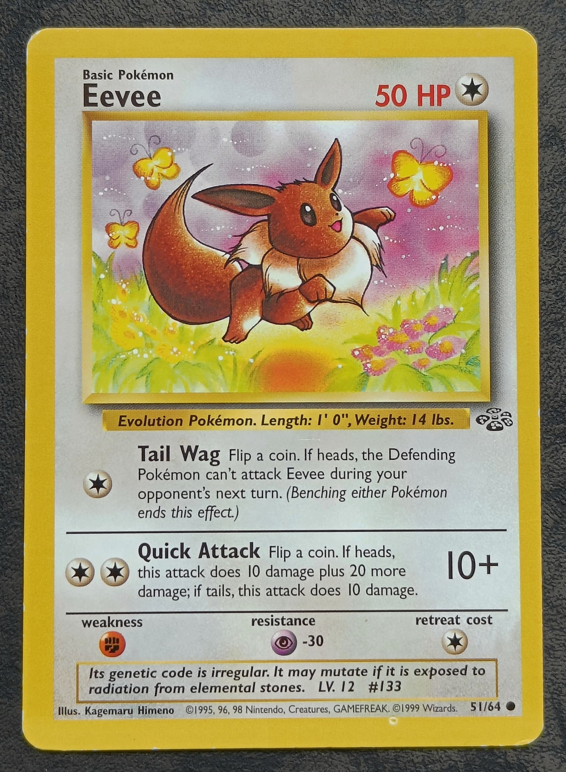
Evee (printer hickey obstruction of the yellow border layer on the bottom of the card)
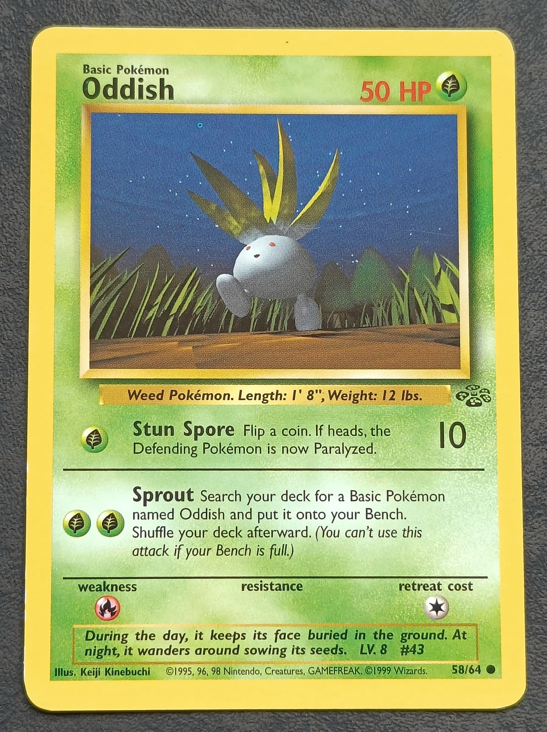
Oddish (printer hickey obstruction of the yellow layer on the sky in artwork) at least I think it is the yellow layer that was obstructed, not entirely sure. And yes it’s tiny, I know. ![]()
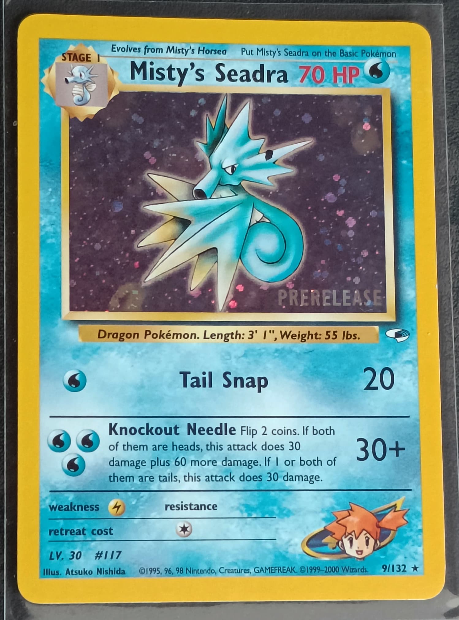
Seadra promo, prerelease stamped (black ink error in the artwork on it’s head)
Dunsparce… because I love the artwork ![]()
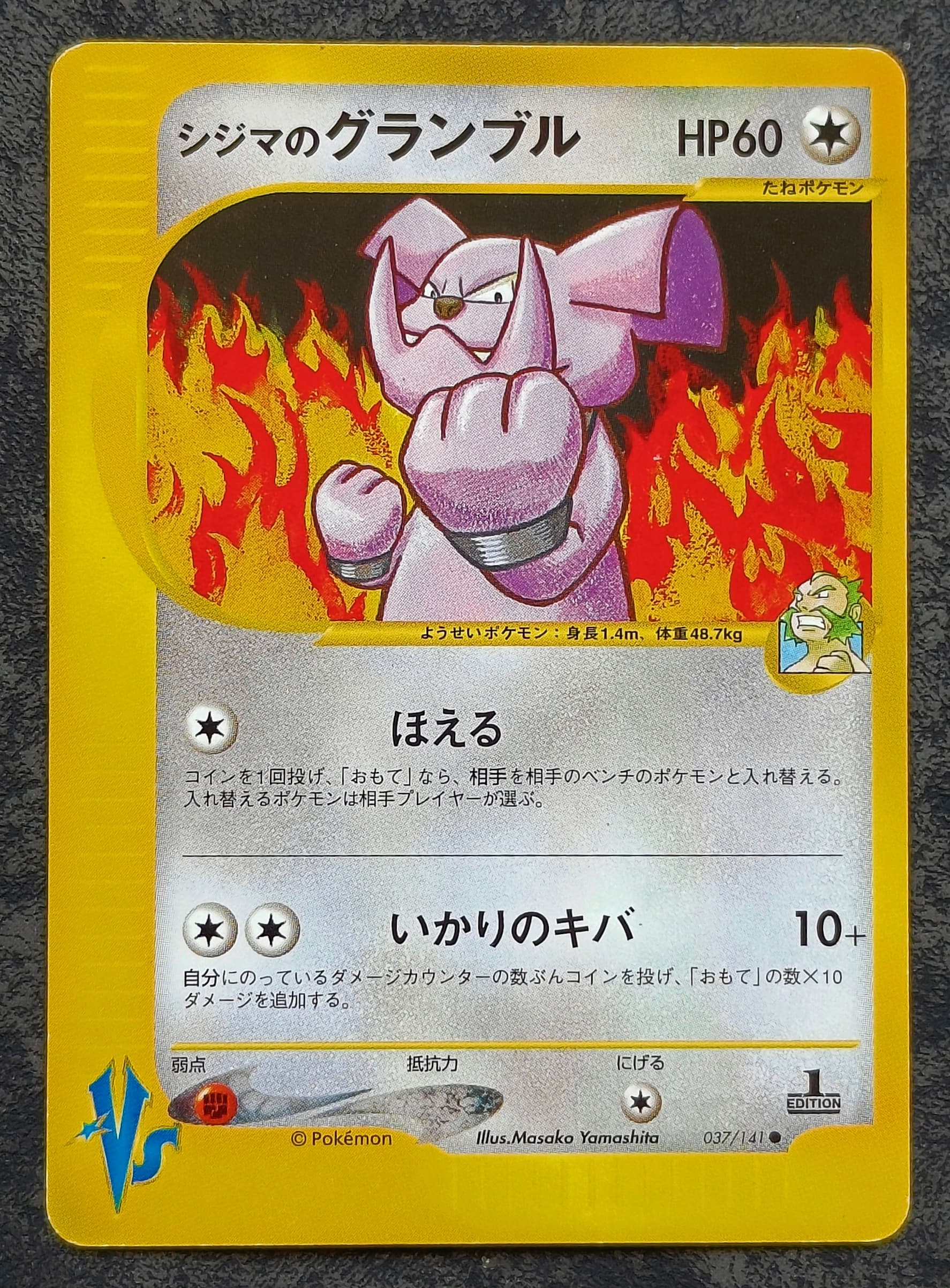
Granbull, amazing art as well.
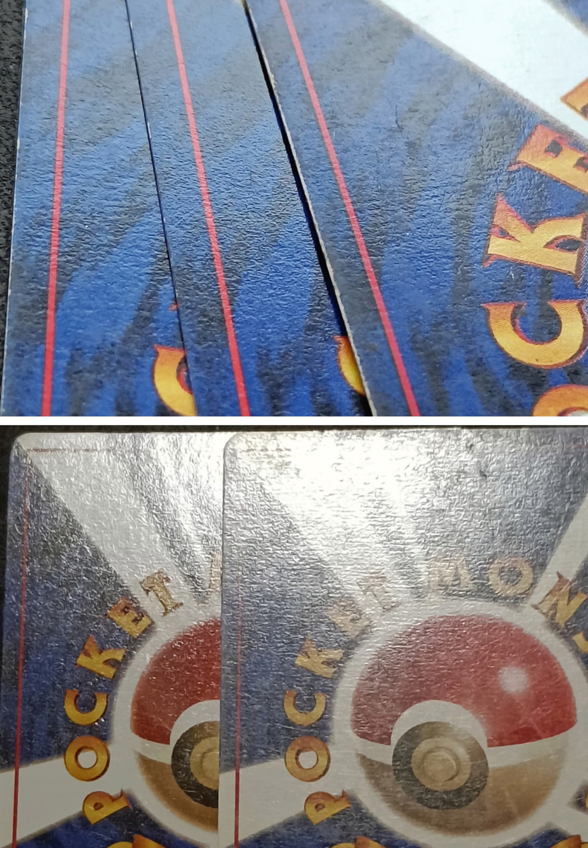
Here are some Wotc different card backside. I’m so happy to have that trainer deck B card even though it is not in the pokédex itself but on the front page of binder. That one was actually a PSA graded card that i cracked open. (Cracked 3 slabs in total for my pokédex) ![]()
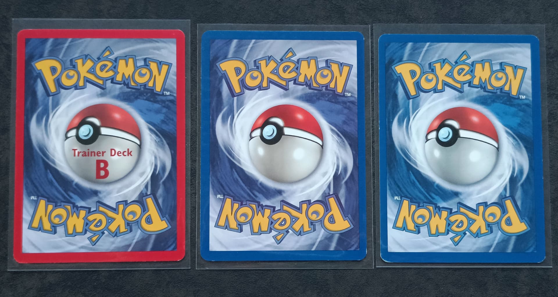
I have noticed multiple cardstock and gloss differences in the cards. I’m still trying to learn about it so I can’t give definitive information yet but I did want to say that I’m working on it and when i know more about it I will make a new post for it or add my info to an existing thread. The differences probably are because of printing locations.
I also noticed possible cardstock differences with the Japanese base set cards but again it’s a work in progress. I will add the info on my post a long time ago on rarity symbol sizes for the JP base set but i will only add on it when i tested some things out. Do need to buy cards for that and it takes time to get my hands dirty on this topic. ![]() (The picture with three cards has two no rarity base set at the sides and one with a rarity symbol in the center)
(The picture with three cards has two no rarity base set at the sides and one with a rarity symbol in the center)
And voila, that’s it for this post. In the future I have been thinking of posting my pokédex binder pages one by one and discussing why I made certain choices but I’m not sure yet, that’s something for some other time.
Hope you enjoyed it! ![]()
Edit: I added some details from cards in this post.
10 Likes
I put the music on and took the journey i advise all others to do the same… this was by far the most enjoyable post ive ever encountered. ![]()
![]()
![]()
![]()
3 Likes
When I added the music link i slowly went through the thread and I really enjoyed it myself as well. It’s only usefull when going through the entire thread and not so much if you just read the update posts but still thought it was a good idea. ![]()
3 Likes
This is such an enjoyable thread. Its a game I play now and try and spot why is a particular card unique before reading your comment for that card. You have an amazingly sharp eye for minute details. Thanks for your constant updates.
Cheers!
3 Likes
I had a lil look up the top after i put the music on for the changes and then went to the update. Ive also had a lil idea maybe buy a little wotc bulk that isnt showing exactly whats there and see what lil differences you can find within it. Doesnt have to be expensive plus resell all that isnt interesting and keep the lil gems. Just an idea… ![]()
3 Likes
Oh!! I was really curious as well about those different patterns on the backs of JP cards. I would see them from time to time and didn’t know if they were damage of some sort. Cool to know there’s a chance it’s just printing materials or mechanics.
You’ve got a really neat way of explaining things and showcasing the “info”
2 Likes
Thx for the nice reactions guys. ![]()
Ye I would love it as well to go through like a big box of old cards and see what I can come up with. I do feel like it’s all what you make of it yourself, meaning that certain details aren’t valuable at all but that doesn’t mean the information it holds isn’t interesting. Also when you make a nice presentation of a card even if it’s a boring card it can still seem allot more interesting just because it was presented well. Also I’m learning to spot card colors and this can make a big difference on the looks of a card as well, even if it’s tiny. ^^
I’m still trying to learn about the Japanese backsides but I think that the no rarity has different cardstock then the small rarity and what i’m hoping to find out is that the big rarity cards also have that old cardstock. It could show some sort of timeline but it’s very possible that the oldest cards are just thinner meaning they have that other look to it, and the newer cards are thicker meaning they got pressed harder in the machine and therefore losing that different look. I noticed I forgot to add with the picture that on the one photo I’m comparing two no rarity base sets with a rarity base set wich is in the center of the three. ![]()
3 Likes