MICR/ barcode would be good.
@dblast, I thought about including the barcode, but tbh I don’t know why PSA cards still have it when they also have a serial number and a QR code
If it has QR then no need for other codes. Just serial is too plain.
1 Like
@ripguyfawkes, I really like your design. Would love to see something like this in the (hopefully near) future.
1 Like
@ripguyfawkes Your design is sweet. It was jarring seeing the label at the bottom at first but the more I look at it, the more I like it. I also like the idea of slimming down the overall case size.
1 Like
Wow this is such a great thread, how did I miss it. It’s really so interesting to see what everyone values in a label and they all look so good.
Here’s my attempt at updating the PSA label to something that better suit the cards and the case itself.

The main thing I changed was to shorten the label. I’ve really liked all the designs so far that have suggested engraving the plastic case itself; slabbing a card is so much about the plastic that I think i’d be nice to use some of its properties within the design. Full engraving didn’t sit quite right with me though as it would be such an effort to engrave each case. Also sending back the labels for regrades & pop reports would be made super tricky.
So I thought it could be a good idea to shorten the label and to the right have the an enlarged grade on an engraved deck icon. Like a few have said i’d also like it if the PSA grades were a little more clear from first view & the engraving gives the plastic a chance to play a bigger role in the overall design.
I also did a bit of a redesign on the label. I didn’t want to change too much as I generally like the PSA labels and wanted some consistency between this and the old cases. Like many I added some extra & more accurate info about the card to the label. Then tried to display it in a clearer way than current PSA labels do. Name at the top with the other info spread out beneath. Also made some small changes like reducing the red bars on the side and adding some little security PSAs.
@qwachansey, that stonks redesign is incredible
6 Likes
Great psychedelic design, but I would be a bit worried for my card to be exposed 24/7 to LED lights haha
1 Like
This should also have an app included linked to paypal and USPS that flips the card every 5 hours on social media, and if it automatically sells, it schedules the USPS pick up and prints the label
1 Like
Really enjoyed this idea so decided to try and design one myself. Right off the bat, I trimmed the label size down to reduce the encapsulation size.

I prefer muted tones over the louder ones that I personally think CGC and PSA currently use. In general, I think it gives a cleaner look, with a more professional and broader appeal. I also wanted to make sure the grades were properly showcases as a focal point of the card, so offset the grade in a contrasting white box against the darker background. Used a blush trim to help accomplish this.
I made sure to leave room to include sub grades throughout the bottom portion of the label. By pushing the card info and grade towards the top of the label I could squeeze the sub grades along the bottom. Put the cert number above the grade for convenience.

A big part of my label redesign was to cut down the size of the case. My idea is around 10% shorter, which I think allows the card to be a large area of focus over the label itself.
4 Likes
The most interesting idea I’ve seen on this thread that really intrigued me was the option for different coloring in the label. In regards to PSA, where you have the red accent along the label itself,how feasible/difficult would it be for them to offer different colors? If I could have different colors to match the Pokemon type on the case I’d gladly pay a bit extra. Imagine red on Charizard, blue on Blastoise, green on Venusaur, yellow on pikachu! They would accent the respective card so nicely
1 Like
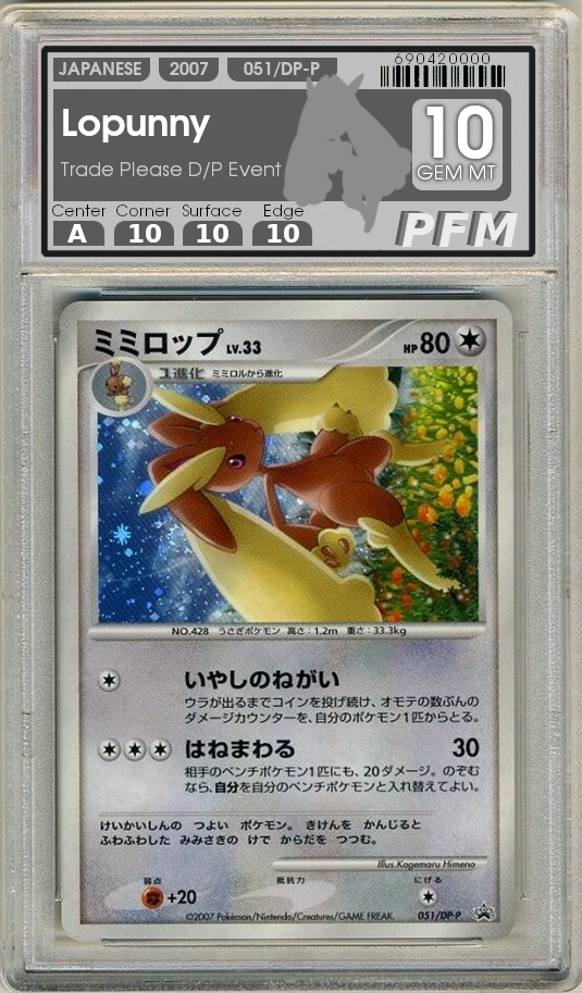
@pkmnflyingmaster Out of curiosity: why is center the letter ‘A’, while corners, surface, and edges are numbers ‘10’?
Greetz,
Quuador
At PFM grading inc. We dont take centering as literally as some of those other companies. Rather than a 20-point centering scale, the grades are one of A, B, C, D, OC, MC
We understand that primarily people are concerned with condition so while anything less than an A can’t receive a GEM MT grade, the centering does not otherwise factor into the final grade
6 Likes
Kudos for making the only one that has aesthetics I would even consider buying so far. lol
1 Like
I have always thought what a label on the right-hand side would look like, a verticle label. We read from left to right, look from top to bottom anyways. So card on the left, label on the right, grade at the top followed by the details. 0 graphic design skill here though.
The silhouette of Lopunny looks great and i think the idea is something that would really catch on, Reminds me of “Who’s that Pokemon” and then the answer is the actual card being graded ![]()
2 Likes
The bumping of this thread reminded me that when I designed the PSA 9 *Investor* case Charizard in July, I put $19.5k as the last sold price in 2022, and multiple people messaged me on Instagram telling me I was exaggerating the price (either didn’t get the joke of it being a future style case and future sale, or just butt hurt). I’ve never owned this card in a 9 and was not trying to shill. Anyway it’s funny that $19.5k was my future value guess in July and we’re already past that, crazy times indeed.
4 Likes
I’d light up the card or nothing. Just another thing to go wrong. Plus a less discreet label is way better,
I like this. Simple and a less conspicuous label. It makes the card artwork pop.
1 Like
This is great too. It really highlites how ugly the CGC method is.